Picture this: you open an email newsletter and are subjected to the same old boring content and uninspired design.
What do you do? You send it straight to trash in a matter of seconds because it failed to retain your attention. This is the fate of boring email newsletters, which translates to all your money and effort going down the drain.
One way to breathe life into your newsletters and get subscribers to take note of them is by refreshing your email newsletter design. It plays a huge role in capturing attention, engaging readers, and driving action.
In this post, we’ll tell you how to incorporate the biggest graphic design trends of 2021 in your email newsletter design and give it a facelift.
Muted color palettes
There was a time when bold and bright colors ruled the design space but not anymore. Recently, muted color palettes have grown to become a popular graphic design trend.
For the uninitiated, muted colors are colors that have been desaturated by adding a mix of black, white, or another complementary color.
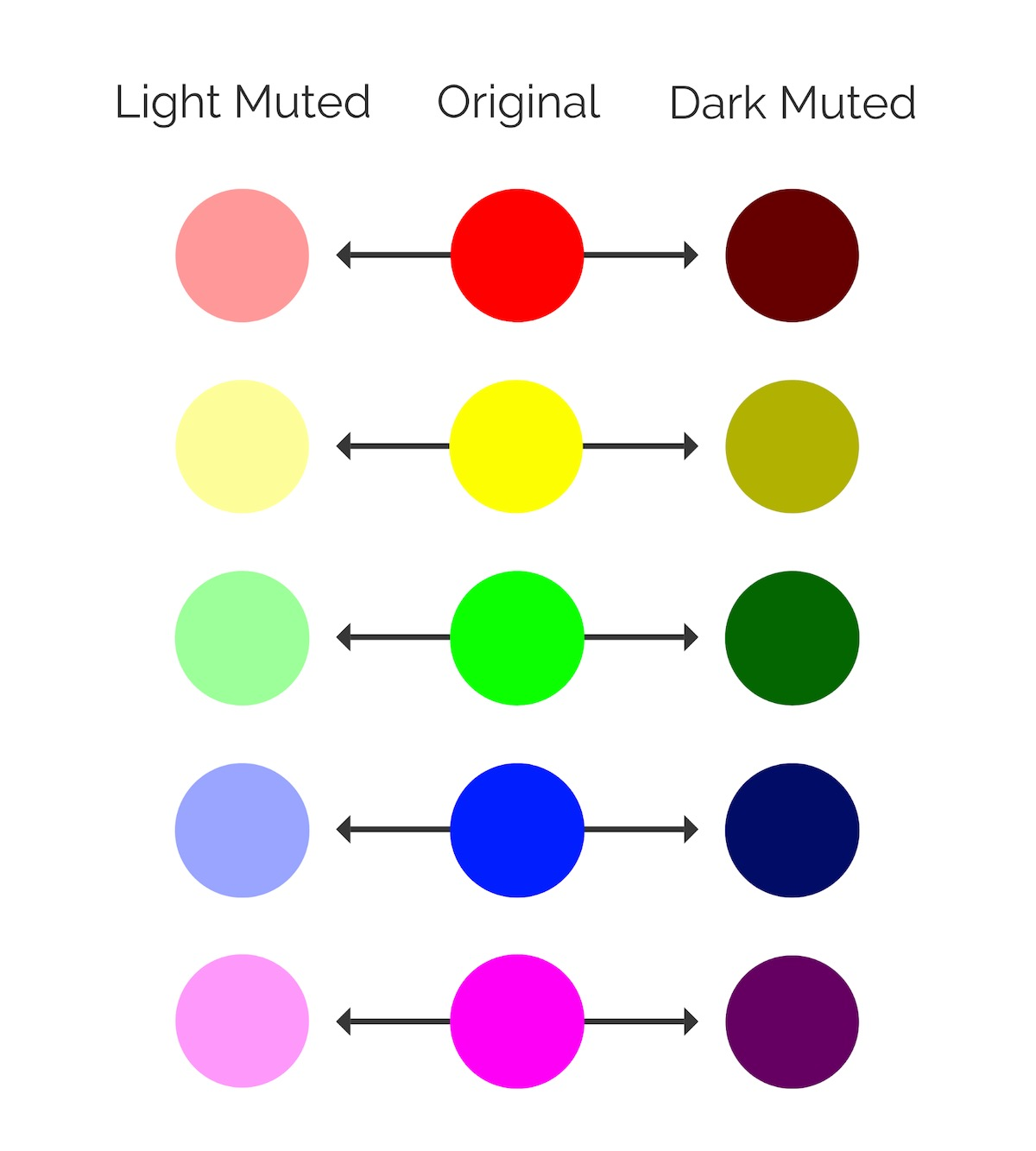 How vivid colors appear light muted and dark muted; source: Venngage
With their edge taken off, muted colors appear to be more understated and organic, leaving readers with a more safe and secure feel.
These are the different areas where you should use color while designing email newsletters:
- background;
- main content box;
- images;
- call-to-action.
Make sure the color palette you select is in line with your branding guidelines and conveys your message accurately. It’s also important to pick complementary colors that sit well together, making it easy for the reader to read without getting distracted.
 Vimeo uses muted colors in their yearly roundup email; source: Really Good Emails
Simple data visualizations
Data is a powerful communication tool — whether you use it for social media, internal presentations, or even email newsletters. It has the power to tell a story and keep readers engaged while driving decision-making.
You can use the following types of data visualizations in your email newsletters:
- infographics;
- charts and graphs;
- diagrams;
- maps.
That being said, make sure you don’t create a complicated data visualization because that defeats the purpose of the exercise.
The key is to keep it simple, focus on a single statistic, and make it easy for your subscribers to digest the information. You can also use visual cues such as arrows and color-coding, to highlight the key points without overwhelming the reader.
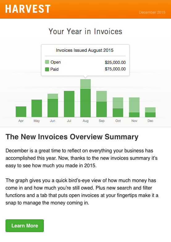 Harvest uses a simple stacked bar graph to give a quick overview of invoices; source: Really Good Emails
Geometric shapes
Last year saw a plethora of abstract and flowing designs, but those have now been replaced with geometric shapes and patterns. From rectangles and squares to circles and triangles, geometric shapes are characterized by hard edges and sharp corners. They add structure and consistency to visuals.
Here are some practical ways to use geometric shapes in your email newsletter design:
- Make your email text stand out against the background.
- Blend geometric shapes to create an abstract background pattern.
- Organize information.
- Emphasize key information and data points.
- Use them as visual cues to guide the user’s gaze.
Here’s an example of email newsletter design based on shapes:
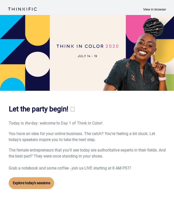 Thinkific uses shapes in their header banner to make a statement; source: Really Good Emails
Simple, classic fonts
HTML emails let you choose from a wide range of fonts and colors, but that doesn’t mean you should opt for a fancy font that makes reading your newsletter tedious.
Your focus should be on choosing a font that is legible across devices and screens of various sizes. The last thing you want is for your subscribers to zoom in and out, trying to make sense of your newsletter.
When it comes to fonts, the safest font to turn to for email newsletters is a classic serif font. Being one of the oldest font styles, they are perceived to be classic and trustworthy while being incredibly easy on the eyes.
You can pair a combination of two to three fonts to differentiate the headline from the body text. In addition to the font style, make sure you choose an appropriate size that leaves enough white space and makes for an easy read without being too overpowering.
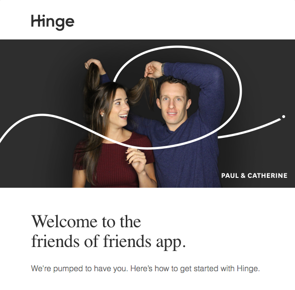 Hinge uses the simple and classic serif font; source: Really Good Emails
Flat icons and illustrations
Visual content in email newsletters does not only mean product shots and lifestyle imagery.
Some of the most effective visual communication devices you can use in your email newsletter design are icons and illustrations. Apart from adding visual appeal and breaking the monotony of text, they are a great way to illustrate information and emphasize points in your newsletter. What’s more, they also add a dash of personality and make the key takeaways more memorable.
Flat icons and illustrations have become a popular graphic design trend due to their simplicity, making them very easy to consume.
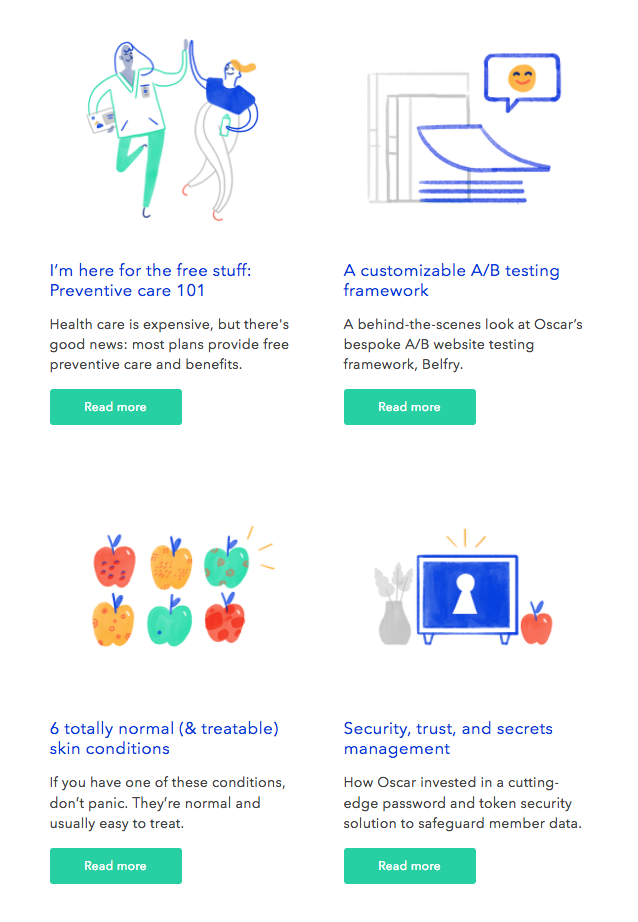 Oscar Health uses flat illustrations to introduce their content pieces; source: Really Good Emails
Text-heavy videos
It’s interesting to note that using videos in email newsletters leads to a:
- 19% increase in open rates;
- 65% increase in click-through rates;
- 26% decrease in unsubscribes.
Video email marketing is effective because it builds trust, engages viewers, and helps you establish a connection with your audience.
As per the latest graphic design trends, text-heavy videos have become hugely popular. They entail an overlay of text coupled with motion graphics. This format works because it gets straight to the point while retaining the viewer’s attention at all times. What’s more, as they don’t require much video footage, they are extremely easy to produce.
Here are the different ways to include text-heavy videos in your newsletters:
- create tutorials;
- announce a product line;
- showcase customers testimonials and reviews;
- share an event roundup.
Below is an example of an email with a text-heavy explainer video:
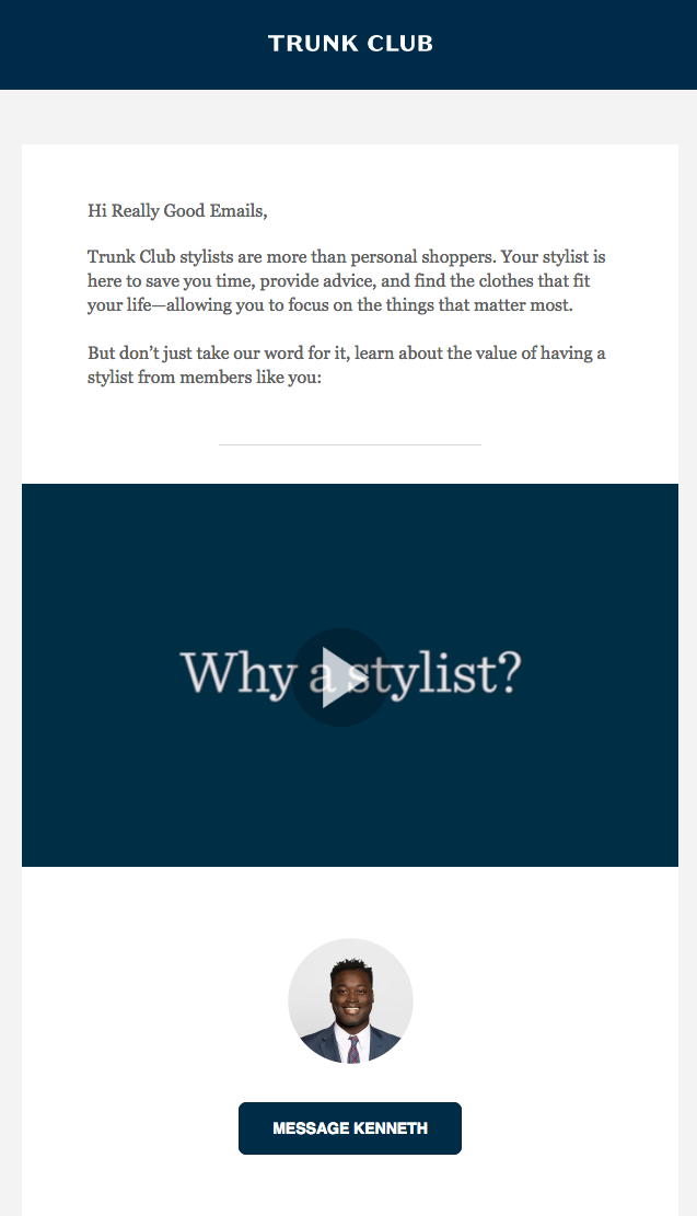 Trunk Club includes a text-heavy explainer video in their newsletter; source: Really Good Emails
The takeaway: refresh your email newsletter design
Newsletter templates should not be set in stone. It’s important to constantly refresh your email newsletter design to keep subscribers engaged and drive clicks.
Not only does this help your emails stand out in a crowded inbox but it also gives you new avenues to communicate your message effectively. These six tactics will help you ensure your email newsletters are in line with the latest graphic design trends.