Conversion rate optimization (CRO) is the systematic process of increasing your conversions. CRO boils down to obtaining more sales from the same amount of traffic and entails studying your target audience, their behavior, and how they interact with your content.
Conversion rate optimization is an integral part of every successful business. From this article, you’ll learn why CRO is important, how it enriches your marketing, and what steps you should take to boost your landing page and email conversion rate.
Why is conversion rate optimization important?
Digital marketing is a rapidly changing field. Your customers’ buying habits, behavior, and journey through the sales funnel change every now and again. As a result, marketing strategies that worked well six months ago may not be effective these days. The only way to keep your business afloat in this constantly evolving environment is by working on conversion rate optimization.
Better yet, conversion rate optimization allows you to get a lot of value from your current audience without investing a ton of money into attracting new leads. Read on to learn more about the ways your business can benefit from CRO.
Benefits of Conversion Rate Optimization
- Advanced knowledge about your customers
- Prolonged customer lifetime value
- Higher search engine rank
- More profitable paid advertising
- Increased brand credibility
Conversion rate optimization has other advantages besides getting more revenue from the same amount of traffic. Let’s take a closer look at some of them.
- Advanced knowledge about your customers. There’s no CRO without collecting customer information, and the more you know, the faster you can drive your audience through the sales funnel.
- Prolonged customer lifetime value. A well-produced conversion rate strategy allows you to gain more leads and retain your current buyers.
- Higher search engine rank. CRO implies that your website visitors get what they want from your site, and search engines love it. Thus, your web page appears higher on SERPs, and you get more traffic.
- More profitable paid advertising. You probably invest a lot in PPC – an advertising model where you pay for each click on your ads. When your landing page converts more leads obtained from this channel, you get more revenue on each cent invested.
- Increased brand credibility. Thanks to CRO, you get more dedicated customers and higher ranks on search engines. These things combined raise trust in your brand.
We’ve unpacked a few benefits your business gets from conversion rate optimization. Now it’s time to take action. Let’s start with seven hacks to skyrocket your landing page conversions.
7 Tips to Increase Landing Page Conversion Rate
- Rethink your landing page design
- Revise your website copy
- A/B test your landing pages
- Add exit-intent popups
- Optimize for mobile
- Improve your page forms
- Remove distractions
Landing pages are insanely effective for attracting customers, subscribers, and leads. Still, if your page is poorly made, you will get no conversions. Consider following our tips to boost your landing page conversion rate.
Rethink your landing page design
Visitors spend roughly 50 milliseconds deciding whether your website is worth viewing. Hence, make your landing page design a show-stopper.
Firstly, revise your structure and ensure it is clear-cut and easy to skim. Check if your page has the following essential elements:
- a prominent headline;
- relevant, high-quality, and eye-catchy images;
- a compelling and distinctive call to action;
- a simple subscription form.
Go for custom visuals like infographics or videos to boost your web page conversions even more.
Webflow provides an A+ example of a well-designed landing page. Various colors for each block make the page structure sharp and keep viewers engaged. The company uses custom visuals, such as collages, videos, animations, and infographics, to showcase its product and illustrate its benefits.
The CTA button is located on the first screen and hooks visitors’ attention immediately. Moreover, Webflow reinforces its call to action with social proof – clients’ logos, which also boosts the conversion rate.
Revise your website copy
Writing is crucial for improving your landing page conversion rate. While your design attracts potential customers, the copy persuades them to take the desired action.
Check if your page text matches your target audience to make it more persuasive. If your knowledge about your customer persona is vague, you’ll fail to address their pain and interests and persuade them.
Start reapproaching your website copy by restructuring it and removing any excessive lines – walls of text kill conversions. Then, make sure your landing page contains only one clear call to action. The fewer links you have, the higher your conversion rate is. Finally, craft your perfect headline to be straightforward and relevant to your offer and your audience’s pain points.
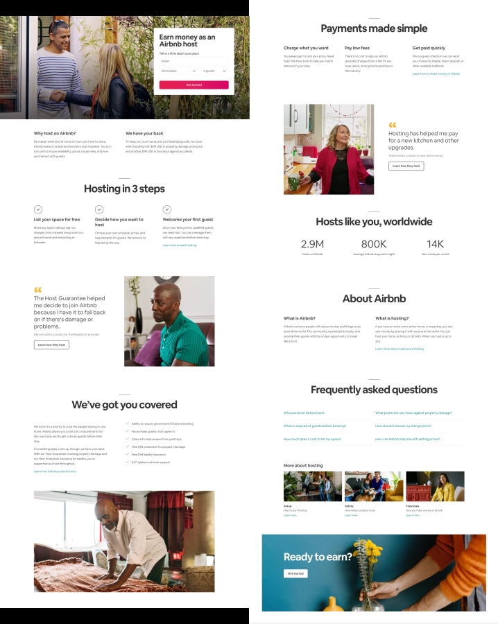
Airbnb knows a little something about creating an effective landing page copy. The page in the example below starts with a sharp headline defining the target audience and the benefits of using Airbnb. Further, the service briefly explains a few details and answers frequently asked questions.
The text is intertwined with social proof, such as statistics and customer testimonials. Airbnb uses minimum words to enlighten its viewers and persuade them to become a partner. The razor-sharp structure makes the copy easy to skim.
A/B test your landing pages
When it comes to CRO, A/B testing is nothing to sneeze at. Changing a minor detail, such as your CTA button’s color or image position, can often increase a significant conversion rate.
If you want to conduct split-testing, start with a hypothesis, for example, which landing page element can change the game for your conversion rate? Or maybe you need a whole new web page design? If you are stuck on this step, try experimenting with the key elements of your page, including your unique selling proposition, main image, features, benefits, and call to action.
When running an A/B test, stick to the following rules to get reliable results:
- Test only one variable at a time. It might be a single page element or a whole different page design.
- Define your primary metric. It can be your number of web page visitors or the number of leads converted – choose whatever serves the purpose of your split testing.
- Outline your test duration. You should run your test long enough to get a substantial number of views.
- Ask users for feedback. This move will give you valuable insights into why your audience prefers one variant over another. Besides, you can get some hints for future tests.
In the example from a WorkZone case study below, the company replaced colored logos with logos in black and white. After 22 days of split-testing, it turned out that the second variant showed a 34% increase in form submissions.

Add exit-intent popups
Exit-intent popups are off the table for many marketers since they are believed to be annoying for viewers. However, this tool is essential for conversion rate optimization as the most well-performing popups convert around 9.28% of users.
To get the most out of your exit campaigns, apply the same rules you did for your landing page design in general. Follow our guide to popup design for more tips on creating beautiful and high-converting exit-intent forms.
Apart from design hacks, you should pay attention to your copywriting and hook a viewer with an outstanding headline and a strong call to action. You can also implement some psychological tricks, as entrepreneur Marie Forleo did in the example below.
The popup explains the benefits of her audio training for subscribers and promises some additional value. Moreover, it accentuates the safety of this offer since a viewer can unsubscribe anytime.

Optimize for mobile
Mobile users spend twice as much time browsing the Internet compared to desktop users. Roughly 70% of smartphone users confessed they would rather buy from companies with informative and convenient mobile websites. Meeting this audience’s interests is a great chance to boost your website's conversion rate.
Improve your mobile landing page loading time to get the ball rolling – it should take less than five seconds. Then make sure your website is convenient for mobile users. Is your content easy to read on a small screen? Are CTA buttons accessible?
Look at the mobile version of the Global Patron website. The page loads in seconds, contains all the features available for the web version, and provides easy access to buttons, including a clear call to action and a live chat button.

Improve your page forms
Subscription forms on your website have the power to make or break your conversion rate. Long forms are often intimidating and irritating since visitors hate to fill them in and usually drop them off before finishing the process. Consider getting rid of excessive fields to acquire more leads. The best option is to go with an email address only.
If you need more fields to segment your subscribers straight away, consider multi-step forms. Simply put, split your long forms into several parts.
The form in the example below entices a website visitor with its simplicity. It looks like you only need to press the “I’m ready to talk” button. Once clicking it, a user sees a form with nine fields, but in this step, they are more inclined to put some effort into filling in the form.
To craft beautiful, responsive, and high-converting subscription forms for free, try the SendPulse form builder. Set up notifications about subscription, send confirmation emails, and create automated email flows to nurture your leads.
Remove distractions
Your landing page visitors have a limited attention span. Hence, it’s crucial to get rid of everything that distracts them from taking a certain action. Think about removing navigation bars, external links, banners, and other non-issues to enhance your conversion rates.
Even sticking to minimum page elements, you can still build a well-designed and persuasive landing page, as Shopify did in the example below. The company left only two CTA buttons on its web page.
Shopify added subtle social proof to boost the conversion rate – the number of customers at the top of the page, clients’ logos, and a testimonial at the bottom. All of them are located right before the CTA buttons to reinforce their message.

We’ve unveiled several tips to boost your web page conversions. If you want to learn more psychological, design, and copywriting tricks, follow our comprehensive guide on increasing a landing page conversion rate.
After gaining the maximum leads from a website, you can get a little more from email marketing. We’ve picked several hacks to help you with email conversion rate optimization.
7 Tips to Increase Email Conversion Rate
- Segment your audience
- Make your communication personal
- Use animations
- Create a sales funnel with your emails
- Make sure your emails display well
- Write an effective subject line
- Make a killer offer
Email marketing is alive and thriving when it comes to promotional activities. The majority of Internet users prefer to receive offers from brands via email. Moreover, the average conversion rate for emails is roughly 4% higher than for social media. If you’re struggling to raise your email conversions, try following the tips below.
Segment your audience
Segmented email campaigns get 100.95% higher click-through rates compared to non-segmented campaigns. If you still do not segment your email recipients, maybe it’s time to give it a try.
To start email segmentation, clearly define your criteria. They might be gender, location, the amount of time your subscribers have spent with you, the frequency of their interaction with your email campaigns, and more. You can get more hints about these criteria and learn how to put them into practice from our article on mailing list segmentation.
After segmenting your subscribers, create different email strategies and campaigns for each group. Your emails should reflect the interests of each category of your receivers.
Zara, a clothing brand, shows a great example of such an email campaign. The message below promotes a new collection and shows some womenswear curated for a female recipient.
Make your communication personal
Emails with the “To whom it may concern” salutation frequently end up in the trash folder without being read. Such impersonal messages annoy your audience, while personalization appeals to 90% of customers.
Thus, starting your communication by calling a recipient by their name is good, as Cognito Forms does in the example below. Moreover, the company uses a person’s name in the sender line because these kinds of email campaigns have a 15-35% higher open rate than non-personalized messages from companies.

Making your emails more personal is as easy as pie with SendPulse. You can add variables and try smart personalization tools to create your customized emails for thousands of subscribers in two clicks.
Use animations
According to Litmus’ State of Email report, 91% of consumers prefer interactive and visual content over traditional, text-based, or static media. The autoplay of in-message videos is not available in most email clients and may not yield the conversion rate boost you need. Try to add GIFs and animations to your email campaigns instead.
To improve your email conversion rate with animations, follow two simple rules. Firstly, use images relevant to your content. The best option is to create your own GIFs – our comprehensive guide will help you craft custom animations and use them in your email marketing campaigns.
Secondly, stick to moderation because GIFs incorporated between every two lines of your email will drive readers up the wall. You’d better limit yourself to one or two animated images.
Let’s learn from the Barkbox email campaign below. The company added only one moving image at the very beginning of its message. The GIF with cute doggies is custom, relevant, and perfectly matches the email’s design and Barkbox’s visual style in general. But most importantly, it’s funny, eye-catchy, and adorable.
Create a sales funnel with your emails
If your email is a standalone piece of content, it will probably come out dead in the water. To prevent this, think about each of your campaigns as a part of a single email marketing strategy.
Create email flows to keep customers engaged with your brand. We’ve collected 14 types of emails you need to provoke interest in your product, create an exceptional user experience, nurture leads, and more. Follow the principles of a marketing funnel to learn how to apply them to your marketing strategy. At first, provoke your readers’ interest, drive them towards purchasing, and push them to take action.
Look at Framebridge’s Father’s Day email flow to get some inspiration. In the first email, the company gives a hint about a perfect holiday present and provokes readers’ interest. In the second message, Framebridge shares several moving stories about dads, intensifying readers’ desire to make their fathers happy. In the final email, the company urges readers to shop for last-minute gifts for their dads.

Make sure your emails display well
65% of emails worldwide are opened on mobile devices, which is why emails that look great on any screen type are a must-have. A poorly-displayed message is unlikely to have a good conversion rate.
Make sure your email displays well on different screen types before sending it. It’s a good idea to enable users to open your email in a browser since it will help with any screen resolution or email client problems.
Look how theSkimm embodied this option in their email campaign. After a click, readers come to the archive of all of theSkimm’s email campaigns. There they can read anything they like.
With SendPulse, you can easily create adaptive emails with the premade “View in browser” link. You can see a preview of your email campaign before sending it. Besides, you can send a test email to your inbox.
Write an effective subject line
Roughly half of the users decide whether to open your email based on the subject line. Three-quarters of recipients report emails as spam without opening them if they don’t like their subject lines. Obviously, you cannot downplay the importance of this element when it comes to conversion rate optimization.
There are tons of techniques and tricks to compose effective subject lines. To dive into this topic, look through the list of hacks we’ve picked for you.
However, the bottom line of each excellent subject line is its relevance and clarity. Readers should be able to grasp the subject of your email after a short glance. You may lose your audience's trust forever if the subject line is ambiguous or misleading.
Wordstream provides a bunch of excellent subject line examples. They are short, sweet, clear-cut, and comprehensible at first sight.

Make a killer offer
Talking about email conversion rate optimization without mentioning the offer is meaningless. Create a killer offer to drive more conversions, and reinforce it with psychological tricks. Our compilation of hacks based on human psychology peculiarities will help your email conversion rate grow like crazy.
Let’s learn from Calm, a mobile app for sleep and meditation. The company offered its customers a tempting offer to buy a lifetime membership for half its average price. To make it even more irresistible, Calm added two psychological tricks. The service highlighted the exclusivity of this proposal right before the CTA button, accentuating the offer’s scarcity right after it.

Optimize your conversion rates to get more benefits with the same investments. SendPulse will help you do it easily – you can sign up and try a variety of our services, from subscription form builder to email campaigns management system.
Last Updated: 22.03.2023
or