While creating an email campaign, you cannot solely rely on your instincts — proven content and design are a must for a successful email. But how can you avoid getting lost among dozens of ideas for your email?
This is when email A/B testing comes in handy — a bulletproof way to beat your doubt. In this article, we’ll share nine ideas for A/B testing and show you how to run your own A/B tests with SendPulse.
What is A/B testing in email marketing?
An A/B, or split test, is a way to compare two variations of an email with the final goal to identify which version gets better results.
Here’s how an A/B test works:
- the contacts on the specified mailing lists are split into two equal groups;
- email A and email B are sent to these groups of subscribers;
- the service determines the best-performing campaign according to the predefined KPI and sends it to the remaining addresses on the list.
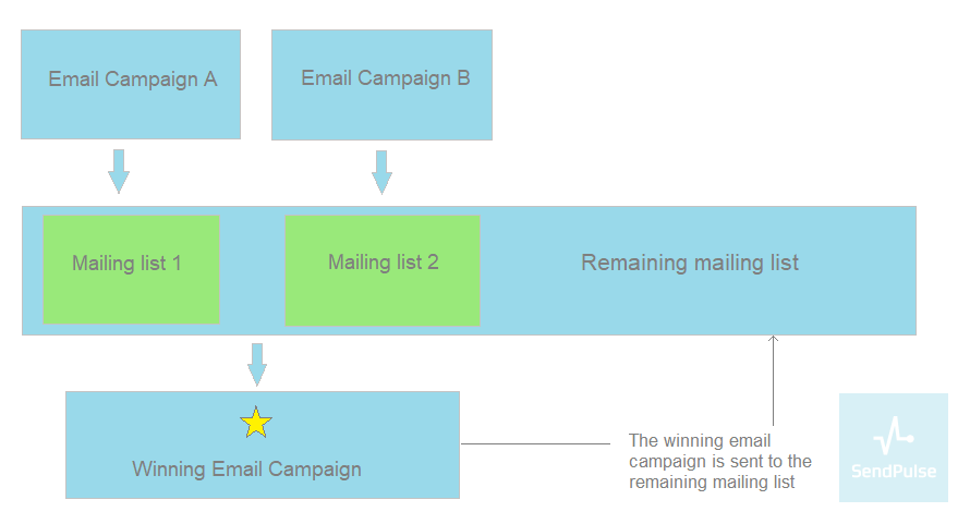 A/B testing basics
In email marketing, A/B testing can vary in complexity, so it is commonly represented by two types:
1. Classic A/B test — used to compare several versions of the same element, for example, to check which subject line brings more opens or which call to action (CTA) drives higher click-throughs.
2. Multivariate (MVT) test — used to check email templates with multiple elements changed, for example, to find out to what time of the day, sender name and salutation subscribers respond better without comparing each of these elements separately.
But before you start any type of testing, keep in mind these four rules:
- change just one element of an email at a time;
- have a clear idea of what you need to check;
- choose a metric corresponding to the goal of your campaign;
- select big enough groups of subscribers so that the testing results will be statistically significant.
Now let’s proceed to the ideas you can use to A/B test your campaigns.
Subject line
Test various subject line formulas to determine the one that will make your email stand out in the subscribers’ inbox and improve the open rate of your campaigns.
Personalization
Using A/B tests helps you choose whether a regular or personalized subject line works better for your email. For example, you can send one group an email with the subject line “Welcome aboard!” and another group an email with a personalized subject line “[Name], welcome aboard!”
 Personalized vs. Non-personalized email subject line
Question
Create two identical emails but choose different subject lines for them: with a question or a statement. For one test group, send an email with a subject line “Can we interest you?”, whereas the second group will get an email with an affirmative subject.
 Question vs. Statement in email subject line
Emoji
Emoji in the subject line can boost the open rate. Yet emoji might not appeal to some users due to their age, status, or just because they are used to getting more formal emails from your company. On top of that, some email clients may simply not display emoji properly. So, you can try a subject line with emoji and without it to check the open rate and determine whether the use of emoji is a good idea for your campaigns at all.
 Emoji vs. no emoji in email subject line
Sender name
Sender name may turn out to be the core aspect which will determine whether your subscribers will open an email or ignore it. There are several variations when it comes to sender name:
Specifying the company’s name is the safest way to go as it’s a sure-fire way to get recognized by the user.
 Examples of names of the companies used as sender names
- Representative+company name
Mixing the company’s name with the name of its representative can help you develop a more personal connection with them and, as a result, build trust. Moreover, with time, a recipient will be able to relate the representative’s name with the content of the email.
For example, subscribers of MarketingProfs might get used to Matt writing about upcoming events, while Jenn invites users to MarketingProfs PRO training.
 Names of the representatives of MarketingProfs used as sender names
- Company name+message type
If you send different types of emails to your audience, it may be a good idea to dedicate a unique sender name to each of them and test how it affects your open rates.
For example, Gap use the “brand’s name only” sender name to promote new arrivals, while “The Great Gap Sale” is all about flash sales. Finally, there is also “Gap Friends & Family” sender name, which indicates the start of a special sale the company holds three times a year.
 Examples of sender names from GAP
Links
You can also compare different formats for representing links in your emails. For example, you can oppose a text-embedded link to a CTA-embedded one to see which will bring higher click-through rates.
Embedded text links
Links embedded in the body copy of your email are less distracting but can be easily lost during reading. If you want such links to bring conversions, they should be visible and well-structured. Check out how MarketingProfs use this format of links in their digest to refer to recent posts on their blog:
 Digest email from MarketingProfs
Embedded CTA links
Compared to text-embedded, CTA-embedded links are more visible. They drive readers’ attention and guide them to the desired action. Here’s how Mailjet direct users to read about their new features in the weekly digest:
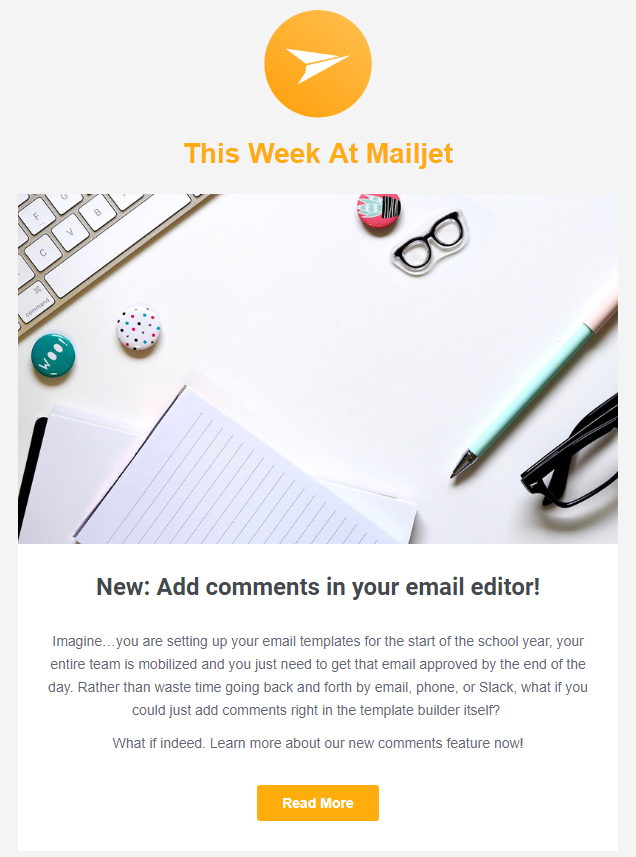 Digest email from Mailjet
Call to action
Testing the call to action helps to choose the one that will boost the click-throughs. Here’s what you can test:
You can play with CTA alignments: left or right, right or center, center or left.
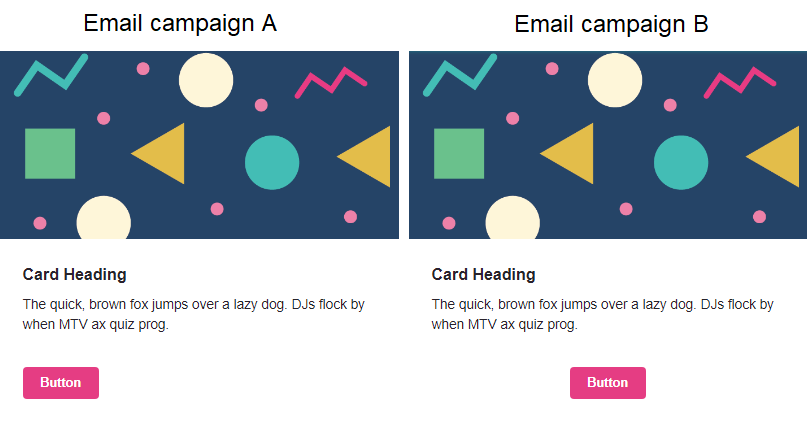 Examples of email CTA positions for A/B testing
You can also experiment with its placement either above or below the first scroll. Maybe the CTA visible on the first scroll would dive readers right into your offer, or maybe your audience need to grasp the content of your email first, and the CTA below the fold would work better. The only way to find out which CTA will get higher conversions is to test it.
You can play around with the color and size of your CTA buttons or try to shape them differently to find the best-converting option.
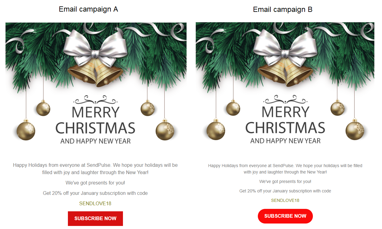 Examples of email CTA shapes for A/B testing
Apart from the button design, it’s important to consider the text of your call to action. Try to compare action-oriented verbs with standard wording like “Read more” or “Shop now.” Experiment with personal pronouns and the length of your copy.
Content
Find out how your subscribers prefer to acquire the information you send them — by reading, watching, or listening. Testing will help you to find the type of email content that brings more clicks.
For example, you can compare how your audience interacts with your email inviting people to either read your blog post or watch your video on the same topic:
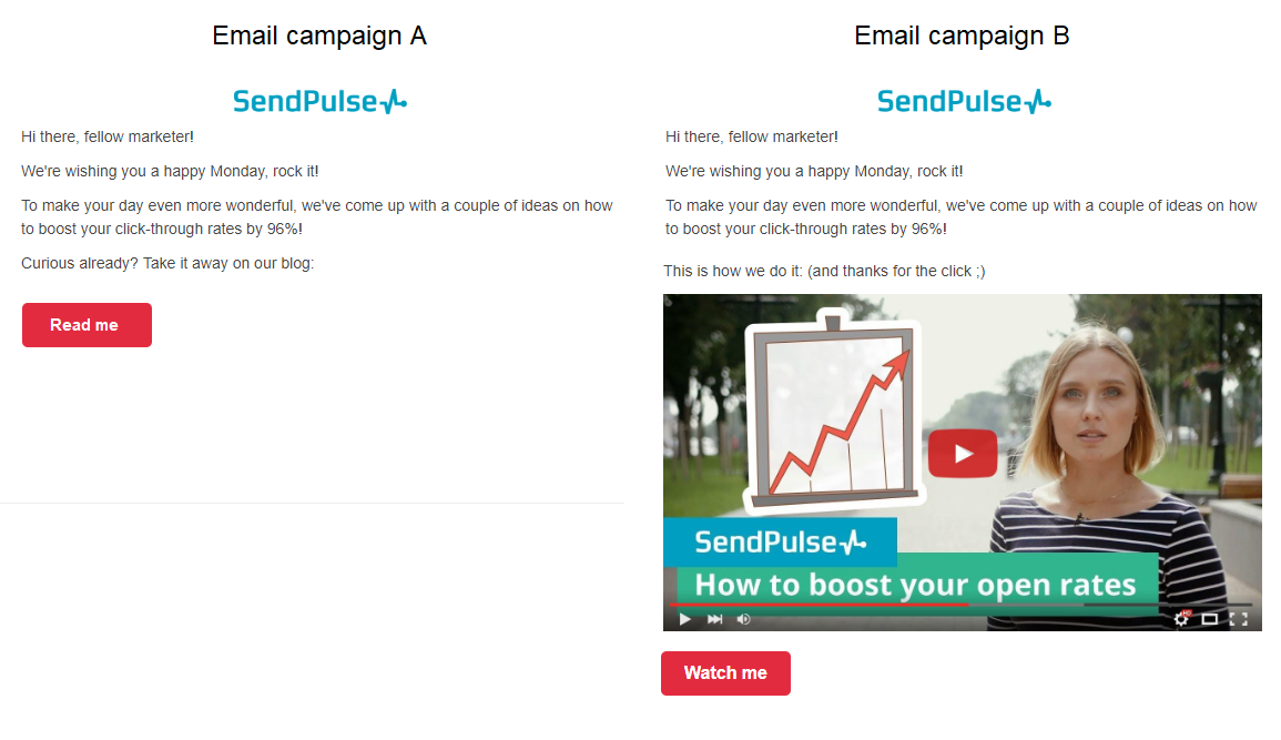 Examples of email content variations for A/B testing
Format
Test an HTML-based email in contrast to a plain-text one. Although HTML emails are more attractive thanks to visuals, colors, and included links, some people simply prefer plain-text emails, which look like personal messages with no fancy fonts and images.
Timing
Email marketing studies show that emails sent on Wednesday have more opens, while Sunday campaigns generate more clicks. As to the best time of the day to send emails, the recommended time span is between 4 PM and 11 PM. But it’s always better to test the sending schedule on your own considering the preferences of your subscribers, the time zones they live in, and their reactions on your campaigns.
Discounts
Adding a discount to your campaign is by all means a conversion booster, but you should try to test different ways to present it: a complimentary gift for the order or free delivery, one 20% off or two 10% off discounts.
Urgency
The fear of missing out improves the conversion rate of your email campaign. You can test whether it works for your subscribers by comparing a regular email with the one with the FOMO trick in the body copy. For example, compare an email with a countdown timer inside to show the time remaining till the end of the offer and an email with no time limitations stated to choose the one which works better.
How to run an A/B test with SendPulse
Take the following four steps to create A/B tests with SendPulse:
1. Log into your SendPulse account and click on the A/B tests section.
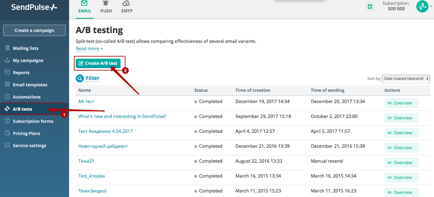 A/B testing with SendPulse. Step 1
2. Choose “Create A/B test.” Fill in the name of the test, choose the mailing list, the metrics you are going to compare, and parameters for the winning campaigns — manual or automated sending at the specified time.
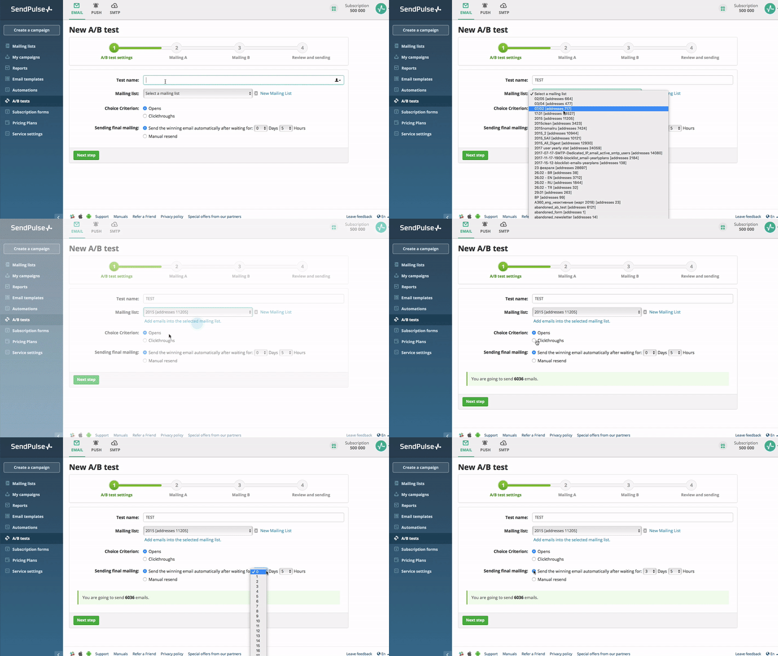 A/B testing with SendPulse. Step 2
3. Next, customize Email A. Fill in the necessary information, create or choose and edit the premade email template.
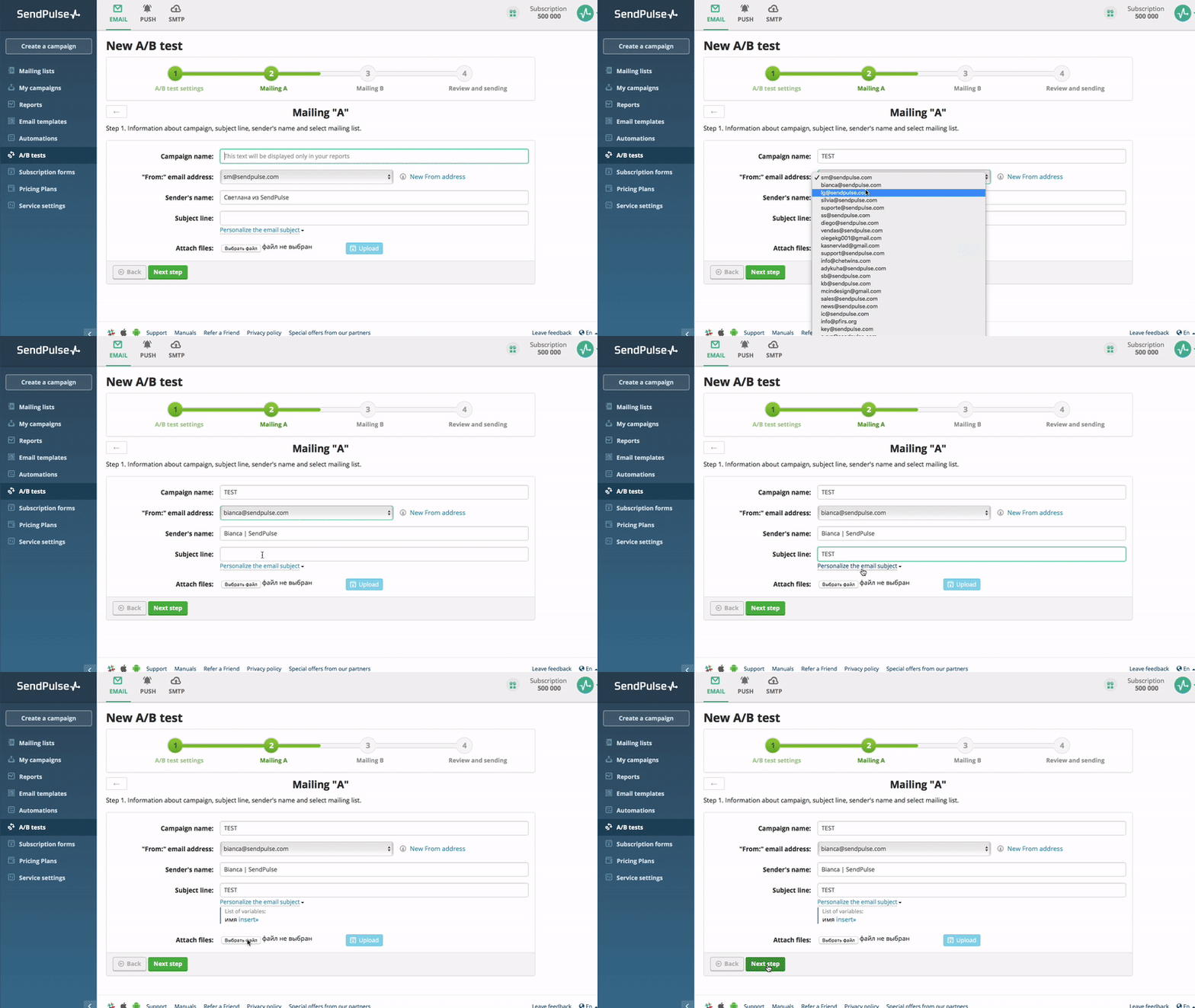 A/B testing with SendPulse. Step 3
4. Repeat the same steps to customize Email B. This way you can finish creating your A/B test or set Email C if needed — and you’re done!
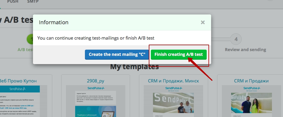 A/B testing with SendPulse. Step 4
Bottom line
Use A/B testing for any element of your email, be it a subject line or your campaign timing, find out your subscribers’ preferences, and provide your audience with relevant content. Good luck!