Smartphones now account for over 56% percent of our online time, and these numbers keep climbing. Clearly, for businesses, there are two choices. Either, they ignore it — and risk being left behind — or, they accept it and make the best out of their mobile-first online presence.
So, how should you approach mobile-friendly website design in 2025? In this post, we’ll give you a consecutive answer along with some hands-on tips and motivating examples. Let’s go!
Why is mobile website design important?
Mobile-friendly website design has gone from nice-to-have to non-negotiable — people around the globe spend a big chunk of their waking hours on their phones, and this isn’t going to change any time soon. Moreover, 58% of Gen Z say they feel uncomfortable if they spend over four hours offline.
So, if your website isn’t optimized for mobile users, you’re potentially alienating more than half of your audience — especially the young and tech-savvy users. What does optimization mean in practical terms? Imagine visiting a website on your phone and having to pinch and zoom just to read the text or tap a hair-thin button. When each scroll opens up a new obstacle, you will likely lose patience and leave before taking any action.
And, you wouldn’t be alone in feeling that way. Studies show that at least one out of five customers says they would leave a brand to which they were loyal after three or fewer instances of frustrating shopping experience. A mobile-unfriendly website, especially if it’s a storefront, doesn’t just hurt users — it directly impacts your bottom line.
Here are the aspects that mobile users find particularly jarring when it comes to website design:
- slow loading speed;
- bad navigation;
- crowded and outdated design;
- poorly structured content;
- obtrusive use of audio and video.
These are the main reasons why visitors leave a website despite having initial interest in its offerings. Another aspect to consider is Google’s algorithms. Since 2019, Google has used mobile-first indexing, meaning it mainly evaluates the mobile version of a site to determine its ranking. If your website isn’t optimized for mobile, your search visibility and traffic could suffer.
To top that off, mobile users are more likely to have a solid buying intent when visiting your resource. Oftentimes, people search for something nearby on their phones just to visit the establishment the same day — and to take advantage of their products or services.
When shopping in-store, customers may also use their smartphones to compare prices and potentially order an alternative online. By offering a great mobile browsing experience, you meet your target audience right where they are and give them a seamless way to engage with your brand.
What are the most popular approaches to mobile website design?
When it comes to building a website that would look good on mobile devices, there’s more than one route you can take.
Responsive design
Responsive design has become a default choice for many designers because of its versatility. Its single website layout automatically adjusts to fit different screen sizes and resolutions, thanks to flexible grids, images, and CSS media queries that adapt the content dynamically.
| Pros of responsive design |
Cons of responsive design |
| Offers predictably good experience across devices.
Easier to maintain since there’s only one site version to update.
Preferred by search engines like Google. |
Takes some effort and experimentation when it comes to ensuring proper scaling.
Might not be the best match for intricate, multidimensional designs. |
What sets responsive design apart is the fact that it isn’t limited to current devices — it adapts seamlessly to emerging technologies, such as foldable screens and wearable devices.
Mobile-first design
This proactive approach starts by designing primarily for mobile screens, which involves a deeper understanding of how mobile users browse and consume content. The design is then scaled up for larger devices.
| Pros of mobile-first design |
Cons of mobile-first design |
| Prioritizes user experience for the dominant platform (smartphones).
Encourages sterile, neat, and tap-friendly design.
Aligns with Google’s mobile-first ranking policy, where the mobile version of a website comes first. |
May feel too simplified and underwhelming when viewed on PC.
Requires a slightly different skillset and taking a deep dive into modern user behavior. |
The mobile-first approach to website design makes the most sense for resources with a primarily mobile audience.
Stand-alone mobile site
With this approach, a dedicated mobile-specific website (e.g., m.example.com) is created alongside the main desktop site. The mobile version is rather rigid and tailored exclusively for smaller screens.
| Pros of creating a separate mobile version |
Cons of creating a stand-alone mobile version |
| Fully customized experience for mobile users.
Easier to implement for existing desktop sites without complete redesign. |
Maintaining two separate sites can be resource-intensive.
Potential issues with duplicate content for SEO if not properly managed.
Might confuse users if the site redirects aren’t seamless. |
This approach, although less modern, is by no means outdated — corporate titans like Shein still use it to deliver a reliable, strictly predetermined experience to their users. This approach can be a perfect fit for legacy websites or industries with distinct needs for mobile-specific functionality.
Here are the key differences between these three philosophies at a glance:
| Feature |
Responsive design |
Mobile-first design |
Dedicated mobile version |
| Core idea |
Single layout |
Builds up from mobile |
Creates a separate mobile-only platform |
| SEO impact |
SEO-friendly |
SEO-friendly |
Potential issues |
| Maintenance |
Easier (one site) |
Easier (one site) |
Harder (two sites) |
| Costs |
Moderate to low |
Moderate |
Potentially higher |
| Flexibility |
Good for all devices |
Mainly focuses on smartphones |
Caters to mobile users only |
So, which approach would be the smartest choice for your upcoming mobile-friendly website?
- Responsive design is ideal for most businesses — it is scalable, simple, and is offered by many popular code-free website builders.
- Mobile-first design is best for mobile-dominant industries or when starting fresh with mobile users in mind.
- Dedicated mobile experience is a logical choice if your goal is to quickly address mobile-specific needs without overhauling an existing site.
In a nutshell, each of these approaches to mobile website design puts the user experience front and center but views it through a slightly different lens.
Mobile website design tips
Designing a mobile-friendly website isn’t just blindly ticking the usability boxes — it’s about intentionally crafting a smooth, engaging experience for users on the go. Regardless of which mobile website design approach you end up choosing, following these recommendations will bring you a stellar result.
Chop complex structures into digestible pieces
Smaller screens (typically with a viewport width of 360-480px) call for simplified designs with single-column layouts, larger buttons, and less text per view. This clashes with traditional desktop-oriented websites and their fixed horizontal layouts.
 An example of a modern one-column mobile website design
When designing a website for mobile, you must account for portrait and landscape modes, as well as the “on-the-go” context of use, which is often full of distractions, time constraints, and shortened attention spans. This means radically trimming down your designs, achieving a sleek and easy-to-follow structure.
Prioritize load speed
Mobile users are rarely in the mood to wait for a bulky page to load. According to Portent, a website that loads in one second is three times more likely to convert than a site that loads in five seconds.
Here are some ways to make your pages speedier and therefore more attractive for visitors:
- Use WebP image format and upload only the resolution you need.
- Choose videos over GIFs and use adaptive video players.
- Enable caching for your pages.
- Display only one video on your homepage.
- Go easy on custom fonts.
- Set up smart lazy-loading to strategically defer offscreen pictures.
- Use a “Load More” button instead of displaying all of your content at once.
- Make sure the use of additional apps and widgets is justified.
- Do not include more than one gallery on your homepage.
- If you use custom code, minify your CSS and JavaScript files and reduce unused styles.
- Switch to a CDN service with points of presence in your target region.
What sounds like a week’s worth of labor can, in many cases, be achieved in a few clicks. For instance, visual website builders do some of the compression for you automatically. To clean up your website code, you can also rely on so-called unused code detectors and plugins as well as AI coding assistants.
AI tools can help you create content, produce video, build chatbots, suggest relevant keywords, and much more. Check out the list of
AI marketing platforms to try out.
Make your hero section speak louder than words
Working on a smaller scale doesn’t mean compromising the impact of your product presentation — rather, you’ll need to readjust the visuals to match the smartphone screen proportions. This also means ensuring shorter headlines and superb legibility in case the text and the background image overlap.
 A mobile website with an eye-catching hero section
This example demonstrates how a mundane product can benefit from creative presentation and create a strong first impression, motivating the user to scroll down. Stylish, three-dimensional visuals like this one feel more immersive and modern than plain product photography, which is crucial for marketing to younger generations.
Simplify your navigation system
Another limitation that comes with designing for smartphones is the inability to use traditional lengthy navigation bars. Hamburger menus with dropdowns are better alternatives as they take up very little space yet always remain at the user’s fingertips.
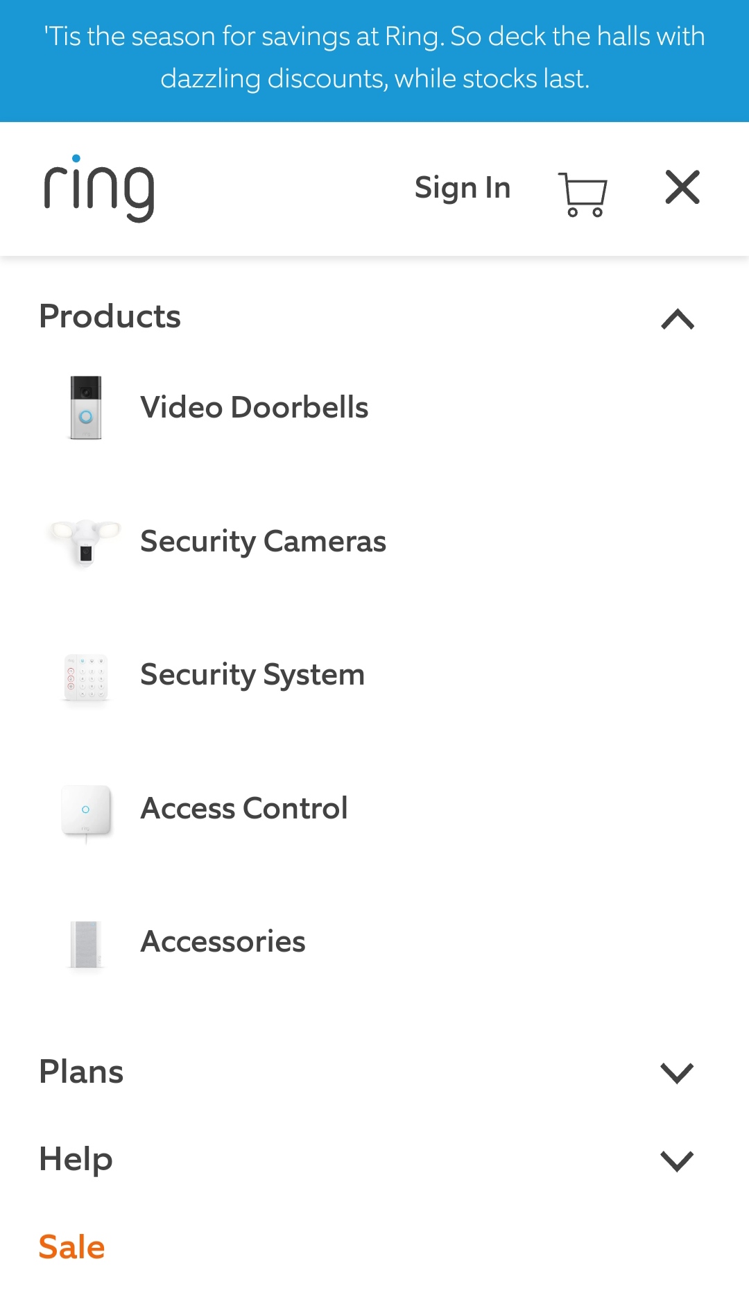 A mobile-friendly website navigation example
The navigation elements should stay thumb-friendly, meaning, they should be large enough to be tapped or swiped. To make the system even more intuitive, you can add icons to represent certain product categories. Sticky navbars are also a popular choice as they allow the user to easily jump to another website section without having to go all the way back up.
Embrace white space and minimalist design
The smaller the screen, the thinner the line between “informative” and “cluttered” becomes. When designing with smartphones in mind, it’s important to fight the urge to pack as much information as possible. Instead, you want to keep your elements nicely spaced to increase their impact.
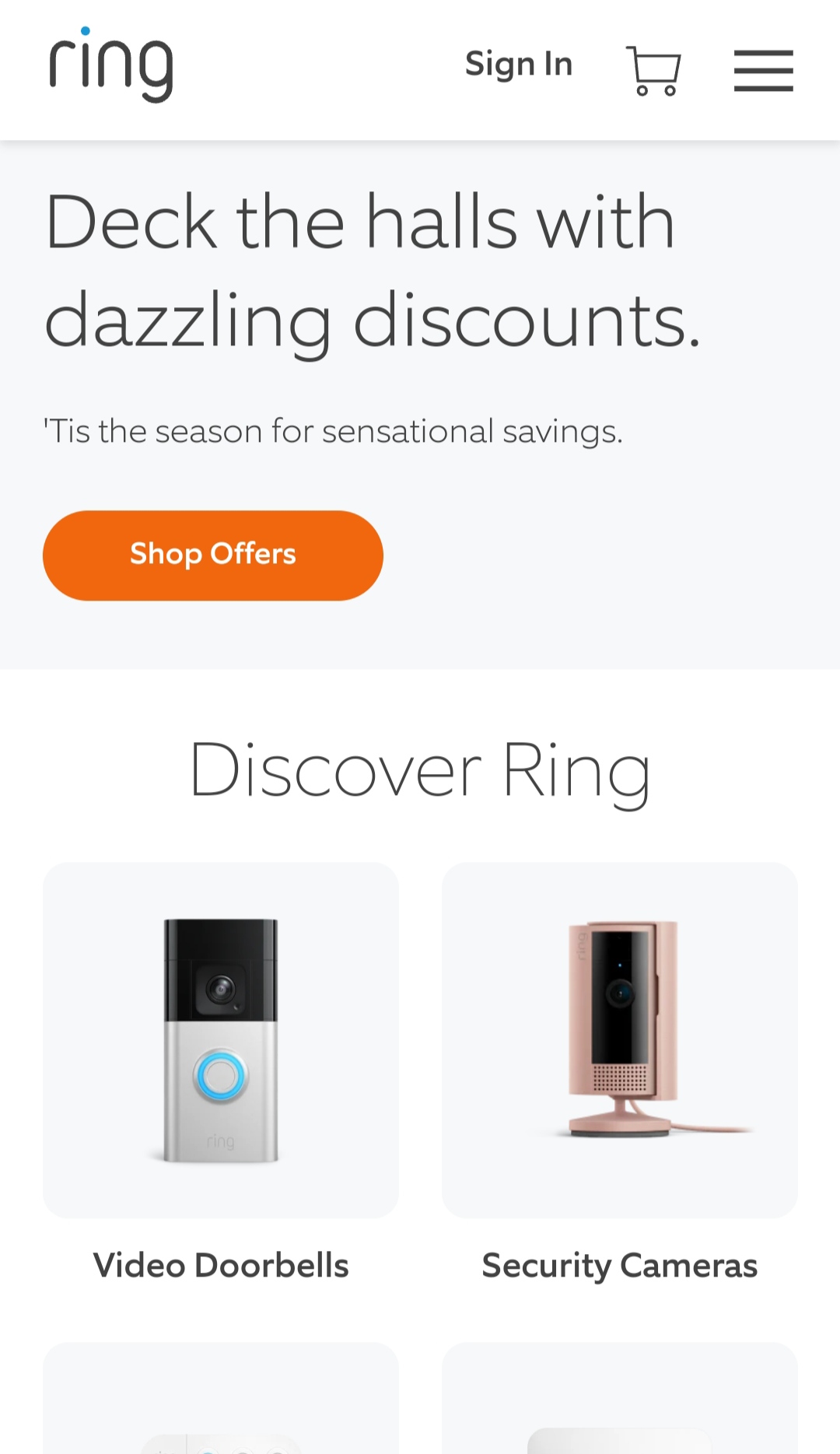 The use of white space in mobile website design
Minimalist doesn’t mean boring or empty — it is more about how each element must serve a purpose. When the whole website layout has enough air to breathe, it becomes much easier to visually digest it and appreciate even the smallest details.
Design for touch-based interactions
Using a PC-friendly website on mobile feels similar to doing simple math on a vintage wristband calculator watch. While it is possible, the buttons are simply too tiny for a human finger to press, and the whole experience is far from being enjoyable.
On PC, interaction relies on precise mouse movements and clicks — that’s where hover effects and detailed controls are effective. On mobile, interaction is touch-based, requiring finger-friendly buttons, swipe gestures, and considerations for larger touch targets — minimum 48×48 pixels for tappable elements per Chrome’s guidelines. With enough padding around each element, you’ll be able to avoid accidental overlapping.
Make sure every bit of text is easy on the eyes
Tiny fonts are a common issue with mobile websites. Here’s an example of what poor legibility looks like — the headline blends into the background image, and the fine print is practically impossible to read without aggressively zooming in.
 An example of poor legibility on a mobile website
To avoid this, use at least 16px font sizes and proper contrast to improve readability. Make sure to shorten your paragraphs to one to two sentences and leave enough space between them. The perceived sharpness also matters — rough, pixelated text is harder to read. When in doubt, it’s recommended to use online contrast checkers to objectively assess your content.
Help your visitors limit their browsing experience to one tab
Users often explore multiple sections of a website in one session. On PC, this usually leads to countless open browser tabs, but that would pose a major inconvenience for a smartphone user unless they’re intentionally comparing products.
Mobile users tend to be task-focused, and limiting the need to open new tabs minimizes distractions and allows them to complete their goals faster. In-app sticky elements, collapsible menus, or dynamically loaded content can help avoid redirecting users unnecessarily.
Prioritize local SEO when relevant
Many mobile searches are spontaneous and location-specific, with over 70% of users visiting a business within a day after researching it online. Moreover, with GPS-enabled devices, mobile users expect location-based results instantly. So, it’s crucial to include your business’s location details and optimize for “near me” searches, including voice searches.
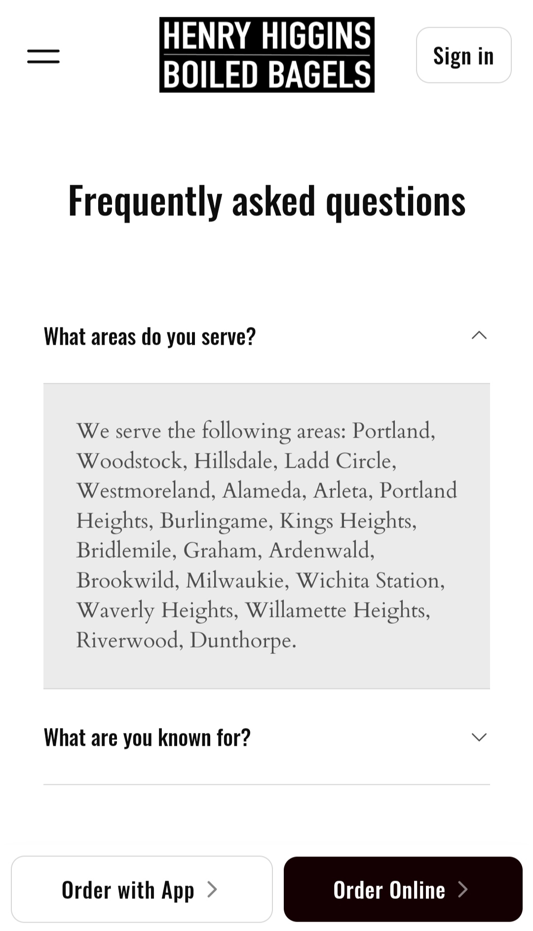 The use of local SEO on a bakery website
The goal here is to weave long-tail, location-specific keywords into your mobile website copy, including the FAQ section and the blog posts. It’s also important to ensure that your business information is identical on your website, Google Business Profile, and third-party directories.
Streamline your forms, pop-ups, and other notifications
Filling out long forms on mobile can be frustrating, especially if they have tiny input fields and tricky radio buttons. To optimize your overlays and other pop-ups for mobile, introduce fewer required fields and use large, tap-friendly buttons, including the “Close” button.
 A mobile-friendly overlay design
In this mobile-friendly website example, the necessary legal fine print had to stay, but it still remains perfectly legible on a mobile screen, thanks to the right font size.
Focus on mobile-specific aspects when testing
Testing your website on various devices is essential to catch issues before your users do. For instance, you can run a quick check with Lighthouse, Google’s new automated tool, which can be accessed from the Developer tools tab in Chrome. Lighthouse is an alternative to the discontinued Google Mobile-Friendly Test — it highlights usability and load speed issues and provides you with clear recommendations.
Testing mobile websites also must account for different screen sizes, touch gestures, operating systems, and slower data connections. Another important aspect to check is how the site handles errors like failed form submissions or 404 pages.
3 state-of-the-art mobile website design examples
The following examples show our mobile website design tips in action and prove that a mobile page can be just as informative and entertaining as its PC version.
Untamed
Untamed is a nutrient-rich cat food brand with a modern mobile website that makes ordering new pate jars for your fluffy companion a breeze. From start to finish, every element on the homepage is beyond mobile-friendly — it is fun to read, tap, and scroll through.
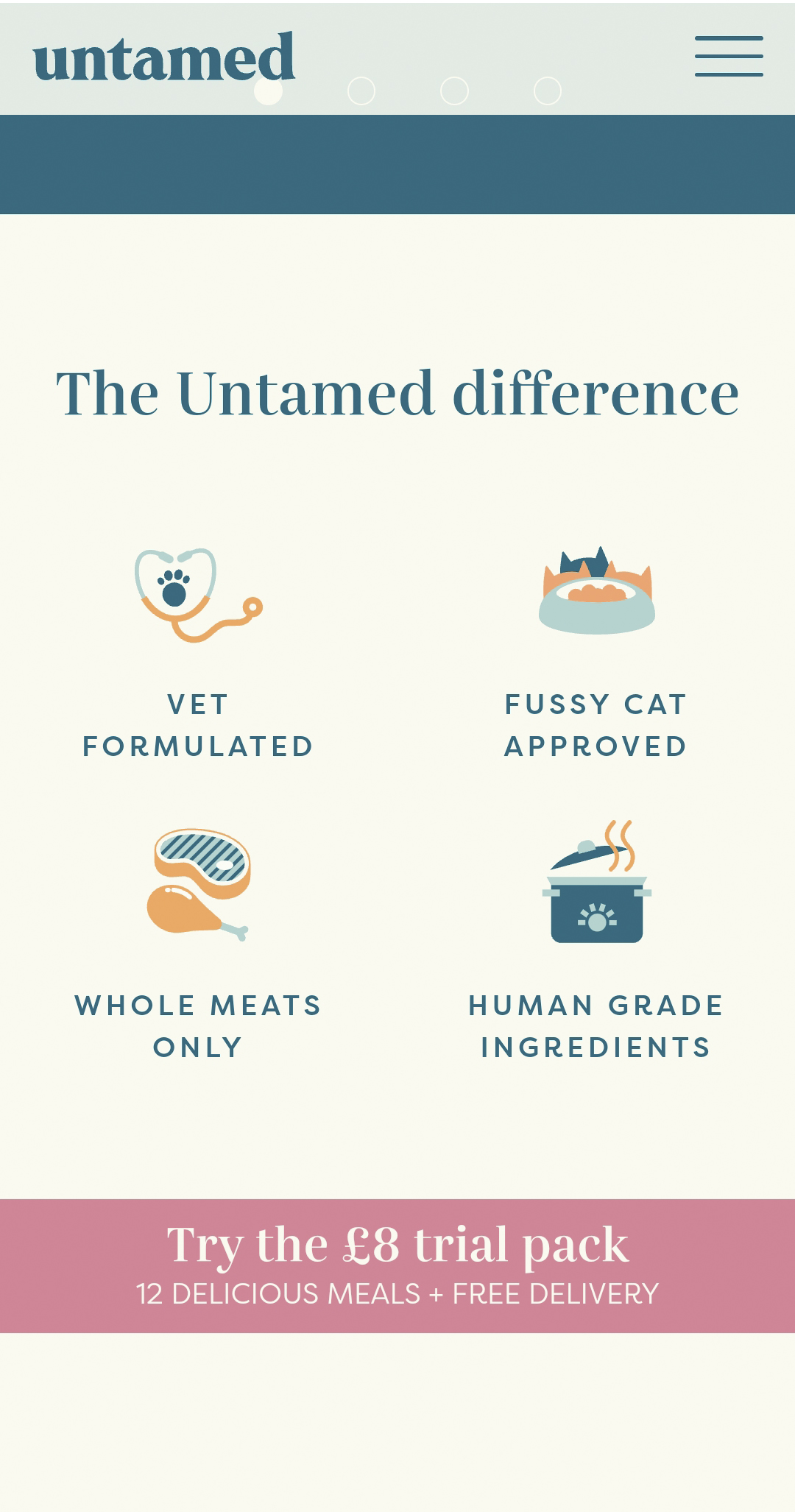 An example of a mobile-friendly product benefit list
There’s no need for wordy descriptions as the intuitive imagery along with icons highlights the key benefits of the brand quite well. The social proof section is also designed phenomenally well — each customer review is vivid and accompanied by adorable pictures of the cats in question.
 Engaging social proof from the Untamed mobile website
Moving on to the product catalog, the website prompts the visitor to answer a few questions about their pet in a conversational form. This is a fantastic way to guide the customer through a product assortment while also building a personal connection with them.
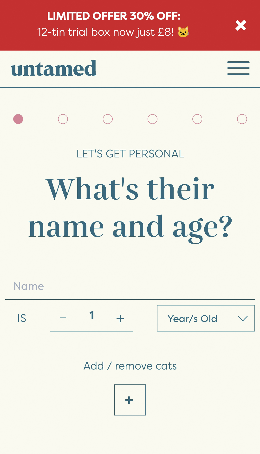 An intuitive product quiz from a cat food brand on their mobile website
The whole layout contains plenty of white space and has a strong visual hierarchy, which prevents distractions and keeps the user journey smooth and controlled all the way throughout. Finally, the carefully selected color palette and detailed descriptions make the recipes look irresistible even for humans.
Pestie
Pestie is a DIY pest control brand, and we’ve chosen it to demonstrate how even the least aesthetic products or services can blossom given the right design. Its mobile website merges customer education with clever promotion, and it does so in a very user-friendly manner.
Pestie’s hero section their mobile website
The hero section does a great job of introducing the product and proving the simplicity of its application. It’s followed by a how-to guide and a safety statement, both of which are aimed at mindful consumers who only trust facts, not exaggerated claims.
 An intuitive dropdown menu from the Pestie mobile-friendly website
The fun visuals break down the seriousness of all the pesticide descriptions while making it easier to skim the pages. Another mobile-friendly design detail is the social proof section with its captivating video-based endorsements from happy customers on TikTok.
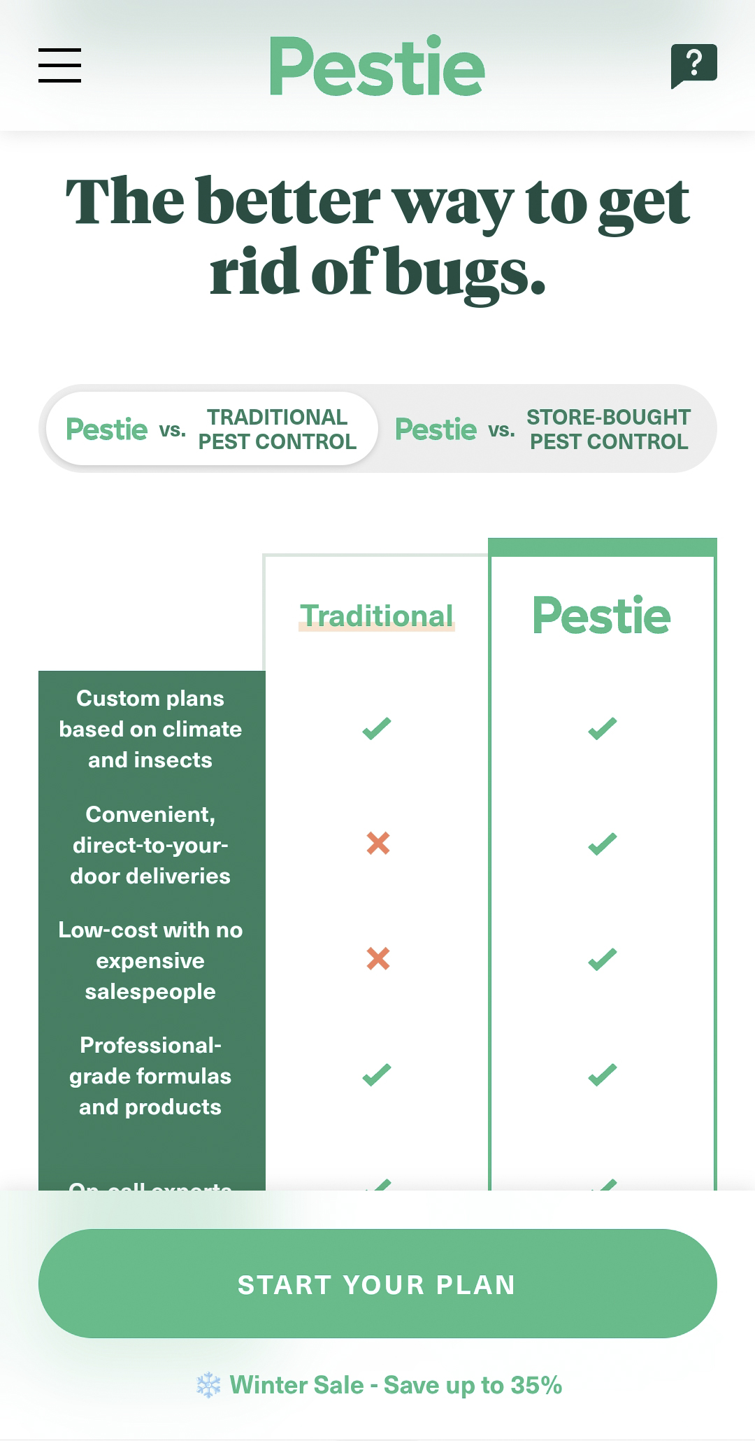 An intuitive product comparison by Pestie
When it comes to pricing details, the user can skip manual research as they’re provided with an intuitive side-by-side comparison of Pestie vs. traditional pesticide brands. Pestie’s mobile website strikes a perfect balance by addressing potential customer objections without sounding pushy or overwhelming them with technical details.
Sundays
Sundays is a startup providing world-class executive assistants and software to busy modern parents. The company’s mobile website features a minimalist yet impactful design, which perfectly complements the Sundays mission.
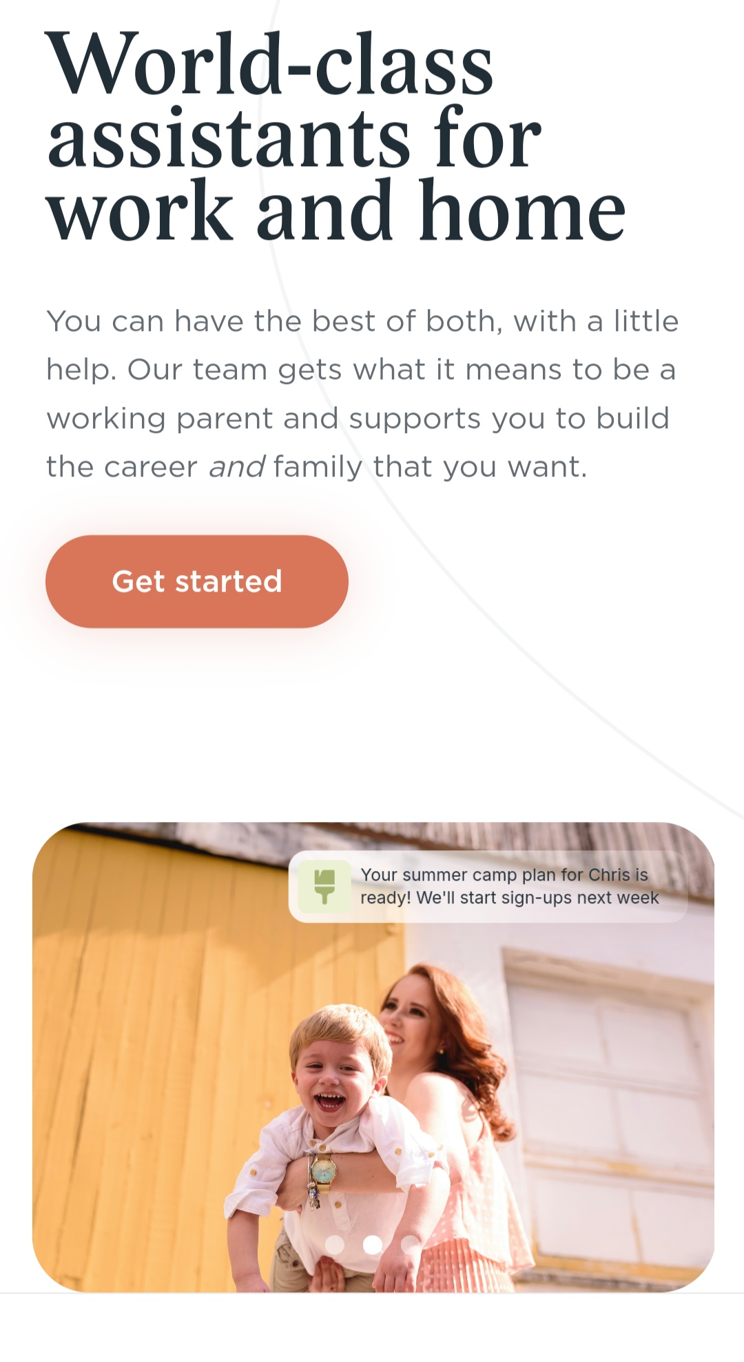 Sundays’ mobile website design
This hero section not only presents the offer but also conveys its emotional significance, reminding the user how happy and hassle-free Sundays can feel. The clean design of the entire mobile page allows the reader to fully grasp the scope of services Sundays provides.
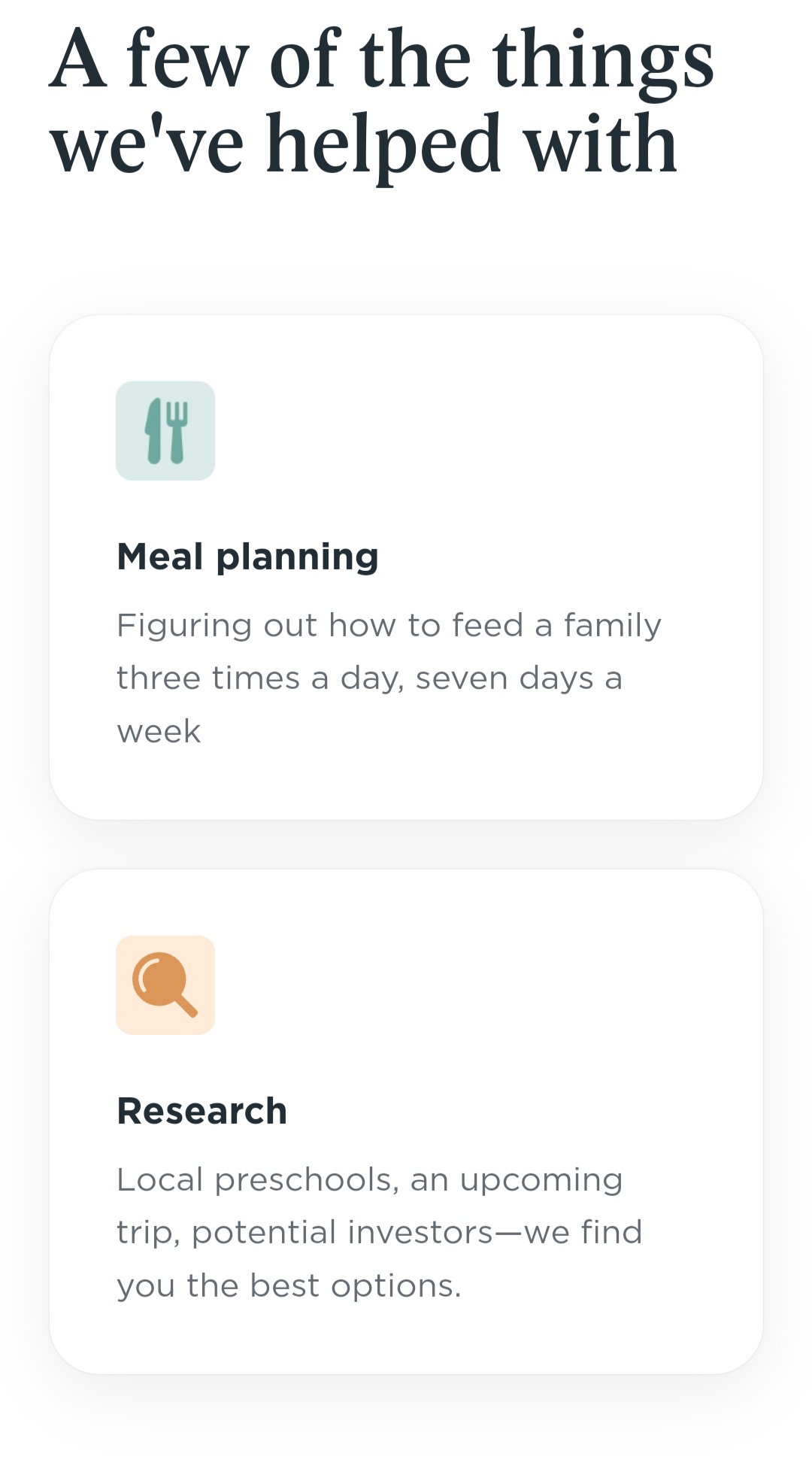 A mobile-friendly website design of a product benefit list
The factual language of the copy paints a good picture of what the company is capable of without boring the user with empty promises and blank statements.
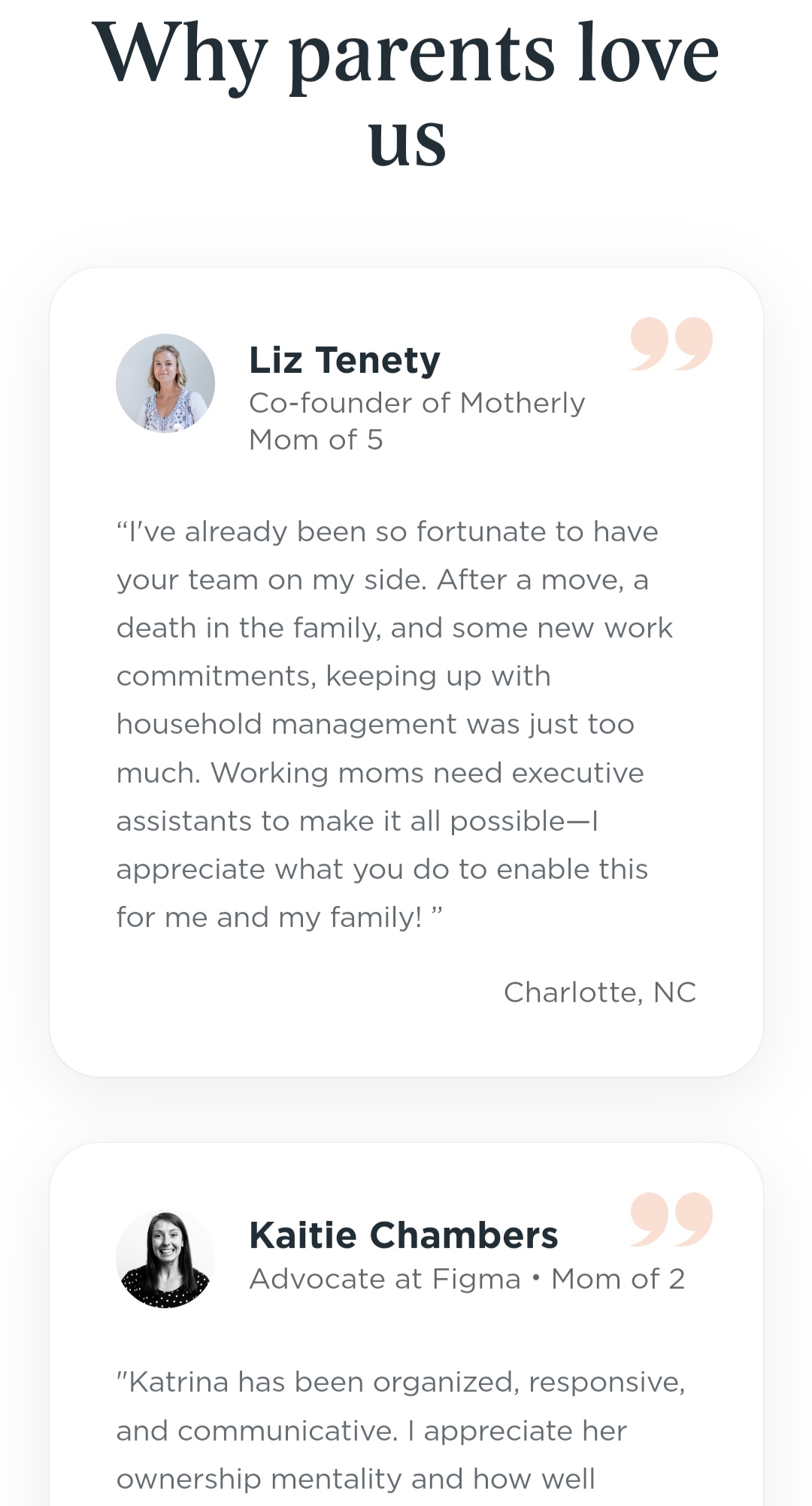 An example of verifiable social proof
The list of benefits is followed by verifiable social proof, which, despite the text volume, remains easy to read even on a small screen.
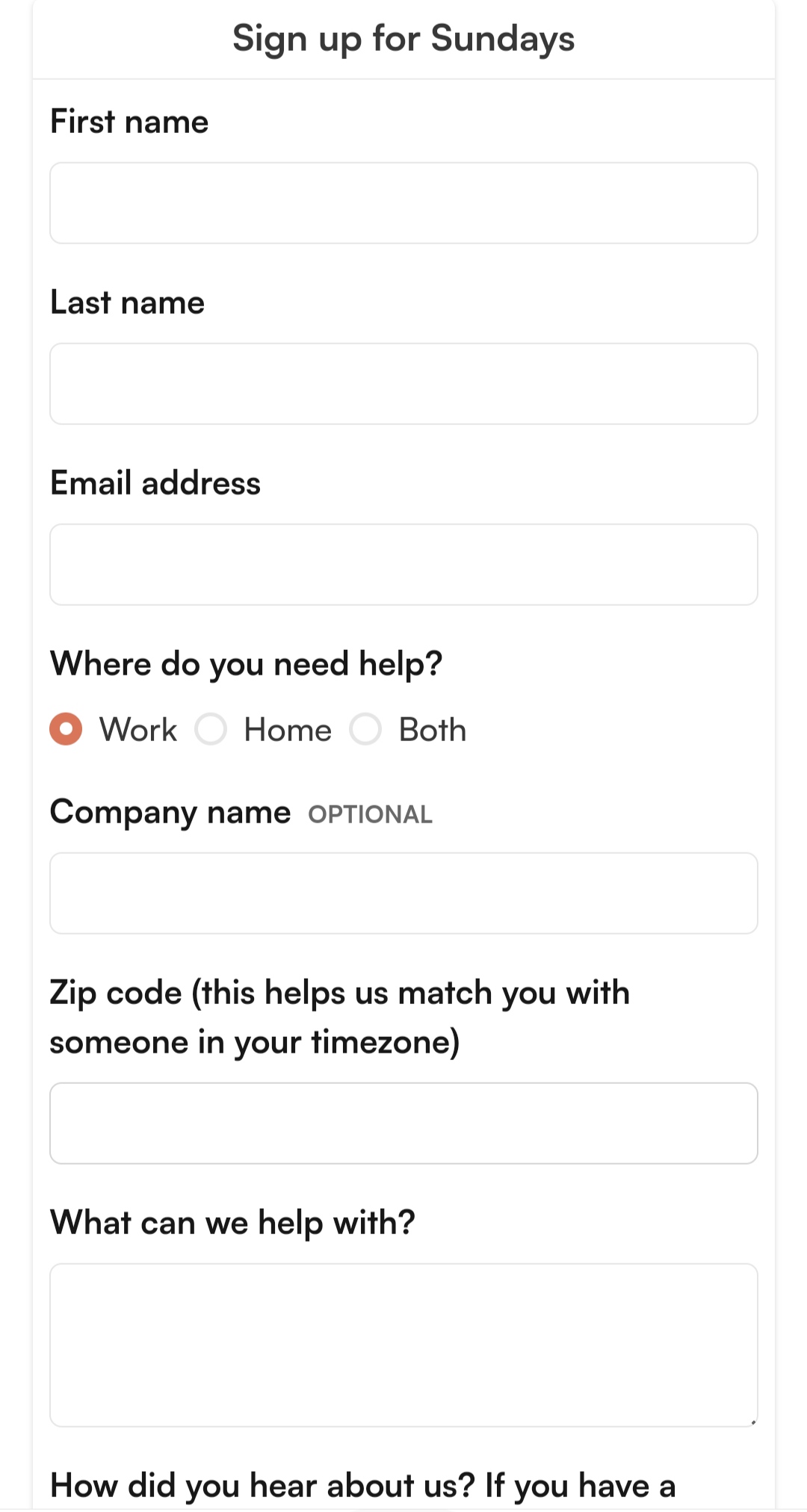 A minimalist mobile-optimized contact form
Since this is a complex offer, the user is inevitably required to fill out a contact form, which is also optimized for mobile. The fields are big enough to tap, and the questions are bolded for better legibility.
Steps to creating a mobile website with SendPulse
Our platform empowers you to create responsive and lightweight landing pages as well as multi-page websites in no time. You don’t need any prior coding knowledge — the visual builder allows you to arrange the structure of your website in a few clicks.
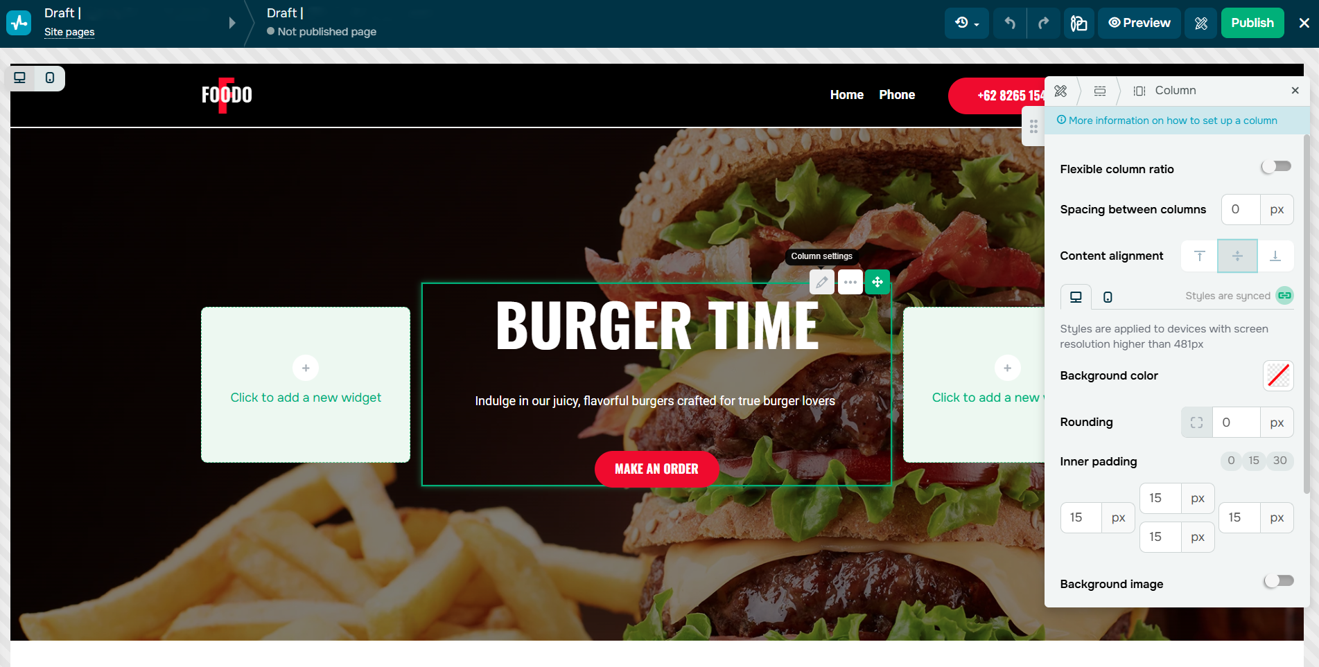 Editing a website in SendPulse
To get started, choose one of our 80+ customizable website templates or create one from scratch. In our builder, you can adjust the appearance of each element, which makes following the mobile-first approach much easier.
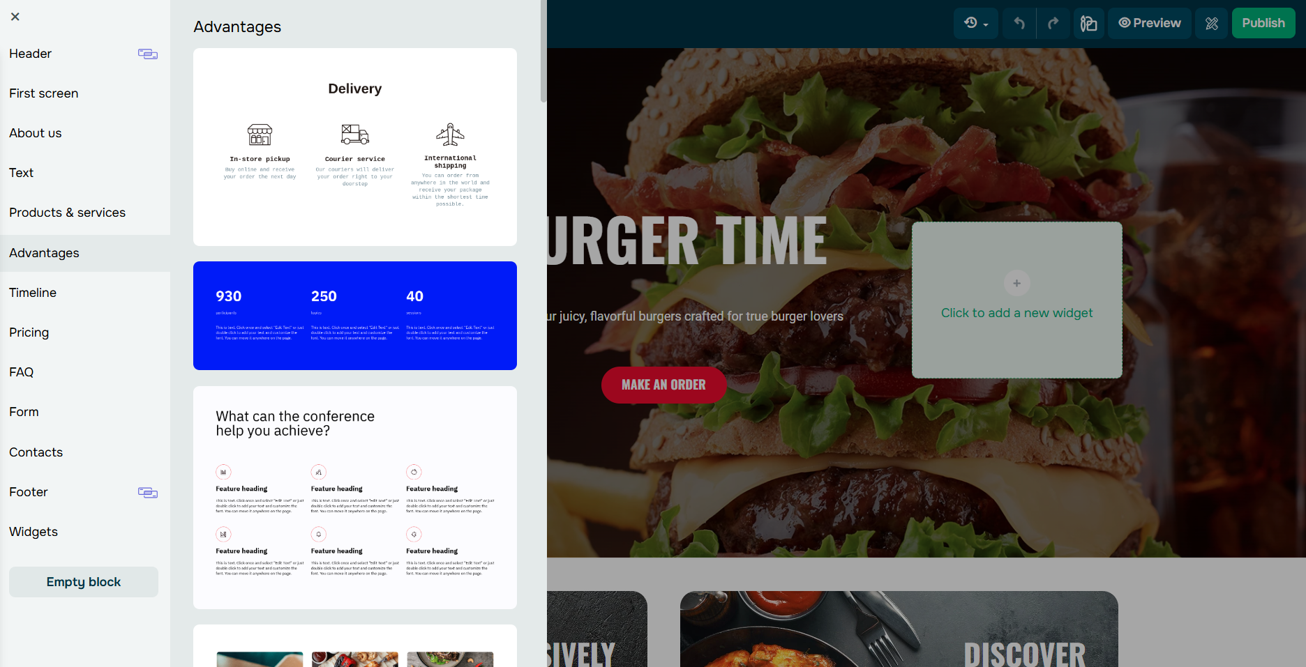 Adding website widgets in SendPulse
To add a new widget, list, contact form, or gallery, click on where you want them to be and drag and drop them from the left sidebar. You can preview your website at any time, including mobile mode, and make necessary changes before it goes live. Each website comes with SEO settings and analytics tools for tracking its performance.
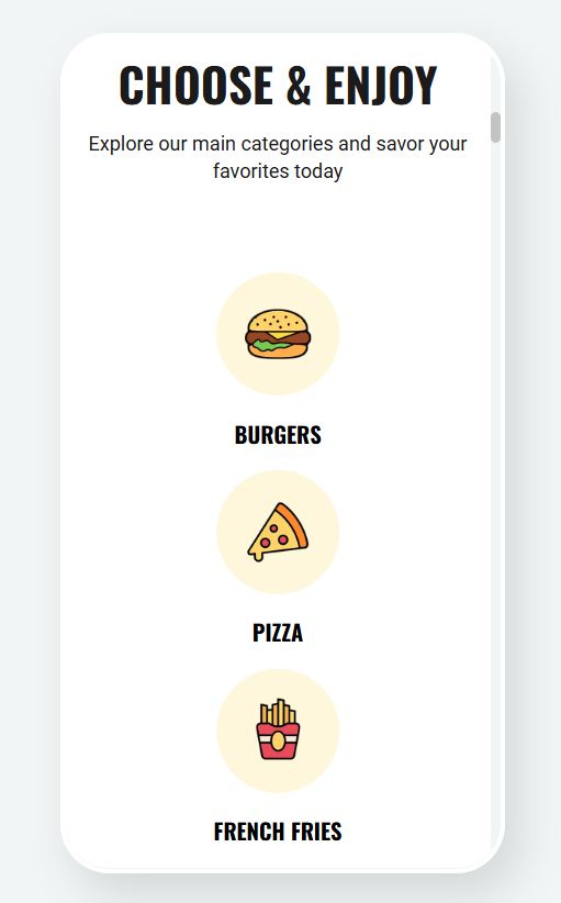 Previewing a mobile website version in SendPulse
There’s a limited free-forever plan. You can unlock premium features like countdown timer or Meta Pixel integration with a paid plan starting at $10 a month, billed monthly.
Start omnichannel communication with your customers
SendPulse is an all-in-one automation platform for sales and marketing. With it, you can not only design sleek mobile-friendly websites but also send personalized email campaigns, push notifications, and SMS campaigns as well as create chatbots, online courses, and pop-ups. It also comes with a built-in CRM for tracking your deals and storing customer data.