How to create a smart pop-up

With our pop-up service, you can create smart pop-ups and show them to visitors based on a certain scenario. Make a personal offer at the right time, help your client choose a product or service, or capture subscribers to interact with them using SendPulse.
You can select a premade template and use it right away or customize it.
Let's talk about how to create a smart pop-up using a template and set up its appearance, elements, and display conditions.
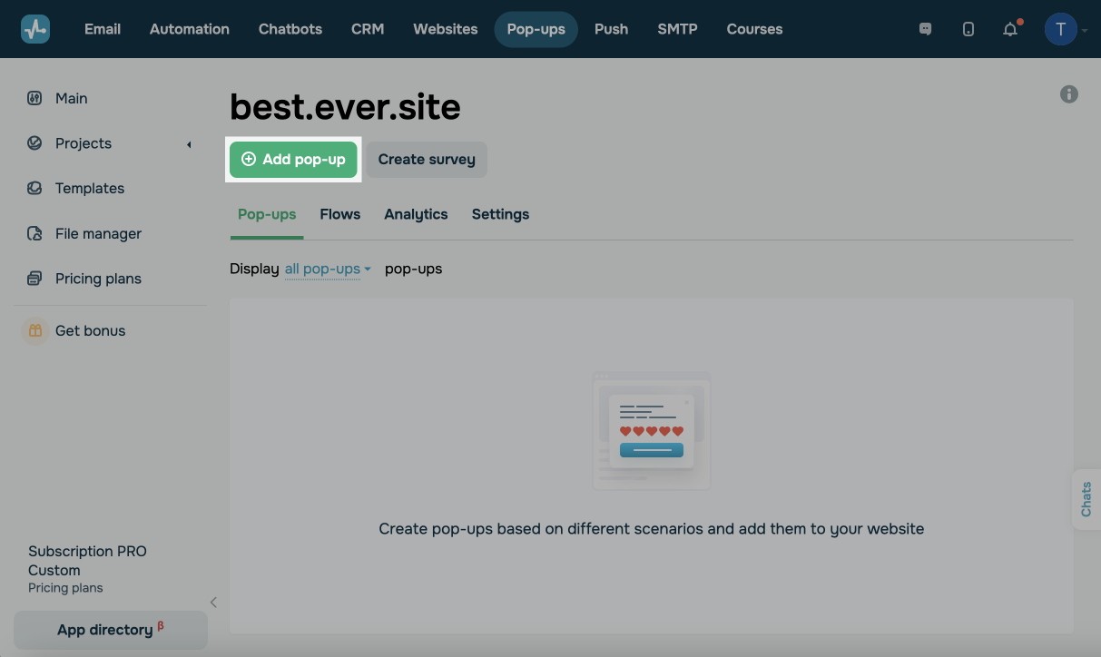
Create a pop-up
You can create a pop-up from scratch or select a premade template and edit it.
Go to your project in the Pop-ups tab, and click Create pop-up.
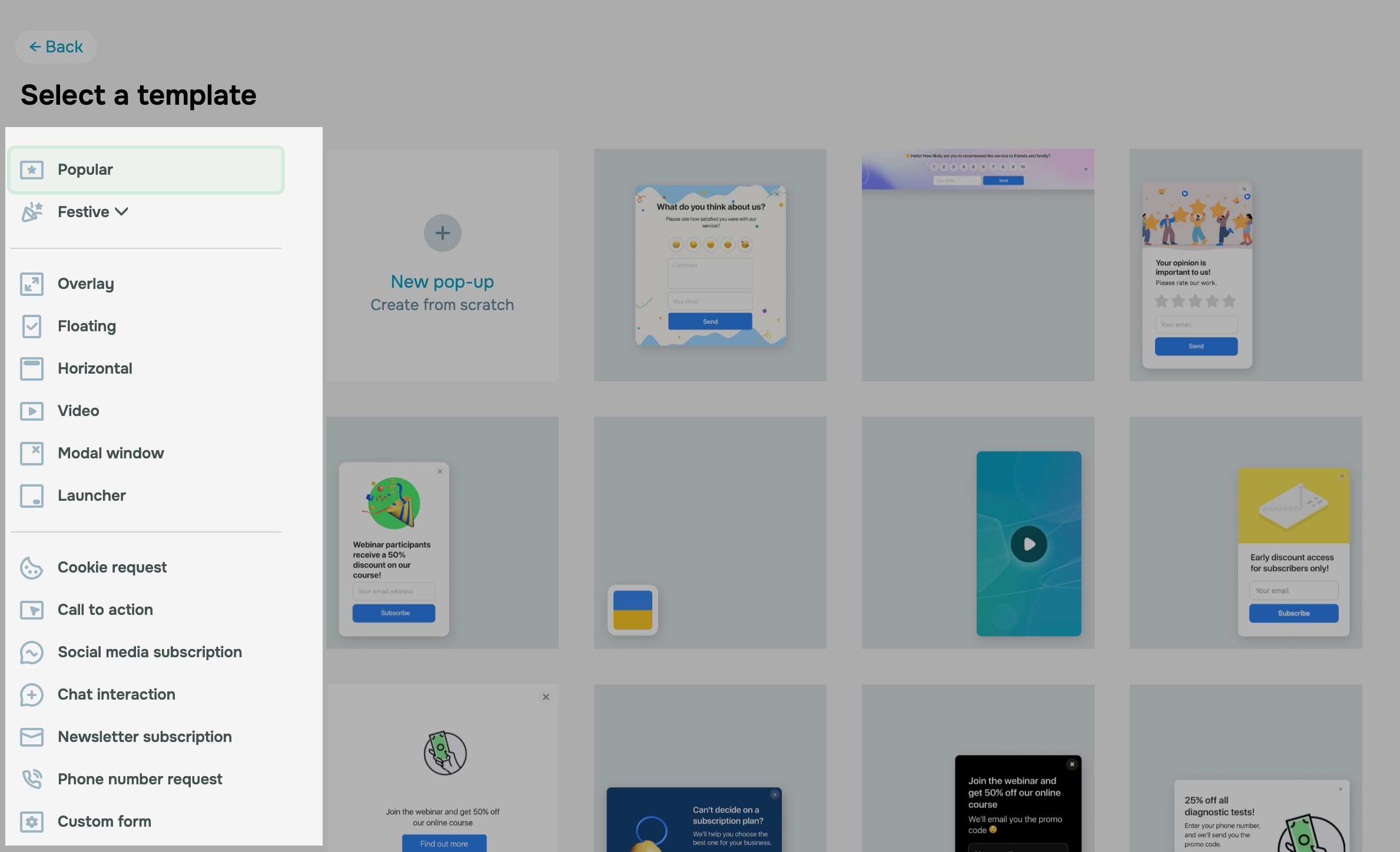
From scratch
To create your own pop-up using ready-made elements, click New pop-up.
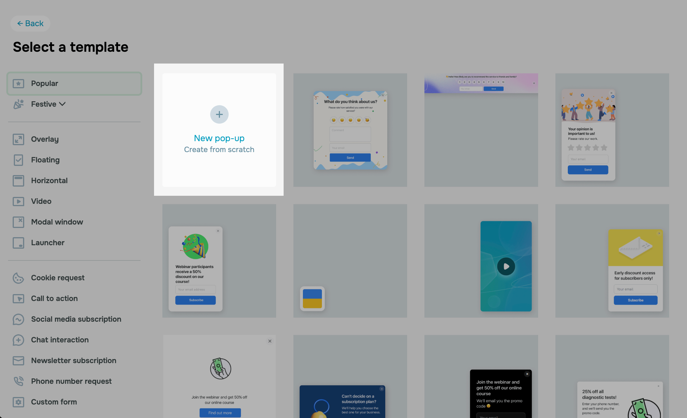
Using a template
A pop-up template is a widget with a predefined appearance and target action settings. You can select a template based on its theme, pop-up type, or elements.
You can select a template with a certain theme or a set of elements only during the first steps of creating a new pop-up. If you don’t select a template but want to create a similar one, check the elements it consists of, and select them in Design > Elements.
You can switch to another pop-up type later in Design > Style.
Select a category on the right and a template on the left.
Set up your pop-up elements
Once you select a template, the pop-up builder will be opened in the Design tab, where you can edit your pop-up and its elements.
If you are creating a pop-up from scratch, click +Add element, and select an element.
You can add elements to pop-ups of the Overlay, Floating, Horizontal, and Modal window types. If you want to customize pop-ups of the Video and Launcher types, read the Additional elements section of this article.
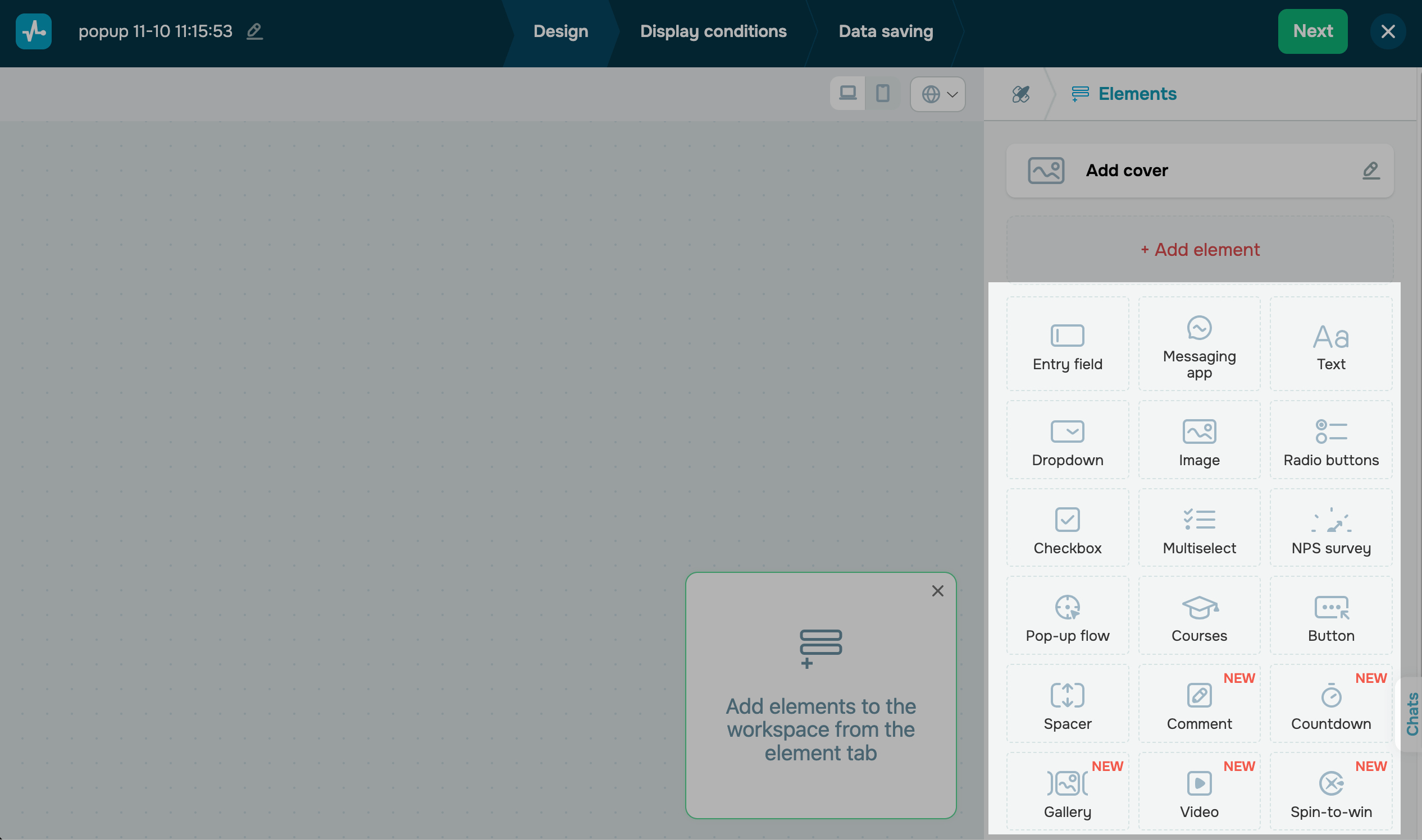
If you are creating a pop-up using a template, you can customize it. To edit an element, click the pencil icon next to it.
You can also start editing an element by clicking it. When you hover over an element or start editing it, it will be highlighted with a green frame.
Read more about each element below.
All elements are optional. You can add, delete, combine, and use them selectively.
However, if you use elements that save user data (Entry field, Dropdown, Radio buttons, Checkbox, Multiselect, and NPS survey), you need to add the Button element.
Cover
This element displays an image within your pop-up design to enhance user experience or draw attention.
If you are creating a pop-up using a template, click Upload image, and select an image from the file manager.
To replace your template image, click the pencil icon next to it.
To upload an image to the file manager, click Upload files. Select or drag it, and click Upload. Then, close the modal window, and select your image.
Select an image placement relative to your pop-up (left, right, top, or fill the entire pop-up).
Unlike the Image element, the Cover element fills your entire pop-up relative to the selected edge.

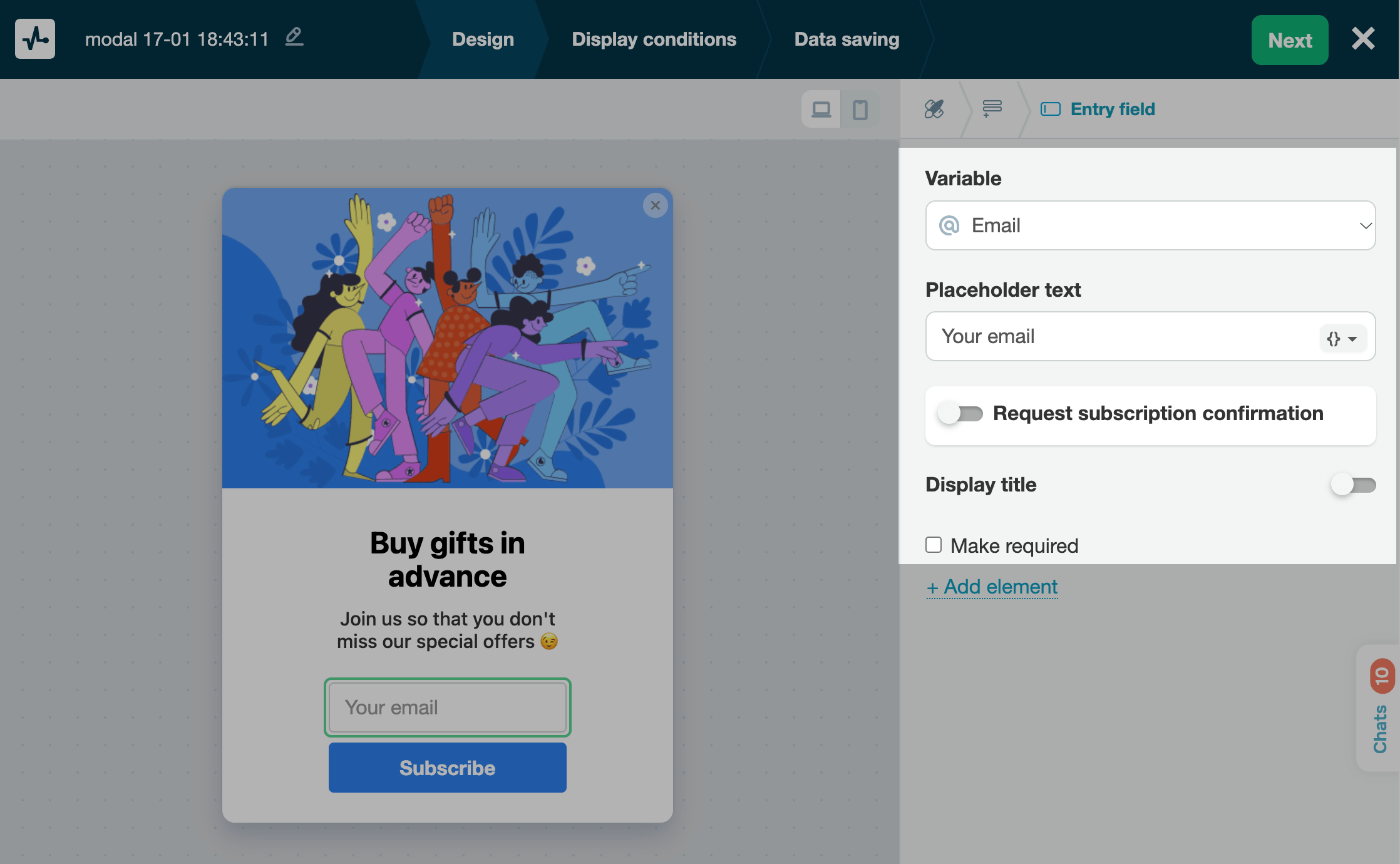
Entry field
This element requests user data you can save to variables, including names, email addresses, phone numbers, birth dates, and more.
In the Variable field, select or create a variable to which you want to save values. You can save values of all data types (String, Number, Phone, or Email).
In the Placeholder text field, enter your text.
You can also automatically prefill pop-up fields, set up double opt-in subscription confirmation, add field names, and make fields required.
Learn more: How to set up a custom pop-up form and How to transfer custom variables.
Messaging app
This element redirects a user to a social media platform of your choice. You can add up to 10 social media icons to one pop-up. If you have a chatbot, you can link it to your pop-up to grow your chatbot audience and launch flows.
Select a social media icon, and type in your button text.
In the next field, add a link to your social media profile. If you have a WhatsApp, Instagram, Facebook Messenger, or Telegram chatbot, you can link it to your pop-up and select a flow that will run when a user interacts with your chatbot.

Text
This element displays text to your website visitors. You can add a message tailored to your pop-up scenario to engage potential clients.
For example, if a visitor has viewed your product page more than three times, your pop-up message can motivate them to make a purchase. Your widget can also help a user calculate shipping costs when they are exploring your shipping options.
Type in and format your text. You can also add links and emoji and personalize your message using variables. Click {}, and select an existing variable.
You can use variables to address website visitors by name, provide unique discounts, give recommendations based on users’ previous orders or views, send abandoned cart notifications, or share other data points from your system.

Dropdown
This element allows users to select an item from the list, for example, a product category.
In the Variable field, select or create a variable to which you want to save values.
In the Text field, add your text, and in the Value field, select the value you want to save to your variable.
You can also mark an option as selected by default.
To add more options, click +Add option.

Button
Once clicked, this element saves user-entered data from the form fields to the Contact section. It can also save user data to the Email section and the CRM system if the corresponding options are configured.
Type in your button text, and select an action (Close modal window or Open URL). If you have selected the second option, in the next field, enter a link.
We recommend that you keep your pop-up size in mind and come up with a clear and concise call-to-action button name.
To change your button color, click the pictogram, select a color using sliders, and click Save. To restore the original pop-up color, go to the Style tab, and select the color.

You can also create buttons group and add up to 6 buttons in the Button element. To do this, go to the Button element settings, and in the Button alignment section, select how to arrange your buttons (horizontally or vertically).
To customize each button in the element individually, click the pencil icon next to it.
Image
This element adds more images to your pop-up. Unlike the Cover element, the Image element does not fill your pop-up.
Click Upload image, and select an image from the file manager.
Select a pop-up size (smaller or larger).
You can also add any link to your image. To do this, turn on the Open URL toggle, and add your link. If a visitor clicks the image, they will follow the link you added.

Radio buttons
This element allows users to select an item from the list using a radio button.
In the Variable field, select or create a variable to which you want to save values.
In the Text field, add your text, and in the Value field, select the value you want to save to your variable.
You can also mark an option as selected by default.
To add more options, click +Add option.

Checkbox
This element allows users to select a checkbox, for example, to consent to personal data processing.
In the Variable field, select or create a variable to which you want to save values. When a user selects your checkbox, its text will be saved to a variable of the String type.
You can also add a checkbox name and make it required to prevent users from submitting your form without selecting the checkbox.

Multiselect
This element allows users to select options using checkboxes. Unlike the Dropdown, Radio buttons, and Checkbox elements, the Multiselect element allows users to select multiple options instead of just one.
In the Variable field, select or create a variable to which you want to save values.
In the Text field, add your text, and in the Value field, select the value you want to save to your variable.
To add more options, click +Add option.

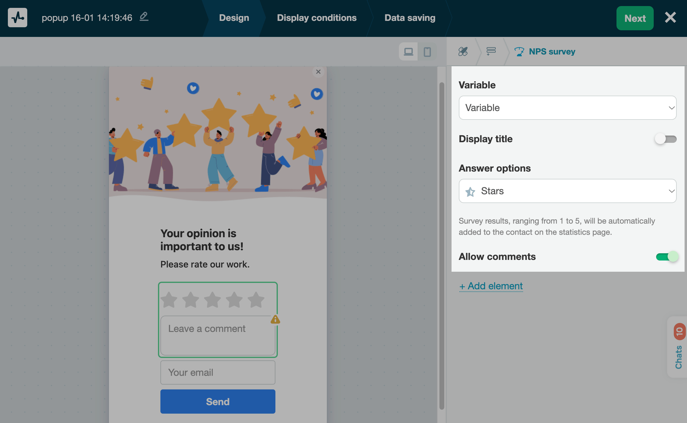
NPS survey
This is an element with a rating scale where users can provide their feedback.
In the Variable field, select or create a variable to which you want to save values. Depending on your selected rating options, values will be saved as numbers or words.
Select how to display your rating options (as stars, emoji, hearts, like/dislike, or numerical values).
You can also add the comment input field and select its size.
Learn more: How to create an NPS form.
Pop-up flow
This element launches another pop-up and is used to create flows.
Select the pop-up you want to launch, and add text to the button that launches it. To add more pop-up launch buttons, add another element.
You can also select your button color.
Learn more: How to create a pop-up flow scenario.

Courses
This element shows a free or paid course registration form.
If your course is paid, turn on the Enroll users in a paid course toggle, and select a course and payment method. You can also add a promo code that students can use when making payments. To do this, turn on the Ask for a promo code, and set up your checkbox.
If your course is free, turn off the Enroll users in a paid course toggle, and select a course.
Regardless of whether your course is paid or free, you can select a pipeline and deal stage to which you want to save paying students’ deals. By default, your pop-up name is used as the deal name.
When a student enters all data, they will be enrolled in your course or redirected to your payment page.
Read more: How to enroll students in a course via a pop-up.

Element management
To go back to the list of elements, click the Elements icon on the upper panel.

To delete an element, in the Elements tab, click the trash can icon next to it.
To rearrange your fields or elements, hover over the icon on the left, and drag and drop it to the required place. You can move all elements except for the Cover element.
Additional elements
You can also create a pop-up of the Video or Launcher type. Select these widget types during the first steps of creating a pop-up or in the Style tab, and customize them in the Elements tab.
Video
This pop-up plays a video in your selected format.
Type in a YouTube video link, and select a placement (horizontal or vertical).
Select a video playback scenario.
| Autoplay | Your video will start playing after any user action on your page. |
| Click-to-play | Once your page is loaded, users will see your video preview. The video will start playing when users click your pop-up.
Mobile device users need to click your video pop-up to play it. |
Select a placement relative to the edge of the screen.
Select a target action.
| Without action | Your pop-up will display only the video. |
| Call to action | Aside from the video, your pop-up will also have a call-to-action button. Enter your button text, and select an action (close the pop-up or open the URL). If you have selected the second option, add a URL. |

Launcher
This is a small static icon pinned to the selected corner of the page. When users click it, a certain action is triggered, for example, another pop-up opening or user redirection to the specified site page.
Select a target action (open a pop-up or open a link).
To customize your pop-up style, you can select a background color, set the rounding, add an outline, change the icon color, and select its type.
You can select an icon when choosing a pop-up template or upload your own. To upload your own, click the pencil icon, and select an image from the file manager.
Learn more: How to create a launcher pop-up.

Customize your pop-up
To customize your pop-up, click the first tab icon (Style). In this tab, you can set your pop-up type and style and add entrance and exit animation.

Type
You can select the following pop-up types based on your widget's appearance:
| Pop-up type | Description | Style settings |
| Floating | A floating window placed on the left or right of the browser window when a user scrolls the page. Users do not need to close it to interact with your site page content. | You can customize these elements in the Style tab. Read more in the Style section. |
| Modal window | A block located in the center of the page. All the other site page content is darkened and not clickable. Users need to close the modal window to interact with your site page content. | |
| Overlay | A block that covers the entire site page. Users need to close the pop-up window to interact with your site page content. | |
| Horizontal | A horizontal window that can be placed at the top or bottom of the page. Users do not need to close it to interact with your site page content. | |
| Video | A window that plays YouTube videos.
Learn more: Video. |
You can customize these elements in the Elements tab. |
| Launcher | A small static icon pinned to the selected corner of the page. When users click it, a certain action is triggered (opening another pop-up or opening a link).
Learn more: Launcher. |
Style
You can customize your pop-up using the following settings:
Styles are applied to all elements at once, but you can also customize your elements individually in their settings.
| Position | Adjusts pop-up position relative to the edge of the screen.
Applicable to the Standard and Horizontal types. Other types will be positioned in the middle of the screen. |
| Width | Adjusts pop-up width. You can use the slider or enter a value in pixels. |
| Inner padding | Adjusts pop-up elements’ inner padding. You can use the slider or enter a value in pixels. |
| Style | Adjusts pop-up elements’ colors.
Select a color scheme — light, dark, or custom. You can apply it to checkboxes, NPS form icons, and all types of pop-up buttons. Select a color. You can apply it to checkboxes, NPS form icons, and all types of pop-up buttons. |
| Background image |
Sets an image as a pop-up background. The image will be applied to the entire pop-up and will not affect any added elements, such as Image or Cover. Click Upload image, and select a picture from the file manager. |
| Field size | Adjusts the size of all pop-up elements. Available options: small (S), medium (M), and large (L). |

Animation
You can also add entrance and exit animation.
| Entrance animation | Pop-up appears with the selected effect when display conditions are met. |
| Exit animation | Pop-up closes with the selected effect when a user clicks the button or the cross icon to close it.
Elements with form submission buttons: Messaging app, Button, Pop-up flow, and EDU. |
Under your animation type, select a side from which it will appear.
You can select the following animation effects: back, bouncing, fading, rotating, light speed, flipping, zoom, and sliding.
To see what an effect looks like, select it. To replay an effect, click the arrow icon.
Preview your pop-up
As you edit your pop-up, you can instantly preview how it will look on your website in real time. To view its mobile version, click the corresponding icon on the right.
Once you finish customizing your pop-up design, click Next.
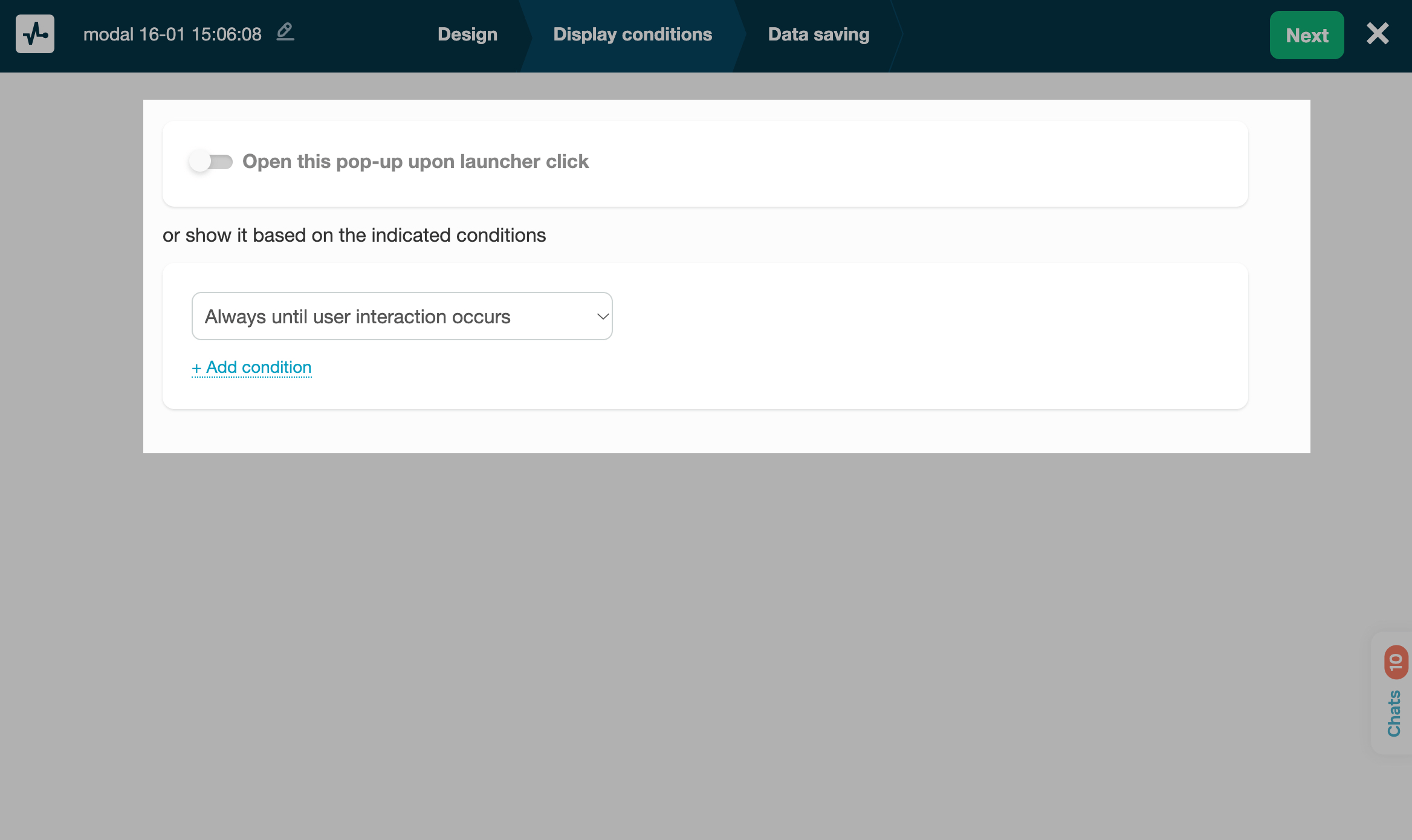
Set up pop-up display conditions
In the Display conditions tab, you can set your widget to appear when a user clicks the launcher or once visitor behavior tracking conditions are met.
To display a pop-up upon clicking the launcher, turn on the toggle, and select an existing pop-up of the Launcher type.
To display a pop-up based on a visitor behavior tracking condition, select the event you want to track and the condition operator, and enter the tracked value. You can also select multiple conditions and link them to operators.
For example, you can display your widget only when users perform a certain action, like scrolling to a certain part of the page or spending more than 40 seconds on your website.
Learn more: How to set up a pop-up display scenario and How to create a launcher pop-up.
Once you configure your pop-up display conditions, click Next.
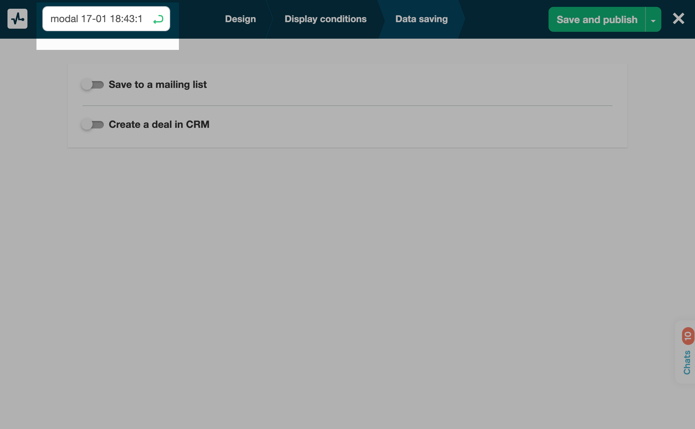
Configure data saving options
In the Data saving tab, you can select where to save subscriber data.
Turn on a toggle*, and select an option.
| Save to a mailing list | Saves data to your selected mailing list in the Email section. A variable name will be retrieved from a placeholder or element, and a value will be retrieved from a filled field or a pop-up element a user selected.
Select a mailing list where you want to save contacts. |
| Create a deal in CRM | Saves data as a deal and contact to your CRM system. You can select a pipeline, enter a deal name, and select a deal stage.
When contact data points are saved to your CRM system, new contact fields will be created. |
| Send an email notification about new subscribers | Sends email notifications about each new subscriber. Enter an email address to which you want to send notifications. |
*You can only save values from pop-ups that collect user data. If you do not have the Entry field, Dropdown, Multiselect, Radio button, Checkbox, NPS survey, and EDU elements, then the toggles will be inactive.

Name your pop-up
By default, your project name is generated using the date and time when it was created. To rename your project, click the corresponding icon, enter your text, and press Enter.
Publish your pop-up
Once you set up all the necessary conditions, click Save and publish or Save and close.
To make sure that all the changes are displayed in your browser, clear your browser cache and cookies after saving your pop-up.
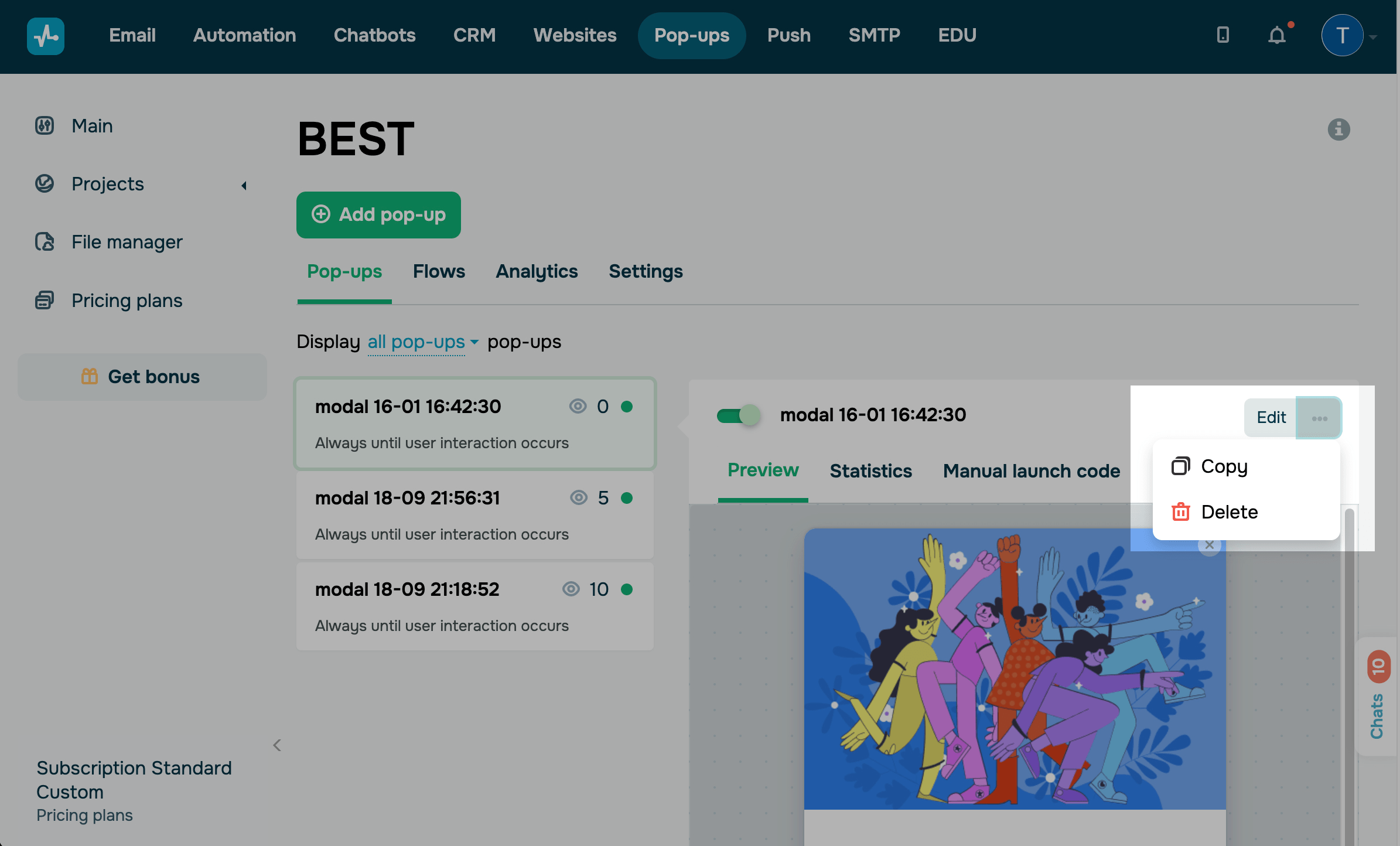
All of your pop-ups are displayed in the Pop-ups section as separate tabs. Once you create your pop-up, you will be able to view it, track its statistics, and edit it. However, you will not be able to change its pop-up type.
Last Updated: 22.04.2024
or