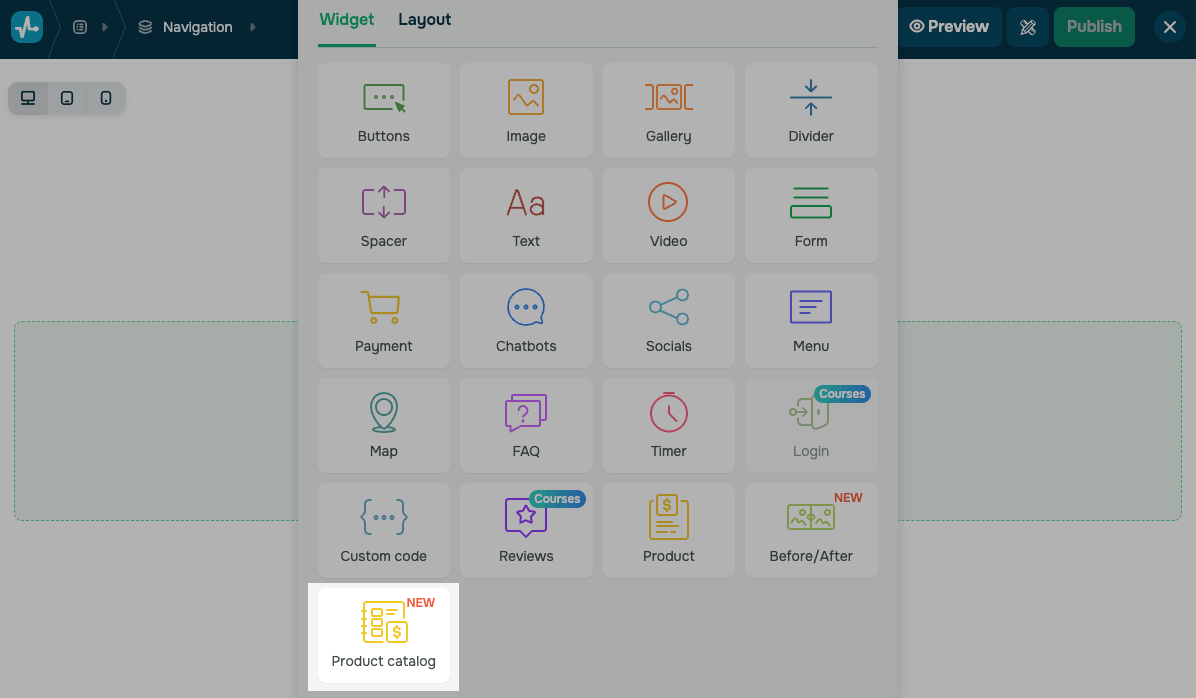
The Product catalog widget in the website builder
With SendPulse’s website builder, you can add a Product catalog widget that pulls products straight from your CRM catalog and shows them on a website page.
For example, you can turn a landing page into a storefront or a product showcase without setting up a full online store.
Let’s talk about how to add the Product catalog widget and customize the product catalog.
Add the widget
Before adding the widget, connect an online store to your website. It shows products and categories from your CRM catalog. You can add or manage them manually or through the API.
Place the Product catalog widget on your website.
This widget takes up the full section width, so you can't place other columns next to it.
Choose products to display
Choose the product categories to show in your widget. In the Products drop-down list, select All categories to show the whole catalog, or choose a single category.
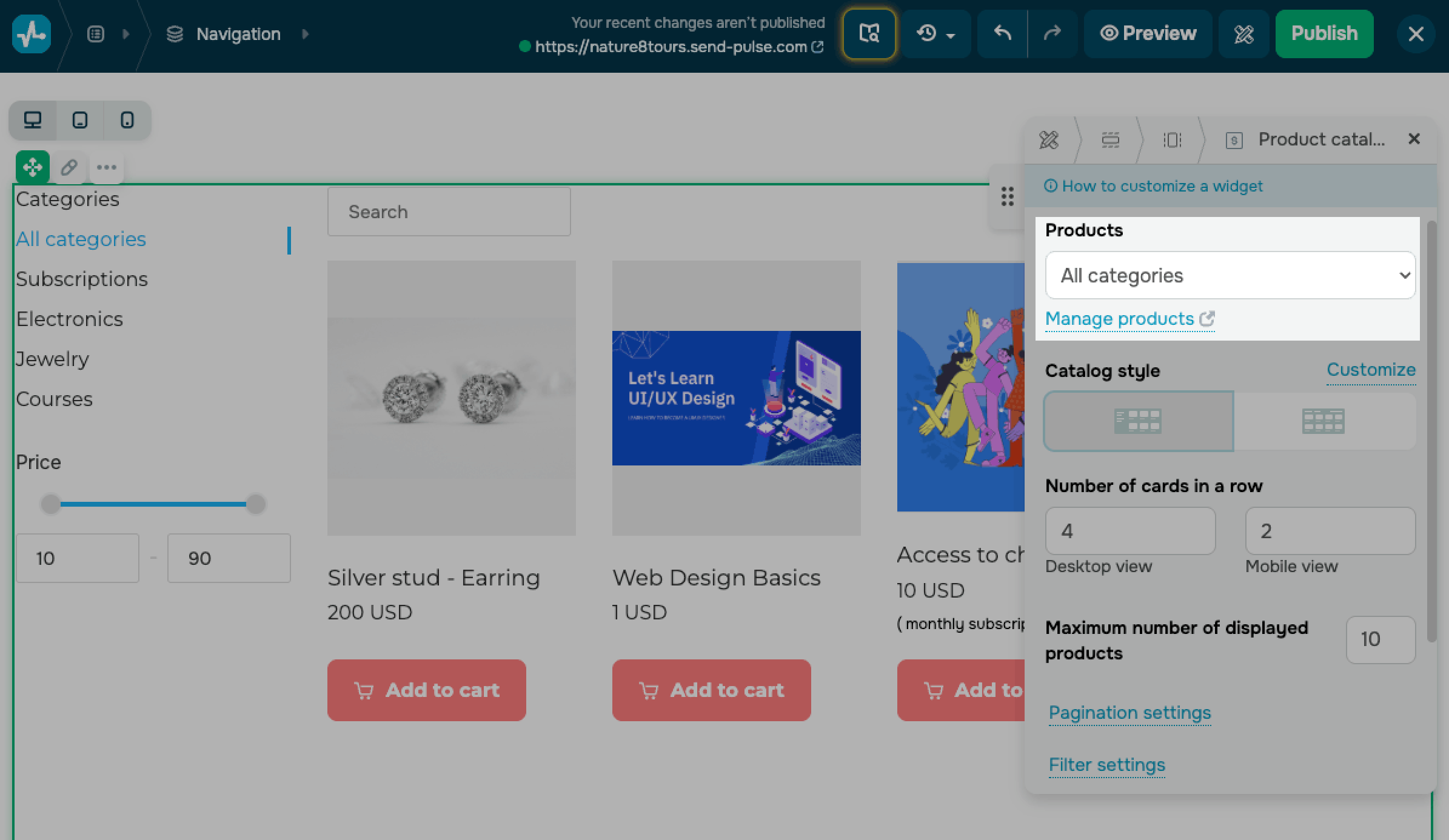
To add or edit the products and categories in this list, click Manage products. The link opens your CRM product catalog.
The category menu reflects the structure of your CRM catalog, including nested categories. If a category has no active products, or no products match the current search or price filter, the catalog shows an empty-state placeholder instead of cards.
Customize the catalog style
Decide where the category and price filter menu sits relative to the product cards. Under Catalog style, select a layout:
| Side layout | Places the menu in a sidebar next to the cards. |
| Top layout | Places the menu in a bar above the cards. |
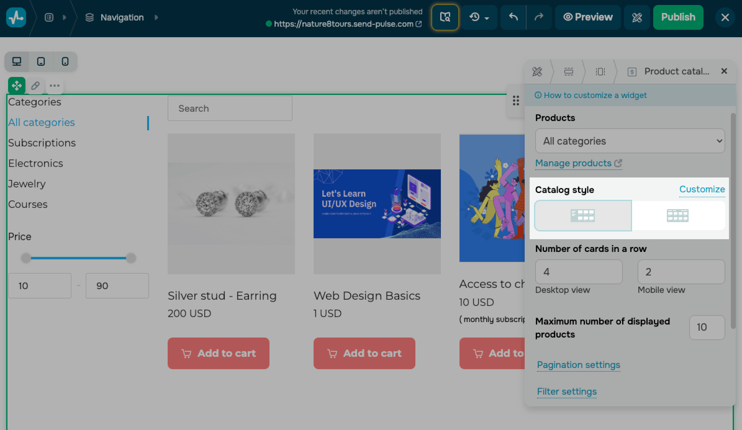
To style the product cards, in Catalog style, click Customize.
In the General section, set Card spacing — a distance between cards in pixels.
In the Card section, set the card's background color, inner padding, contour, and rounding.
In the Gallery section, decide how product images should appear:
| Image scaling | Choose how an image fits its frame: Cover or Contain. |
| Aspect ratio | Choose an aspect ratio, such as 1:1, 16:9, or 4:3. |
| Background color | Set a fill color shown behind the image. |
| Rounding | Set an image rounding value in pixels. |
| Indent | Set a space around the image in pixels. |
In the Typography section, set a font size, format, and color for each text element:
| Product name | Set a product name font. |
| Product description | Set a short description font. |
| Price | Turn the price on or off and set its font. |
| Old price | Turn the old price, which appears next to the current price, on or off and set its font. |
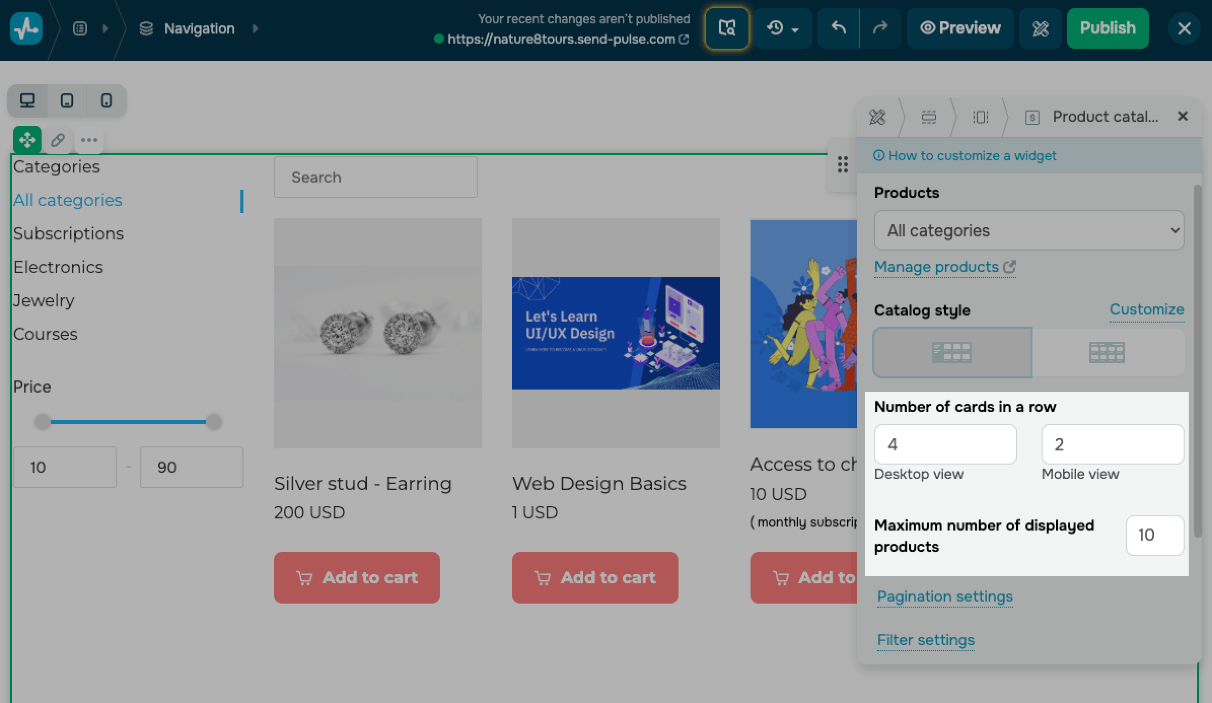
Set a number of products
Control how many products the catalog shows and how many appear in each row.
In the Number of cards in a row section, set the number of cards per row for Desktop view and Mobile view.
The maximum card number per row depends on the layout. In the Desktop view, you can show up to 4 cards with the Side layout and up to 5 cards with the Top layout. In the Mobile view, you can show up to 2 cards per row.
In the Maximum number of displayed products section, set how many products the catalog loads at once. You can choose from 6 to 24.
When the catalog has more products than the selected number, visitors move through them with pagination.
Set up pagination
Pagination splits your catalog into pages when it holds more products than the maximum you set.
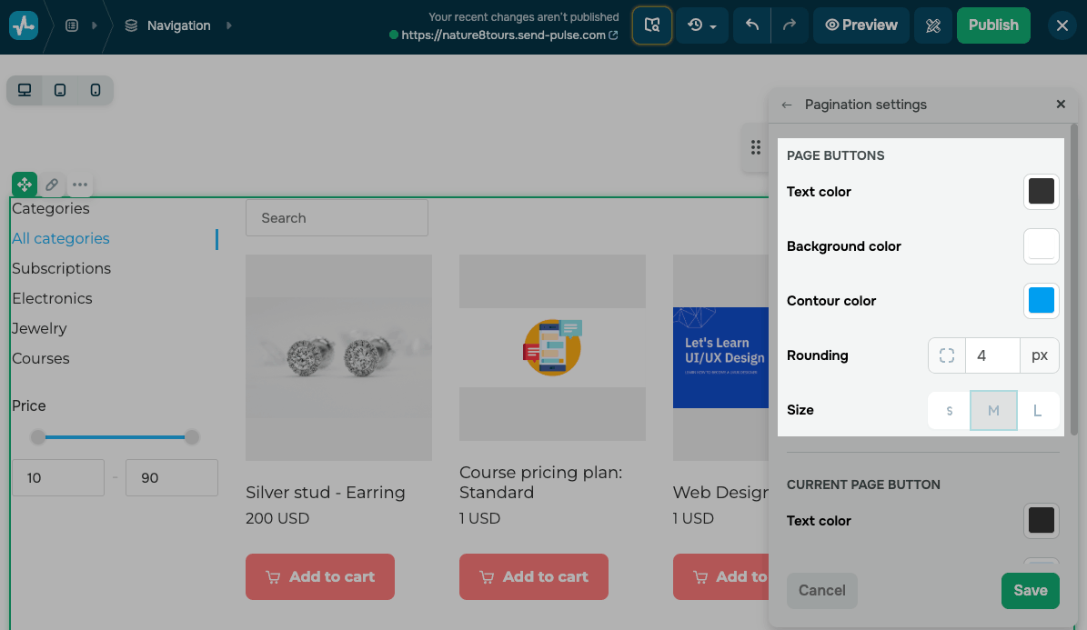
To style it, click Pagination settings. The options are grouped into three sets.
In the Page buttons section, style the page buttons:
| Text color | Set a button text color. |
| Background color | Set a button fill color. |
| Contour color | Set a button contour color. |
| Rounding | Set a rounding value in pixels. |
| Size | Choose a button size: S, M, or L. |
To help visitors see which page they are on, in the Current page button section, style the current page button:
| Text color | Set a button text color. |
| Background color | Set a button background color. |
| Contour color | Set a button contour color. |
To add a button that loads the next page, turn on the Next page button toggle. Enter its Text, then choose its Style and size. Optionally, you can turn on the Add icon toggle to show an icon and use Additional effect to add a hover effect.
Style the filter panel
The filter panel includes a category menu and a price filter. Visitors can browse products by category and filter them by price using the From and To fields or the price slider. The fields support whole numbers only.
To style the panel, click Filter settings. The available options reuse the standard color, contour, and font settings and are grouped into three sections.
In the General section, set the panel's background color, rounding, contour, and inner padding.
In the Categories section, style the category menu:
| Title | Edit the heading text and set its font. |
| List of categories | Set a category name font. |
| Featured category |
Set the style and color of the category a visitor is browsing. This category is highlighted in the menu. |
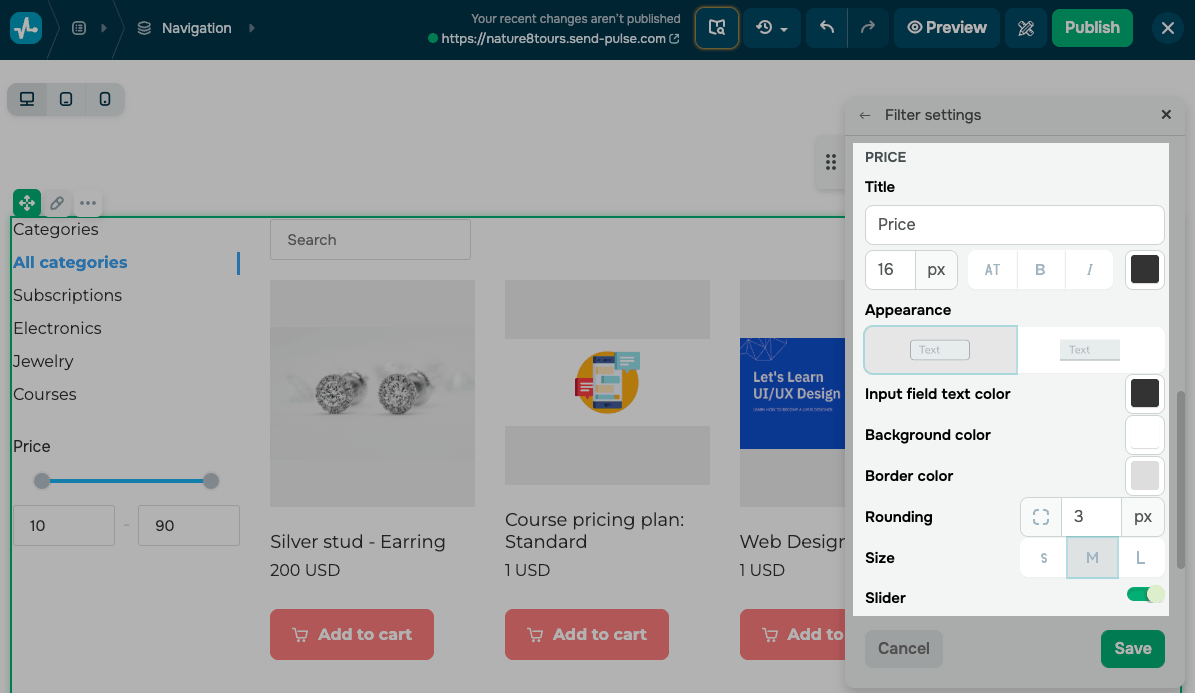
In the Price section, style the price filter:
| Title | Edit the heading text and set its font. |
| Appearance | Choose a filled or outlined field. |
| Input field text color | Set a color for input fields. |
| Background color | Set a background color for input fields. |
| Border color | Set a border color for input fields. |
| Rounding | Set a rounding value in pixels. |
| Size | Choose a field size: S, M, or L. |
| Slider | Enable the slider, then set the Line color, Filled line color, and Button color. The slider is available only with the Side layout. |
Set up sorting and search
Search and sorting help visitors find products and browse the catalog more efficiently. To set this up, click Sorting settings.
Set up product search
The search field helps visitors find products by name.
Turn on Search toggle and enter the Placeholder text for the search field.
When enabled, the search field appears above the product cards and filters the catalog as visitors type.
Search supports product names only.
Set up product sorting
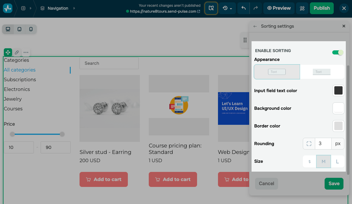
The sorting menu lets visitors browse the catalog by date added, price, or name in ascending or descending order.
Turn on the Enable sorting toggle, then style the sorting field:
| Appearance | Choose a filled or outlined field. |
| Input field text color | Set a color for input fields. |
| Background color | Set a background color for input fields. |
| Border color | Set a border color for input fields. |
| Rounding | Set a rounding value in pixels. |
| Size | Choose a field size: S, M, or L. |
Set up the Add to cart button
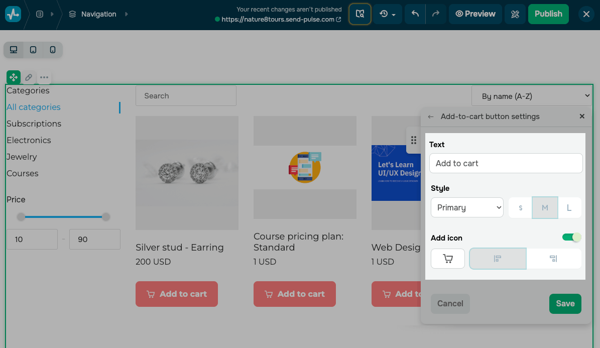
The Add-to-cart button helps visitors add a product to the cart directly from its card.
To show or hide this button, use the checkbox next to its name in the widget panel.
To edit the button, select the checkbox and click the pencil icon. Enter the button Text and choose its Style and size.
To show an icon on the button, turn on the Add icon toggle. Choose an icon, such as a cart or an app icon, and set its position.
Visitors can click a card to open the product page. When you enable the Add to cart button, they can also click it to add a product to their cart.
The Product catalog widget uses the same general settings as other website elements.
Last Updated: 03.07.2026
or