Growing a sustainable presence on social media these days feels more like walking a tightrope. One low-performing reel, poorly chosen soundtrack, or algorithm tweak, and your reach drops overnight. A new trendy aesthetic can suddenly make your entire feed feel outdated. Even the top-performing creators are constantly forced to adapt, bend, and conform their content just to stay visible out there.
That’s why having your own website isn’t just a nice-to-have — it’s a must. It’s the one online space you truly control, a safe haven free from the unpredictable whims of platforms and their ever-changing rules. Whether you’re building a brand, showcasing your work, or offering something valuable, your website will remain your reliable digital anchor.
Let’s talk about how to create an effective personal website without investing a small fortune in it. Spoiler alert: you won’t need to code anything, unless you really want to. We’ll also show you ten head-turning personal website examples and break them down, explaining what makes them work.
What is a personal website?
A personal website is a standalone, self-owned online space where you can present your identity, work, expertise, and values. It functions as a digital home base and remains fully under your control.
A personal website is an all-in-one hub where you can:
- Introduce who you are and what you do.
- Showcase your work, achievements, or portfolio.
- Share insights through blog posts, videos, or other media.
- Offer services, products, or ways to get in touch.
- Build a mailing list or lead funnel for long-term engagement.
It helps to think of a personal resource as your brand headquarters, credibility engine, and long-term content archive. The latter one is especially important as the biggest social media apps and streaming platforms are known to remove content overnight without a proper warning, and when decisions are made by opaque AI-driven moderation systems, it’s often difficult, if not downright impossible, to appeal or get a clear reason.
One of the biggest freedoms of owning a personal website is the ability to shape it exactly how you want. You can keep it short and sweet — a clean, focused landing page with your essentials — or build out a rich, multi-page resource with blogs, portfolios, case studies, and more. Most modern website builders allow for customization, which means that you’re not limited by rigid templates, character counts, or themes.
Social media platforms are like rental properties. Surely, you can decorate the space and invite people over, but you don’t own it — the landlord (the platform) has the final say and can change their mind at any moment. In short, it’s convenient, but fragile.
When you have a personal website, you control everything — the design, the content, the experience, and the rules. As long as your content is legal, no one can shadowban it or change how it functions without your consent. Just like owning a home, it may take more effort up front, but it’s a long-term investment that grows in value, builds trust, and offers stability.
Who are personal websites for?
A personal website is more than an advanced version of a business card. It’s your own online kingdom where you get to express yourself freely, both visually and verbally.
Freelancers, speakers, artists, coaches, content creators, and other experts use personal websites to introduce themselves to the world — and to make their knowledge, products, services, and achievements visible to a large audience, who can also become their clientele.
Personal websites often have direct or indirect commercial use and fall into one or several of the following categories:
The degree of personality you can inject into your website varies. If you want to push your personal brand, you may want to make a strong emphasis on your own career journey or personal growth and describe it in detail. It’ll help your website visitors get to know you better and relate to your path.
On the other hand, a portfolio website usually calls for a more objective, if not abstract, approach. If you want your creative work to be the start of the show, you can easily turn your site into an experiential gallery where formal descriptions come secondary.
Why should you create your personal website?
First things first, let’s establish the benefits of having a personal website.
- It’s an independent resource. Social media accounts are borrowed space. Your website isn’t at the mercy of ephemeral social media trends and algorithms. This allows you to fill it with any type of content as long as it’s SEO- and AEO-friendly.
- It’s a way to control your narrative. Social media encourages quick takes, clickbait strategies, and condensed content pieces. A personal website gives you the space to craft and unfold your story on your terms, without worrying about recommended video length or fleeting trends.
- It implies full control and ownership. You decide where to host your website, which framework to use, and when to update or rebuild it. There’s no algorithm deciding how many internet users are “allowed” to see your content or whether it stays online.
- It helps you build your mailing list. A personal website can easily be transformed from a passive resource into a dynamic connection enabler. By adding a lead capture form to your website, you can grow your audience and nurture it in an automated way.
- It keeps everything in one place. Share different projects, ideas, products, events, blog posts, and merchandise — all under one cohesive brand and URL. This unified hub makes it easier for people to explore who you are and what you offer without bouncing between fragmented platforms.
- It can be turned into a source of passive income. Instead of sending potential clients across multiple apps or links, you can streamline everything. Build trust through testimonials and add a payment form to your website to sell consultations, sessions, audits, and other services or products.
Owning a personal website is as permanent as it gets in terms of digital presence. It can serve as a unified, centralized hub where all your work, links, and content live together, neatly organized and easily accessible.
Essential components of a personal website
The following elements are crucial for creating a strong first impression, regardless of whether you have a single-page website or a multi-page resource. Our simple personal website examples will demonstrate how much impact these seemingly small components can deliver.
Component #1. Clear value statement
Think of it as the ultimate summary of your personal brand and your mission. This short, punchy statement should ideally be placed above the fold in order to hook the new visitors right away.
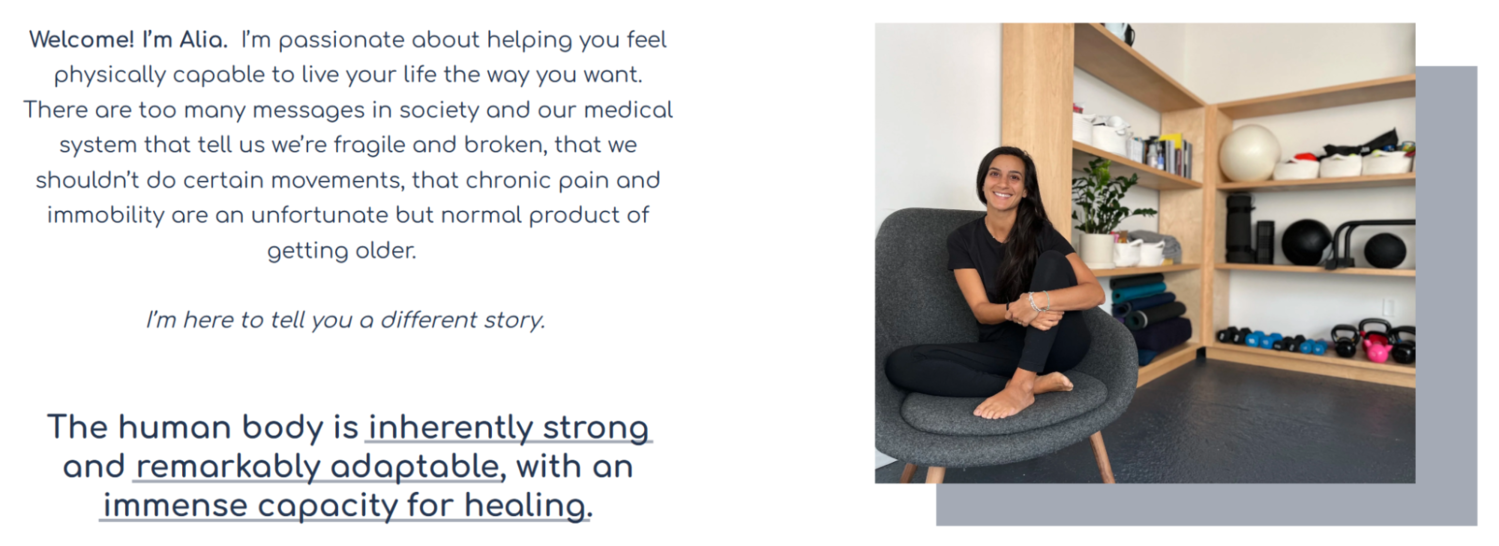 A value statement from a movement coach’s website; source: Alia Bisat
From it alone, it should be clear what you do and why they should care, helping them decide to stay and explore further. It’s also important to address customers’ pain points early on — the visitors will see that you’re not just talking about yourself but are dedicated to solving their problem.
Component #2. Memorable bio
Once your visitors have developed some interest in your persona, it’s time to solidify that first impression by building connection and trust. Add a personal touch and context by describing your background, profession, and what makes you a unique expert in your niche.
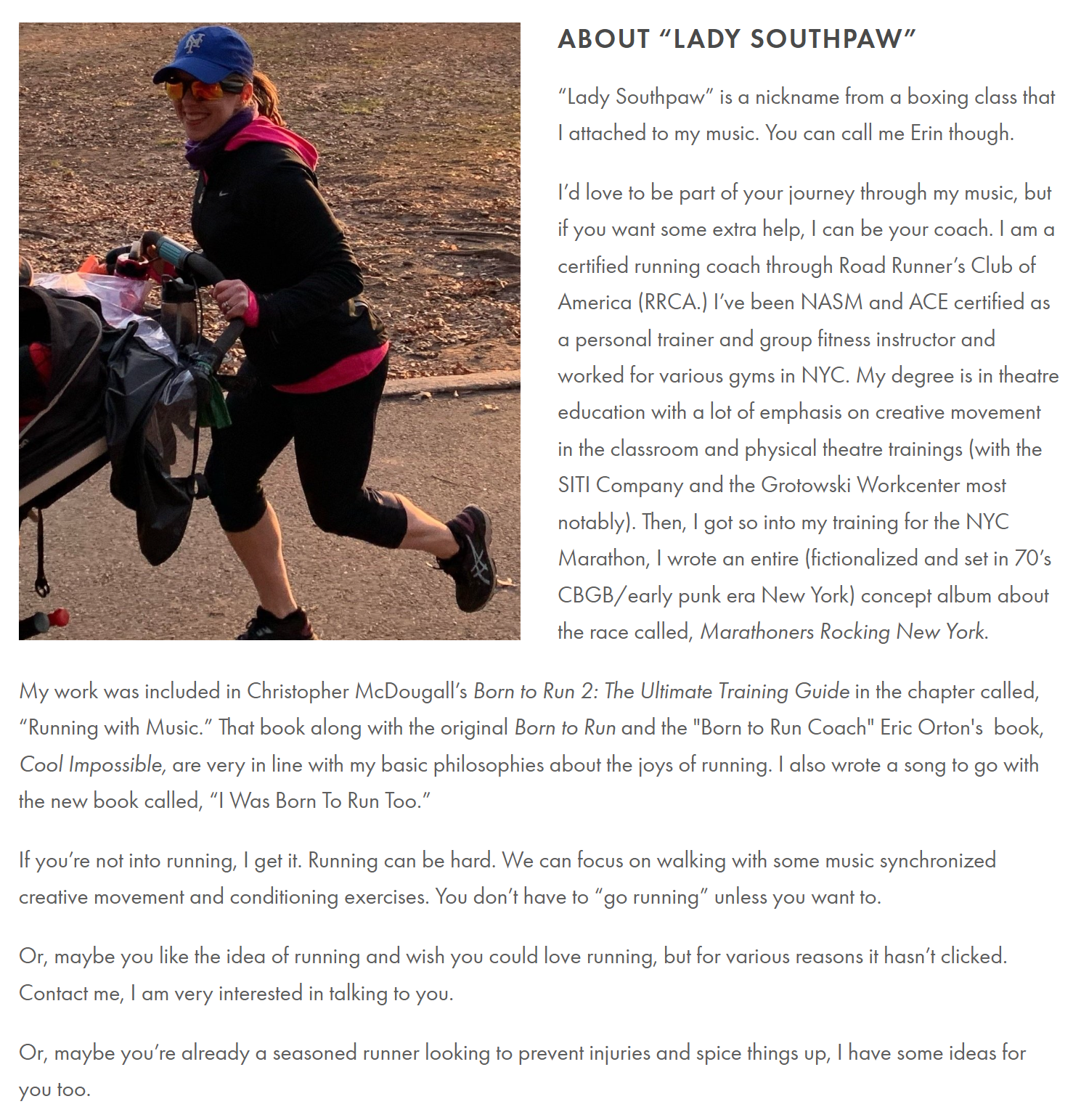 An example of a charismatic yet professional bio; source: Lady Southpaw
Make sure to balance charisma and professionalism in your bio — the goal here is to come across as both relatable and credible. Your bio should reflect the energy and values people can expect when working with you.
Component #3. Hero image
An “About Me” website can hardly be perceived as such without a strong visual capturing your personality and charisma. Adding a personal photo, no matter how intimidating it might feel at first, will make your site more human and inviting.
It will also prevent confusion by clearly showing visitors who the site belongs to, especially if your name is common or your brand spans multiple platforms. The only case when the hero image should depict inanimate objects is when the look and feel of your work is far more important than your own persona.
In these instances, leading with a bold visual piece can be more effective than a traditional headshot. However, it’s still important to weave in personal elements elsewhere on the page.
Component #4. Featured work
A preview of a few accomplished projects, clients, or achievements gives visitors a quick taste of your credibility or skills right away, without requiring them to dig through subpages.
Depending on your niche, you have a few options:
- portfolio gallery;
- case studies;
- project write-ups;
- in-depth articles;
- embedded videos;
- downloadable content;
- interactive prototypes.
Make sure your work is presented in a format that aligns with how your audience consumes content and makes decisions.
Component #5. Call to action
This personal website element is essential for turning passive visitors into engaged contacts. Without it, your personal website remains nothing more than a pretty picture — nice to look at, but unattainable and therefore forgettable.
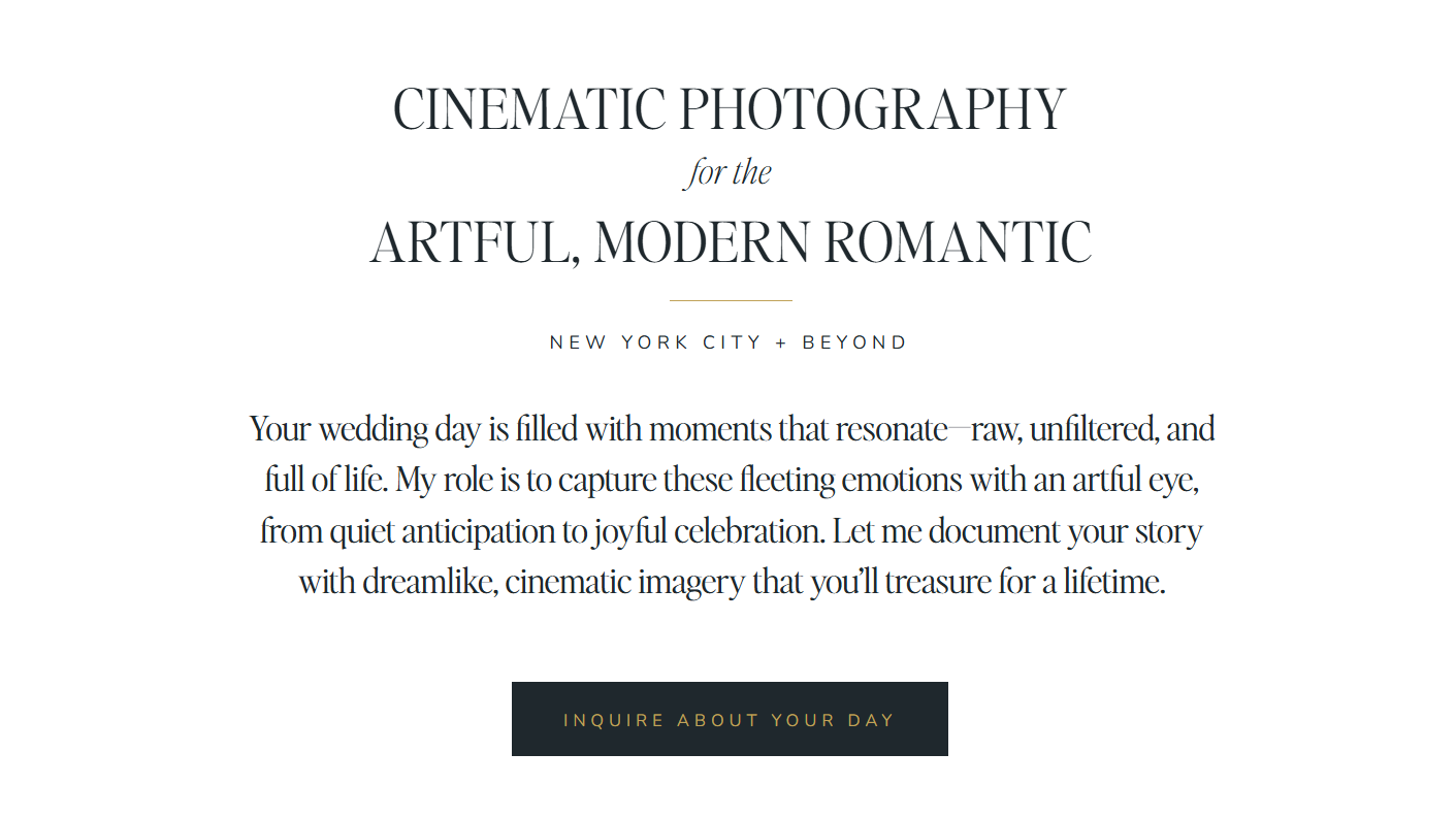 A CTA example from a photographer’s website; source: Jenny Fu
A well-crafted call to action is like a signpost guiding your audience toward next steps, whether that’s getting in touch, exploring your portfolio, subscribing to a newsletter, or booking a consultation. In short, clear CTAs create opportunities and transform your personal resource into a dynamic converting tool.
Component #6. Social proof
Featured work showcases what you do. Testimonials, in turn, demonstrate how you do it, and this aspect is often what seals the deal.
A few well-placed quotes from clients, colleagues, newspapers, industry magazines, or niche opinion leaders can highlight your professionalism, reliability, and impact — all the qualities your potential clients want to see.
Testimonials are something you should keep gathering and reusing — whether in a graphic, a social media reel, or a blog post. They help establish your credibility, position you as an expert, and build trust by showing that others have had great experiences with your brand.
SourceKati Noakes
Social Media Trainer, Founder of KN Communications
Stellar personal website examples you need to see
Most website builders out there are template-based, and their convenience is both a blessing and a curse, tempting you to save time and settle for generic, barely edited layouts. But, with enough inspiration, you’ll easily be able to deeply customize them to authentically express your brand.
The following hand-picked personal website design and copy examples will supply you with creative ideas you didn’t know you needed. No celebrities — just a few outstanding niche experts who poured their souls into creating resonating personal pages.
A life coach website
Trish Barillas is not just a certified life coach — she is a survivor of generalized anxiety disorder and panic disorder. Her website does an exceptional job at blending her clinical insight with real-life empathy, creating a layered personal brand.
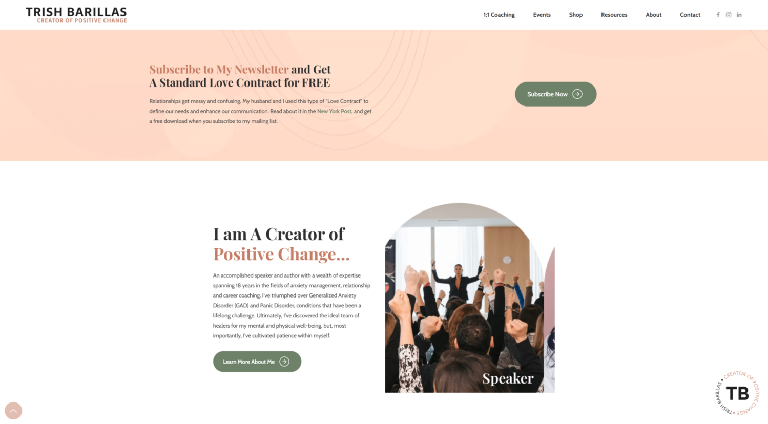 The intro from Trish Barillas’ website
From the get-go, we’re greeted with a highly personal lead magnet — her own communication framework for couples. The user is prompted to subscribe and engage with the resource right away.
The coach skillfully injects bits of her charismatic personality into the personal website copy, for instance, by mentioning her emotional support dog.
 Trish Barillas’ personal website copy example
The impact of the page is strengthened by the testimonials, which include powerful quotes from real clients testifying to Trish’s expertise.
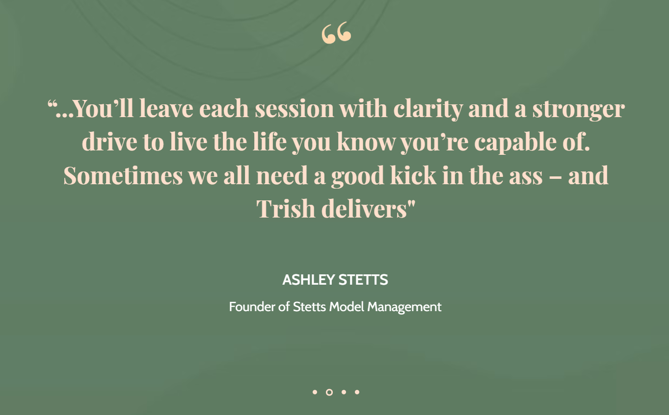 Social proof from Trish Barillas’ website
The “Meet Trish” page not only shares her coaching credentials but also opens up about her immigrant roots, mental health journey, farming work in Guatemala, and charity efforts. This depth makes her feel genuine and relatable.
 The “About Me” section on Trish Barillas’ website
Each section includes an opportunity to book a free 15-minute consultation, buy coaching packages, download her book, or subscribe, making conversion frictionless. All in all, this simple personal website example works so well because it leads with Trish’s unique lived experience, reinforces it with client success stories, and backs it up with practical tools.
A web designer website
Matteo Serra specializes in designing websites for the well-being, medical, and creative sectors. Thanks to his combined background in mindfulness practice and web design skills, he’s able to deliver holistic, calming, and purposeful work, which is beautifully presented on his landing page.
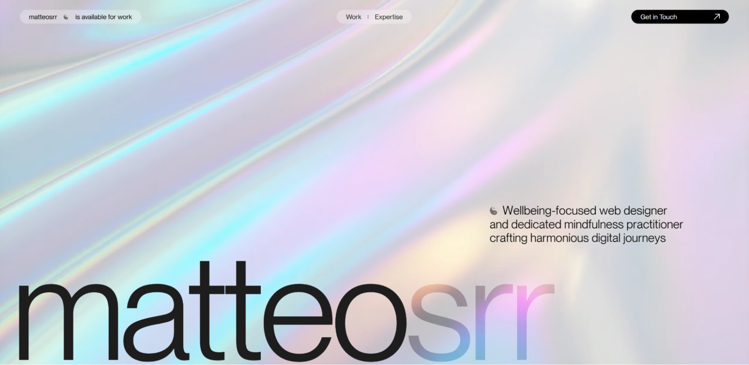 The intro section on Matteo Serra’s website
The mesmerizing section above the fold is followed by a charismatic headshot and a short bio. The designer intentionally highlights his work with wellness brands, medical professionals, photography, and retreats, and this tight focus lets visitors immediately understand where his strengths lie.
 Matteo Serra’s project gallery
The project gallery is followed by a detailed write-up for selected works. Projects like “The Garden of Nâm” retreat or “Patanjali Yoga Retreats” are presented with clarity, stating context, deliverables, niche, and year. This level of detail communicates both process and outcome.
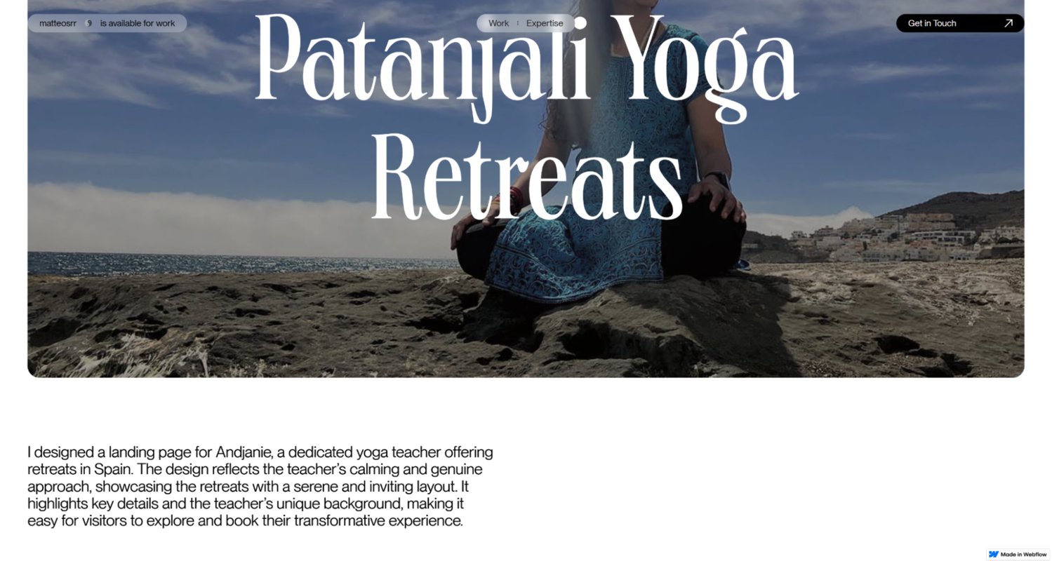 Project descriptions on Matteo Serra’s website
Finally, this personal website example features prominent calls to action like “Get in Touch” to make it easy for visitors to initiate contact, supported by a clear email link and social links.
A fitness coach website
Tom McGee is a holistic trainer whose background includes corporate experience, professional certifications like NCSF, and a deep understanding of nutrition. His minimalistic personal website goes straight to the point and signals depth and real transformation while completely avoiding fluff and empty promises.
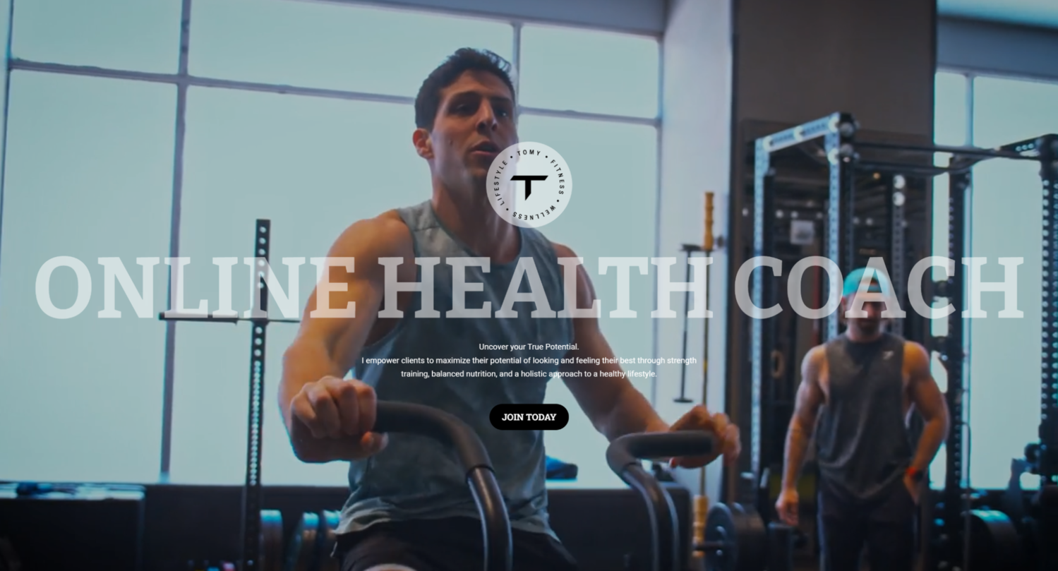 Tom McGee’s homepage
The captivating video background does a good job of demonstrating Tom’s training routine and physical form, leaving no doubt in his expertise. The emphasis is put on long-term lifestyle change, habit tracking, and accountability via his dedicated coaching app. This allows website visitors to experience Tom’s approach right away, without having to sign up for a class.
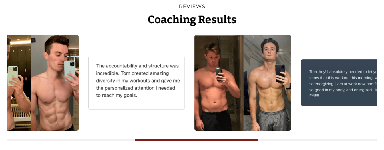 Testimonials from Tom McGee’s personal website
Diverse testimonials are presented as screenshots and before-after comparisons, which makes them more convincing.
 Tom McGee’s introductory survey
Instead of plain contact forms and CTAs, Tom uses an intuitive survey to find out where his potential clients are in their fitness journey and weed out an indecisive audience.
A tech expert website
Jad Joubran is a web developer and JavaScript educator. His website presents a long-scrolling one-page layout that is clean and visually balanced, focusing attention on essential content without overwhelming visitors. The video background on the first screen immediately captures the user’s attention and proves that this expert has tons of experience with public speaking.
 A personal website example from Jad Joubran
On the following screens, we see even more social proof as well as his published online courses and blog posts, which also demonstrate his high expertise. His portfolio reflects a strong community and pro bono mindset — he actively shares tools, tutorials, and project ideas publicly.
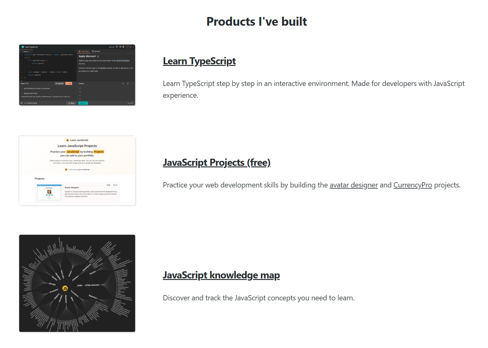 Jad Joubran’s portfolio
This personal website example includes a contact page that pre-sets expectations with detailed instructions, emphasizing self-service support and FAQ use, to streamline inquiries. Jad’s prior accomplishments are clearly summarized and presented at a glance, without forcing the user to dig through complex graphs and documentation.
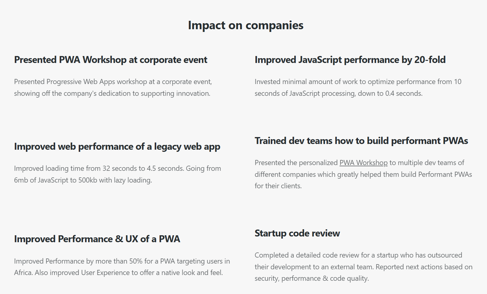 Accomplishments listed on Jad Joubran’s personal website
Another standout feature is an interactive map highlighting his international speaking appearances. This dynamic element conveys credibility and reach, showing that this expert is considered relevant in the global market.
A real estate agent website
Kevin Mullen and his partners run a real estate agency with a strong personality. This is a beautiful personal website beaming with luxury, and it speaks directly to its affluent target group through curated images and carefully chosen words.
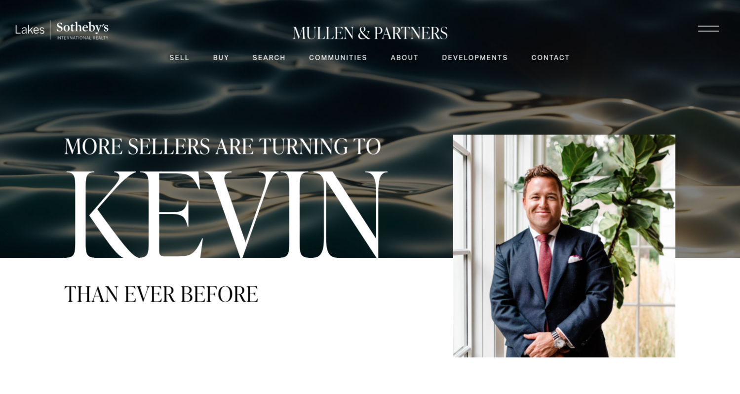 Kevin Mullen’s personal website
A short video gives us a glimpse of the type of real estate these agents specialize in as well as their professional approaches. This personal website example also features convincing social proof in the form of mentioned partnerships.
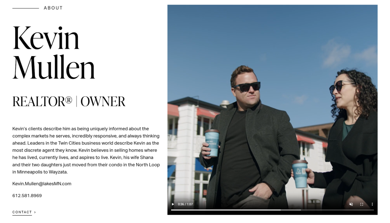 The “About” section of Kevin Mullen’s website
It’s worth mentioning that this website promotes not one but two personal brands. That’s also a clever solution for when you’re working with a partner but don’t want to put a faceless label “agency” on your business.
Each team member shares highly personal backstories, which humanizes their realtor brand. By highlighting their residential neighborhoods and personal ties to local markets, Kevin conveys both expertise and genuine commitment to community — not just transactions.
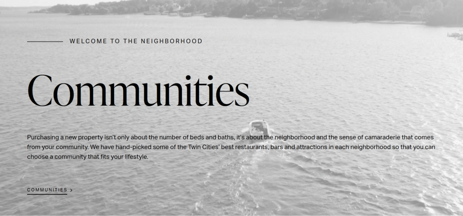 The “Communities” section of Kevin Mullen’s website
Instead of vague claims, the website copy clearly states how Kevin serves. Forward-thinking, responsive, discreet — these are traits that target clients want to hear without having to guess. Directly placed email and phone contacts provide instant access and transparency when someone wants to engage.
A nutritionist website
Francesca Alfano positions herself not just as a nutritionist but as a functional medicine practitioner focusing on hormonal health and weight management. Her website makes it clear — this expert prioritizes a positive, flexible approach over restrictive, all-or-nothing fad diets. The typography helps draw attention to the keywords that her potential clients want to see.
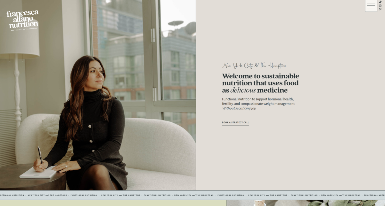 Francesca Alfano’s personal website
Francesca uses strategically timed pop-ups to invite cautious visitors to start interacting with her content and recognize its value. It’s also a clever way to build a long-term audience around her newsletter.
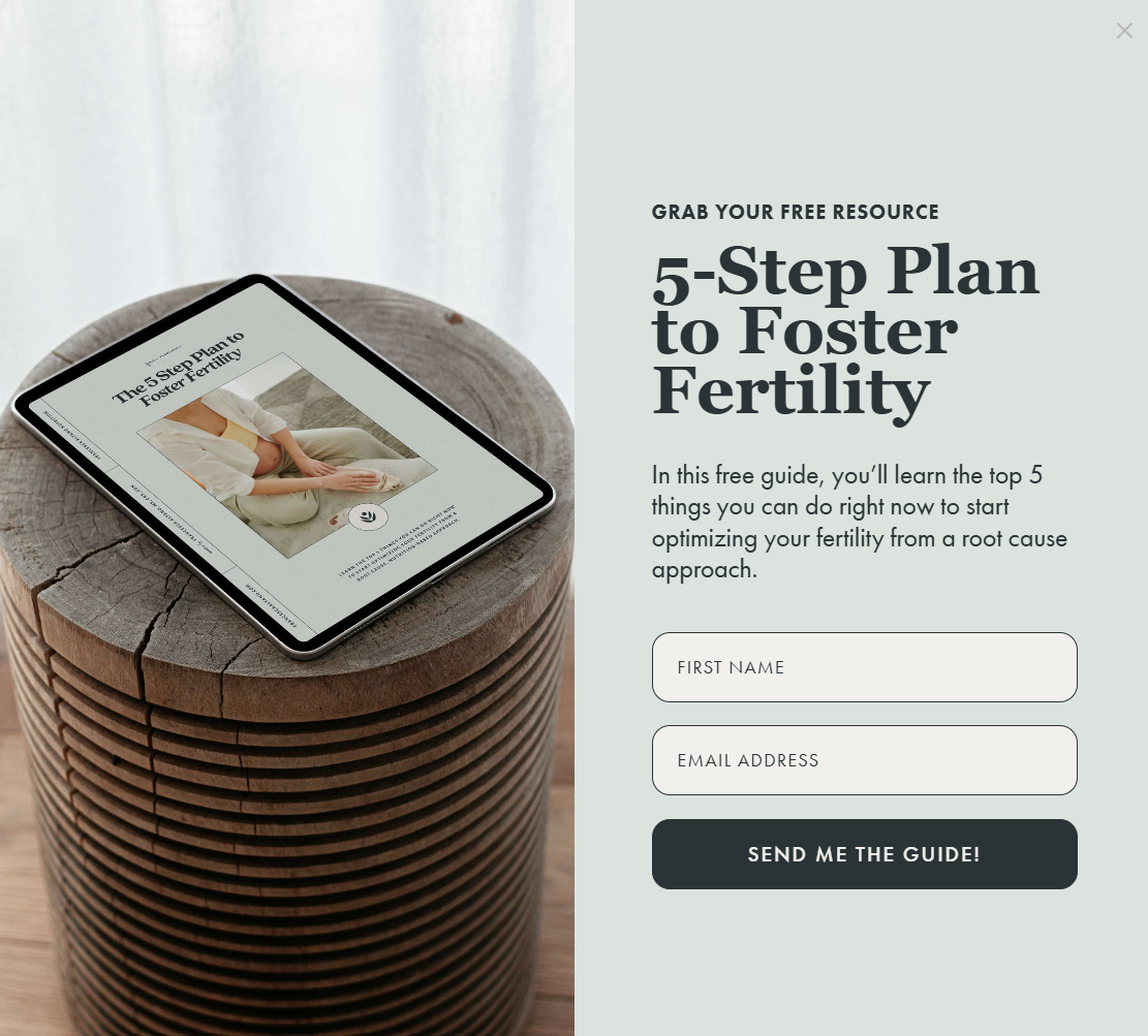 Francesca Alfano’s website pop-up form
The About section showcases her master’s degree, dietitian credentials, functional medicine certifications, and professional accreditations, building professional legitimacy. Multiple client testimonials mention weight loss, improved energy, and a reframed food mindset, which proves the quality of Francesca’s programs.
 Testimonials from Francesca Alfano’s personal website
This personal website design stands out with its warm color palette and effortless, natural imagery that create a down-to-earth look and distance us from the traditional, sterile aesthetic many dietitians choose for themselves.
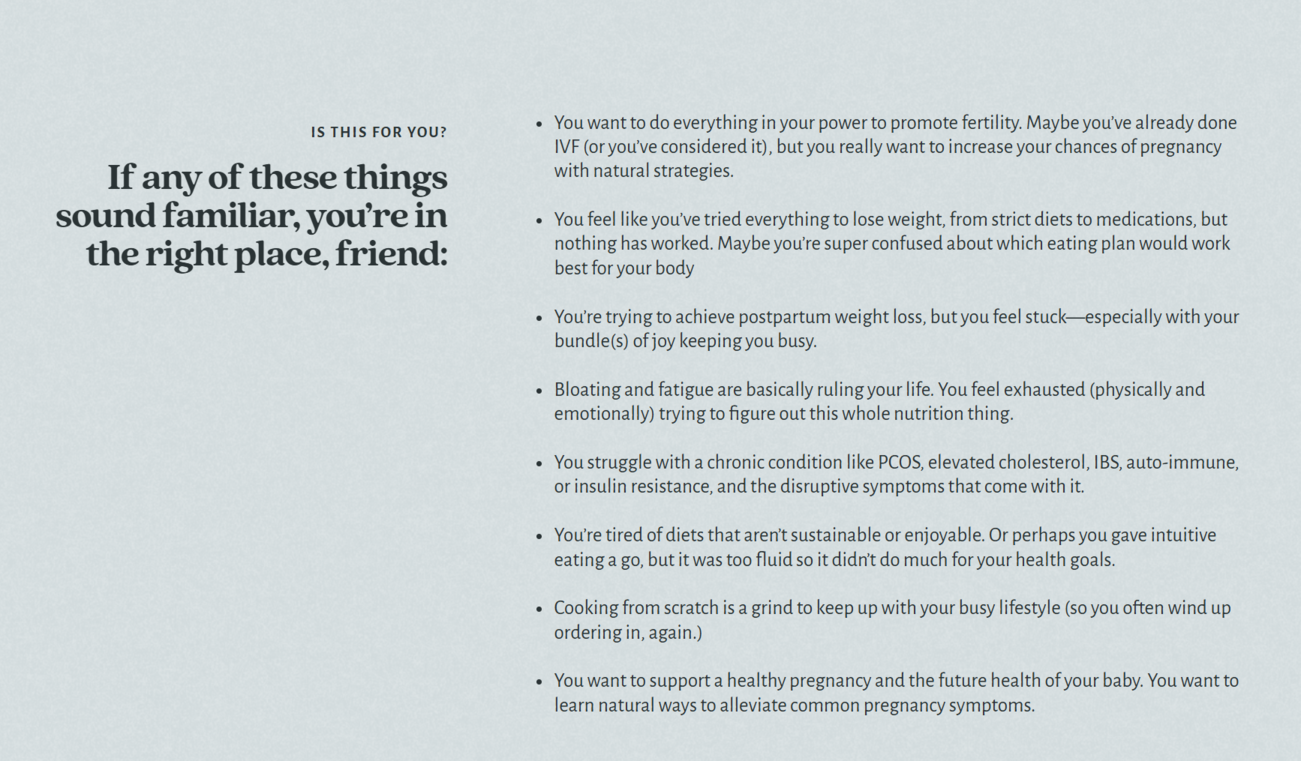 Francesca Alfano addressing customer pain points on her site
To remove any doubt, Francesca lists common pain points her clients express, letting them know they’ve come to the right place. Prominent CTAs invite visitors to book free strategy calls, download a fertility optimization guide, or explore private and group coaching programs.
A creative director website
Jason Briscoe is a seasoned hybrid designer‑advisor whose creative vision and commercial insight shine through at every point of his website. With the help of the contagiously positive photo and clear taglines, the page presents him not just as an expert but as someone who brings fun and high energy to the table.
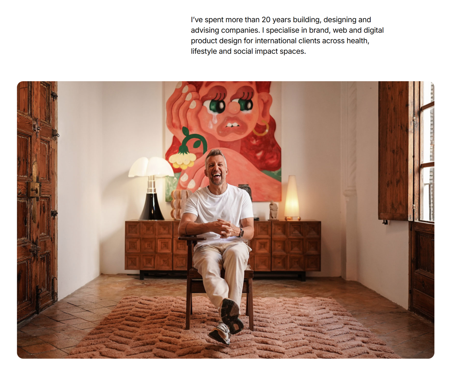 Jason Briscoe’s personal website
His personal website copy balances professional warmth and playful energy — promising experience and fun. Jason presents both his personal brand and his design studio, showing he works solo or leads teams at scale. His multi-city presence and studio roots signal flexibility and global availability.
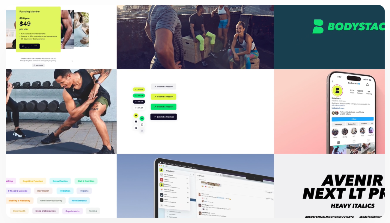 The project gallery from Jason Briscoe’s personal website
Short, casual testimonial quotes highlight his unique impact, while the fast-paced dynamic gallery gives us a glimpse into the universe of projects he has helped build. The bold color blocks make the personal website design appear less serious — and the quotes themselves more snackable and prominent.
A lawyer website
Emily Rubenstein practices exclusively in family law, and her narrow focus is reflected in her personal website design and copy, both of which signal deep specialization and confidence in highly sensitive, emotionally charged cases.
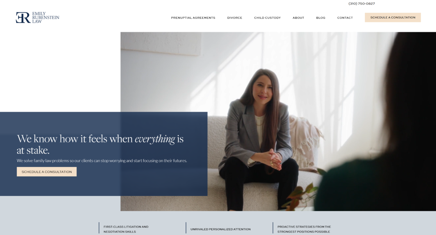 A personal website example from Emily Rubenstein
Both her value statement and her powerful hooks convey the same message — there’s a way out of any complicated situation, and it’s essential to take the initiative early on. Emily acknowledges the stress, fear, and uncertainty clients face, effectively building emotional connection right away.
 Emily Rubenstein’s value statement
Multiple detailed testimonials mention Emily’s planning, advocacy, and compassionate guidance. Also, the entire three-step process (Schedule → Tell Your Story → Move Forward) is visually laid out, which makes the experience more predictable and reassuring.
 Social proof on Emily Rubenstein’s website
This personal website example also features insightful legal content like “How a Strong Declaration Can Make or Break Your Case” or custody and asset division topics, reinforcing her niche expertise while improving SEO.
A love story photographer website
Lucie B. is a couple photographer who advocates for an authentic, candid approach and aims for emotionally honest images. Her website makes it evident that she brings a cross-cultural perspective and a sharp personal aesthetic. The hero image gallery above the fold immediately immerses us into her urban-inspired artistic vision.
 The personal website of Lucie B.
Lucie’s bio speaks to couples who expect untraditional, effortless shots and easy directions. The emotional testimonials prove that she gently guides every couple toward being their natural self in front of the camera.
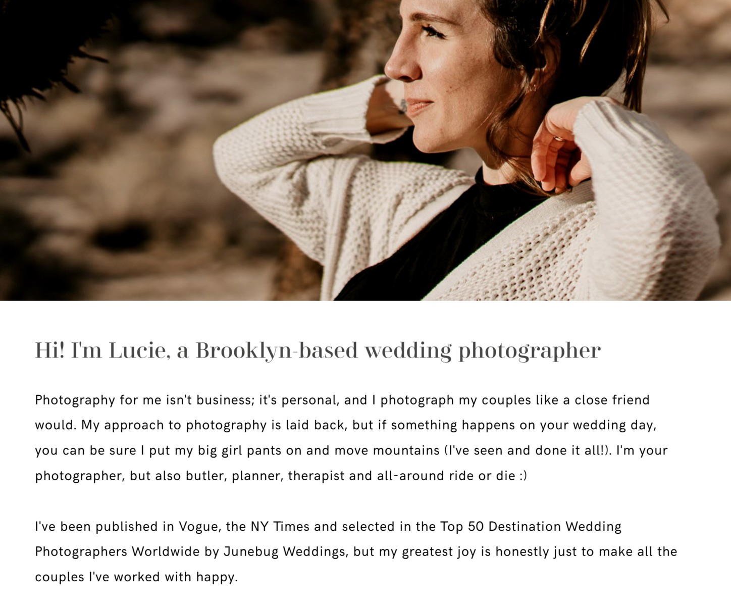 Lucie’s website bio section
Through a thoughtful personal website design, Lucie breaks down her work process into simple steps, which makes it less intimidating even for the most camera-shy couples. Her previous work is featured in a full-screen gallery as well as in detailed posts, which allow us to develop a proper feel of her style.
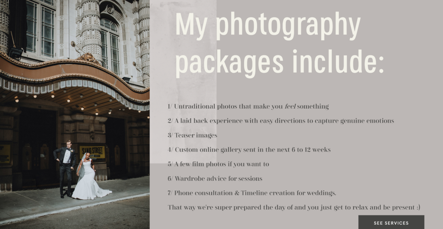 Lucie’s work process description
Featuring articles and posts from real NYC engagement and wedding shoots deepens the narrative around her photography style. In short, each element of the website works toward positioning Lucie as a friend, a planner, and a confidante — not just a vendor.
A mindset coach website
Brian Siegal is a confidence coach with a highly diverse background, and his personal website manages to efficiently communicate his unique expert value. Starting from an embedded lecture video and continuing with an extensive FAQ section, we gain a deep understanding of what to expect when working with Brian and how he differentiates from other coaches.
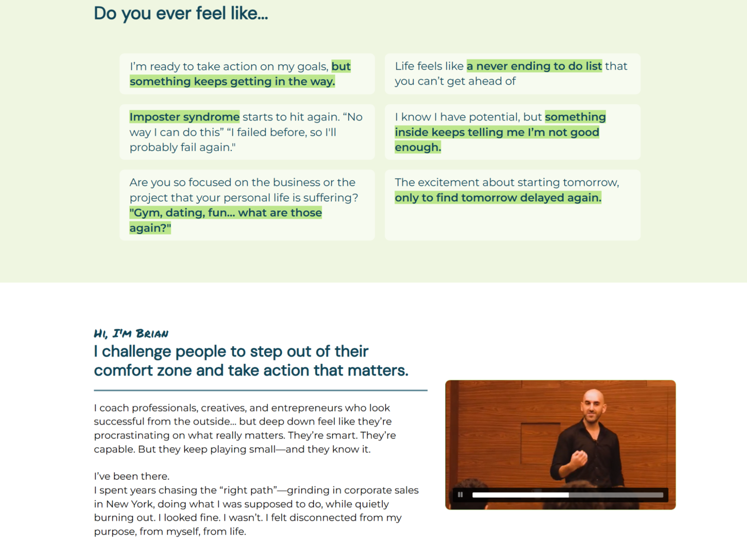 A personal website example from Brian Siegal
His informal, highly personal bio is nicely paired with a more cleaned-up and formal description of his achievements and qualifications. But, the star of the show is the social proof section, which features organic, highly trustworthy videos recorded by his former and existing clients and listeners.
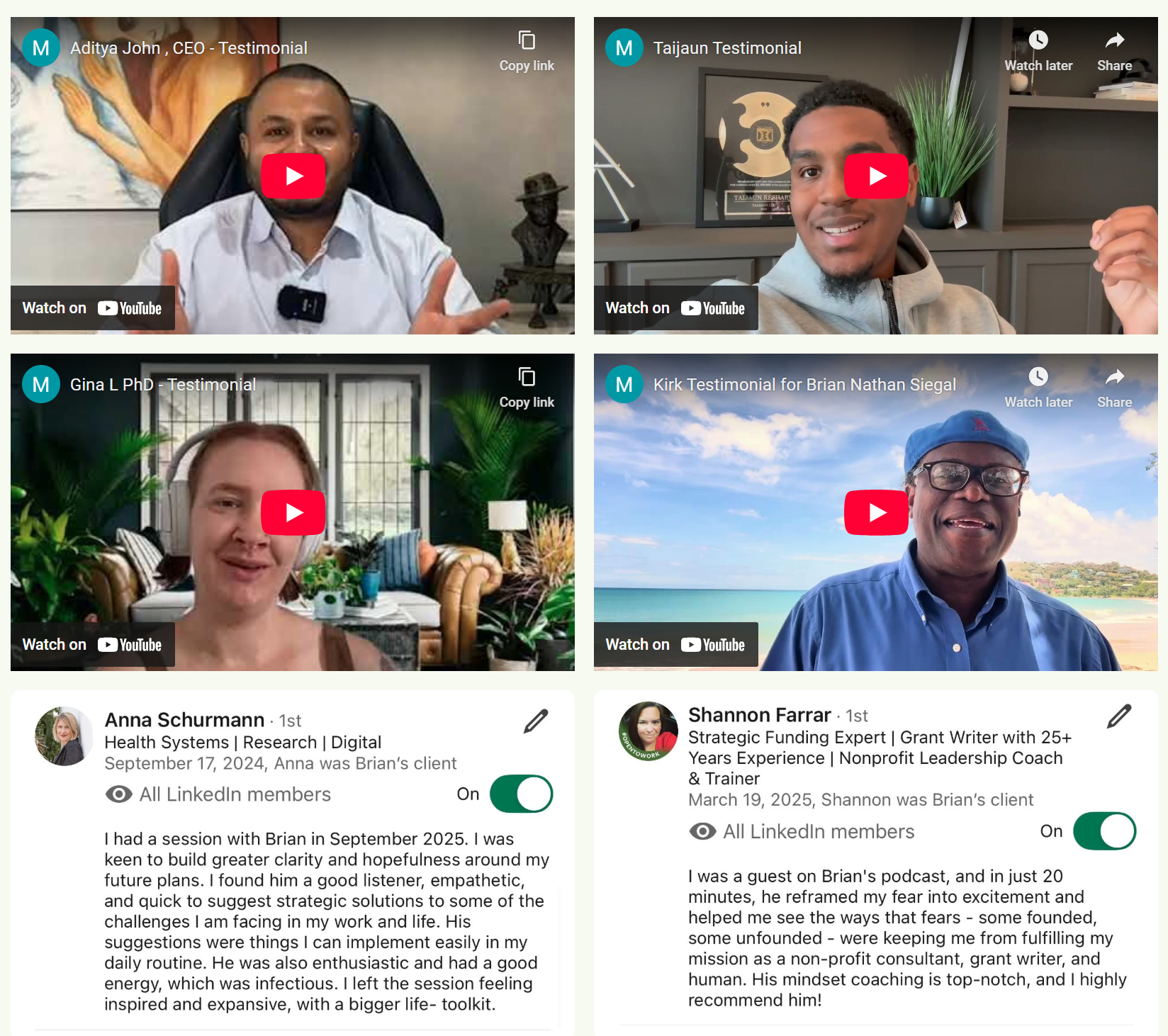 Brian Siegal’s testimonials
As the user gets closer to the website footer, they’re met with a non-pushy call to action inviting them to book a risk-free discovery session. The CTA is followed by a contact form, which allows visitors to sign up to receive free expert content from Brian.
Step-by-step guide on how to create a personal website with SendPulse
With our intuitive website builder, you can either create your website from scratch or choose a theme template and deeply customize it to suit your needs. Both options shouldn’t take more than 20 minutes of your time if you have your images and texts ready to go. Don’t just take our word for it — try and see for yourself!
Our builder allows you to create not just attractive but also mobile-first pages you can easily link to on your socials. For the sake of this example, we’ll go with the template option.
Step #1. Choose a template that suits your goals
Log in to or create your SendPulse account and go to “Websites.” Then, click on “Create a website.” There, you can decide whether you need a minimalist, distraction-free link page or a proper multi-page website.
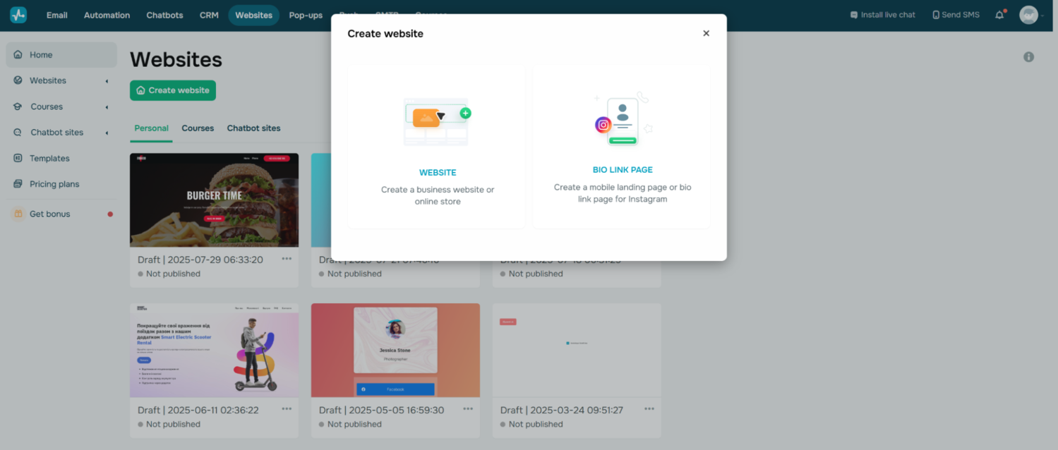 Creating a personal website with SendPulse
Take a look at the available templates. If none of them fit your goals, click on “New site.” This will open a blank page layout.
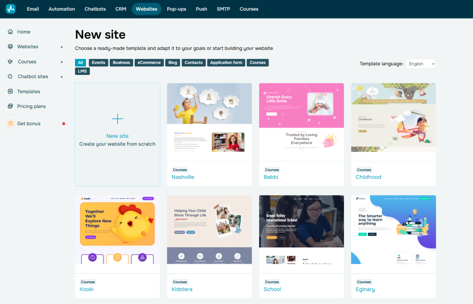 SendPulse offers you templates for your personal website
Our template library contains 80+ flexible, small-business-friendly templates that allow you to properly present your persona, display your work, and connect with your potential clients through email campaigns, an integrated live chat widget, and more.
Step #2. Shape your website structure
Give your project a name and start building its “skeleton.” If you point at any of the individual blocks, you’ll see the “move tool” icon with four arrows pointing outward. The tool allows you to drag and drop the block. Other tools give you granular control over each block’s appearance — more on that in the following steps.
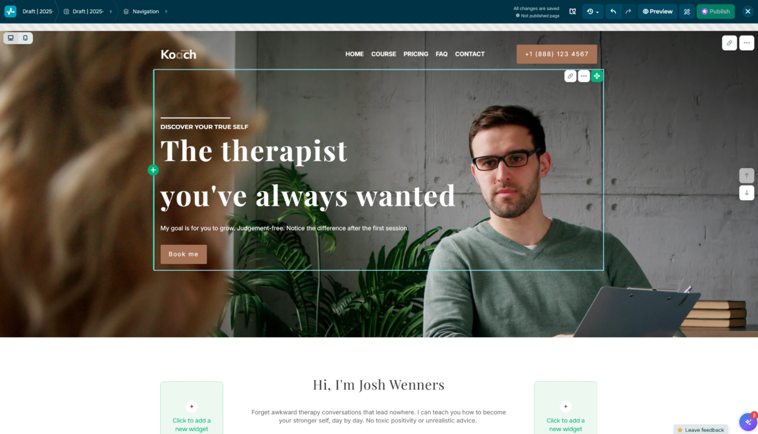 Editing a personal website in SendPulse
Feeling like something is missing? Click on the “plus” symbol to add building blocks such as CTA buttons, text blocks, image galleries, FAQ, dividers, spacers, videos, or contact forms from our widget collection.
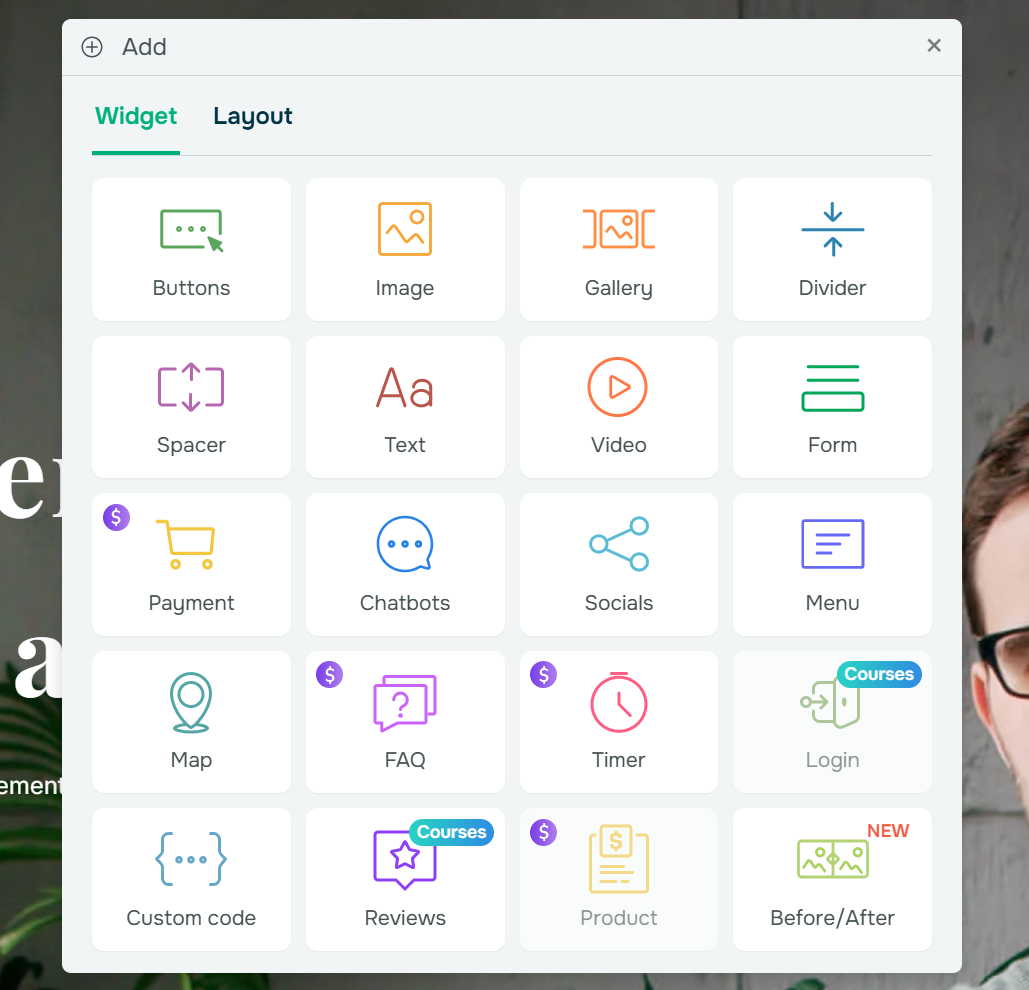 Adding widgets to a personal website in SendPulse
Other conversion-inducing elements with which you can enhance your personal website include chatbots, social proof, before-after galleries, countdown timers, integrated checkout, and more. SendPulse also allows you to add custom code.
Step #3. Use AI to create custom blocks that reflect your needs
Pre-designed templates and blocks can feel quite limiting at times, especially if your personal brand occupies a unique niche. If you are unsure how to go about customizing the default elements, simply describe your vision to our integrated AI block builder, and it’ll generate the right elements for your project.
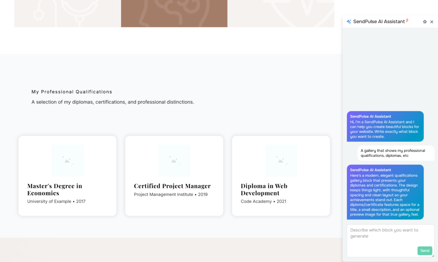 Using AI for generating custom website blocks in SendPulse
With the AI assistant, you can dramatically speed up your website creation without sacrificing the distinctive personality of your brand. It also allows you to organically integrate your existing assets into the landing page.
Step #4. Customize individual elements
Hover above the column or widget you want to customize, click on the pen icon, and use the settings in the right menu to change its appearance.
- Resize individual buttons and blocks for a more even look.
- Paste your headlines, CTAs, and copy.
- Use the built-in AI assistant to translate, rewrite, or otherwise improve your content.
- Edit lead capture form fields and buttons.
- Add your logos, brand colors, and images.
- Adjust padding and alignment.
You can introduce animation to make some of the elements pop — this can be done from the same menu.
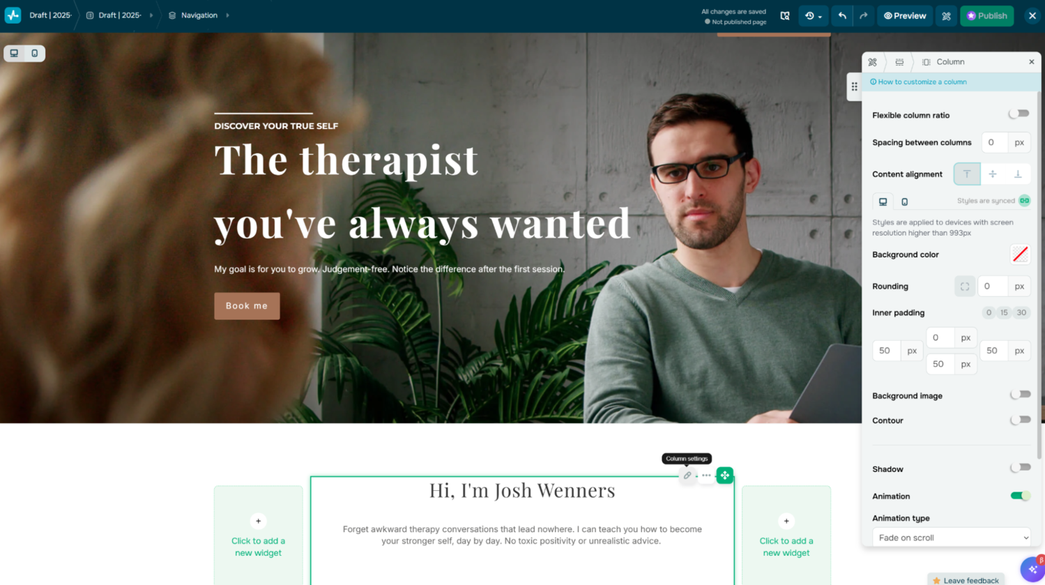 Editing a personal website created with the SendPulse builder
Make sure to preview your work in mobile mode after any major changes to stay on track in terms of smartphone-friendly design. You can hide some of the widgets on mobile if needed to keep the user journey smooth.
Step #5. Include important links and contact information
Add necessary links, addresses, maps, directions, availability, and phone numbers to make sure your contact and CTA buttons are functional and up to date. Using dedicated social media buttons, which you can also find in our widget library, will make it easier for your potential clients to discover your other channels.
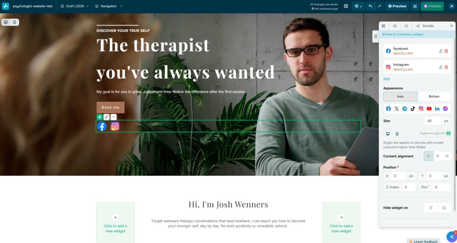 Adding links to a personal website in SendPulse
For payment forms, you need to specify the payment system you use. For lead capture forms, you may want to connect them to the built-in CRM to be able to properly store, navigate, and manage gathered data for the following campaigns.
Step #6. Create additional pages if needed
Once you’re done with your homepage design, you can consider expanding your resource. For instance, having dedicated “About Me,” “My Works,” and “Contact Me” pages can help your visitors get to know you as an expert and connect with you better.
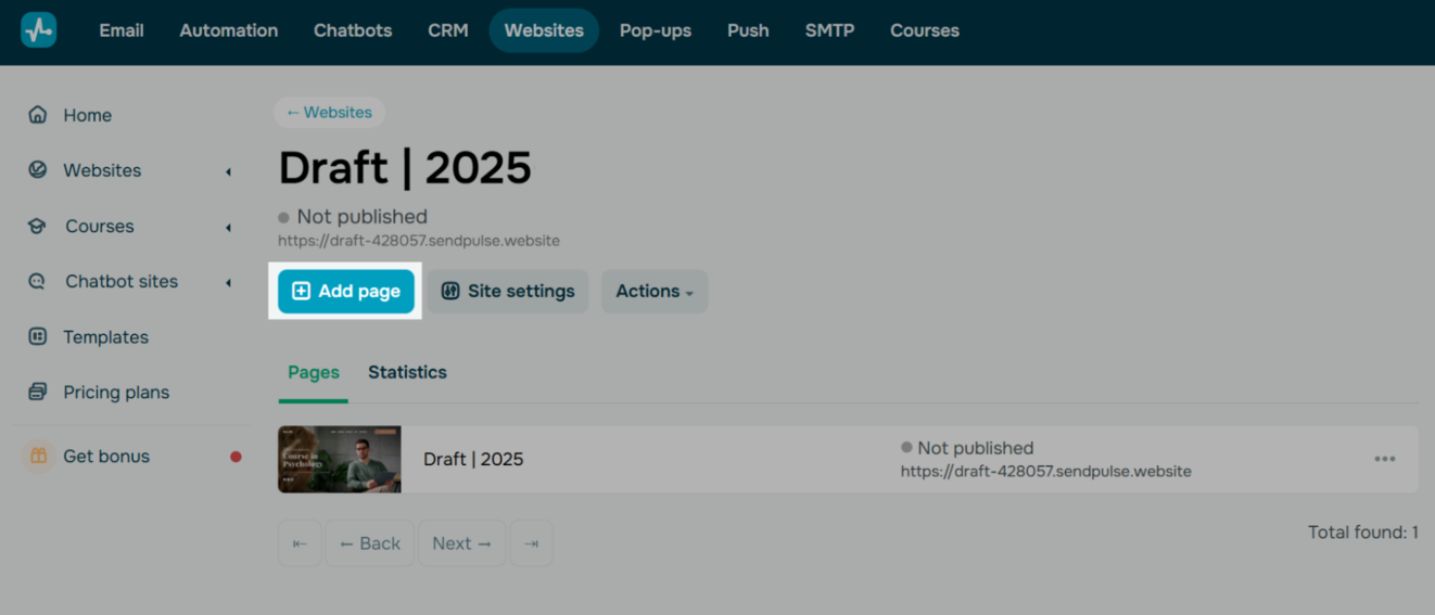 Add multiple pages to your SendPulse website
Multiple pages are helpful for breaking up content into logical sections and preventing first-time users from getting overwhelmed. You can add pages either directly in the visual editor or from the “Websites” tab.
Step #7. Give your website a unique domain name and publish it
Go to the website settings and specify the domain name by clicking “Add domain.” This option is only available on a paid plan. If you don’t have a domain name yet, your site will remain on the SendPulse subdomain.
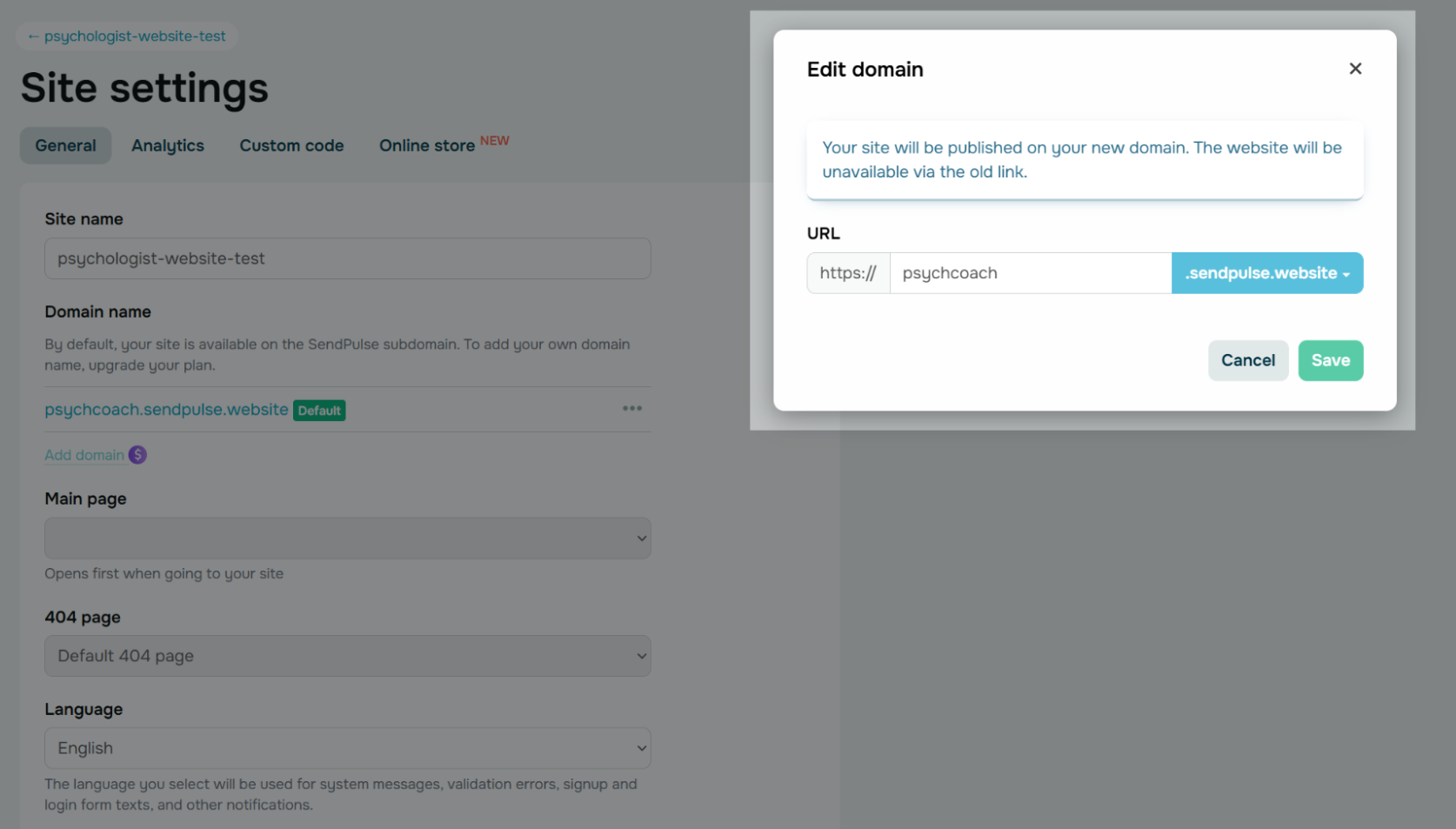 Give your personal website a unique domain
A better option would be to purchase a unique domain name from a domain registrar — it will reinforce your personal brand and make your site appear more trustworthy.
If you have products showcased on your personal site along with the integrated checkout, you can already set up your online store from the same website settings menu. This includes specifying your currency and delivery options.
Before you go
You can try our website builder for free and see how easy it is to make a personal landing page that you can also link to in your social media bio. Collect all your important resources in one place and impress your audience from the first touchpoint.
Our platform also comes with an AI-powered chatbot builder, a CRM system, email automation tools, a pop-up builder, an LMS system, and more — make sure to check these tools out!