eCommerce website owners can generate leads and offer their customers unique experiences using pop-ups. According to the statistics, pop-ups generate a 9.28% conversion rate. So you can see that it’s an effective tool for driving conversions.
There’s no universal rule on creating the best website pop-ups. Every business owner has their conversation goal and chooses the corresponding pop-up type for their website. In this post, you’ll find what a website pop-up is and why you should use it. You’ll also get some optimization tips and see a bunch of pop-up examples to get inspired.
What is a website pop-up?
A website pop-up is a window with an informational or promotional offer overlaying your website content. It captures the attention of your site visitors and calls them to actions that depend on your marketing goals.
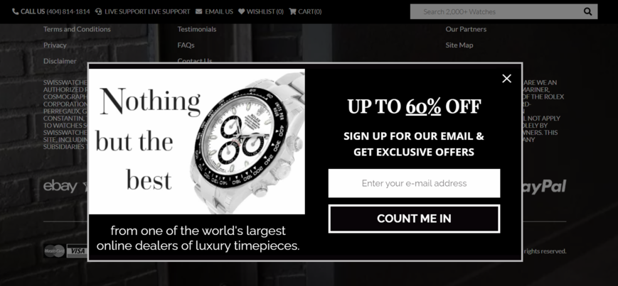 A standard website pop-up example
A pop-up window appears once visitors load a page when they access the site. People can also trigger them by scrolling, clicking, or intending to leave the page. Users browse the content, and this graphical overlay pops up on their way unexpectedly and unintentionally.
eCommerce website owners use a graphical user interface display area to promote their offers, generate leads, and increase brand awareness. Despite how annoying pop-ups can be when misused, pop-up technology still attracts many users and increases sales.
Why use pop-ups on your site
Using pop-up windows can bring many benefits to your website and your business. This window is a valuable source of information for your customers about discounts, membership, newsletters, and new products. You can easily grab their attention and channel them into conversions.
Types of eCommerce pop-ups
You know what a pop-up is and why your website needs it, so let’s find some popular pop-up types with inspiring examples.
Discount pop-ups
When people visit an eCommerce site, they can see a window offering a discount or coupon. 97% of buyers always seek deals when shopping in online stores, so a discount pop-up encourages them to buy something.
An appealing discount coupon pop-up offers customers a lucrative deal — anything from $10 off their first purchase to a 20% discount code. It is not triggered instantly but appears on the site in 5-10 seconds, not to annoy visitors. This pop-up may be displayed when visitors scroll a certain percentage of the page or want to leave.
You can make the most of your discount pop-up with a strong, creative call to action. If you set a time limit, users will more likely benefit from your offer. Make sure it’s easy to use, and customers immediately go to a page with your best-selling products.
Let’s explore several website pop-up examples with discounts.
A discount pop-up example from Hydrant encourages visitors to claim the $5 offer. People can enter their email addresses and get a discount or ignore the offer and pay the full price. This CTA makes visitors feel they lose something and encourages them to save on purchases. It is clear, well-readable, and easy to understand, as you don’t have to calculate any percentages from the price to find the sum of your discount.
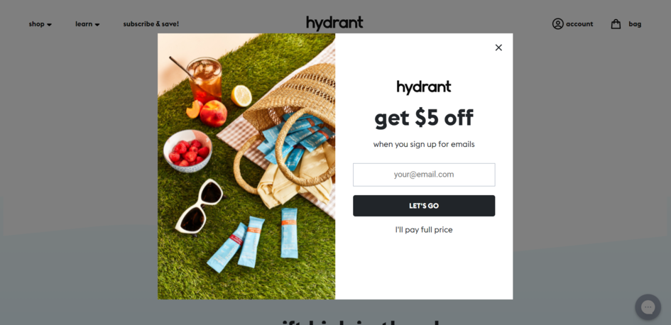 A minimalistic discount pop-up with just one input field
One of the best website pop-ups is the one by Hashtag Company. Its clear and simple headline focuses on the value a user gets and incentivizes new sign-ups.
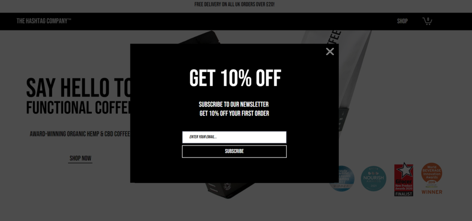 A stylish discount pop-up that matches the website style
Giveaway pop-ups
A giveaway pop-up is perfect for promoting new products, growing your mailing list, and boosting sales. With an eye-catching pop-up, eCommerce site owners can inform visitors about the giveaway at the right time and invite them to join. You can also add a countdown timer to drive urgency and make people act faster.
Here’s what a giveaway pop-up can look like:
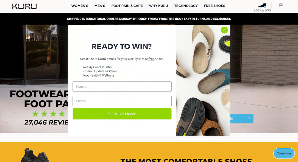 A giveaway pop-up used to convert new visitors into subscribers
This giveaway pop-up captures visitors’ attention from the first lines. There are explicit instructions on how to join and win a giveaway. Using this pop-up type, you can get more subscribers and encourage visitors to place an order to enter your giveaway.
Cart abandonment pop-ups
Many companies experience an increase in cart abandonment rates amounting to 98% in certain industries. You can do everything correctly, offering people your help and getting their email, but something can go wrong, and they leave their cart.
Your task is not to allow customers to go until they check out. Cart abandonment pop-ups can help you convince visitors to stay and buy. For instance, Menkind Friendly reminds visitors to complete their purchases.
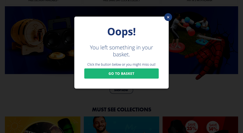 A cart abandonment pop-up stimulating visitors to complete the purchase
To make your cart abandonment pop-up more attractive, you can offer customers a coupon code or giveaway to win their cart items. For instance, Adidas uses a timely cart abandonment pop-up to make sure their visitors know the company offers free shipping.
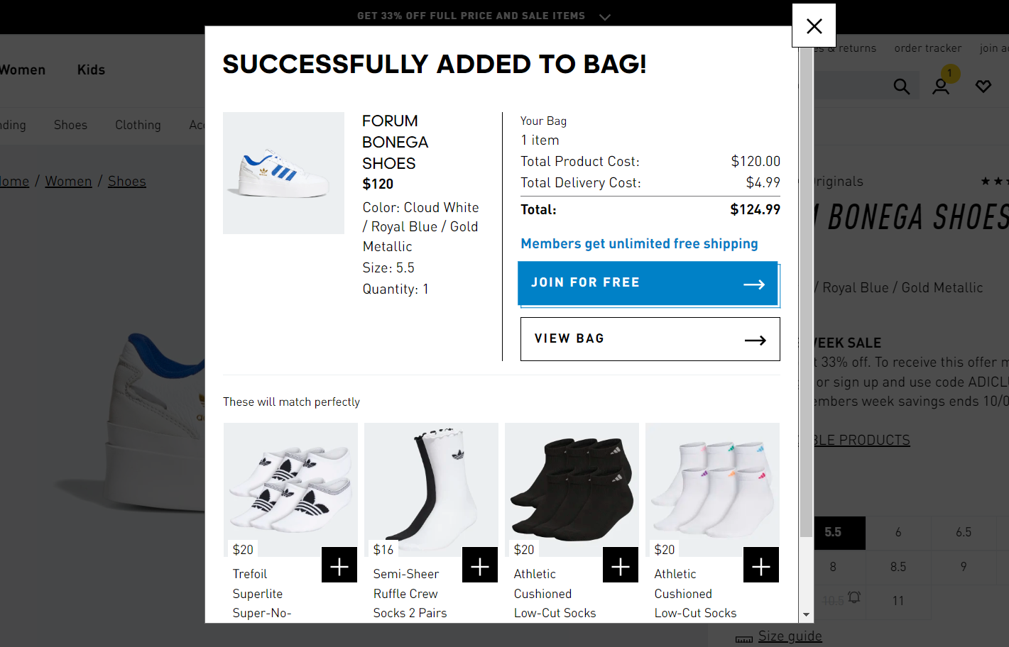 A pop-up example nudging visitors with free shipping
Sales promotion pop-ups
If you’re about to launch a sales campaign, consider giving your visitors a heads-up about the upcoming sale. It will help you build anticipation if launched a week before the busiest sales days, encourage prospects to discover your products in advance, and improve your customer relationships.
Here’s a well-timed pop-up example that creates a sense of urgency without disturbing visitors.
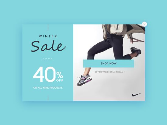 A sales promotion pop-up with a 40% discount is an effective incentive for customers to explore products; source: Pinterest
Survey pop-ups
If you want to collect more customer feedback but don’t want to bother users with too many questions, a survey pop-up is a great option for you. It allows you to measure user satisfaction and trace weak spots in your product or service, launch personalized nurturing campaigns, identify upselling opportunities, etc., without hampering your user experience.
Feedback from your customers is essential to better plan and prioritize your product development. But how do you generate customer insights effectively? People are more likely to answer questions about your product when they have just bought it. So, consider launching a post-purchase survey pop-up offering a discount code or a gift to people sharing their feedback.
Here’s a survey pop-up example:
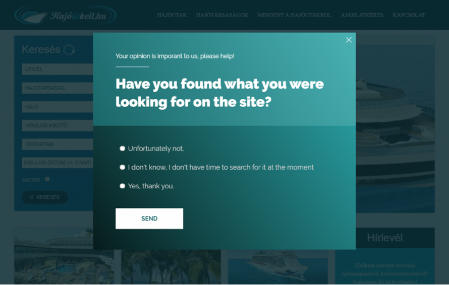 A survey pop-up example used to evaluate visitors’ experience
Note how little effort is required from a visitor to complete this survey — all they need to do is select the appropriate option. It doesn’t disturb visitors with a new browser window opening or direct them away to a different page.
Social proof pop-ups
Social proof is a great way to demonstrate to your clients that your brand is trustworthy and your main focus isn’t only on making money on them. A pop-up is an excellent way to connect with site visitors and show them your best products, customer testimonials, or expertise. Consider that numbers strengthen social proof. Look at an example below of how to showcase the number of your newsletter subscribers.
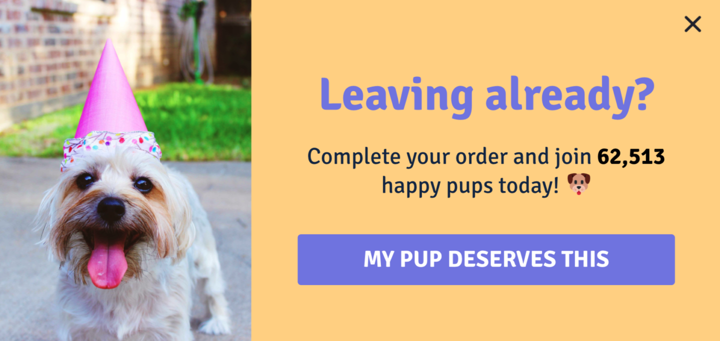 A social proof pop-up motivating visitors to convert into customers; source: Drip
If you are looking for more best website pop-up techniques to highlight your social proof, you can combine it with FOMO. For example, if you say that this bestseller product sells out quickly and they can use a discount to buy it here and now, they will actively engage with your pop-up. Also, you can show visitors how many users are looking at the same product right now. That’s how Pandora warns an abandoning user that the product they’re viewing is high-in-demand.
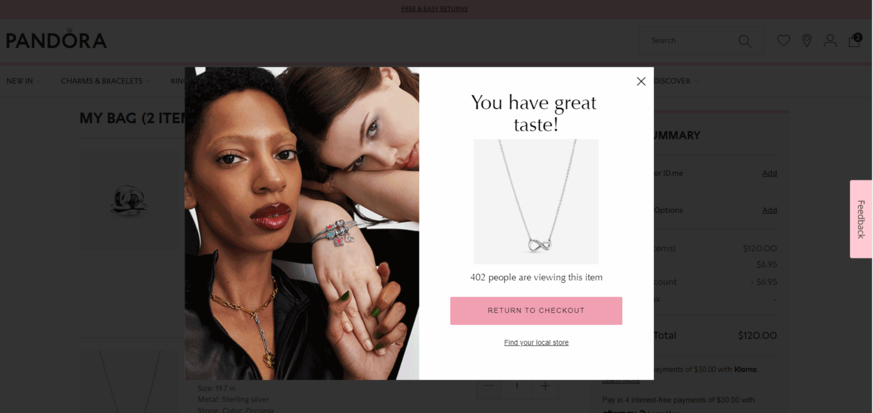 A pop-up highlighting the popularity of the product
Final thoughts
Now you see that a website pop-up is a powerful tool for growing your customer base and boosting sales. So, if you feel inspired enough and want to bring your own pop-ups to life, we make it dead simple with our pop-up service — make sure to test it now!