We’ve all been there, seen that. Handshakes, unnaturally wide smiles, athletes jumping up, mountain landscapes — the list of landing page image cliches goes on. But there are other common problems, for instance, overedited, pixelized, or skewed images conflicting with each other.
How do you make sure your images look professional and amplify your words instead of weakening them? Do you always need to look for something custom, even when your budget is limited? We’ll answer these and other questions about creating and choosing effective images for landing pages of all types.
Why do you have to go the extra mile when creating landing page images?
Landing page images aren’t there to jazz up the page look — they are part of a universal language everyone understands.
Sure, landing page images help you illustrate your point and make your page more attractive, but there is so much more to them. Skillfully chosen visuals can also drive conversions, convince the most cautious users, evoke a strong emotional response, and even guide them through the buying journey.
Consider the study where users were invited to browse a website that is not in their native language. Every participant benefited heavily from having intuitive visual cues — graphics, icons, and photos. They succeeded at the task even when the website’s language was completely unfamiliar to them. You can easily extrapolate these results to a native-speaking audience who just happens to have ad fatigue and isn’t ready to focus on your text.
Contrary to popular belief, there is no clear data on how much information people retain after reading a piece of text vs. looking at images. And there won’t be because everyone’s retaining process is unique, and the type of presented information plays a big role.
However, we know that the human eye tends to jump to the most digestible information first (images and headlines) and only then proceeds to the more complex pieces of information (paragraphs of text). So, it’s natural to assume that your landing page images are responsible for the first impression your whole offer creates.
This landing page image, for example, can instantly make anyone thirsty:
An animated landing page background
Of course, it’s a professionally made animation, but even a still image of those super-sized blueberries would produce a similar mouth-watering effect. The user doesn’t even have to read the supportive text or click on any buttons to understand that some yummy refreshing drink has entered the market and that they should give it a taste. This landing page image isn’t just nice to look at — it tells the story and conveys the key information about the offer.
Landing page image best practices
We’ve put together helpful practices that can bring your landing page design to the next level.
Make your hero shot the star of the show
A hero shot is an image you place above the fold. It’s the first thing your landing page visitors see so it has to leave an imprint. For a hero shot to work, it has to convey certain emotions your customer usually experiences when using your product or service. It doesn’t have to be a photo of a happy influencer — it just has to be relatable and capture the essence of your offer.
Let’s take Roller Derby House’s landing page as an example:
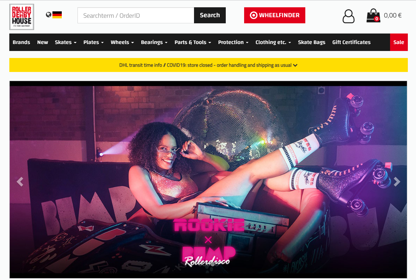 Roller Derby House uses relatable hero shots featuring signature roller skates
This hero shot says it all. It perfectly captures that playful, careless, and a bit mischievous mood familiar to everyone who has ever put on a pair of iconic retro roller skates. That’s the exact mood their potential buyers want to experience so this hero shot hits the spot. The photo doesn’t even feel staged — the model could easily be one of the customers.
Look for authentic, real-life stock photos
Absurdly perfect and stiff poses, forced smiles, too formal clothing, aggressive glossy editing — these are the main things that usually make stock photos appear so fake and uncanny. Gentle retouching combined with natural facial expressions and poses makes a world of difference when it comes to evoking trust with images.
Let’s take a look at how Lyft sees its target audience:
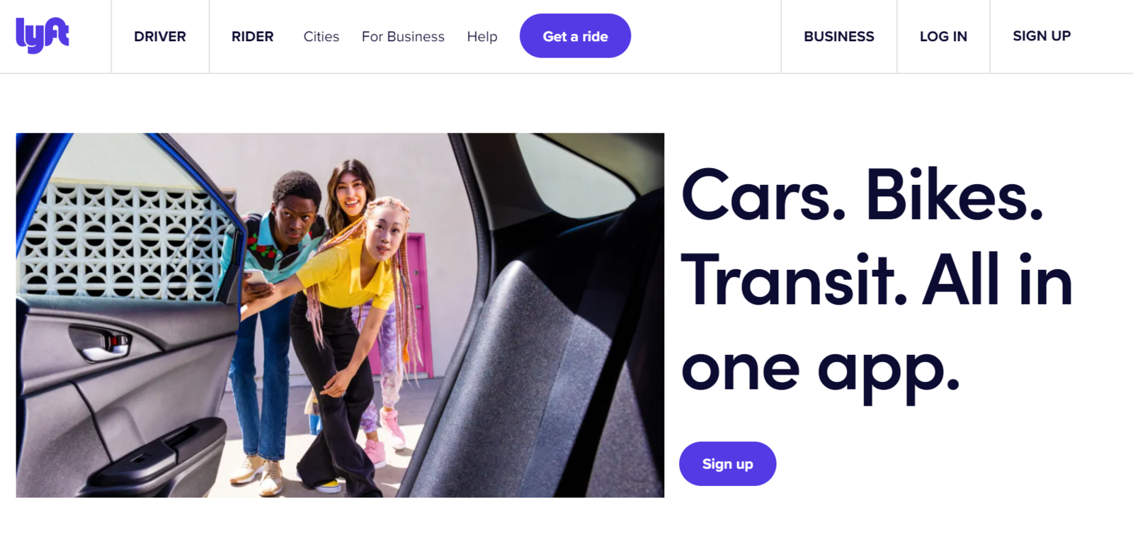 Choose realistic images for your landing pages
This landing page image represents real Gen Z. Regular clothing, natural facial expressions, diverse styles — the photo looks so effortless you wouldn’t even think that these teens posed for it. Lyft wants to make its rides more available for the general public, and this landing page image only enhances their offer.
Don’t choose overused images for your landing page
Always go beyond the first page of your favorite stock image bank and try to find a more unique image. Why? Because thousands of other users will grab the first relevant image they see, for example, something like this.
 Avoid choosing the most popular and overused photos; source: Unsplash
This is one of the most popular images you can find on Unsplash when you search for keywords such as “corporate” or “team.” There is nothing wrong with this image except the fact that it illustrates thousands of articles and website pages effectively rendering them not-so-original.
Before you decide on a specific image, take a quick look at the download count if there is one to get a grasp of how many people are using the same image elsewhere. The image from our example has 314k downloads.
Pick custom illustrations whenever possible
The virus of sameness has struck millions of landing pages, and it has a name: corporate Memphis. Faceless, disproportionate characters with green hair and noodle-like limbs seem to occupy almost every startup page.
It’s challenging to present your offer as unique when your page doesn’t look that unique. The only cure is to hire an experienced illustrator and ask them to come up with something relatable and connected to your brand. Even if you genuinely like the Alegria style, you can ask a professional to add some new twist to it.
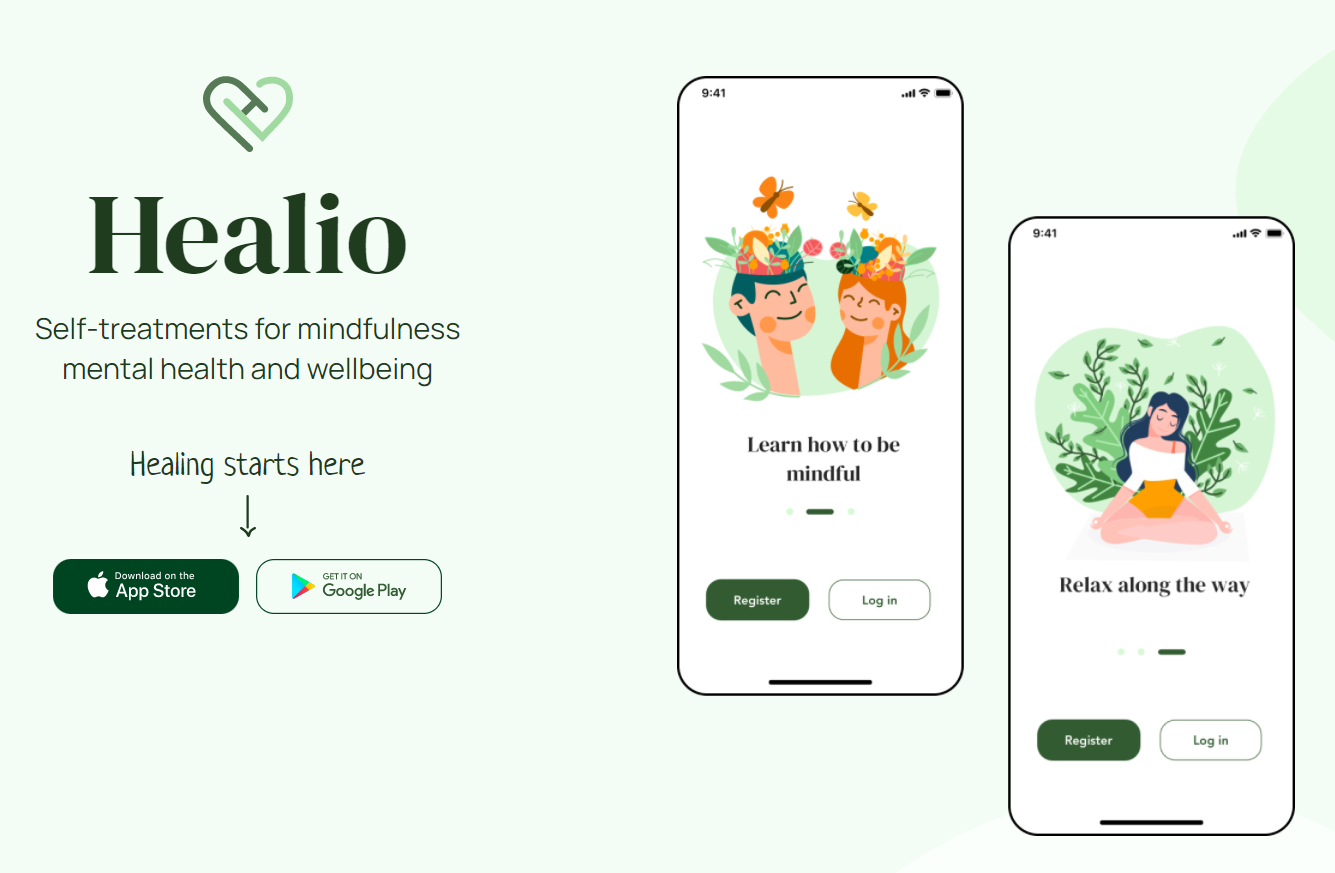 An example of a landing page with customized illustrations
In this example, the illustrations are still made in a typical big-tech style, but they are customized and represent one specific product, a well-being app. A natural color palette and floral elements make them more distinguishable and effectively enhance the message.
Include real photos wherever you can
Let’s say you want to show who your typical clients are. Or, perhaps, you need to illustrate the way you provide your services. Whatever your task may be, you can achieve it with real photos showing yourself, your team, events, customers, or spokespersons.
Don’t hide them on your “less important” pages — place them front and center. They belong on your landing page because they can help resolve any doubt your visitors might have about your offer’s credibility.
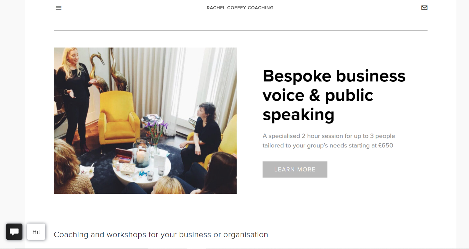 Real photos will help your boost your users’ trust
This might not be the most pixel-perfect landing page image, but it does its job — it immediately evokes trust and proves the authority of the coach. We see that this expert is a real person conducting no less real events with a real audience carefully listening to her.
But, in some niches, stock photos are your only choice. For example, you are a travel agency — it makes no sense for you to hire a photographer to shoot every single landmark in Europe. Or, you are a psychologist and you can’t use photos of your happy clients because they prefer to remain anonymous. In a situation like this, follow our previous tip about finding more effortless, authentic stock images.
Don’t use images just to fill white space
Eyetracking studies prove that purely decorative images aren’t performing well on commercial landing pages — they don’t satisfy the user intent. So, it’s recommended to find informative images for landing pages or omit them altogether.
Here’s an example from SurveyMonkey demonstrating that you can even leave a hero shot out if your headline is powerful enough:
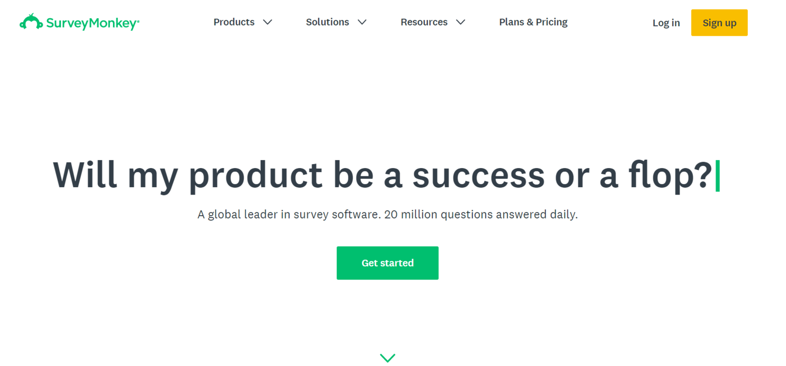 SurveyMonkey’s landing page has no hero shot above the fold
In this example, white space immediately drives the user’s attention to the headline and the CTA button. The lack of images here is in no way hurting the user experience. Also, another study points out that too captivating images may even divert users’ attention away from more important functional elements.
Choose landing page background images that won’t interfere with your copy
Tempting as it is, using busy group photos and saturated landscapes as background images isn’t the best solution if you plan on placing your headline and a CTA button on them. By doing that, you run the risk of making these crucial components illegible. According to accessibility requirements and UX studies, informative images should have a contrast ratio of at least 4.5:1 or 3:1 for large fonts.
Here’s a good example of a background photo that doesn’t mess up with the legibility of the headline. This stunning landscape serves a commercial purpose — it immerses the user into the world of picturesque bike routes, and Brooks sells comfortable bike saddles:
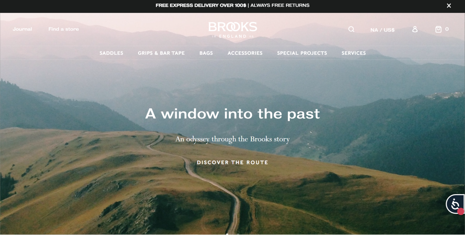 Engaging background photos should interfere with your landing page copy
You can still create highly visual landing pages — just use a color contrast checker to make sure your headlines are easy to scan.
Find the right landing page image size and compress it correctly
Here are some image optimization practices that can help you improve your landing page’s look and loading speed:
- Always view images at 100% when you edit them. This way, you won’t get carried away with tiny details no one will be able to read.
- Reduce your image size down to 1280 PX in width and 600 PX in height. Make sure you have “Constrain proportions” on when resizing.
- If you use Photoshop, choose the “Save for Web” function when you’re done editing — it’ll result in a smaller file size. Select JPEG or PNG (only for icons and logos), check the “Progressive” format option, and lower your quality down to 60%.
- In general, small landing pages should stay within 80 – 150 KB while large hero shots are allowed to reach the size of 250 – 350 KB.
- Converting your images to WebP in an online WebP converter can also help. Keep in mind that not every browser supports this format.
- Use a compression tool to reduce the size of your images even further.
When the image quality is too good, it can backfire. Since most websites are no more than 1200 pixels wide on a desktop, uploading movie-poster-sized images doesn’t make a lot of sense — they will just slow down your page. While the 1280 px width is a standard, it’s not a must. Just make sure your image is still detail-rich and shows no pixelation and don’t push beyond the 1600 x 800 limit. Also, resize images for each medium — email, Instagram, Facebook, etc.
Keep your visual style consistent when it comes to social proof
We know how hard it is to make customer reviews look coherent — some buyers may have very formal user pics while others prefer selfies taken at home, and the quality is always unpredictable.
Zoho’s team has found a way to deal with it — they remove the background and fill it with their brand colors. Alternatively, you can apply the same color tint filter to every photo. This way, you’ll get a more unified social proof section.
 Zoho gives its customer reviews a recognizable, clean look
Or simply resize customer photos to the point where minor visual inconsistencies don’t ruin the overall look of your page anymore.
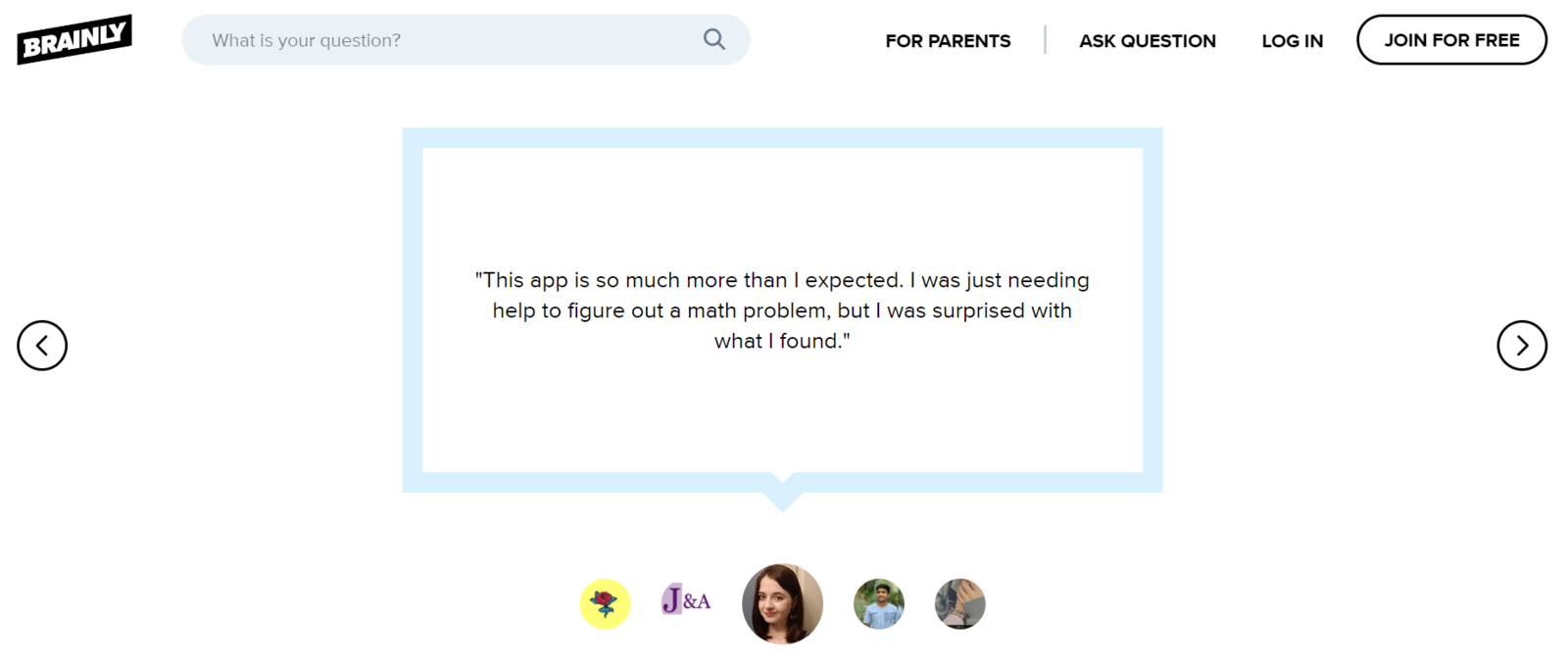 Resize customer photos to make your landing page look tidier
Real photos make testimonials appear more legit and trustworthy, so never omit them just because they look a bit out of place — now you know how to fix it.
Treat your icons as landing page images too
Look for rare icons or order custom sets whenever you want to create a truly outstanding landing page. Generic icons immediately give any page a bit formal if not generic look, so it’s not the best choice. Take a closer look at the online compression tool page we’ve mentioned earlier:
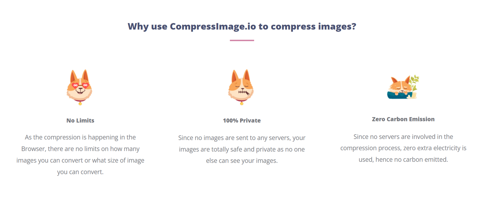 Use unique icons to make your landing page stand out
This page has one distinct character, a cheerful red-haired dog, so no wonder they’ve included it into their icon set. These icons are attention-grabbing, informative, and fun to look at. Moreover, drawing them from scratch won’t take a lot of time or money, so it’s certainly a good practice to follow.
Design for mobile but keep large screens in mind
One size doesn’t fit all when it comes to landing page images. You need to optimize them and double-check everything to make sure your users will always see your page the way you intended it:
- Combine scaling and cropping to preserve more visual information.
- Choose images that could be trimmed without losing their impact.
- Replace images if they don’t look good on some devices.
- Check how the overlay text legibility changes when you switch to a smaller screen.
- Remove some images if they cause excessive scrolling.
You need to test your landing pages on mobile devices and large screens before they go live to make sure the visual elements retain their proportions, meaning, and effectiveness.
5 more examples of informative and eye-capturing landing page images
Hopefully, you have already developed a clearer vision of how to create more informative landing page background images and illustrations. If not, here are more examples to get inspired from.
Haandus
A beautiful example of a collage acting as a hero shot and featuring both a brand advocate and a product photo. Two images are aesthetically aligned and convey just enough information to wake up the page visitor’s curiosity and invite them to click the CTA button.
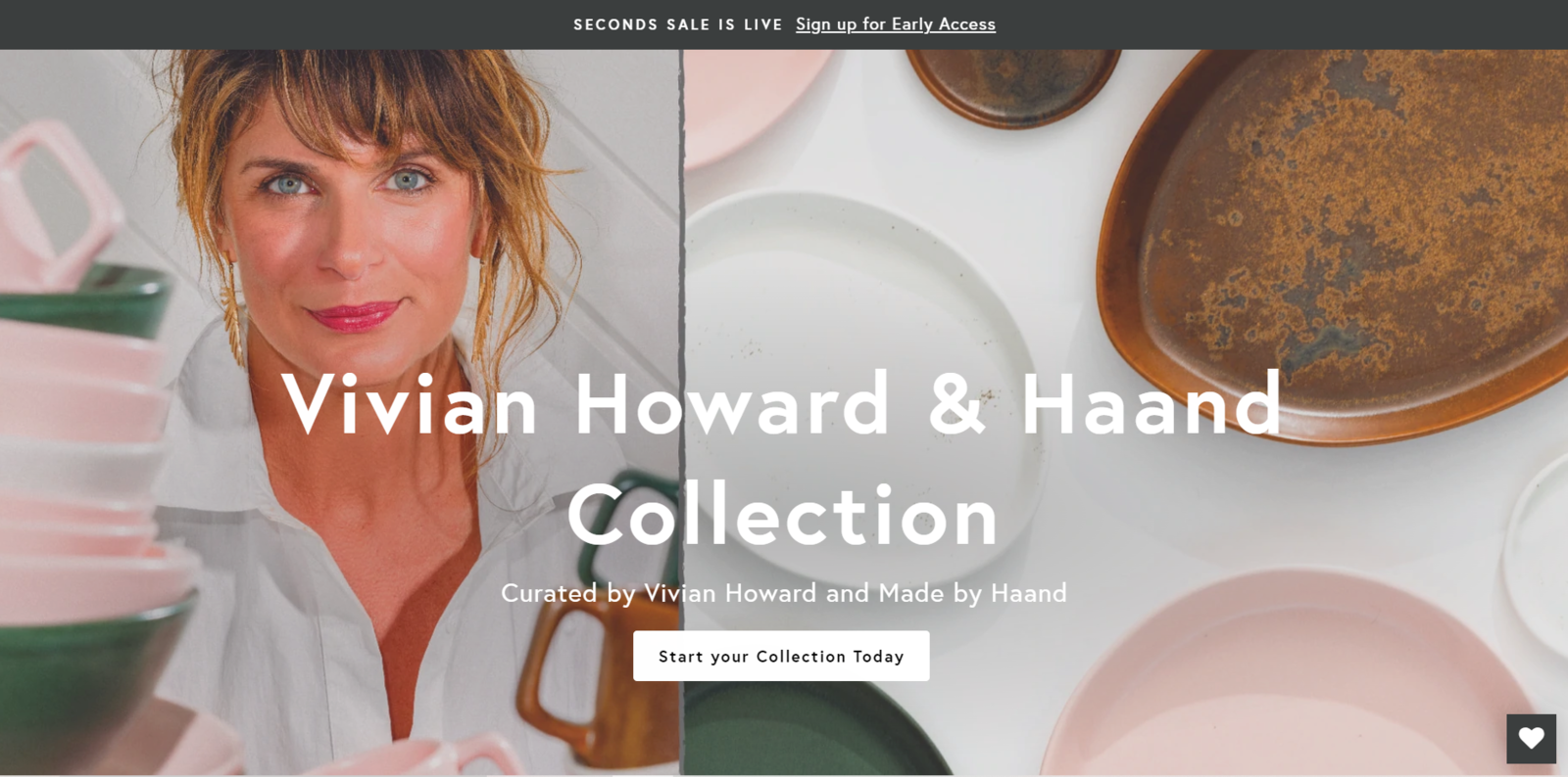 Simple collages can also work as background images
The headline’s placement is just right — the text remains legible even though the background image includes white elements.
Nooma
Another great way to pack a lot of information into a single image is to turn it into an intuitive visual scheme. Nooma, for example, lists its ingredients and explains how these innovative hydration drinks work.
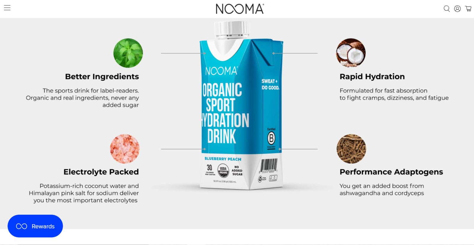 Turn boring product descriptions into simple and exciting visuals
Product descriptions will become much more digestible if you break them down into visual bullet points or short fact-based statements.
Moxi Roller Skates
Another roller-skating-related landing page image example, and this time, it’s a collage that looks a lot like a typical teenager mood board. Every month, Moxi chooses one color and gives a discount on the products of that specific color. A mood board turns out to be a fantastic way to illustrate a special offer of a similar kind and showcase everything you have in stock.
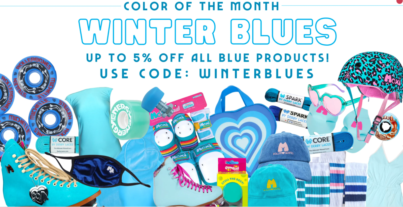 Demonstrate all of your products on a single mood board
You can create mood boards for any occasion — pumpkin season, Mother’s Day, Coachella, or, like in this example, based on one specific characteristic.
DARE.SEE
This Belgium-based branding agency uses bold, pop-art-style landing page images to drive attention to its unique selling point. It also makes the agency name stand out more, which is extremely helpful when you’re working in the creative industry.
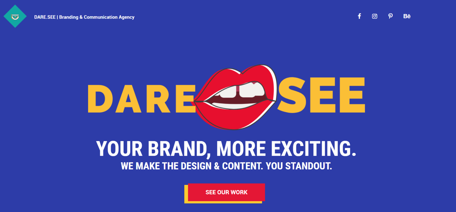 Use illustrations and typography to drive attention to your CTAs
The illustration also draws attention to the CTA button, which has exactly the same color and leads to the portfolio projects.
The Harley Street Dermatology Clinic
Finally, let’s take a look at this very subtle example of a realistic yet appealing landing page image for a top dermatology clinic in London. The clinic most likely has quite an affluent target audience but doesn’t use any stock images depicting people with unrealistic poreless skin and blinding white smiles.
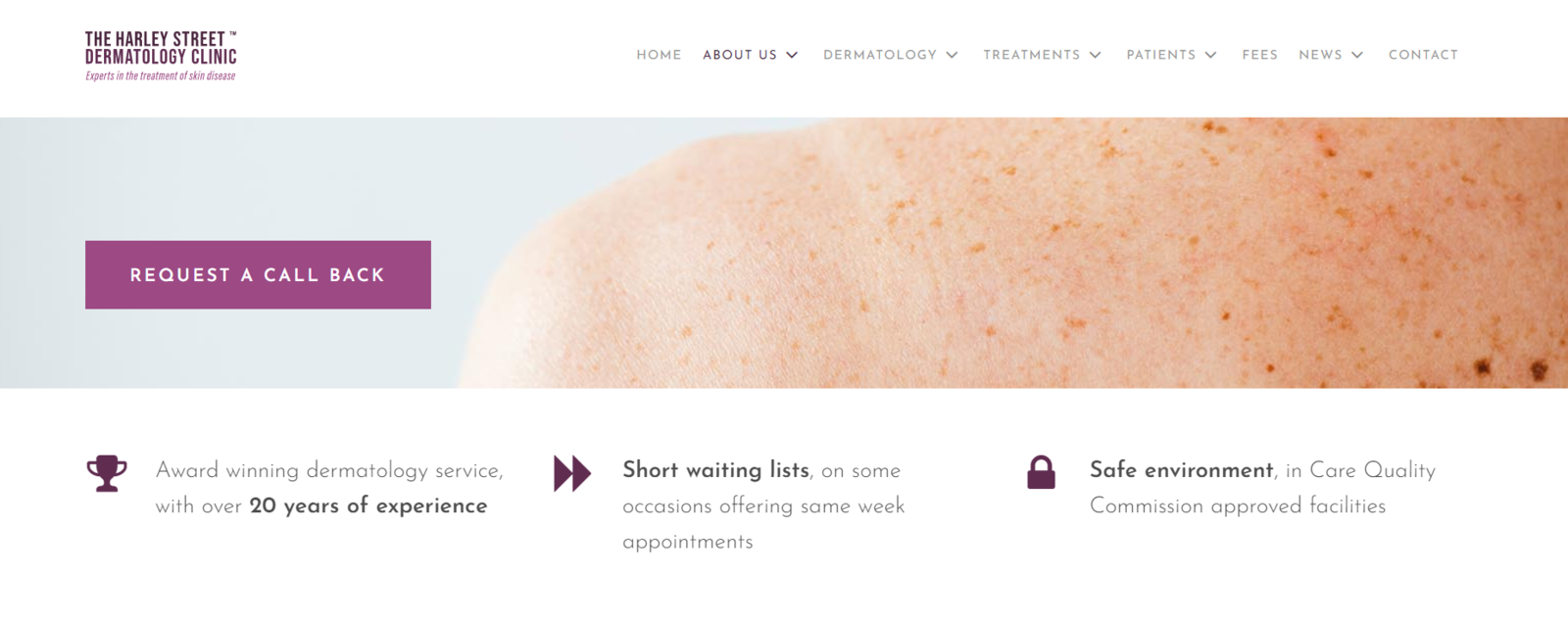 Choosing realistic images for your page will make it look more professional
They gently show normal skin conditions without giving them any additional context. In this case, it’s easier for their target audience to relate to these realistic images and develop trust towards the clinic’s professionals. The website’s tone of voice adds the necessary dose of empathy and makes its visitors feel understood but not excluded or objectified.
If you don’t have one, get one
Create converting and good-looking landing pages in minutes using our code-free landing page builder. We offer customizable templates, an intuitive interface, and many other marketing tools you will love. You can track your page’s activity, capture leads, accept payments, and more — be sure to check it out!