Your landing page headline is your opening line, the first thing you say to your visitors. A witty headline entices users to stay and scroll down — while a misleading one could make them lose their initial interest and leave. But you can’t always predict what will hook your audience. Or can you?
After reading this post, you will know how to develop a perfect headline formula that motivates users to pay attention. We’ll also uncover some common mistakes you need to be aware of before you write your next headline. In addition, we’ll discuss the best practices and provide you with a generous collection of smart headline examples. Buckle up!
Why is your landing page headline so important?
Every page has its own hierarchy, and a headline usually finds itself at the top. It’s one of the main focal points, and your visitors’ attention flows directly to it. Make your headline strong, and you will give them an additional boost and the desire to read on. Make it weak, and you’ll dampen their enthusiasm.
A strong headline brings other page elements together and allows you to tell a clear story.
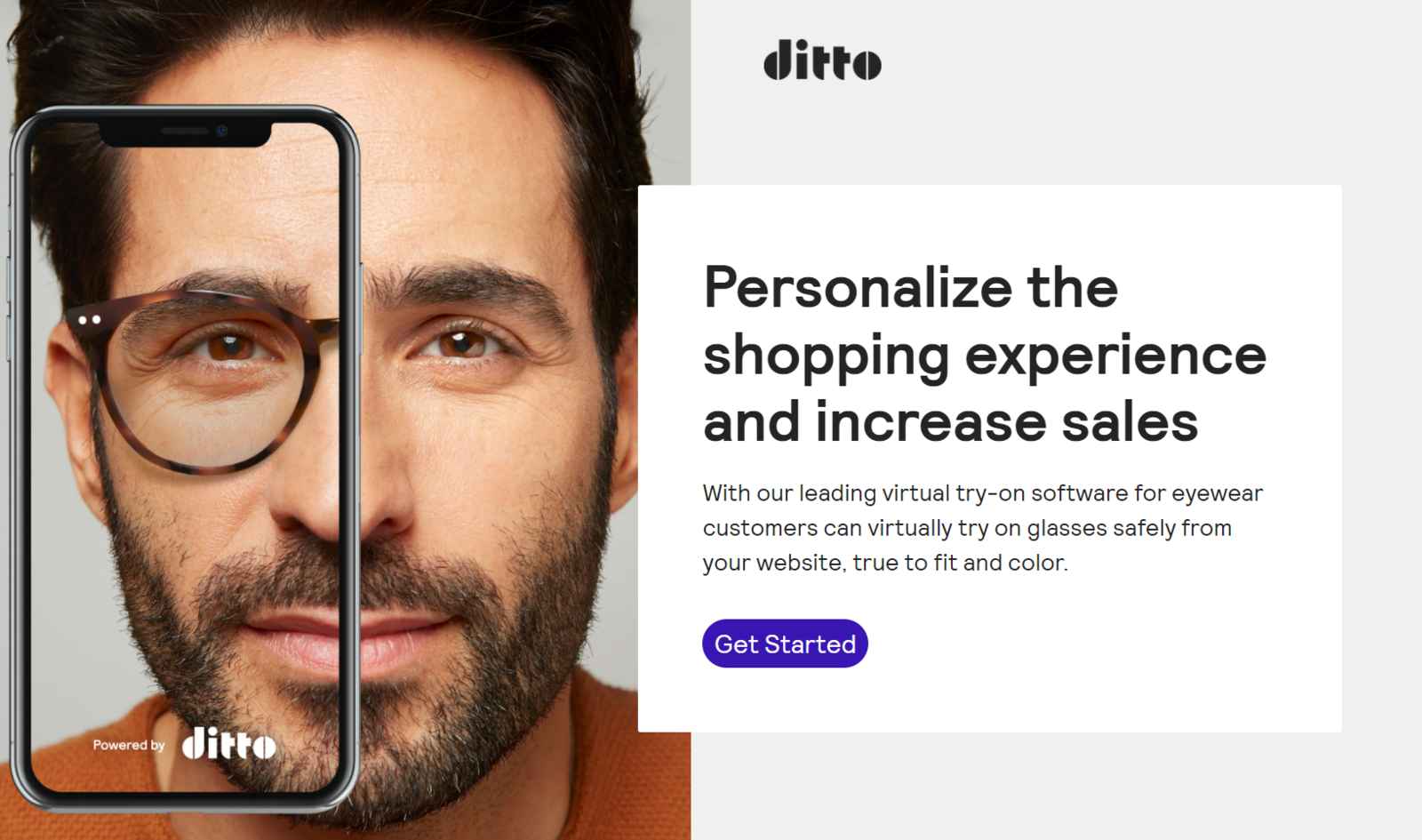 Effective headlines can make your users pay attention
You need to put effort into writing your headlines, especially if you sell top-shelf products or premium services. Here’s why.
A good landing page headline:
- instantly grabs users’ attention;
- sparks their curiosity;
- helps your on-page SEO;
- presents your offer in an instant;
- makes your content more memorable;
- leaves an imprint on your visitors’ minds.
The most beautiful thing about great headlines is that they don’t cost you a cent. However, you need to invest some time and test different versions before choosing one.
Common mistakes when writing website headlines
Let’s talk about bad practices many website owners unintentionally adopt and their potential repercussions. Here are a few things you shouldn’t do if you want your landing page headline to be effective:
- Treating it as a book title. Use fewer descriptive words and nouns — arm your headline with strong action verbs instead.
- Choosing vague language. If you offer divorce counseling services, it’s not the best idea to open with “Not all relationships are meant to last.” Use empathic but clear language to sound caring and professional.
- Using cliches. “Your number one choice for X” and similar phrases are overused and have lost their power. Instead of standing out, your offer will blend into the crowd.
- Not empathizing with users. Use customer-centric language to express your understanding of their pain points.
- Making the headline too short or way too long. It’s way harder to convey your desired meaning with just one word than with a concise phrase. On the other hand, a long, rambling title might appear cheap and unprofessional.
- Overusing keywords or forgetting about SEO completely. Your headline shouldn’t sound robotic, but it should include some keywords; otherwise, your page won’t make it to the top of search results.
- Turning to clickbait. You need to attract attention while staying honest. If you promise something your offer doesn’t really provide, you are setting your users up for a big disappointment.
- Diving into sensationalism. “The ONLY Product That Can Change Your Life FOREVER” is a misleading headline simply because everyone’s life and needs are different. Try not to make your offer sound ten times more exciting than it’s actually is 一 it’s better to leave some room for surprise.
Many great brands, for some reason, still cling to ultra-short and non-informative headlines, like this one.
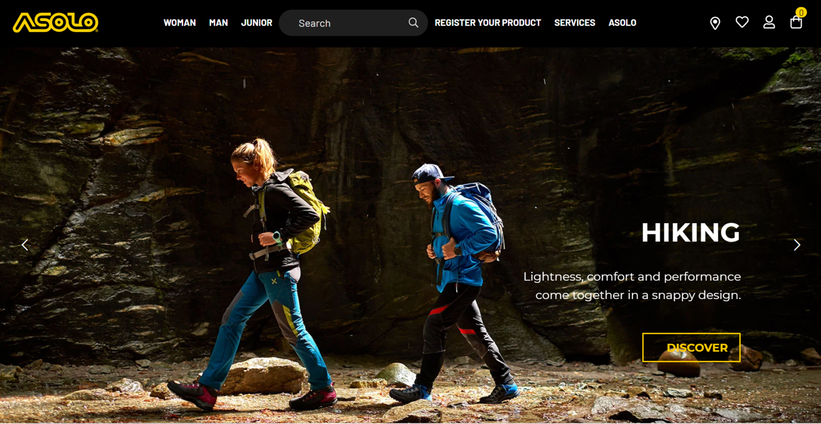 Ultra-short headlines are less likely to hook your website visitors
In our opinion, this is not the most suitable headline for a commercial page. If you are a first-time visitor, you won’t be able to guess what kind of product is being offered here (spoiler alert: it’s hiking shoes). It might as well be a landing page promoting backpacks, raincoats, or hiking pants.
Don’t make the same mistake 一 in most cases, a commercial headline needs to be more informative.
Landing page headline formulas and how to find yours
There is no single recipe, but you can easily build your own by considering the following “ingredients” and mixing them together:
- Your headline should match your ads and other related content assets. Otherwise, your visitors will think they’ve landed on your page by mistake.
- You need to recognize your target audience’s pain points and offer a remedy. This can be done in a straightforward manner, for instance, “Make your boring commutes productive with X,” or a more subtle version like “We all hate long commutes. Let’s change that.”
- Consider SEO but don’t overdo it. As mentioned above, keywords are still a thing, and there is no reason to omit them. However, use them in the most natural context, the way they would normally be used in human speech.
- Make sure your headline is punchy and witty. This doesn’t mean you always need to use puns, but injecting some personality and humor won’t hurt. Treat landing page headlines as your supportive taglines: they should be sharp, memorable, and to the point.
- Go for a surprise or wow-effect. Many great website headlines are bold statements on their own, and they are effective because they manage to amaze or excite the user.
- Make it personal. Use “you” or “we” language to create a sense of belonging and deep understanding. When you follow this practice, you speak to your audience at the same eye level.
- Start with a question. You can use questions instead of statements 一 they will make your audience mentally interact with your content without even realizing it.
- Use supporting copy to strengthen your headline. Your supporting text is just as important: it can provide necessary context or details to make your statement more powerful and factual.
We’ll show you 10+ headline examples illustrating these recommendations in a bit, but first, let’s think about the ways you can present your landing page title.
Design tips for creating a killer landing page headline
Some design decisions can easily ruin the overall impression your page creates, while others can magically improve it. We recommend giving some thought to how your website headlines are displayed.
Legibility comes first. Always use high-quality contrasting typefaces that remain legible on any screen size. Save excessive flourishes for other types of content 一 your main headlines need to be skimmable.
Finding it impossible to choose one headline? No problem. Use an animated headline with interchangeable words that replace one another through CSS transitions: they’ll help you demonstrate how versatile your product or service is.
Animated headlines help you demonstrate how many problems your offer solves
Play around with typography to emphasize your headline visually, and give mundane expressions a new spin. Capitalizing every word or using all caps isn’t a crime either 一 it can only help you make your title even more attention-grabbing.
You can also use background videos to create the ultimate immersive experience.
Video backgrounds deepen the first impression your page creates
In this example, you see a website for a nonprofit organization, whose mission is to build sports clubs in refugee camps, create sustainable sportswear, and drive positive change. Dynamic videos make its headline even bolder and more inspiring so that the page stays in your users’ memory.
10+ landing page headline examples
Let’s jump into some exceptional real-life examples of headlines that tick all the boxes.
PlanToys
This toy producer’s website has a beautiful and inspiring headline that perfectly represents what the company is all about. PlanToys creates eco-friendly toys that enhance both the physical and cognitive development of children.
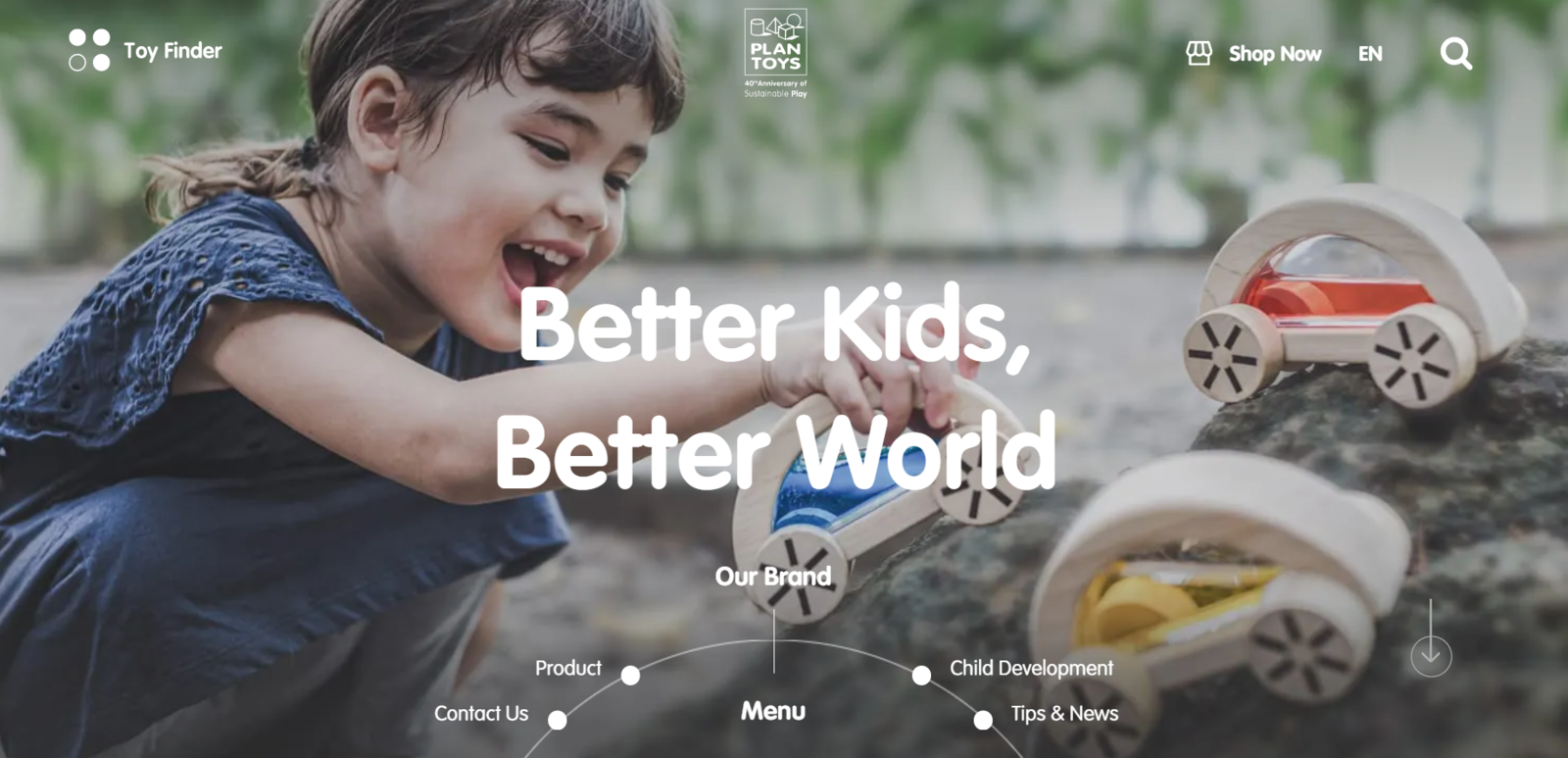 This headline emphasizes the company’s focus on sustainability
Yes, the headline doesn’t say anything about toys, but the picture in the background does. It’s enough to call this headline not only memorable but also informative. The company does support green business standards and, therefore, has a right to mention their positive impact on their landing page.
AXA Insurance
Here’s a textbook example of empathizing with the consumer and offering a relevant solution at the same time. This website headline acknowledges that filling claims is something that no one enjoys, and the supporting copy explains how to minimize time spent on it.
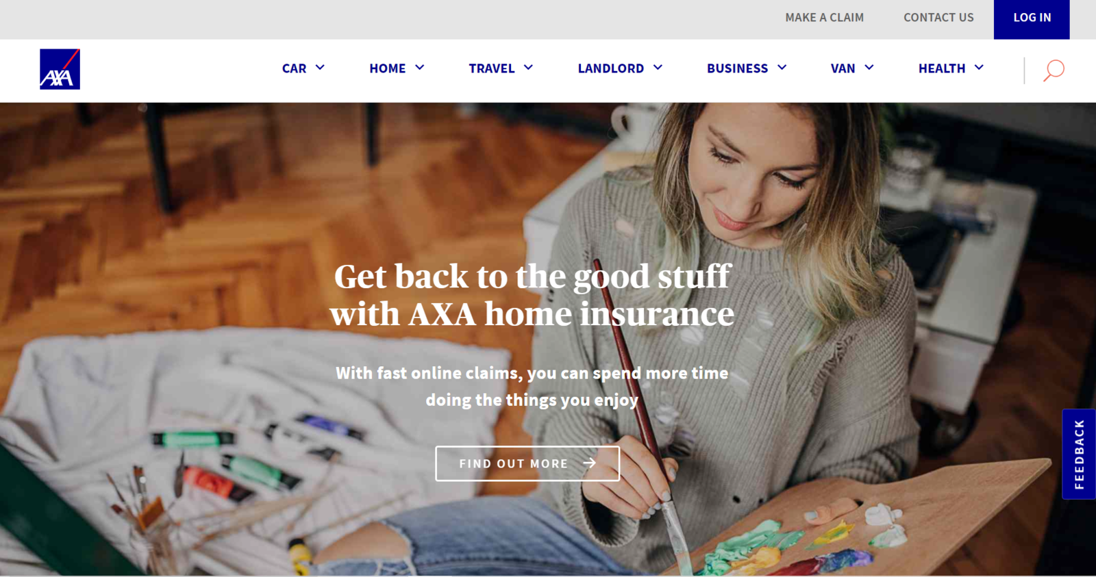 An informal and friendly headline that empathizes with the user
The background photo strengthens the statement by showing a woman immersed in an activity she truly enjoys. This example is outstanding partly because of the complex nature of the offer behind it 一 the creators of this landing page managed to drop the legalese and make the topic of home insurance more approachable.
StackAdapt
This native advertising automation platform follows another best practice we’ve described 一 they create intrigue by promising to show how agencies thrive using their solution. Such a headline, in turn, creates the right context and makes the offer more tangible.
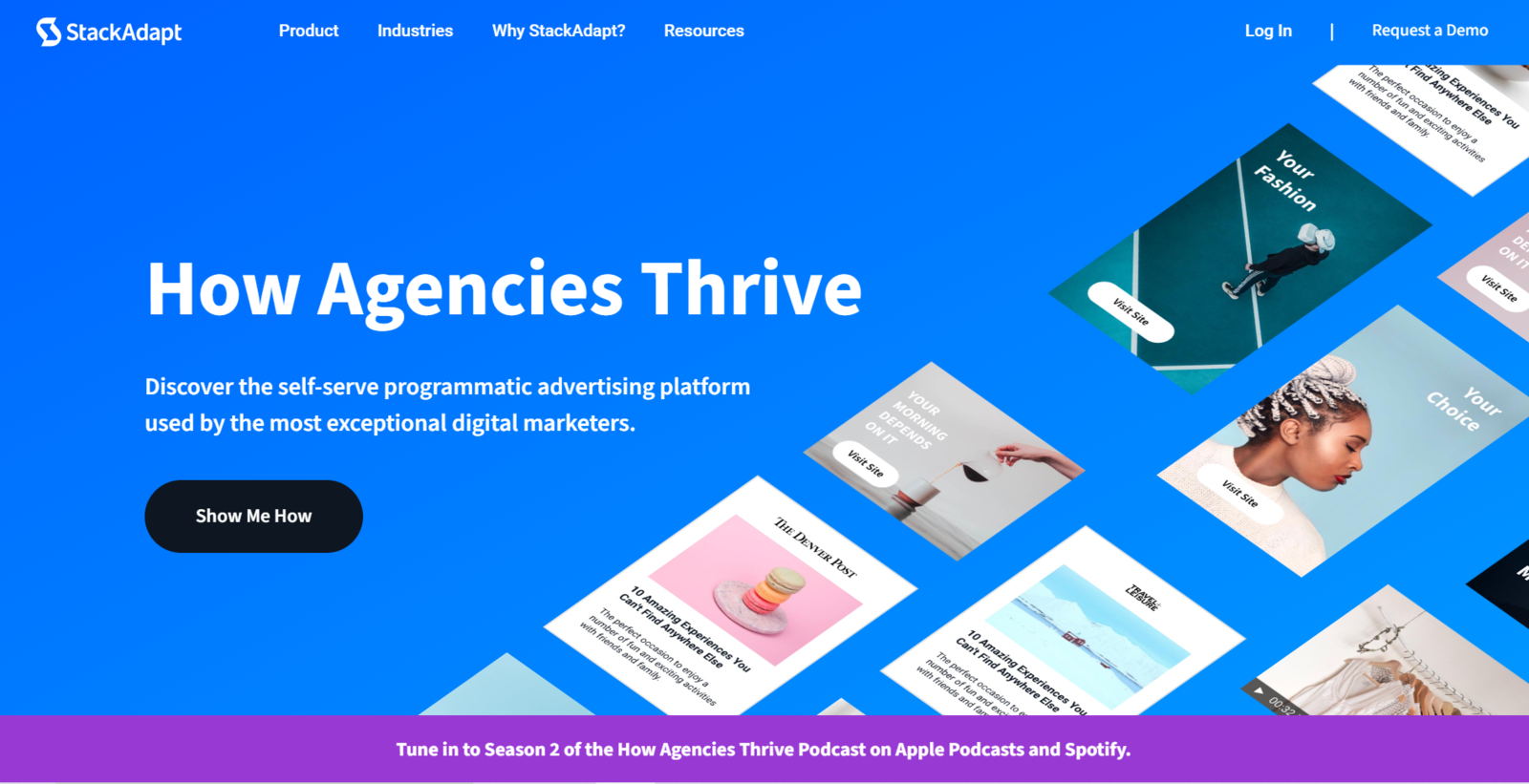 Concise and intriguing headlines always capture users’ attention
Even the CTA button works in unison with the headline. The supporting copy is also informative but doesn’t reveal too much to keep the user motivated and make them scroll down.
Chilly’s
How about embracing minimalism? This reusable bottle producer does exactly that. Chilly’s landing page headline is as simple and functional as their bottle design.
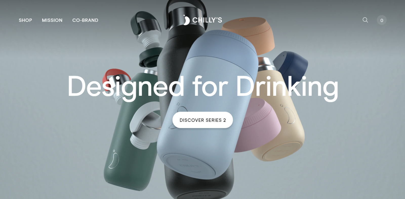 Chilly’s uses minimalistic yet strong website headlines
The prominent CTA button reinforces the message, while a stunning tech illustration demonstrates the utilitarian beauty of the product. Capitalization only emphasizes the statement and is by no means redundant here.
mySugr
This app proudly carries the tagline “Make diabetes suck less,” and helps people with this condition claim control over their lives by tracking their necessary data, such as blood sugar levels.
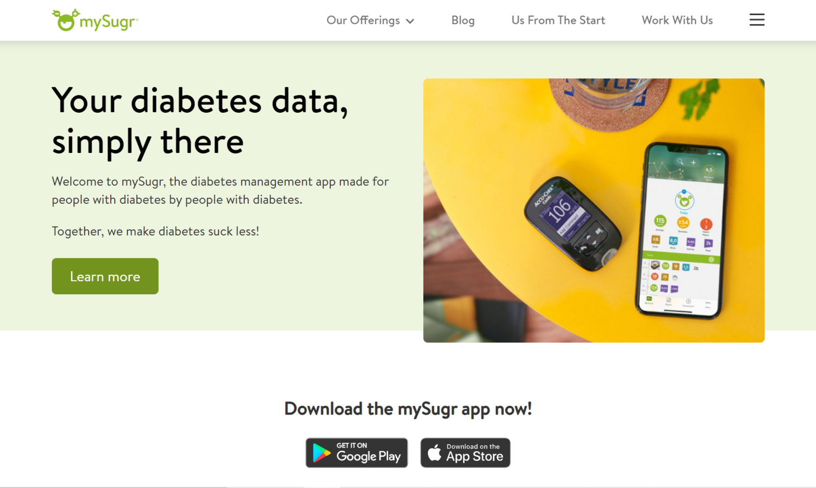 Another example of a friendly and to-the-point website headline
Their headline sums it up perfectly and makes the purpose of the app very clear, no guessing game here. A descriptive copy underneath explains exactly what it is and encourages users to learn more about this practically life-saving app.
Start Right
Start Right is a brand of protein-packed breakfasts made for people with a fit and active lifestyle. Their website also illustrates the right start with its punchy headline “Breakfast is solved.”
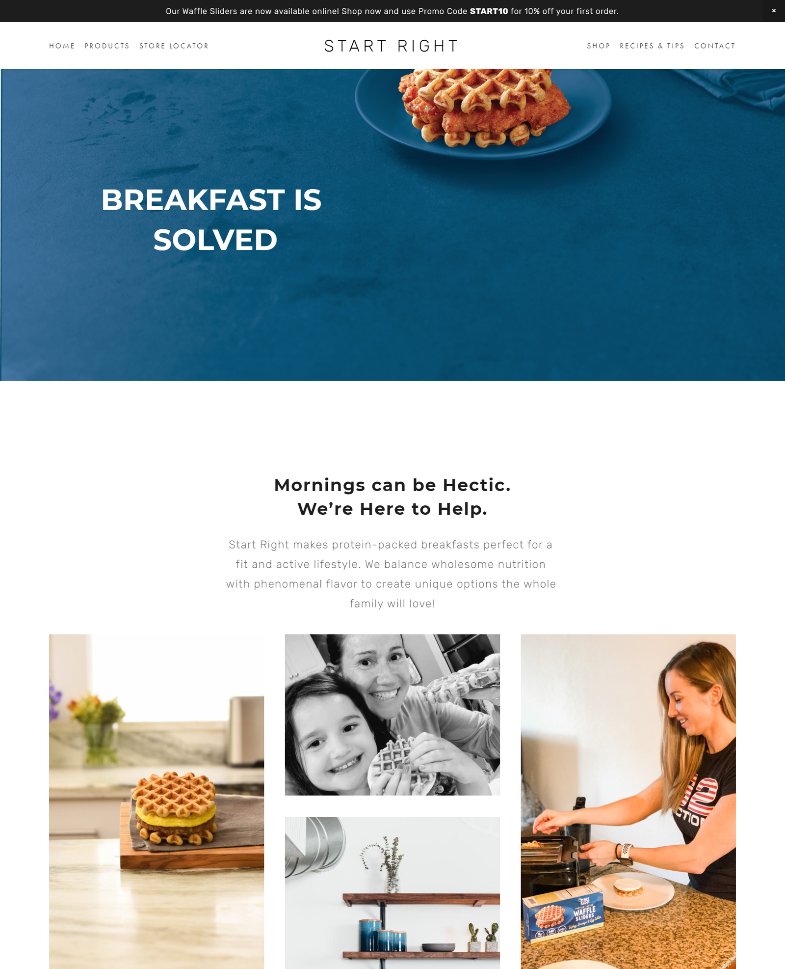 Witty headlines will always make your page stand out
They don’t go into details right away but rather keep their visitors intrigued and entice them to learn more about their smart breakfast options. The mouth-watering illustrations and concise descriptions solidify the overall positive impression from this landing page.
Dirk Lehmann
As you already know, questions can also function as headlines, and here is another prime example of that. This is a landing page belonging to a business consultant helping entrepreneurs, innovators, and movers and shakers bring their ideas to life and accelerate their business.
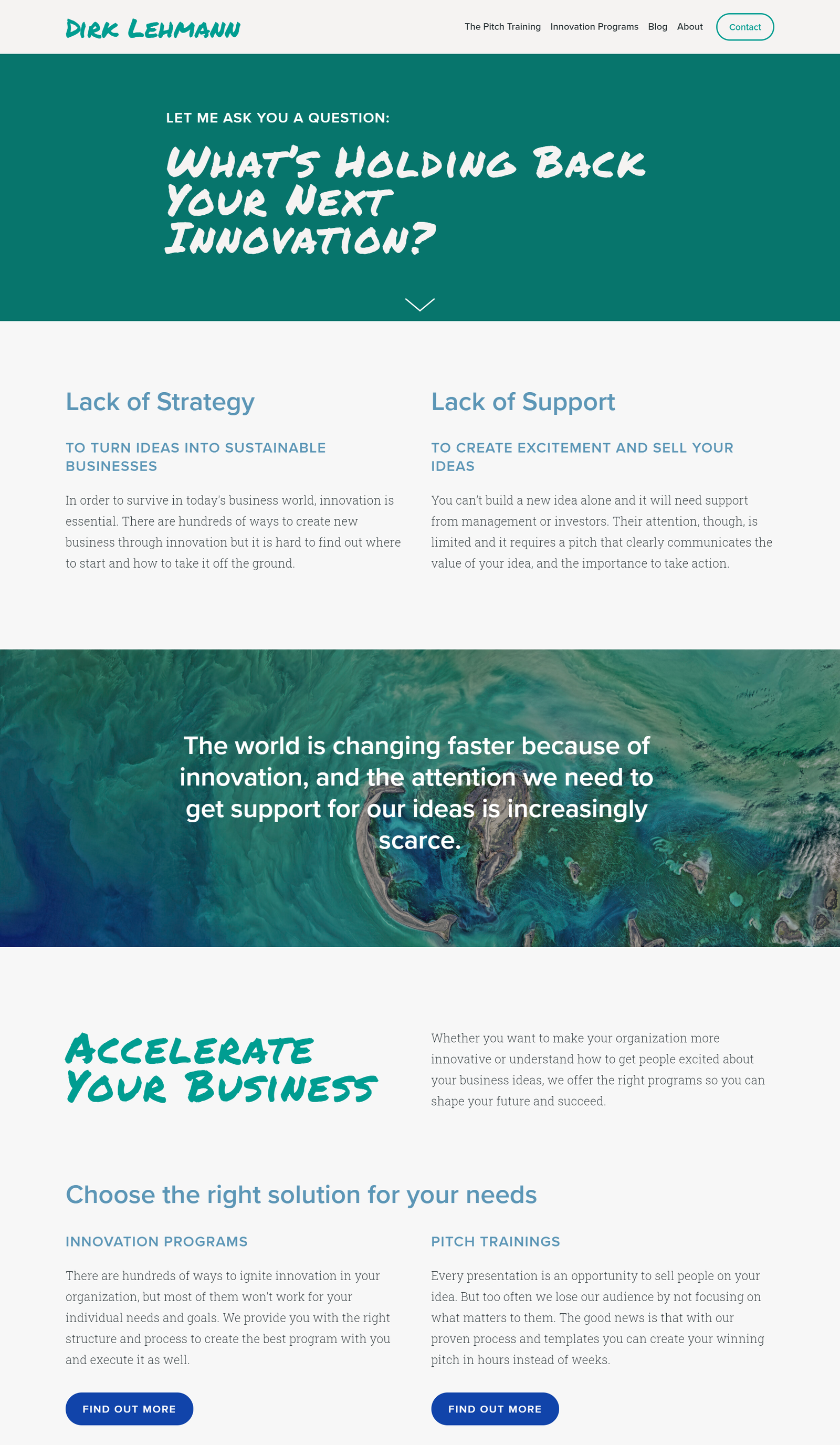 Conversational headlines can immediately engage users
This headline establishes immediate contact with the user and makes them reflect on their business development. The storytelling here is brilliantly crafted: the landing page first poses a question, then helps us find the right answers, and, finally, presents two possible solutions.
Tropicfeel
We’ve talked about how you can play with typography when designing your headlines, and here’s an excellent example of that. Bold letters add some intonation and make the user focus on the keyword.
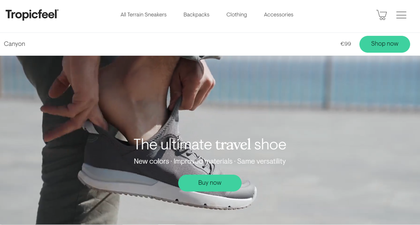 Deliver your offer in a few words with the help of typography tricks and images
This headline works well even though it doesn’t have any active verbs 一 the CTA button alone motivates the user to take action. The illustration also serves a purpose here. It’s one of the shoes from their new collection, and users can order it immediately by clicking on the “Shop now” above the headline.
Exod.AI
This headline example illustrates another foolproof approach. EXOD put their offer in a nutshell using their landing page headline and its supporting copy. This approach works wonders when you need to deliver a complex message without overwhelming or intimidating your audience. In similar cases, just cut to the chase and omit secondary details while focusing on the core of your offer.
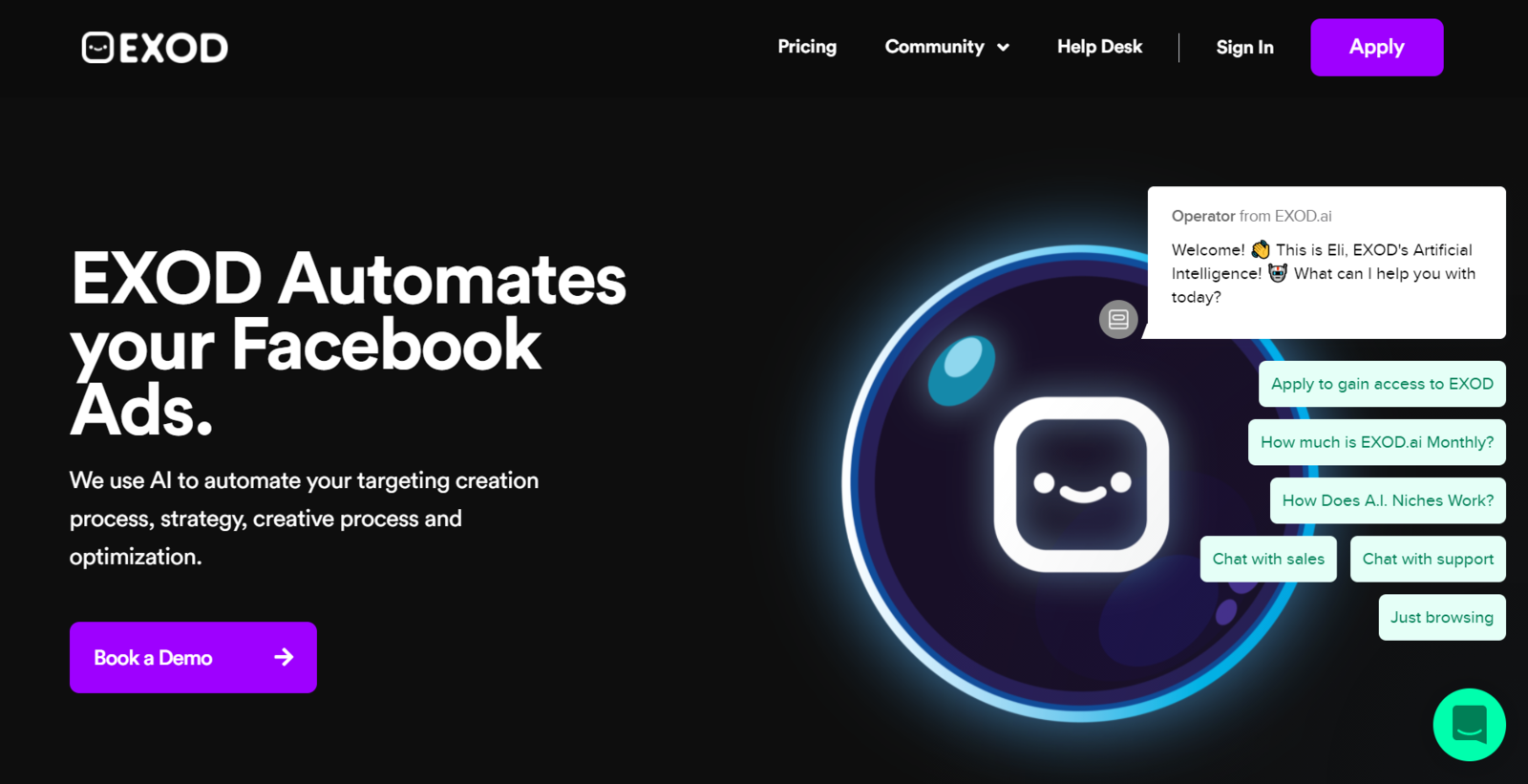 Use headlines to explain what your product does, not what it consists of
A period at the end makes the phrase even stronger. This website also uses “you” language and an intuitive chatbot helping users extract maximum information and value in a short time.
Tammy Lally
This website belongs to the renowned speaker, author, and money coach, Tammy Lally, and features one of her quotes as a headline. “I believe money is not your worth” is also a motivational phrase since it points out that money doesn’t define her clients’ worth and that they just need to regain control over their finances.
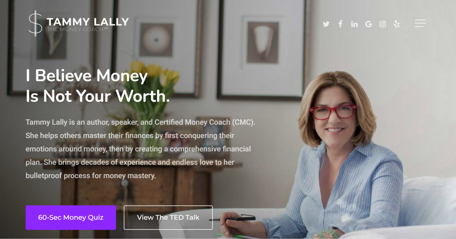 Motivational and emotional quotes can sometimes work well as headlines
If you sell services, one-on-one consultations, or coaching sessions, you may benefit from adopting the same approach. Add a personal touch to every piece of content your website features and abstain from generic phrases and third-person narration.
WhaleStream
Here’s another great example of a complex offer explained simply with the help of a single headline. WhaleStream is an algorithm-based options flow platform that allows users to focus on big money whale trades as they happen.
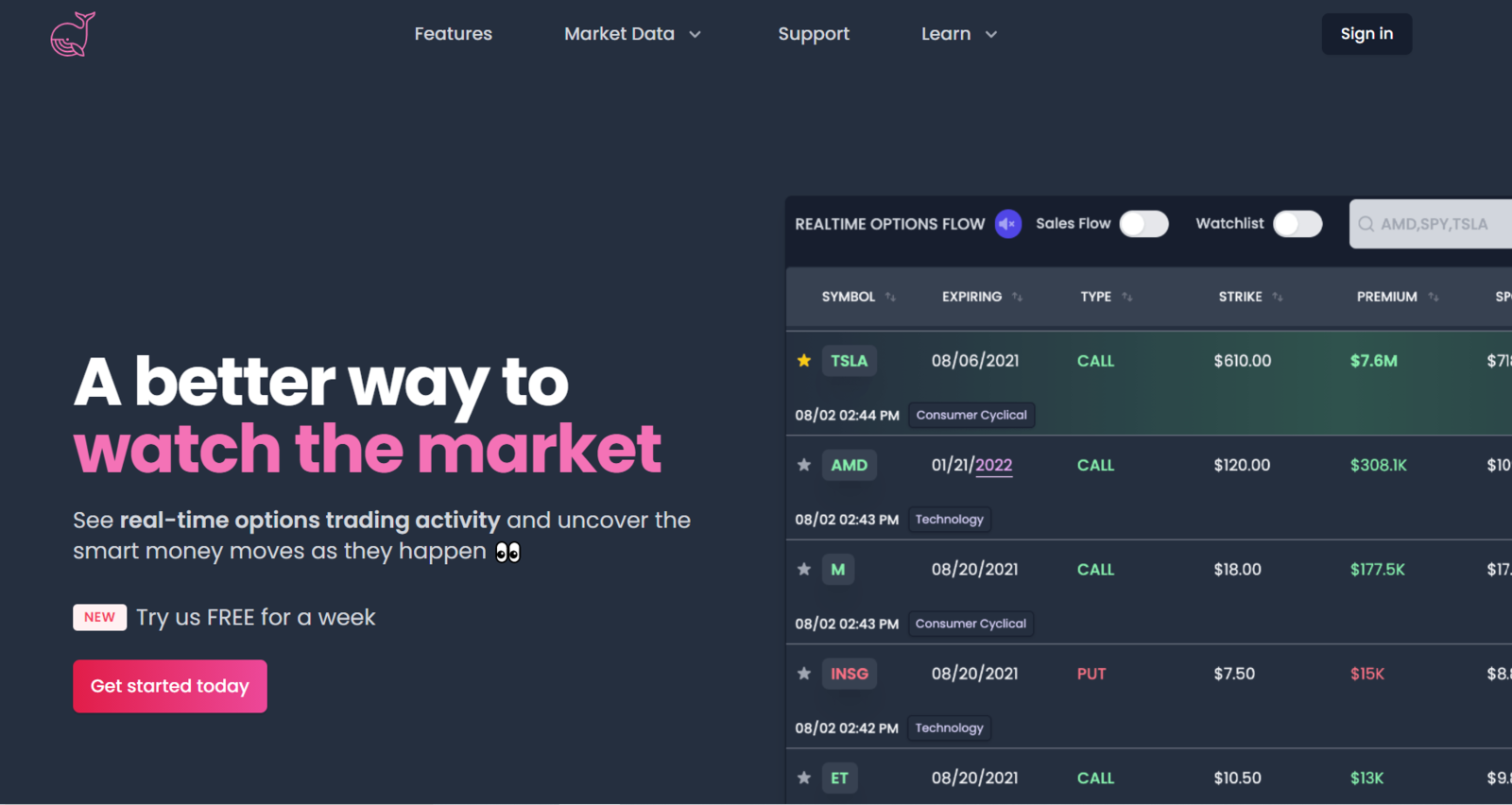 Use customer-centric language to bring your product closer to the end consumer
The supportive copy in this example includes an emoji, which makes the whole page sound friendlier. It’s also very user-centric: instead of talking about how great their product is, it’s focusing on the value this product brings.
Create your own landing page in no time
We believe that you now know everything about how to create a perfect landing page headline for your product or service. Putting that knowledge into practice is easier than it sounds. Why dream about making a perfect landing page when you can start working on it right now?
Try our landing page builder and build an effective landing page in just 15 minutes! Our code-free builder allows you to fully control your page layout and make changes in real-time. You can also use a subscription widget to let your page visitors initiate contact on the channel they prefer and add payment buttons for instant purchasing experiences.
Creating a landing page has never been easier 一 give it a try!