Calls to action (CTAs) in marketing serve two main purposes: they guide users through your website or email and motivate them to complete the desired action. Read this article to discover some website and email call to action examples from various brands all over the world and find out valuable tricks on how to improve your call to action design and copy.
What is a call to action?
A call to action, or a CTA, is a motivating or propulsive word, sentence, or phrase in an advertisement such as “buy,” “order now,” “register,” and others. It encourages users to complete an action right here right now, often presupposing benefit they will get as a result.
Usually, CTAs look like buttons or hyperlinks. Here’s an example of an email call to action from The Sill — a prominent green button with a clear message.
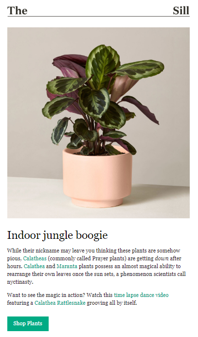 Email call to action example from The Sill
Email senders often place calls to action inside of a hyperlinked text. For instance, Modsy used a hyperlink and colored it orange to draw users’ attention.
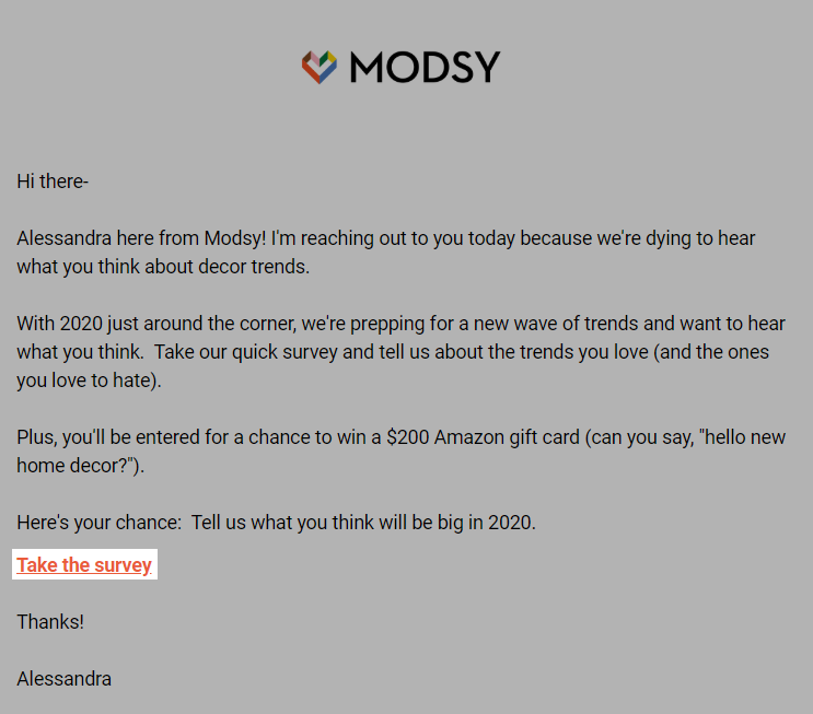 A hyperlink CTA in the email from Modsy
Call to action copy tips and tricks
As was mentioned above, calls to action are made to motivate people to complete some sort of action. Let’s see what copywriting techniques will make your CTAs effective enough to influence email and website users.
Use strong imperative verbs and clear language
When choosing the verb for your call to action copy, focus on the desired action — buy, call, request, and so on. The verbs you use should provide direction and guidance to your users.
Be as clear and concise as possible to avoid confusion. People should be able to understand and imagine what exactly will happen after they click your CTA. Avoid situations when users click “Sign up” and face an infinite number of fields to fill in. In this case, it’s better to be straightforward and use the “Fill in the form” text instead of the “Sign up.”
Here are some examples of crystal clear call to action copy:
- “Download for Windows,”
- “Try for 30 days for free,”
- “Sign up in one click,”
- “Register for a meeting in Moscow,”
- “Fill in the Google form,”
- “Buy the eBook.”
See how BlogLovin uses the call to action copy on their website. Their “Find blogs to follow” CTA sounds clear enough to let even a new website visitor understand what to expect after they click.
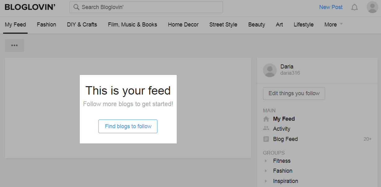 Call to action example from the Bloglovin’ website
Focus on the value
If you ask users to take the action which will require some effort, it’s important to demonstrate what value this action will bring to them For example, if you want to gather data about your audience for segmentation and ask to fill in the form, a user can’t see or experience the value of it right away. So, you’d better explain why it’s important and say something like, “Please take a moment to answer these questions to improve your customer experience and make it more personalized.”
Here are some examples of call to actions packed with value:
- “Sign up for our emails to be the first to know about our offers!”
- “Sign up to see personal recommendations,”
- “Pay for the luggage to grab everything you will need during your trip!”
Rakuten, for example, ask users to refer a friend for extra cash and explain the mechanism in three simple steps. There’s a focus on the physical value behind completing that call to action.
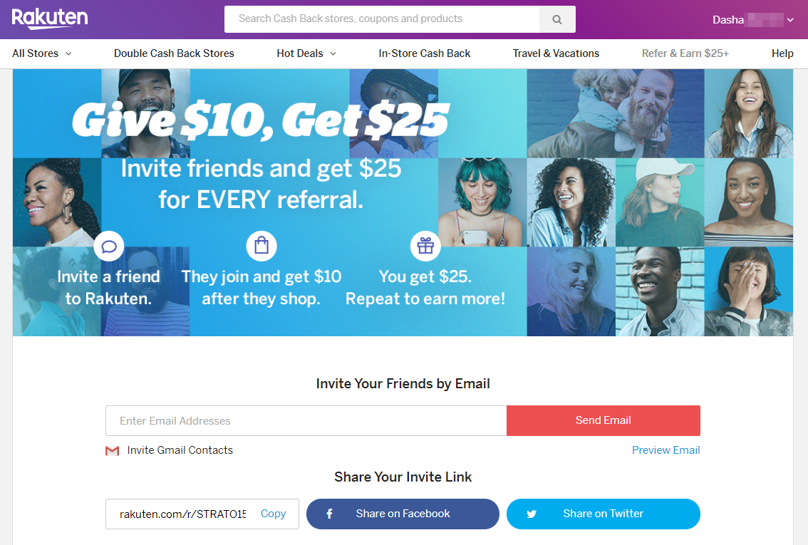 Call to action example from the Rakuten website
Make your CTA personal
To personalize your call to action, use segmentation results based on user data you’ve collected. It can be product browsing history, data from your CRM system, or past orders.
Here are some personalized call to action examples:
- “Shop men” or “Shop women,”
- “Check out popular places in your location,”
- “Download for iOS/Android/Desktop,”
- “Add to Safari/Chrome.”
For instance, Armani Exchange segments subscribers by gender. Below you can see their CTA appealing to their male audience.
 Example of a call to action targeted to men audience
Another option is personalization by device. If, for instance, you go to Slack website from your computer, you will see the “Try for free” call to action in the middle of the screen.
 A bright call to action button on Slack website
However, when you open the same website on mobile, you will notice that the call to action copy changes to “Get Slack for iOS.” Why? Because these examples of call to action are personalized based on the device you use. See the screenshot below, which was made on an iPhone:
 Personalized call to action copy on a mobile version of the Slack website
Use first-person text
A first-person call to action copy sounds more personal and open. You don’t tell the user what they should do, but rather offer to agree with your offer.
Some examples for your inspiration:
- “Keep me posted,”
- “Tell me more,”
- “I want to see your best deals,”
- “Subscribe me to your list.”
Noun Gazette, for example, use action verbs combined with first-person pronoun to create a friendly vibe in their email, which a user, most likely, will find endearing.
 Email with first-person CTAs from Noun Gazette
Unbounce also decided that the best call to action buttons on their website should have a first-person text, and not for nothing. The company has held a test and seen 90% increase in click-through rates after changing a standard text to a first-person one.
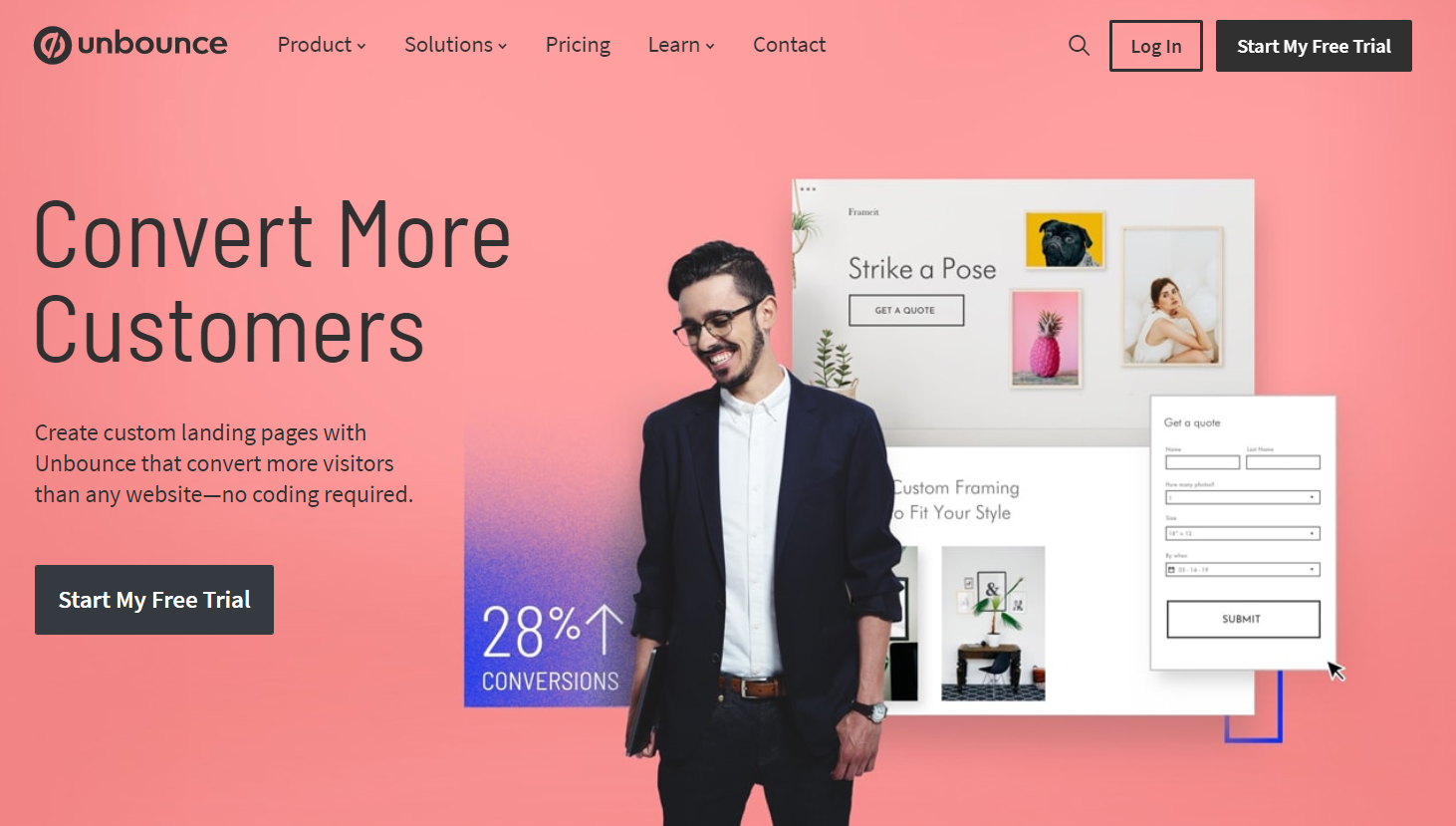 First-person call to action example from the Unbounce website
Call to action design tips
First, we see and only then we read. Design can either strengthen your CTA or make it invisible among other website or email elements. Let’s see how to get the most out of your design choice and make your calls to action convert better.
Make sure your CTA is responsive
81% of people open emails on mobile devices. So, we recommend you check and double-check to make sure your CTA scales well on all screen sizes.
Let’s see how some call to action examples from Shine look like on desktop and mobile. The desktop version offers a large black CTA at the center of the screen.
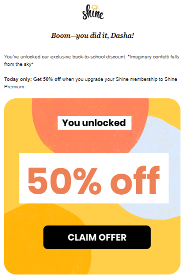 Desktop version of an email from Shine
In a mobile version, the text is squeezed into the width of a mobile screen to make it readable, the call to action button staying aligned to the center and being large enough for a user to push it with a fingertip.
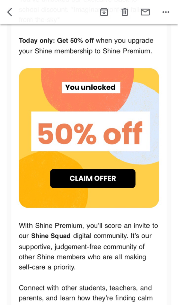 Mobile version of the email call to action from Shine
Talking about websites, StudioPress offer three call to actions on their main page. Here’s how it looks like on desktop:
 Call to action examples on the StudioPress website
When we go to the mobile version, the illustrations disappear as on mobile, the best call to action buttons location is one that makes them visible on the first scroll. This way, a user understands what to do to get what they need.
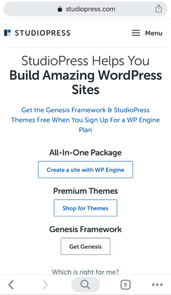 Call to action examples on the mobile version of the StudioPress website
Make your CTA stand out
This advice might sound obvious, but people tend to forget about it. To grab attention to your call to action, use bright colors or the ones which contrast with the surrounding images or text.
In the example below, TunnelBear use a contrasting CTA button with extra white space around it to create a visual break and make it even more prominent. So, even though the corporate colors do not let the brand make the CTA too bright, it is still eye-catching.
 Prominent CTA button in the TunnelBear email
Avoid using too many CTAs
It only takes seconds for a user to form their first impression about your website or email. Since you should pique the interest of your visitors or subscribers and get them to click your CTA button within this very short period, any other details should be kept out of the way.
When you use too many calls to action, you risk looking too pushy or simply confusing your audience. We recommend placing your main CTA on the first scroll. However, if your page or your email is too long, you can use a couple of similar CTA buttons at the beginning and at the end correspondingly.
The Teacher’s Guild, for example, placed their first CTA as the main focus on the first fold of their website and finished up by repeating the same CTA at the end of the page.
 Multiple calls to action on The Teacher’s Guild website
Notice that although both of these buttons lead to the same destination, the second call to action design is brighter than the first one.
Society6 used two CTAs at the very beginning of their email, but they separated the buttons with a divider in the middle, so you clearly understand that the call to actions lead to different destinations. So, use this trick as one of the email call to action best practices when you need to use a couple of CTA buttons and make sure the readers won’t get confused.
 Society6 using two CTAs in their email
Website call to action best practices
A website is a point of contact with your potential and existing customers, partners, and brand ambassadors. Here we’ll show you some examples of calls to action that different companies use on their websites for various purposes.
CTA used for lead generation
This type of CTA button is usually used on high traffic pages such as blogs. The call to action can be placed at the end of an article — as a floating window, in a sidebar, or as a single button. To bring conversions, it should grab people’s attention and communicate value.
The New York Times offer users to create an account on their website to keep reading their articles. The CTA is placed in the middle of the article, which will be fully visible after a user signs up.
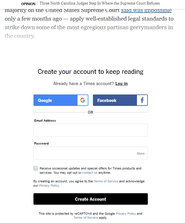 CTA button on The New York Times website
CTA used for building a mailing list
Such calls to action are used to receive contact details of your website visitors to keep in touch with them later.
Below you can see a pop-up email subscription form with a call to action button. You enter your email address, click the “Join” button, and you’re done — as simple as that.
 Call to action example from a subscription form on the Wix Blog
The “Share on Facebook” or “Follow us on Instagram” calls to action are made to motivate users to engage with your brand on social media. People who don’t want to share their contact details may gladly follow you on Instagram, for example. Then, you will be able to convert some of your followers and close sales.
Dermstore, for example, allow sharing their blog publications clicking simple social media icons that internet users are already used to.
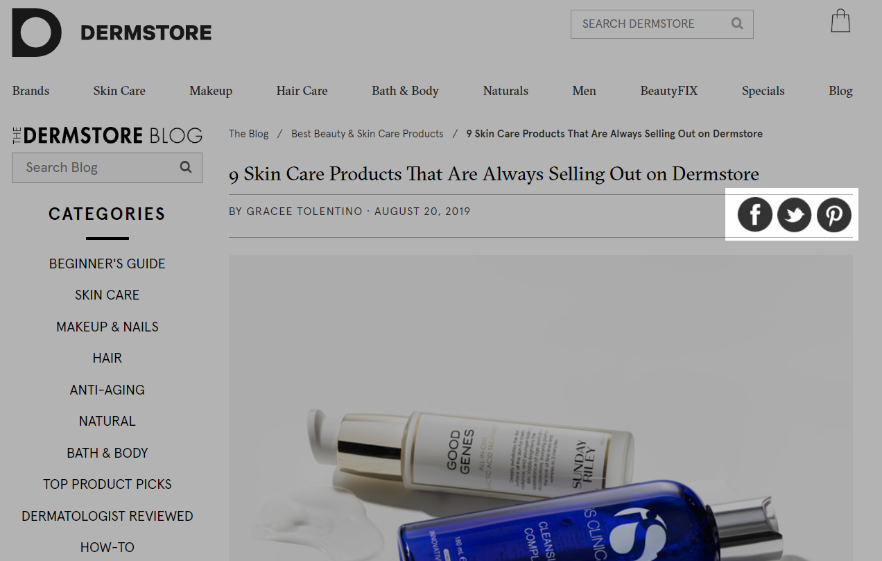 Social sharing buttons on Dermstore website
CTA used for making a sale
Imagine that some users already know about your products, follow you on social media, and read your emails. These warm contacts can become your customers if they see and follow your CTA. In this case, the CTA should be as clear as possible and focus on completing a purchase. Such buttons are usually placed on product landing pages, in wishlists, carts, or on promotional pages dedicated to a sale or some other deal.
For instance, ASOS use a bright green purchase-stimulating button on their product pages.
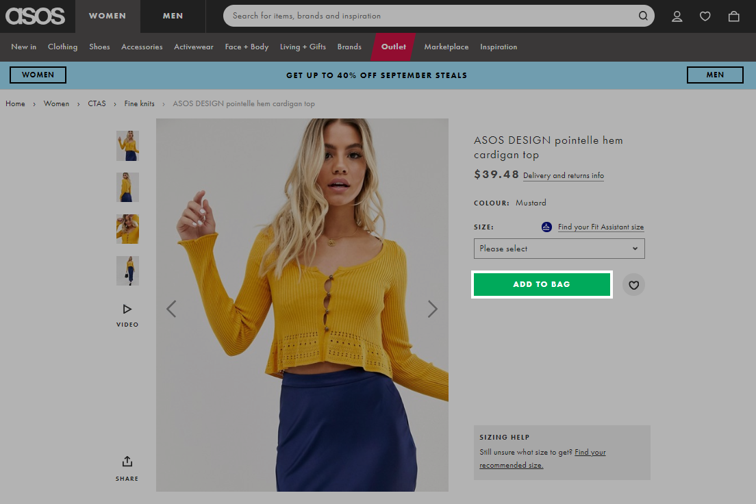 Call to action example from the ASOS website
Additionally, they give an opportunity to move an item to a bag right from the wishlist. Both of these buttons lead to the same result even though the call to action copy is different.
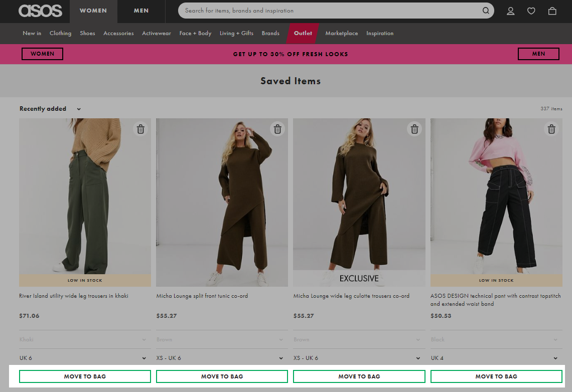 Call to action buttons in the ASOS wishlist
Email call to action best practices
People read emails from different devices and email clients. Your goal is to make sure that the CTA is visible and effective in any case. What are the secrets of converting email CTAs in particular? Just follow several good tips.
Make your CTA a logical extension of your email
When users scroll through their mailbox and read an email’s subject line, they form their expectations based on what they have read. The subject line, the body of the email, and the CTA itself should meet these expectations. This is how you guide a user through your email.
If you read the subject line of an email from Insight Timer, you understand that there’s going to be something that concerns your sleep habits. When you open an email, you see a call to action encouraging to listen to a course of Yoga Nidra, which is supposed to help you sleep better. The CTA matches the subject line well.
 Subject line and a matching call to action in the email from Insight Timer
People often scroll through emails on their mobile phones. It’s important to make sure that your CTAs are visible even when users want to save their mobile internet, and images in the mailbox are turned off by default.
So, it’s more reasonable to use a “Button” element in your email template builder:
Adding a button in SendPulse drag and drop editor
A call to action button instead of a text link is 28% more effective. Make sure you follow the fat-finger rule: place the CTA button front and center and maintain a minimum tappable area of 44×44 pixels.
Ace Hotel, for example, uses a button in their email call to action, at the same time adding hyperlinks inside the main copy only to refer to some additional resources.
 CTA button and hyperlinks in the email from Ace Hotel
Repeat the CTA at the beginning and at the end of a long email
Don’t make your subscribers search for a button; simply place it one or two more times inside your email if it’s long. For example, the email call to action in the event invitation from DMA is repeated with the same design, copy, and the size of the button.
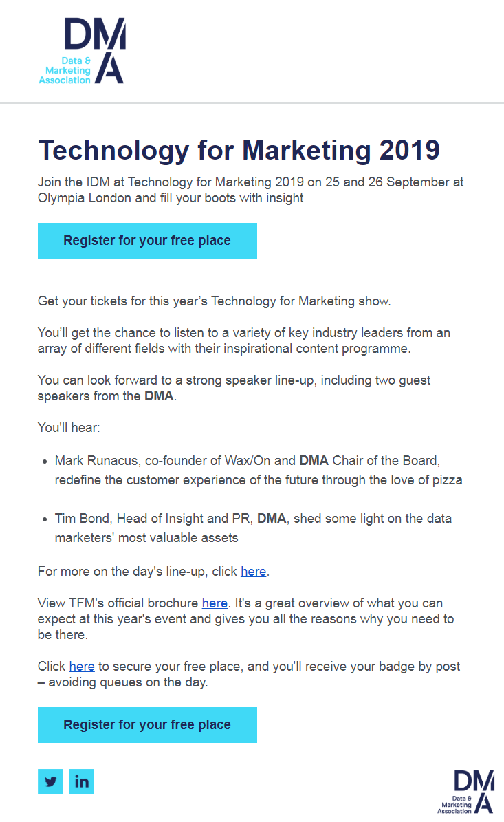 Long email from DMA with two call to action buttons
Don’t stop just yet: do A/B testing to increase the effectiveness of your CTAs
There’s no ultimate template that works best in all cases. That’s why you need to experiment and A/B test variations of your email: change the color of elements, rewrite the copy, try another placement or style.
For instance, if you can’t decide between red or orange for your email call to action, create two versions of the email with SendPulse and use the following principle to send them out:
- send option A with red buttons to 20% of the mailing list;
- send option B with orange buttons to the other 20% of the mailing list.
Check which option gets more clicks and send the most effective one to the rest of your subscribers. You can find out more information on how to carry out an A/B test in our Knowledge Base.
We hope these tips help you push your email marketing results to another level. Remember to send your emails with SendPulse — we will take care of automation!