These days, it’s not enough to simply publish your offer and wait for someone to notice it.
You need to be proactive and start the conversation with your audience first by providing them with value and gathering their email addresses to guide them into becoming paying customers.
You’ve probably heard that you need to incentivize your site visitors to give you their personal data. But how exactly can lead capture pages help you with that? And what is the difference between a regular landing page and a lead capture landing page? Enough guesswork. Let’s find the answer together!
What is a lead capture page?
A lead capture page is a page dedicated to a specific feature, product, item, or event. This is where you send your leads after they click on your ad. So, it’s a post-click landing page with a lead capture form for users to fill out and a CTA button. Some lead capture pages have both, and some have forms hidden behind their CTA buttons.
It’s not a homepage nor a product page. A lead capture page has a lot of information, but it’s not overwhelming. It also provides more value than a typical product page. So, you can’t use your homepage as a lead capture page because it has distracting elements such as navigation links — you need to create a standalone page instead.
For example, if you’re looking for a time-management tool — this is where you land after clicking on one of the relevant Google ads:
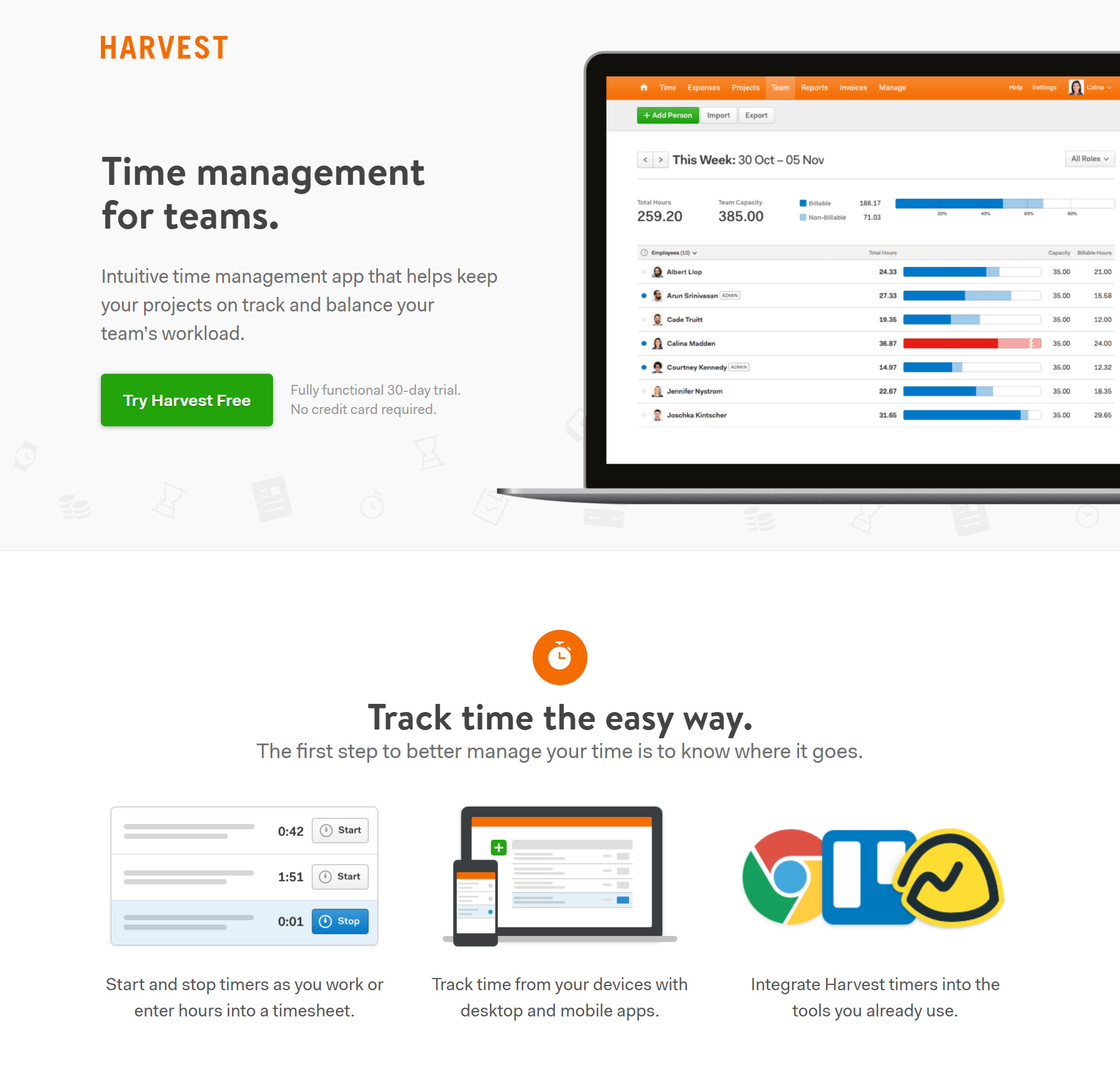 Lead capture pages always have lead capture forms and (or) CTA buttons above the fold
This lead capture landing page has only a CTA button, but you will see a lead capture form right after you click on the button. It’s an account creation landing page — you can try Harvest for free in exchange for your email address, name, and the name of your company.
This is an example of what we mentioned at the beginning. You need to motivate people to share their contact information with you, and the best way to do that is to give them something in exchange. It could be a free version of your software, a series of educational emails, an eBook, or any other lead magnet.
The information that you collect through a lead capture form helps you build a steady relationship with your leads. First, you need to establish contact. Then, you can educate your prospects, lead them through the stages of your marketing funnel, and, finally, convert them into devoted clients. No pain, only gain.
Why do you need a lead capture page?
Their personal email address is a subject that is very dear to every user’s heart. This comes as no surprise: no one is thrilled about sharing their contact information unless they see some value in doing so.
A quality lead capture landing page helps you remove that barrier and collect customers’ data with their consent. Moreover, you get more high-quality leads because people who share their contact info have already expressed an interest in your brand, even if they’re not ready to commit to anything yet.
With a lead capture page, your mailing list will grow organically, and you’ll always be a hit with your target audience by offering the benefits they’re after. And there is room for creativity and experimentation as well — you can test different designs and lead capture forms to see what works best for your audience.
Here is something else you need to know about the benefits of using lead capture pages:
- visitors develop more trust because you offer them something useful;
- users stay more focused on one specific offer you want to promote;
- visitors are less likely to leave your page by clicking on internal links;
- you can add testimonials to give your brand more human appeal;
- you’re free to choose between getting more leads or generating higher-quality leads by changing the length of your lead capture form.
What to include on your lead capture page
Before you start creating a lead capture landing page, you need to know what to include and what to leave out. There are at least seven basic elements you can use to capture more leads, but nothing is stopping you from using more. Use these lead capture page examples as a source of inspiration for your own page.
Headline
Create an unforgettable first impression by starting with a loud, eye-catching headline that encourages customers to scroll down and learn more about your product or service. Include your unique selling proposition in your headline and make it conversational.
Here is an example:
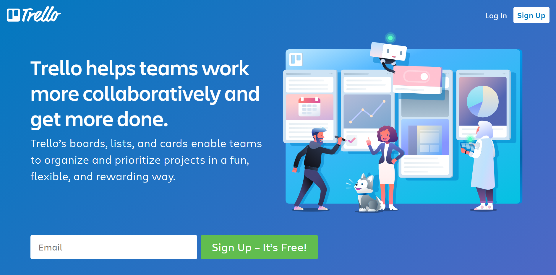 Trello goes for a user-friendly approach in their headline and copy
Trello could have started with a long and winding description of their platform. Instead, they use active language and explain their USP without overcomplicating it. They aren’t even afraid of finishing their headline with a period — which only makes their claim stronger.
You might want to go for a more bold, in-your-face kind of headline, just like this one:
 The Content Factory uses bright colors and hard-to-miss CTAs
This dazzling headline immediately grabs the reader’s attention, and the giant CTA button does the rest. It’s also an example of how you can hide your lead capture form under a prominent CTA button placed above the fold.
This lead capture form is also focused on the value the brand is ready to share:
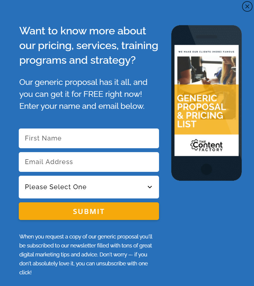 Always explain why your emails are worth subscribing to
Copy
Words matter, especially when you’re trying to get your leads to share some personal information with you. Choose yours carefully. Focus on the value you’re about to deliver. Your copy should be centered around your offer but in a way that underlines how much your audience will benefit from it.
Make sure you clearly explain why your visitors need to sign up or subscribe and what it is that awaits them after. Split your copy into scannable chunks by using bullet points or icons whenever possible.
Take a look at this killer lead capture page example — Avira goes deep into explaining why it’s safer to use their antivirus software and why you don’t need to sacrifice your privacy for that.
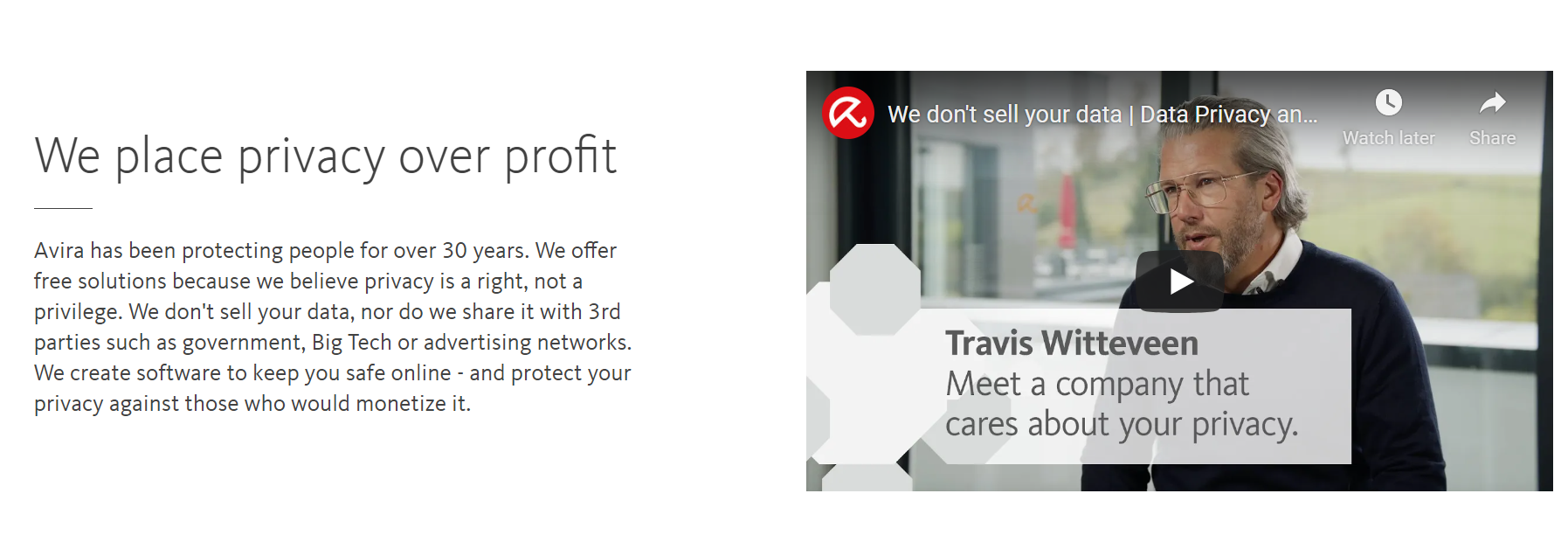 Go beyond a generic commercial copy and demonstrate that you care about your clients
Images
The main purpose of using images on lead capture pages is to trigger an emotional response, a strong desire to follow your CTA. You can use images to amplify your message and convince your leads to subscribe to your emails or sign up for your service.
Avira tackles this task by addressing parents’ safety concerns and using a relatable image with a happy family with kids:
 It’s always better to use authentic, relatable imagery for lead capture pages
You can take a radically different, more utilitarian approach by integrating interactive sliders and animations to show your product in action. Trello delivers their message by using a slider that acts as an animated workboard:
By clicking on the dots, you go through the stages of “creating” your own board, and it’s much more informative than reading a plain block of text. This is an elegant solution stripped of any heavy elements, and that’s why we like it.
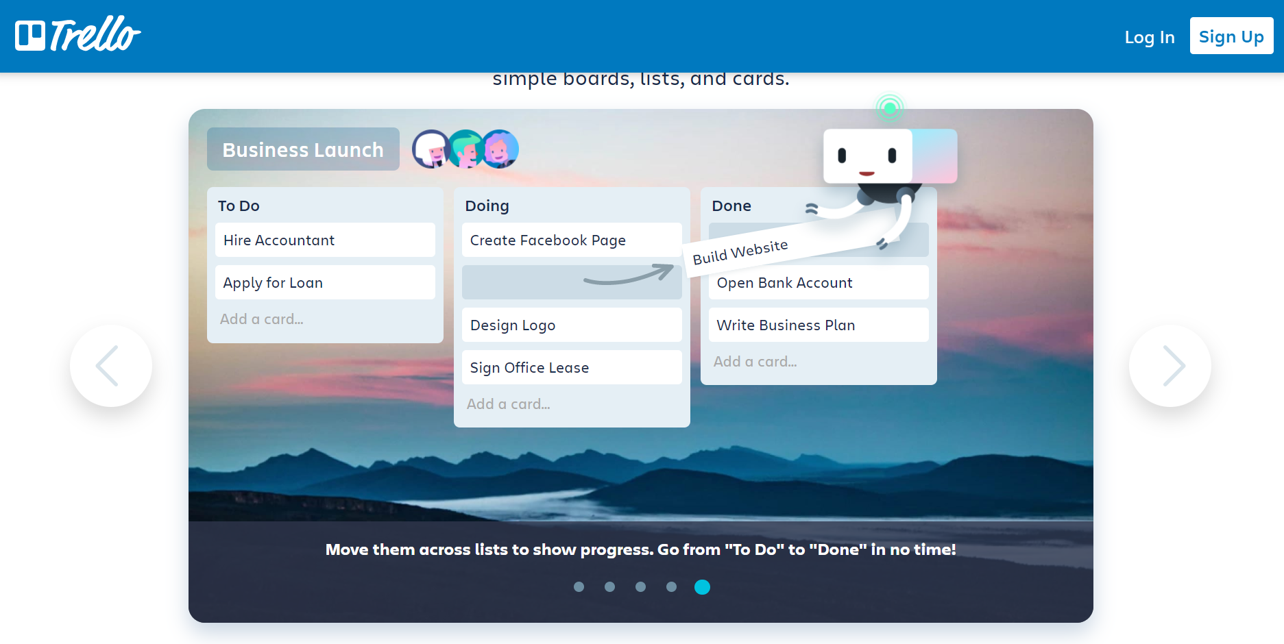 Integrate some interactive graphic elements into your lead capture page
The main rule is to keep your lead capture form above the fold, meaning, at the top of your lead capture page, so that your visitors cannot miss it. Multi-step lead capture forms help you qualify your leads to run more personalized campaigns, while single-field lead capture forms generate more leads. Just don’t forget to explain how your leads will benefit from sharing more information about themselves.
The complexity of your lead-capturing form should match the complexity of your offer. If you provide financial consulting, your leads will be fine with investing more of their time and telling a bit about themselves. If you sell funny air balloons for parties, asking for an email address and using one input field is more than enough.
Embrace simplicity the way Calendar does:
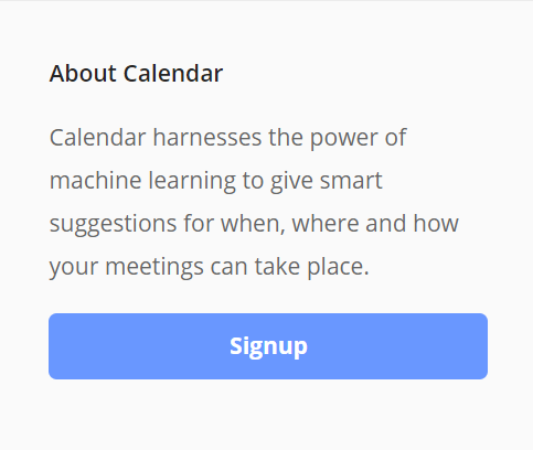 Show your leads you care about them by reducing their need to type
You can’t oversimplify it though. If you absolutely must qualify your leads and capture more information before contacting them, go for a hyper-personalized quiz rather than a long and dull form full of monotonous fields users need to fill in manually. Many lead capture form builders allow you to create elaborate forms with conditional logic.
We recommend adding a conversational feel to your form:
 Try using two-step lead qualification to make sure your leads belong in your target group
Neil Patel starts with quick segmenting to ensure only interested leads reach out to him. After clicking on “Yes,” a user can fill out a simple lead capture form and read more about the benefits of working with Neil and his team:
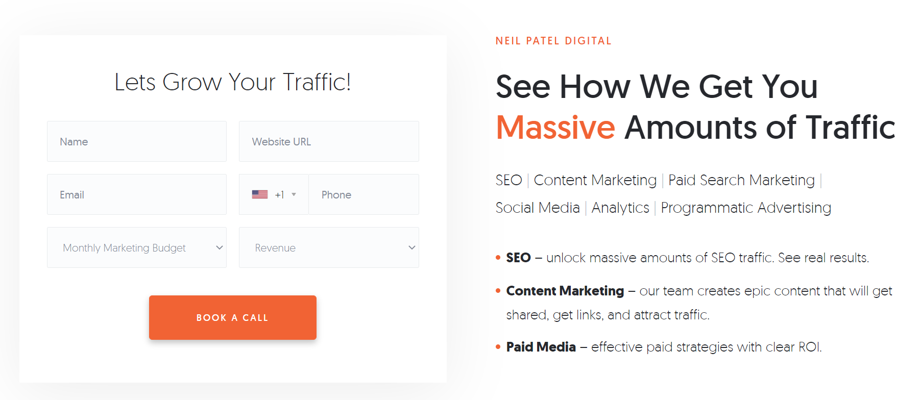 Place bullet points with the benefits of your offer next to your lead capture form
Your call to action should be intuitive and clear, encouraging users to act on it without overthinking it, for example, “Boost your sales now” or “Send me your exclusive tips.” The right tone will motivate your leads to grab what you’re offering.
Does your offer include a free trial or a free version? If so, the CTA button is the right place to mention it, at least in the supporting text right below your button. Add a lead hook by mentioning “No credit card required” or “Free forever” if it’s true, of course.
Stay open and honest, like Headspace does in this example:
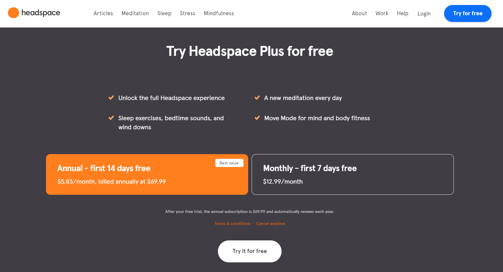 Use lead hooks to make your offer more desirable
In the supporting text, they let their leads know that the app won’t stay free forever. It’s a very honest approach — a user knows what to expect and won’t be disappointed or unpleasantly surprised when their free trial is over.
Here is another lead capture page example where the CTA is reinforced by the supporting text:
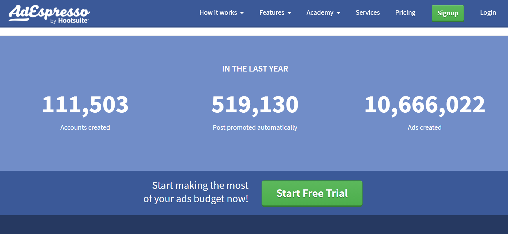 AdEspresso use facts and real numbers to back up their statement
You can also try a more informal approach and add some playful illustrations or explain in a friendly, simple manner why it is so cool to be your subscriber:
 How-To Geek isn’t scared to call their newsletter the best
Countdown timer
The best way to create healthy FOMO is to demonstrate that your offer isn’t available forever. For example, NordVPN uses a legit reason, their birthday, to offer a discount and encourage their leads to try their VPN for free with a 30-day money-back guarantee:
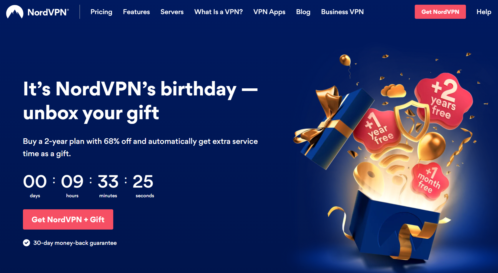 Add a countdown timer to your lead capture page to create scarcity
Testimonials
Without social proof, your lead capture page will stay weak. Give it some support, make it strong and steady by adding testimonials from your customers. Of course, you can get away with simple customer badges — logos of the companies that trust your brand. But we recommend adding names, job titles, and photos to make your testimonials look real and more personal.
Placing testimonials above the fold is another smart move:
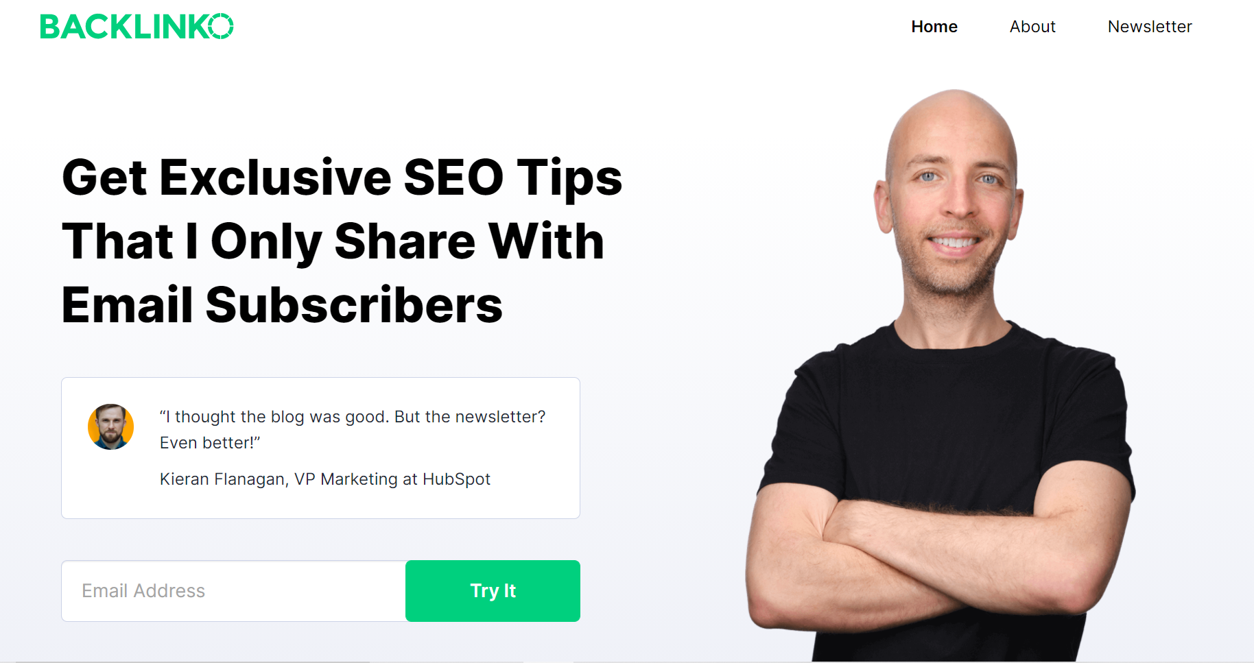 Backlinko use social proof to encourage their leads to subscribe
If you decided to put your testimonials below the fold, take advantage of that and make them more interactive and engaging. The NordVPN’s landing page is a perfect example of how it can be done — they even use video testimonials:
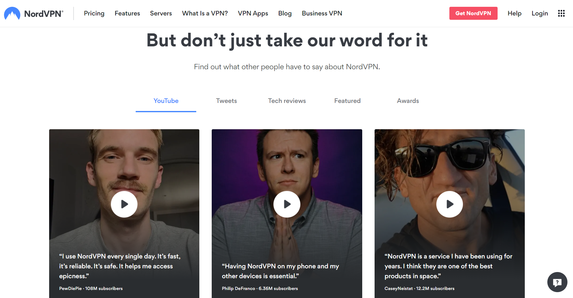 Let your satisfied customers speak instead of you
Ready for the next step?
After placing your leads on the relevant mailing list, you need to start nurturing them with email and content marketing campaigns to gradually turn them into happy clients. If you don’t know how to automate your lead nurturing email campaign, go no further than to our page describing email automation powered by SendPulse.
Your leads are ready to explore your product and discover its benefits — it’s time to use automated emails to educate, engage, and convert them. Automation 360 will do the work for you. Last but not least, using SendPulse, you can send up to 15,000 automated emails to 500 recipients monthly at no charge!