It’s not enough to just put your offer out there and wait for your target audience to contact you first. You need to make the first move, create the first touchpoint. But you don’t want to spam either — so where does that leave you?
In this post, we’re going to be talking about lead capture forms and the ways they help us solve that dilemma. Also, we’ll list their essential components and look at some inspiring examples.
A lead capture form is a form containing one or more fields that leads are expected to fill in. It also has a CTA button. The form itself might be hidden behind that button, but it’s always up to you to decide whether you need to do that or not. Usually, a page with a single CTA button looks a bit cleaner and less intimidating — that’s just common sense.
Here is what a typical lead capture form looks like:
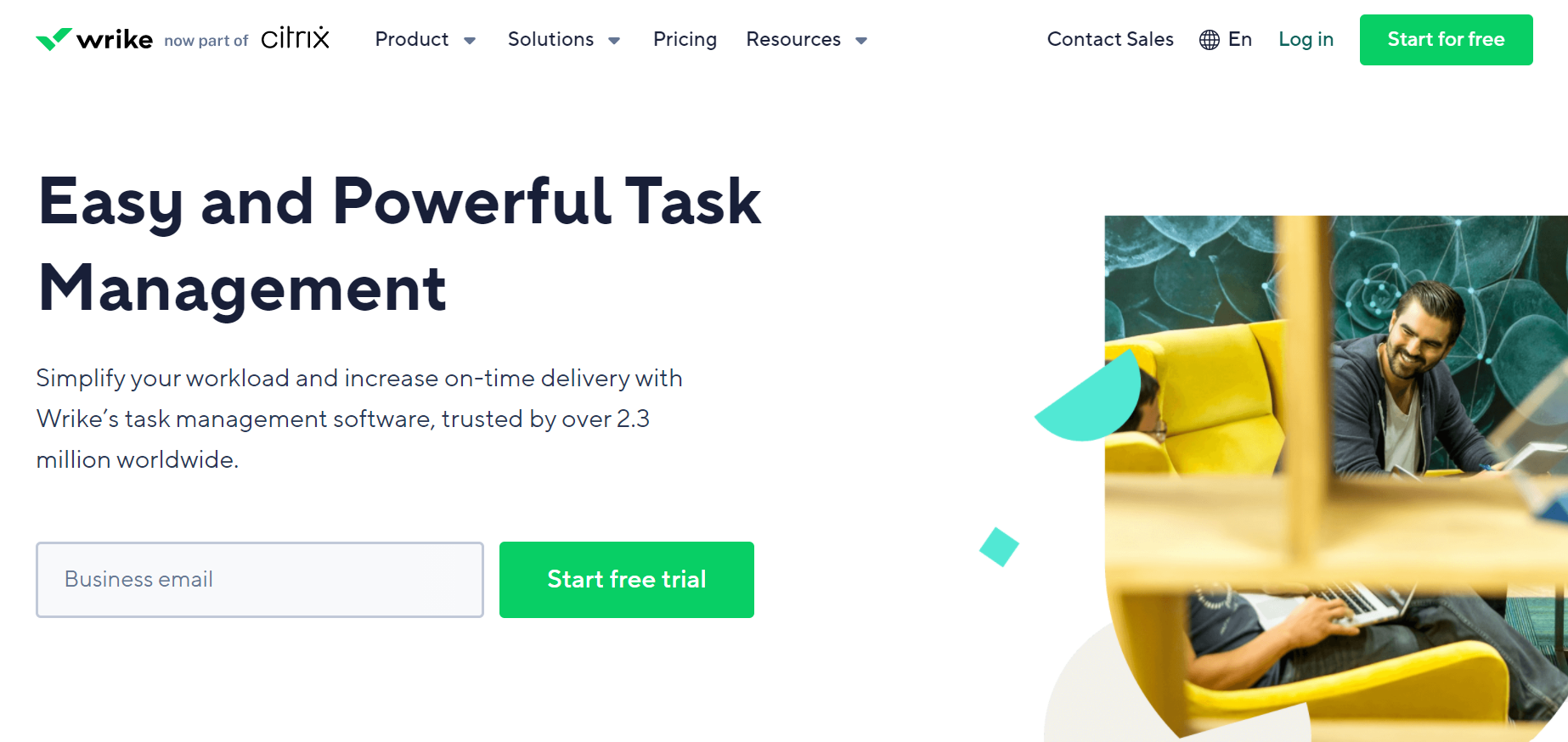 Simple lead capture forms usually contain between one and three fields
Lead capture forms are great for delivering a concise and time-sensitive offer, whatever it may be. They are inseparable from lead capture pages.
You can use them to encourage or help your visitors to:
- download a piece of gated content;
- subscribe to your emails;
- get exclusive tips;
- request a demo;
- start a trial period;
- get a call back;
- register for an event;
- join your waitlist;
- get a more personalized offer;
- receive news and updates;
- get a special discount or a coupon.
Lead capture forms help you collect your visitors’ information — it’s the final step of the lead generation process. Once you have that valuable information, you can contact your leads and start nurturing them. It’s the only legal and consent-based way to get someone’s contact data, and that’s why marketers use lead capture forms whenever possible.
When users opt-in to your mailing list, it means they are already somewhat interested in your product or service. In that case, the likelihood of your emails being opened is higher than when you’re dealing with a cold audience. Also, you can acquire higher-quality leads because they belong to your target audience — otherwise, they wouldn’t have clicked on your ad and ended up on your lead capture page.
Another reason to use lead capture forms is the value you can deliver with their help. You make it easy for your visitors to start interacting with your brand and get their hands on all of the useful content you offer. Lead capture forms and pop-ups are fantastic for creating lead magnets: you grow your mailing list and spark your users’ interest at the same time.
Without a lead capture form or pop-up, your landing page is not going to do much in the way of boosting sales and engagement. It doesn’t tell your users what action you want them to take and what your page is all that is about. The user’s journey through your page isn’t finished — it’s like reading a book where the last chapter is ripped out. No lead capture form — no CTA — no conversion. It’s better to not initiate this vicious circle.
Let’s run through some other advantages of lead-capture pop-ups and forms. They:
- help your visitors concentrate on your offer;
- show your availability and bring your offer closer;
- make personalization possible;
- enable you to start a long-term email marketing strategy;
- help you start a conversation with your audience;
- make it easier for users to get in touch with your brand;
- speed up the conversion process.
The bottom line is, you need to take an active position to make your users join your mailing list. There are too many good offers out there, and your visitors are free to walk away without contacting you — make sure you grab and retain their attention before letting them go elsewhere. Using an efficient lead capture form is a proven way to achieve exactly that.
We will not only list essential elements here, but we’ll also try to understand their actual purpose. Let’s look under the hood and find out what constituents a high-converting lead capture form. Be prepared to learn a few tried-and-true practices!
A strong headline
Use bold, hard-to-miss headlines that take all the attention. The font size of your headline should be two or three times bigger than your supporting text. Cut to the chase — try to explain the essence of your offer without using any enigmatic metaphors or descriptions.
The fewer words you use, the better it gets:
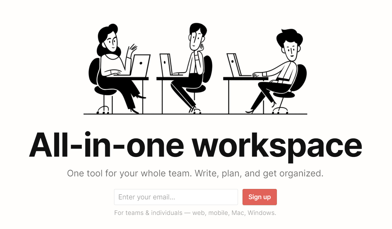 Give your users the gist of your offer using a clear headline
Value
First of all, you need to explain what your audience will get from giving you their personal information. Always provide clarity on what they’ll receive after clicking on “Submit” or any other CTA button. And that explanation should be value-based because people are eager to learn new ways to improve their work routine, shopping experience, or personal life — be sure you promise something worth subscribing to.
It doesn’t require you to go the extra mile — just mention that value in the supporting text:
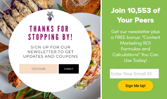 Incentivize your users to opt-in using supporting text
But how about creating lead magnets to share beautifully crafted, priceless content in exchange for your leads’ email addresses? Offering a free eBook, guide, or report is a solid way to get more opt-ins and fuel your audience’s interest.
 Use lead magnets to grow your mailing list
The human approach
If you have a long lead capture form, it’s better to explain how all that data will help you craft a better offer for your leads. You can make your form more personal and less dry by using photos of your team members and their names so that your users will be able to relate:
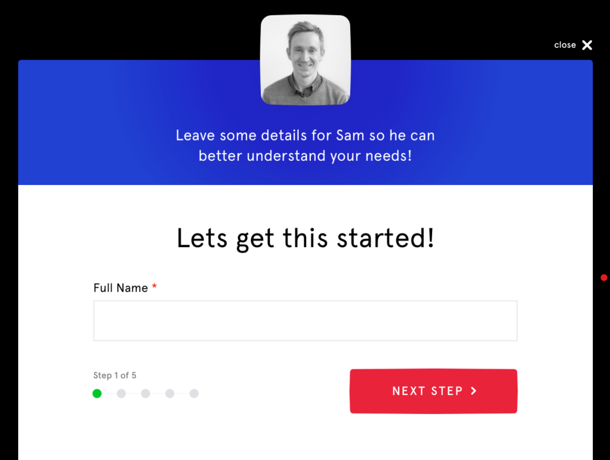 Personalized, informal lead capture forms give you all the chances to bring in more leads
Your help text will also sound better if it has a friendly and encouraging tone — and it will make the completion of your form more desirable. Take a look at the form below. Who wouldn’t like to share their big ideas?
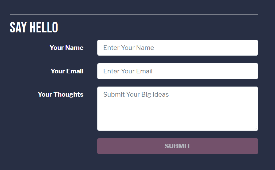 Friendly placeholder text might help you win more leads
Great visuals
By using relatable, authentic images, you’ll be able to trigger an emotional response and put your visitors in the right mood. We’ve chosen an example where it’s easy to notice how well the background image corresponds with the main idea behind the offer. They offer a whole new way to work remotely, and this life-changing project looks much more convincing with real photos rather than with a blank background.
 Keep clear of generic stock images
By the way, this example demonstrates another good practice — notice how they emphasize the three main benefits of their service right below the CTA button. Basically, they explain their offer in a nutshell and give their users a reason to convert right away.
A strong call to action
We recommend choosing actionable phrases like “Grab your free account” and avoiding ambiguity when writing copy for your lead capture form and its CTA button. By using active verbs, you plant the idea of trying out your product in your visitors’ minds. They might briefly scroll through your page, but a bold claim or a confident promise will make them stop and pay attention to what you’re offering. The trick is to keep it real and avoid clickbait.
Here’s another example:
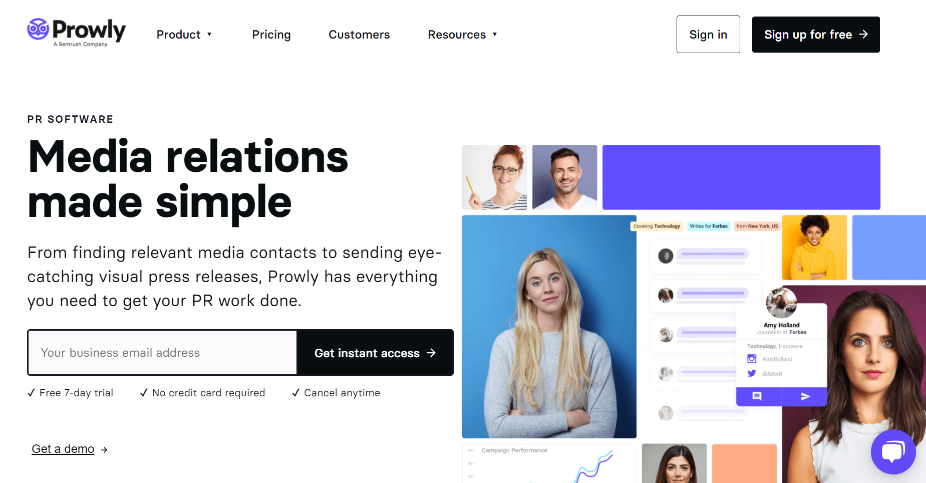 Strengthen your CTA by mentioning safe payment options
As you see, the best place to mention perks like “Free trial” is right under your CTA — this is where all the decision-making happens. By adding them, you give your leads confidence and remove barriers preventing them from saying yes.
The next lead capture form has a powerful call to action and an email example to back it up. A user can easily click on the link below the CTA button and see what their typical email looks like. It might be a good idea to provide your leads with a sneak peek of your offer to finally convince them.
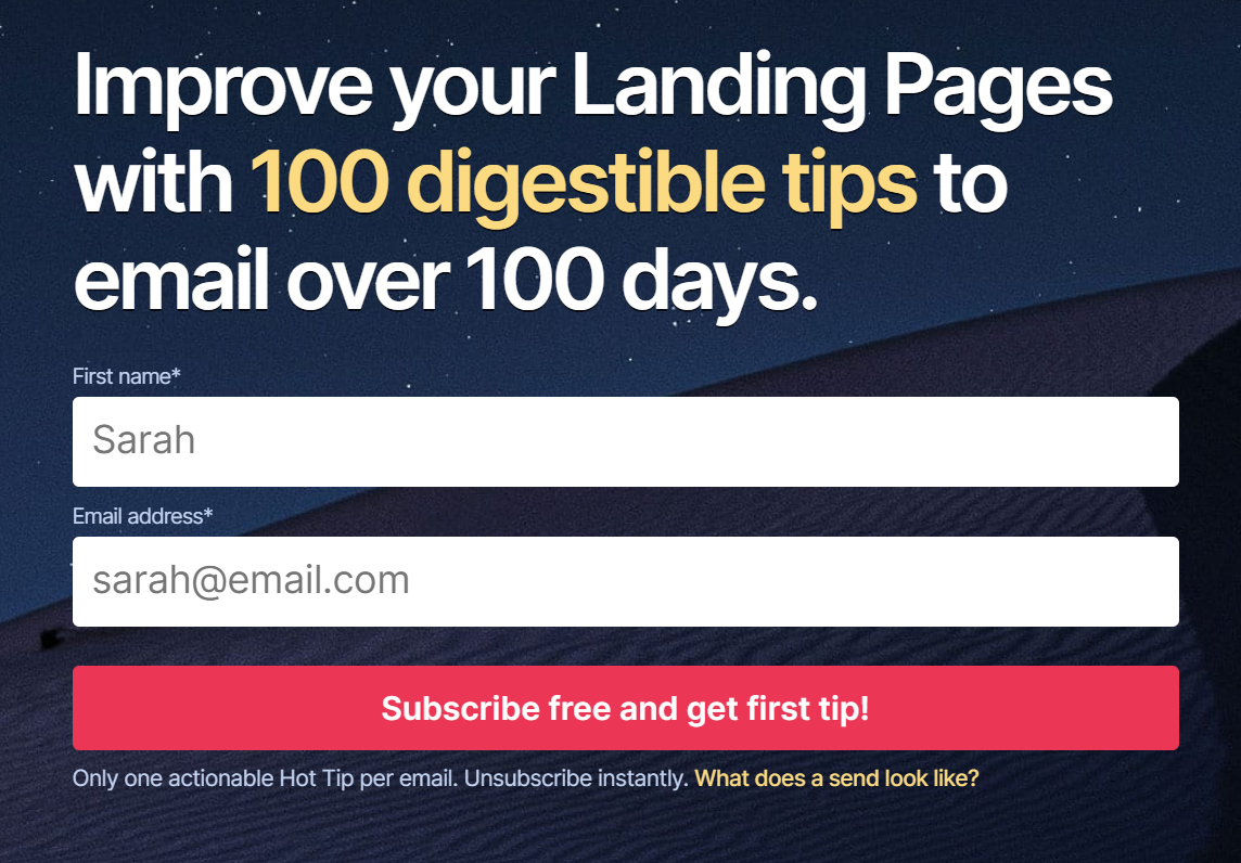 Allow your visitors to take a look at your offer before giving you their data
A reasonable number of fields
This is a tricky one. Of course, it’s better to keep the number to a minimum because people quickly get bored with endless forms, and they rarely complete them, but there are some exceptions. You need to be sure you get enough information to help you with segmentation and personalization.
In this example, the catering service asks quite a few questions to get a full picture of what their potential clients want. As a result, they’ll be able to contact them and provide highly personalized, relevant information without wasting anyone’s time.
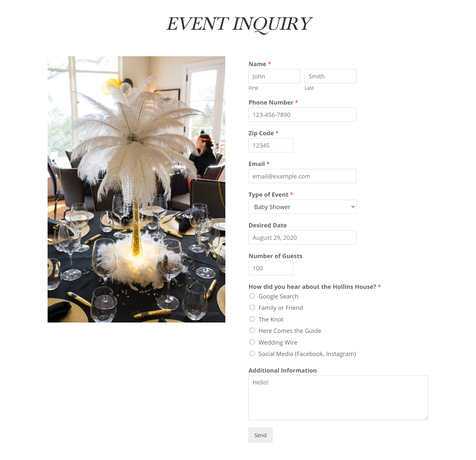 Use long lead capture form wisely — you don’t want to bore your leads
Honesty
Another important component that’s constantly being overlooked is being honest and transparent with your leads. Let’s take Clickflow as an example. Instead of promising their leads they’re going to supercharge their website and send it to the Moon, they simply explain how their service works — and it evokes even more trust! Also, they promise to not sell their users’ data, and it seals the deal.
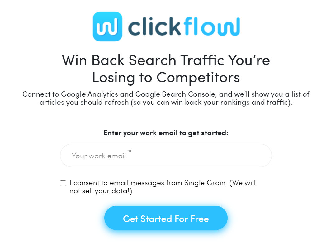 Stay open about what your product or service can and cannot do
Radical honesty is also a good way to stand out from the crowd, especially now that everyone is using lead generation strategies and trying to increase their sales. Just point out that your marketing efforts are actually beneficial for your audience as well because this is your way to help them find the most relevant information or solution.
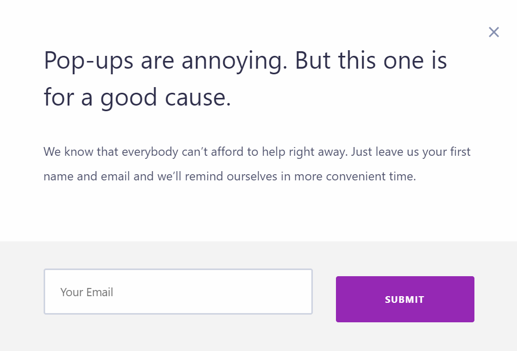 Keep your lead capture forms noticeable but not too invasive
Finally, let’s walk the walk. We’re about to show you how to create a simple lead capture form or a lead capture pop-up using our form builder. It’s an intuitive drag-and-drop and code-free builder with pre-designed templates you can quickly customize to suit your needs.
Step 1. Sign up
You can try our form builder for free, with no strings attached. Just sign in using your existing SendPulse account or create a new one in no time. After that, you’ll be able to find the subscription form builder in the sidebar menu.
An embedded subscription form works better when placed above the fold. A lead capture pop-up is often used to catch users who are about to leave the page. A floating form is a good choice for saturated landing pages where it’s easy to get lost and miss a CTA. And a fixed form is a less distracting alternative to a floating one.
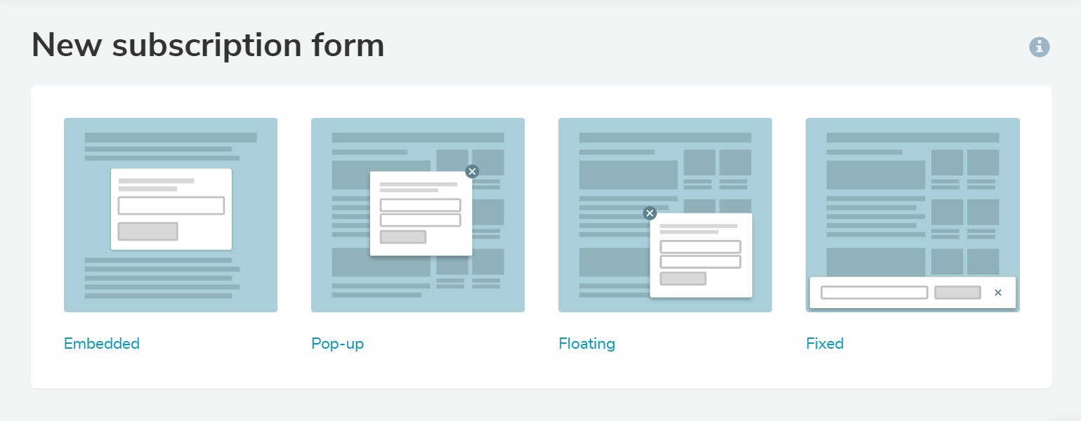 Use different types of forms for different marketing purposes
You can create a subscription form from scratch or use one of our pre-made templates. Click on the template first to open the full-size image and see if it’s exactly what you’re looking for.
Step 3. Select a mailing list or create a new one
This step is important because this is where you decide which mailing list you want to grow. You need to segment your audience and run individual email campaigns for different groups of users, so it’s better to create a new mailing list for every new audience that you want to target. For example, your repeat clients might be interested in updates and news while newcomers would prefer to learn about your brand first.
You can add, edit, and delete any elements you think your form needs. Using our builder, you can also make your form correspond with the overall design of your website by using your brand colors and images. All the changes you make will instantly appear in the preview, so there’s no need to guess what the final result will look like.
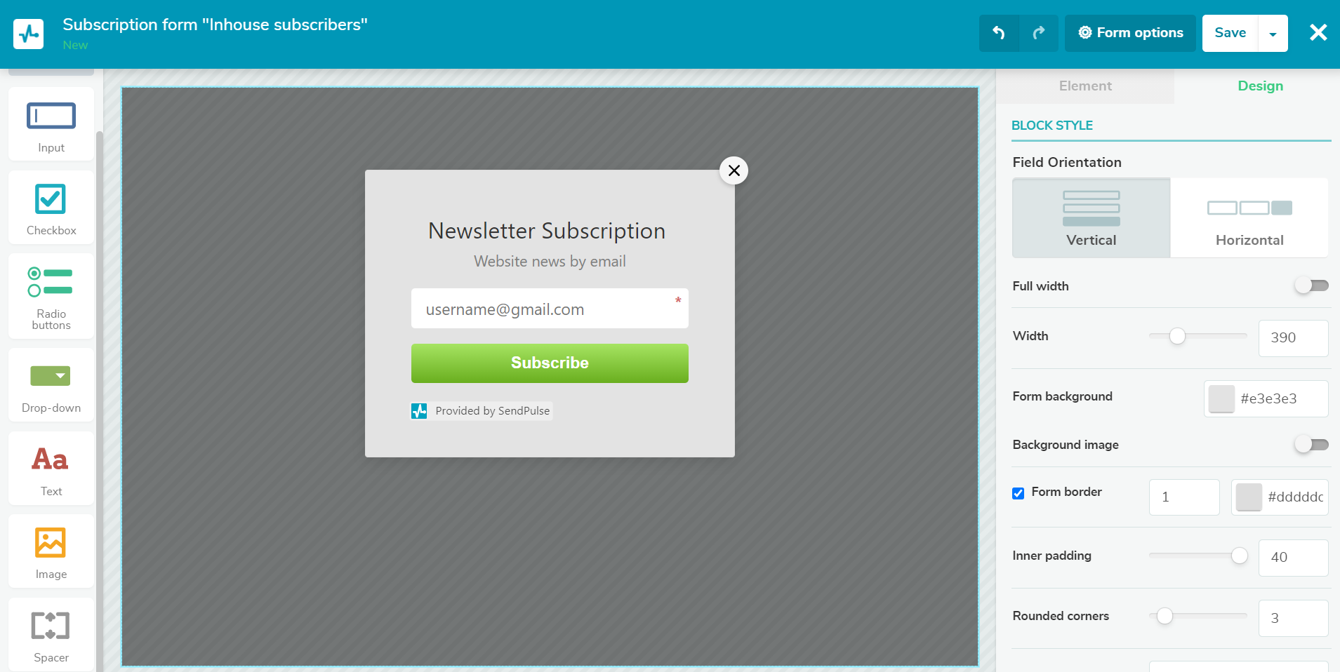 Our drag-and-drop editor helps you create converting lead capture forms
Go to the settings to create display conditions, make your form GDPR compliant, or set up tracking for form submissions for Google Analytics. By using conditions, you’ll be able to target users more precisely and display your lead capture form to remind them about your offer or give them a nudge in the right direction.
Give it a try and walk out with a ready-to-go lead capture form you can embed in your blog or website!