
Lead form optimization is improving the quality of the forms to collect data about potential customers. It allows marketers to get more form submissions, which results in higher lead quality and conversion rates.
In this article, we’ll explain why optimizing your forms is crucial and discover actionable tips to get started.
Why is it important to optimize your forms?
By improving your lead forms, you can boost the performance of several crucial indicators for scaling your business. Better lead capture, fewer drop-offs, and quality customer data are only a few main reasons why you need to optimize your forms. Below, you’ll discover even more benefits, so let’s dive in.
- Higher lead quality. Asking the right questions and having smart field logic enables you to quickly understand which of the prospects are interested in your product. You can collect the necessary information about potential customers and focus on the right audience segments, resulting in conversions.
- Better conversion rates. With nicely designed, eye-catching, and concise lead forms, you can reach your goals faster. The right use of analytics enables you to prioritize areas that require your attention. You can identify some gaps, problems with the form’s design, the number of fields, etc. By paying attention to even small details, you can significantly improve lead form performance and the number of conversions. For instance, if your form has too many fields, it can be the reason for users getting overwhelmed and leaving your website without submitting the form.
- Reduced abandonment. Once users come across long, confusing forms, they would rather leave them without attention. That’s why it’s important to avoid such a scenario and prevent users from abandoning your form. Optimization helps you identify such problems and eliminate them before they negatively influence the number and quality of prospects. It will result in lower bounce rates and more leads sharing contact information with your brand.
- Seamless user experience. Having well-designed forms that load fast enables you to improve trust and prevent any type of dissatisfaction with your business. When customers have only a positive experience with your brand, they are more likely to engage and provide you with their contact data. If the form works properly and doesn’t require users to give too much information, the likelihood of conversion increases.
Now that you understand the value of optimizing your lead forms, it's time to explore proven tips to help you do it effectively and maximize your results. Let’s dive in.
10 Tips to Optimize Your Lead Forms
- Ensure that your forms are short and simple
- Offer a lead magnet
- Include visible, appealing CTAs
- Make your forms mobile-friendly
- Reduce user drop-off
- Take advantage of pop-ups for higher visibility
- Include trust signals
- A/B test your lead forms
- Instantly send follow-up messages to new subscribers
- Take advantage of conditional logic
Businesses use various tactics to catch users’ attention and make them share their contact information. However, not all of them work. We’ll provide you with some effective must-do tips to improve your lead forms and get more potential customers. Let’s take a closer look.
1. Ensure that your forms are short and simple
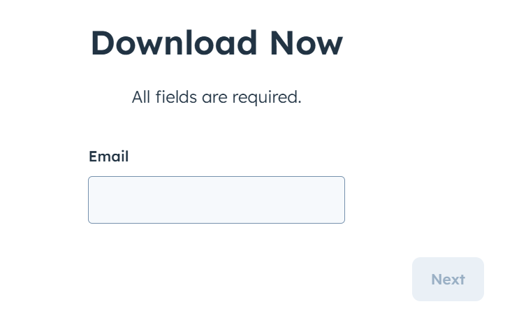
If you want more users to share their contact info, keep it simple—ask only for what’s essential, like an email or phone number, depending on your business. Fewer fields mean higher conversions and more leads to nurture. Always review your forms to ensure they’re as short as possible. If you need more details, consider using multi-step forms to break the process into easier steps.
Here’s a quick, simple form from HubSpot that users fill out to download a free marketing report.
2. Offer a lead magnet
It’s always a good idea to include a lead magnet in your subscription forms as it catches attention and encourages leads to share their contact information. You can provide value depending on your business industry. It can be an eBook, a discount, a free trial, a report, infographics, or anything that people consider useful.
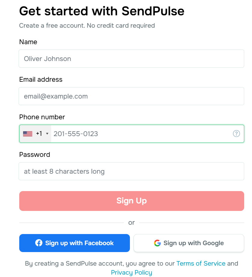
For instance, to enjoy the benefits of a free account with SendPulse, users need to share their name, email address, and phone number. Only three fields provide prospects with access to the platform’s tools and features.
3. Include visible, appealing CTAs
When you add call-to-action buttons, ensure that they are big enough for users to notice and take the desired action. Make them stand out by using the right colors, font, and action-oriented language. Phrases like “Get a guide for free” or “Download now” are more likely to drive attention than long combinations of words.
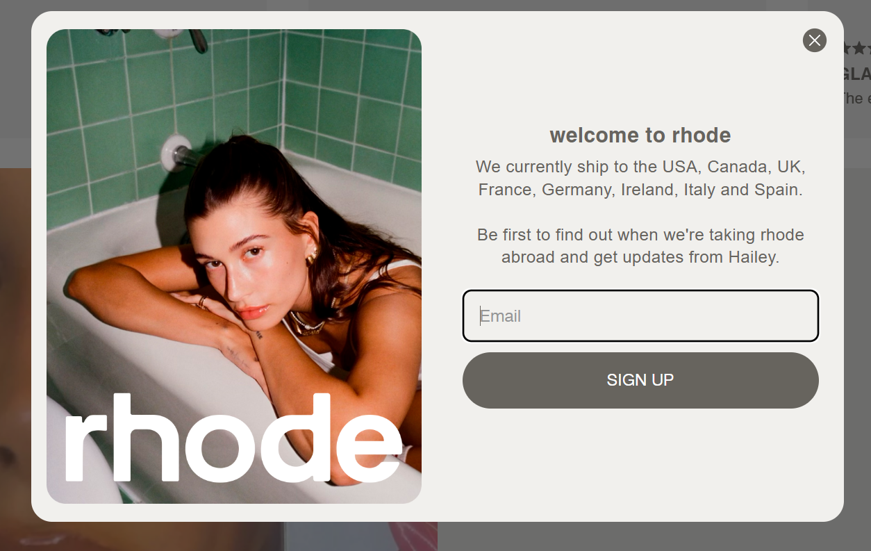
In the example below, you can see a simple “Sign up” encouraging users to share their email addresses in exchange for the latest updates from Rhode.
4. Make your forms mobile-friendly
Since more and more users access websites using their smartphones, it’s a must for you to make forms fully responsive. It means that prospects can seamlessly fill in the forms without facing any type of inconvenience or obstacle. For this purpose, consider taking advantage of mobile-friendly input types. It will make it so much easier for leads to share their contact data with you and provide space for further interaction.
Below, you will find an example of a mobile-friendly form on Neil Patel’s website. Users can simply insert their URLs without friction and have an analysis done.

5. Reduce user drop-off
Make filling out your forms as easy as possible. Consider using auto-fill and smart fields if they work for your business. Avoid drop-down menus and mandatory fields, as they can frustrate potential customers. These extra steps often take time and can cause users to leave your site.
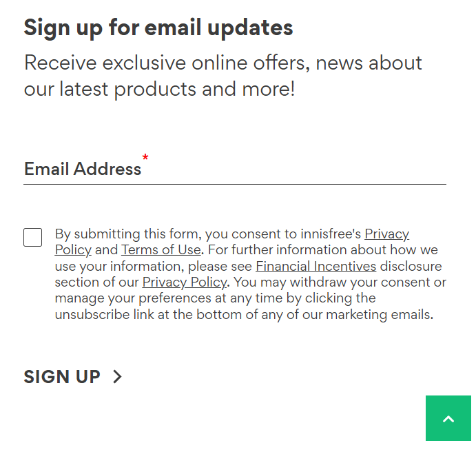
Below, you’ll find a simple yet very effective subscription form from Innisfree. It asks users to fill in their email addresses only and get information about exclusive offers and product launches. So when users are interested, they will need a couple of seconds to sign up.
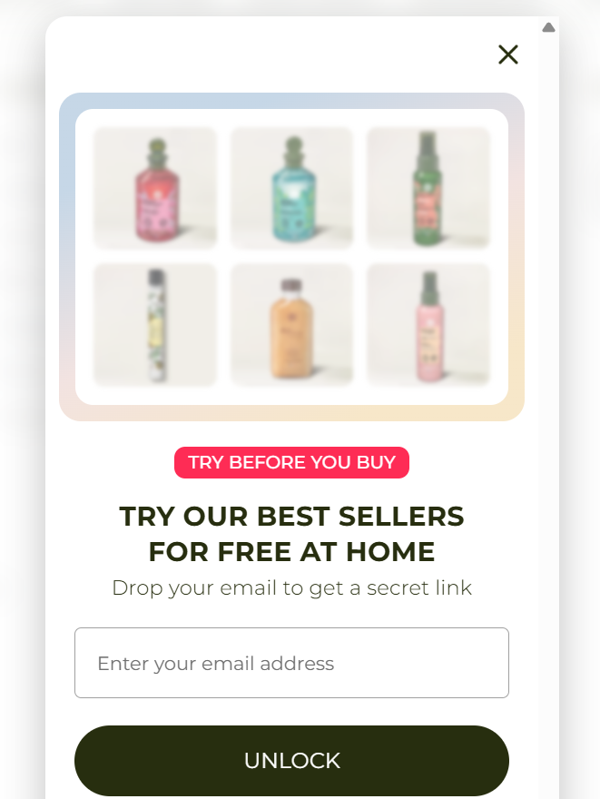
6. Take advantage of pop-ups for higher visibility
If you want to collect more contact data, consider using pop-up subscription forms, enabling you to focus all users’ attention on a single message. Before closing the pop-up, potential customers will think twice about whether to fill in the form and redeem the offer. It’s even more effective when you not only offer to subscribe for updates but also to get an exclusive link to free products or discounts for the first purchase. It will encourage users to participate.
In the example below, you can see how Yves Rocher uses pop-up subscription forms to focus users’ attention on its offer. The form invites prospects to provide their emails in exchange for free products.
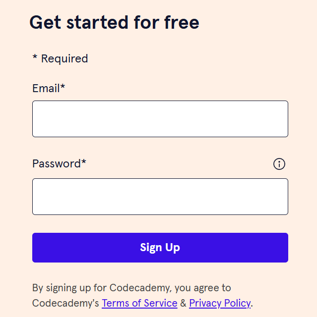
7. Include trust signals
When you create forms, remember to add elements that encourage users’ trust. These might include testimonials, privacy statements, and secure badge icons. If prospects click the “Sign Up” button, they automatically agree to the terms and conditions of your business.
Here’s an example from CodeAcademy. This straightforward form includes details about the terms of service and privacy policy, reassuring users that their personal data is safe.
8. A/B test your lead forms
Always test your lead forms to find out whether they correspond to your audience’s needs. Headlines, button colors, field placements, and copy are essential elements of your lead form that affect how people perceive them and whether they want to interact with your brand. By regularly testing different formats, you can find out which of them perform best and make well-informed decisions regarding lead form optimization.
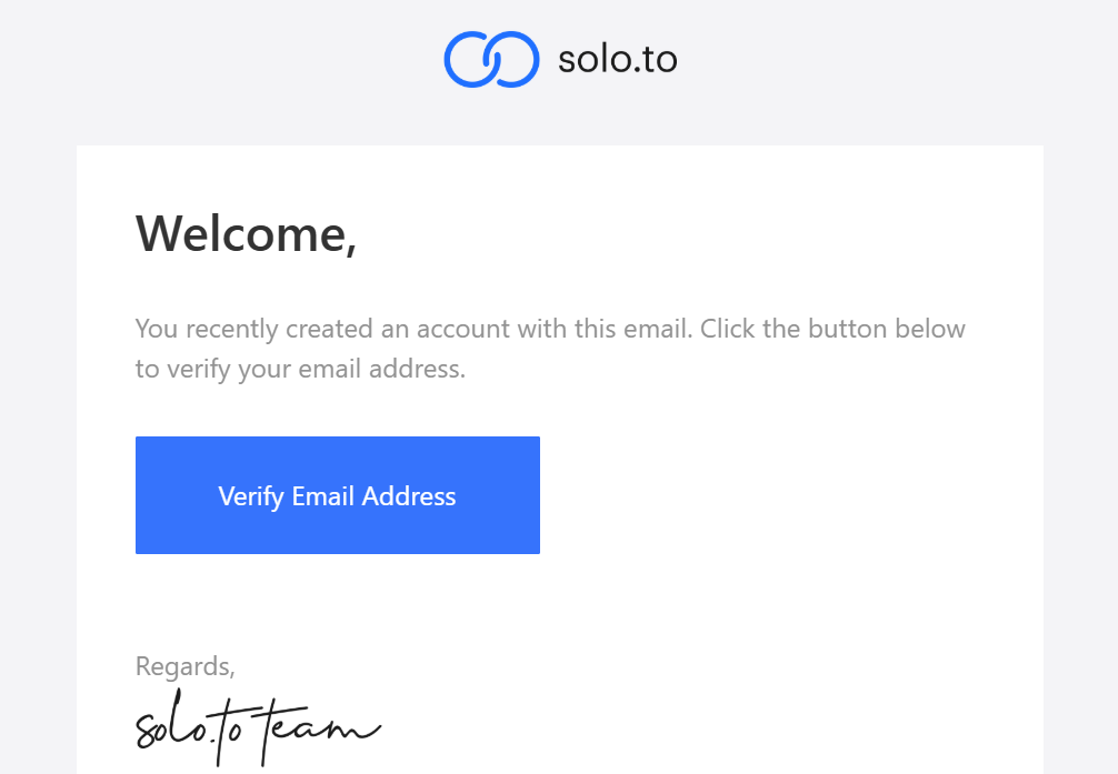
9. Instantly send follow-up messages to new subscribers
Sending follow-up emails to new subscribers is essential for both engaging them and verifying their email addresses. A timely email allows you to welcome new leads and ensure the provided email is valid. To boost efficiency, consider automation. With tools like Automation 360 from SendPulse, you can automatically send confirmation emails without the need for manual effort.
Below, you can see how a platform asks new users to click the provided link to verify their emails.
10. Take advantage of conditional logic
If you want your lead forms to be relevant to users, it’s necessary to show or hide specific fields depending on the answers people provide. This enables you to ask questions one by one without overwhelming new leads and preventing them from churning out.
Below, you can see how Shopify uses conditional logic to onboard new subscribers. The fields are personalized based on previous answers and are shown one by one.
Lead form is a powerful marketing tool that helps you gather all the necessary information about prospects and ensure proper communication with them. However, like any other marketing tool, it should be incorporated wisely. With optimization, you can always make your forms even better, resulting in higher conversion rates and customer loyalty.
or