Your potential customers will always have a thousand and one excuses to not act on your offer. The key is to tickle their interest and create a shopping urge by emphasizing that the opportunity will be gone tomorrow and they need to act now.
Last chance emails can make your customers pay attention to your sale or any other short-lived deal, which may otherwise go unnoticed. These are special emails — they allow you to use a bit more direct and sensational language and spice it up with the most eye-catching images and emoji. Let’s see how you can use your customers’ FOMO to your advantage!
What is a last chance email?
A last chance email is an email you send to your audience when you want to motivate them to act on your expiring offer. It could be anything — a last day sale, a limited series of products, or a one-time promo code that they can apply. The fact is, your offer is limited in time, it’s about to come to an end, and you want to make sure your subscribers won’t miss it.
So far, so good. But how do you actually motivate them to seize the opportunity? You need your email copy and design to be synergistic to make that happen. The secret is to convey a sense of urgency without turning it into clickbait. In other words, your email shouldn’t be deceiving in any way — don’t set a countdown timer for 24 hours if your sale lasts for a week.
Here is what a proper last call email looks like:
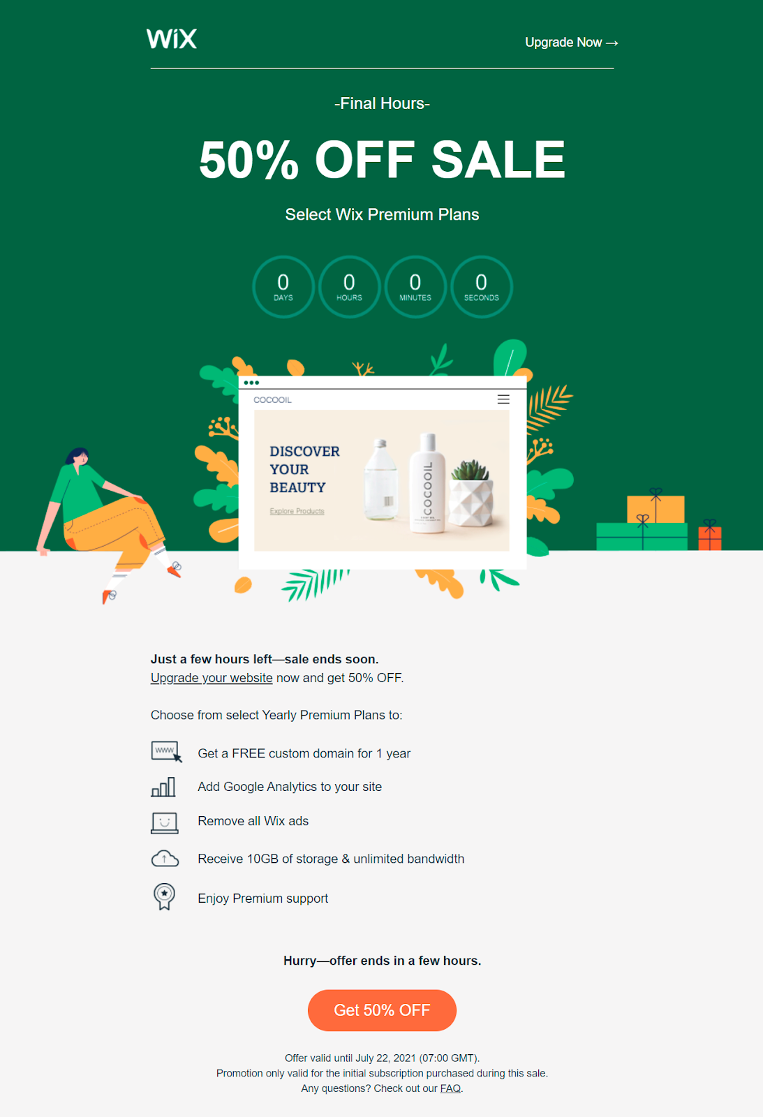 Last chance emails help you motivate your subscribers to act faster
It’s always better to personalize your last chance emails and notify users when their favorite items are on sale. Let your email trigger a chain reaction:
- Your subscribers learn that you have a limited-time offer.
- They check out your featured products and recognize an item they were looking at long ago but couldn’t afford.
- They realize that now is the best time to buy it because the price will never be this low again.
This is a simplified timeline, but, at the core, all last chance campaigns or sale extended emails are similar. They tap into the buyer’s fear of missing out on a great deal and regretting it later. It’s not even manipulation — you just get one step ahead of them and help your audience discover your products on their most favorable terms.
Design and copy recommendations for last chance emails
It’s no secret that our attention span is decreasing, although it hasn’t dropped to 8 seconds yet, despite what some marketing resources say. However, users do have very little patience and desire to read every single promotional email from top to bottom — there are just too many of them.
But they still enjoy staying on top of things. With the right email design and copy, you can help them achieve exactly that.
- Cut to the chase. Don’t talk about your brand or your team — use other types of emails for that. Instead, focus on the “here and now” and explain in a few words how little time there is left to grab your special offer.
- Use the boldest headlines you can think of. Your last chance emails should be loud and reflect the scale and importance of your offer. Don’t shy away from a more informal, maybe even cheeky tone to unapologetically grab all the attention.
- Put emphasis on scarcity. Add a countdown timer or just mention when exactly your offer expires and how many items are left. After reading your email, your customers should be left with the impression that there will never be another sale like that and they can’t let this lucky opportunity slip through their fingers.
- Oversimplify it. Use ultrashort and concise sentences. If you give a promo code, make it easy to copy and don’t hide it under the fold. The same with a CTA button — it should be even more noticeable than usual because you can’t risk it being missed.
- Add social proof. It will fuel your users’ FOMO because they will see all those happy customers who have already acted on your offer. Although last day promotion emails aren’t for lengthy testimonials, you can insert short emotional reviews or just show how many purchases have been made in the last 24 hours.
- Put your subscribers in a buying mood. Tie your offer to the change of seasons, upcoming holidays, a big event, an emerging trend, or any other cultural or social occasion, and support that connection with images. You’ll create an emotional response and give your users another reason to consider purchasing from you.
- Tell them why. Why should they buy your product right now? Why can’t they just think about it and come back later? Show them the price difference or any other benefit that really makes your current offer stand out. Maybe, it’s the last batch, and you won’t be producing it anymore? Mention that too!
Does it sound too abstract? No worries, we’ll give you more examples in just a moment. But first, let’s talk about last chance email subject lines.
Subject lines for last chance emails
Your subject line is the first thing your subscribers see, so it should be practically screaming about your short-lived sale. Use it as a visual hook to catch your users’ eyes. Emoji like or are encouraged — you want to trigger an emotional reaction so you need to sound excited as well.
Your last chance email subject lines need to intrigue and give a hint rather than reveal your whole offer because you want your users to open your email and take a good look at your products. Just emphasize the fleeting nature of your offer by saying how long it will last.
Using all caps in email subject lines isn’t usually recommended, but it may be useful for your last chance emails. People react to all caps automatically. Upper case usually means something important, and that’s the effect we are aiming for. It’s sort of a harmless psychological trick because we are used to seeing all caps being reserved only for urgent messages.
You can also use hours instead of days when specifying the time period of your sale. It’s very subjective, but, for some people, “48 hours” may sound like a more narrow timeframe than “2 days,” especially when it’s accompanied by a merciless countdown timer. With that in mind, let’s look at some examples.
Urgent email subject lines
Here is what you can put in your last chance email subject line to spark some action:
- Sign up before the deal ends!
- HURRY! This offer ends in two days
- This offer is expiring
- ⏰Get it before it expires! ⏰
- Get your deals before it’s too late ?
- Be quick! These great deals are almost gone
- ?Our sale is about to end!
- Almost out of stock, hurry up
- Don’t miss out on these deals ?
- You’ll regret missing this sale. Only two days left
You can, of course, just write “last chance” and be done with it, but keep in mind that your customers get many similar emails from other brands. It’s better to give yours a little twist.
Sale extended email subject lines
If you want to give your audience another chance to get their hands on discounted pieces, try these or similar subject lines:
- You don’t want to miss this sale ?
- Enjoy extended discounts while they last
- Two more days of BIG savings!
- ?This sale is too good to miss
- You asked, we listened. Our sale got extended!
- Don’t blink or you’ll miss It: Extended sale ends soon!
- Time to revisit your wishlist ❤️ Our big sale is still on
- One more chance, don’t miss it
- We heard you! Two more days to snatch these goodies
- Missed out? No biggie. We’ve extended our sale
The main goal here is to demonstrate that you are paying attention to your customers’ needs and are ready to accommodate them even at your own expense.
Last day promotion subject lines
What if you want to emphasize the fact that your offer is final and that there won’t be anything remotely similar any time soon? Here are some ideas that may help:
- Just one day left!
- LAST CALL!
- Ends today! Grab yours ?
- Final call!
- Last chance to order. It’s now or never!
- It’ll be gone tomorrow!
- Get it or regret it
- Almost over! ⏰
- How the time flies! Our sale is about to end
- Still eyeing your favs? ❤️ Grab them at 30% off, TODAY only
- LAST DAY of our sale!
- Final hours 50% off
In general, short, intriguing subject lines are more efficient at grabbing the user’s attention, especially if the email itself is also brief and to the point.
10 last chance email examples to learn from
Big brands use last chance emails to drive impulsive purchases and help their customers grab the products they’ve always wanted but couldn’t afford before. Let’s see how they persuade their subscribers and motivate them to visit their website.
Hollister
This is a clothing brand for teens, and its communication style has always been upbeat and to-the-point. The brand uses minimalistic last chance emails to stimulate its audience to jump at the opportunity and grab their favorite tees and jeans while they’re still on sale.
The subject line says it all:
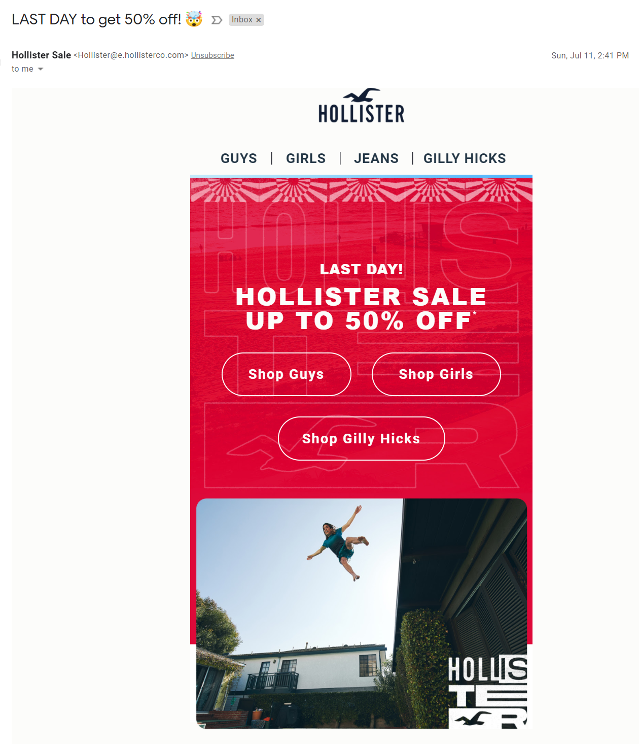 Red is the most prominent and contrasting color to use for last chance emails
In this case, deep personalization isn’t really necessary because Hollister wants its subscribers to discover new styles and items they haven’t seen yet, so they link to the main categories instead of offering a curated collection of products.
While we’re at it, let’s take a look at how Hollister uses images in its last chance emails.
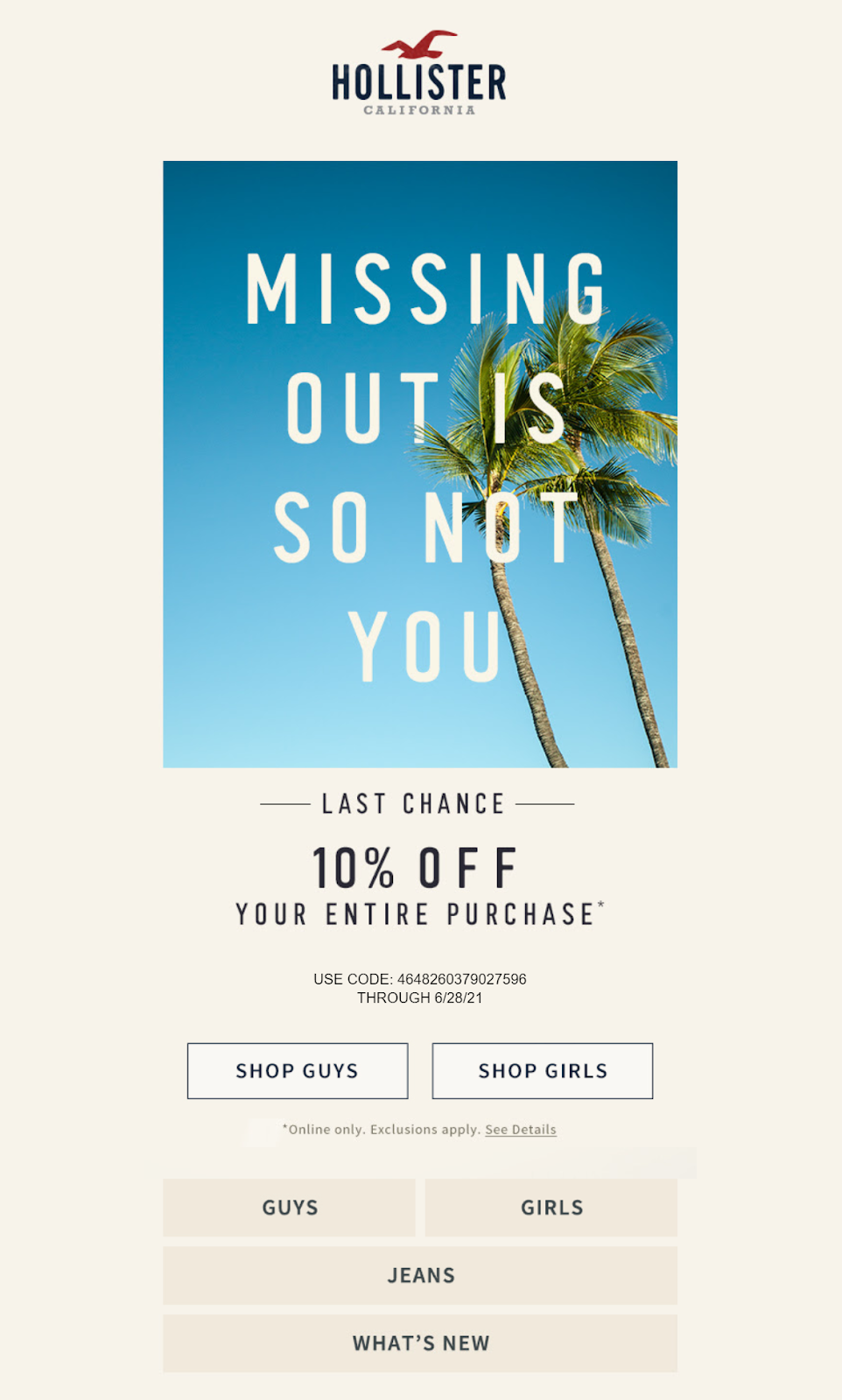 Short emails also require visuals to create a mood
This photo with a slogan immediately puts a user into a purchasing mood because it conveys that “careless summer” vibe that Hollister relies on. The only issue here is the promo code. It could have been shorter, more noticeable, and easier to copy or remember. But hey, we all learn from our mistakes.
Bose
Bose is an American audio equipment producer. The brand skilfully uses social proof in its last chance emails and stuffs them with fascinating visuals to make up for the inability to convey crisp-clear sound over email. Although it’s a Black Friday email, it also falls into the category of last chance emails because it encourages users to act now instead of waiting.
There’s a lot to be inspired by.
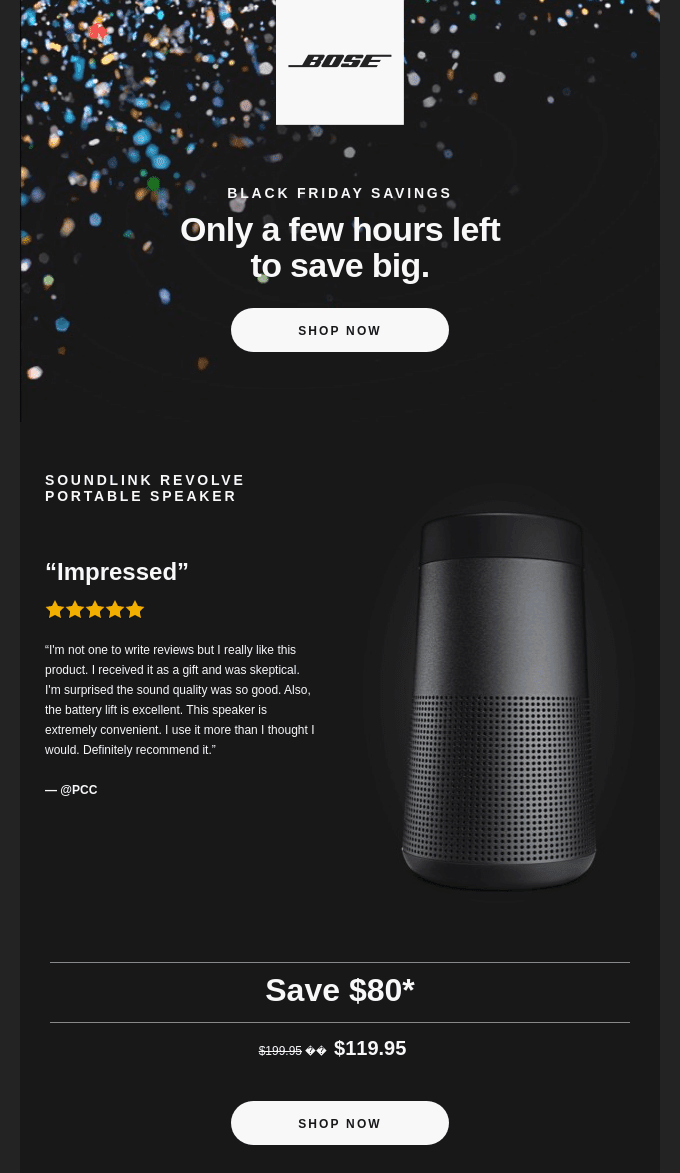 Bose sends slick and to-the-point last chance emails; source: Really Good Emails
Also, notice how well this last chance email design corresponds with the overall brand style. The same color scheme and tone of voice make it instantly recognizable. Bose shows the price difference to help its users immediately grasp the benefits of the offer in its entirety.
The New York Times
Big newspapers also have to work to gain readership, so it’s no wonder that even The New York Times uses last chance emails to sell subscriptions. Sometimes, they also come up with special offers to help a new audience gain access to high-quality journalism.
The tone of this email is drastically different from that of the previously described emails. It’s a bit more sophisticated, but not nearly dull.
 The NYT take a friendly and intelligent tone in their last chance emails
There is no doubt that The NYT has almost unlimited creative resources. However, they prefer to keep their email design simple for a reason — it doesn’t distract subscribers from the content, which often is very text-rich. The email copy here is also very brief and concise because the name of the company already evokes trust and doesn’t require additional praise.
Dolls Kill
This alternative fashion shop truly loves email marketing and puts a lot of effort into it. Their emails are always highly visual and include a lot of model photoshoots instead of blank product photos. Since the Dolls Kill clothing and shoes are out-of-the-ordinary, those emails help their audience imagine themselves wearing those items.
Both the subject line and the design of this last chance email are worth paying attention to.
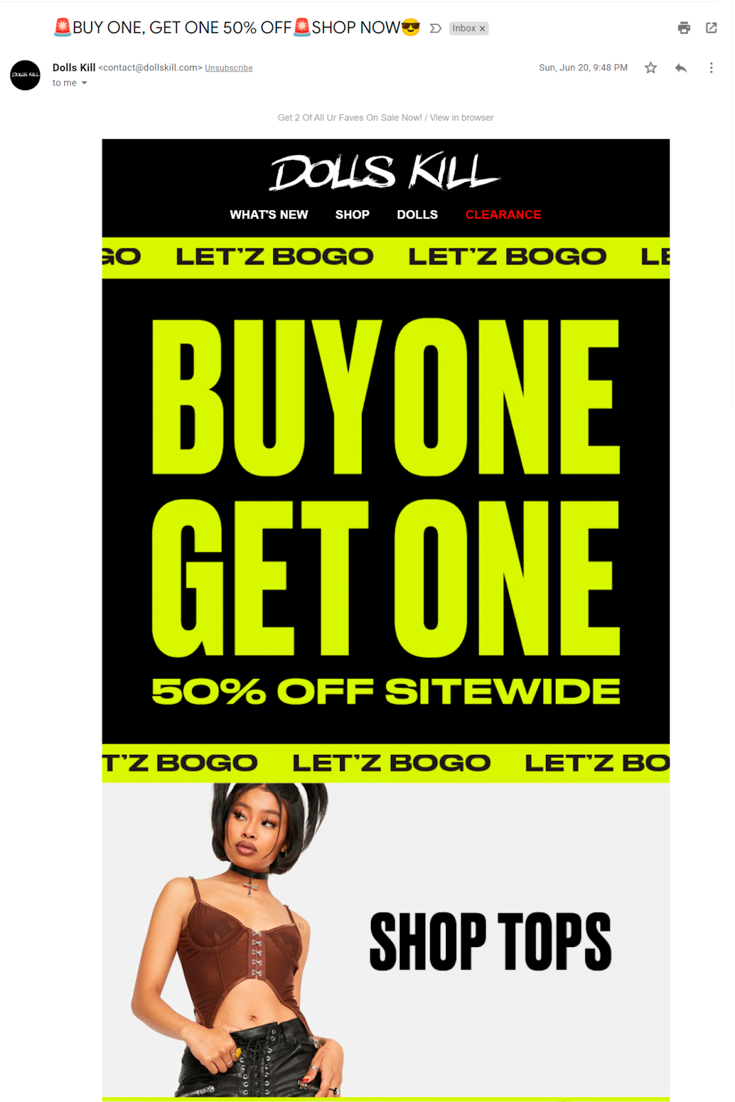 Bold colors and typography will create a sense of urgency
This last chance email and its color scheme instantly remind us about security signs and caution tape. These alarming colors are associated with emergency situations, and they immediately attract our attention — whether we want it or not. It would have looked out of place in any other type of email, but here, this design choice is absolutely relevant… and even genius.
The Futur
It’s natural to expect great emails from a leading online design school, and here we are, another cool example from The Futur. This time, they combined the aesthetic of plain text emails with unique illustrations crafted specifically for this purpose. There are no huge CTA buttons because they would have ruined the whole stylistic choice — yet this last chance email still works.
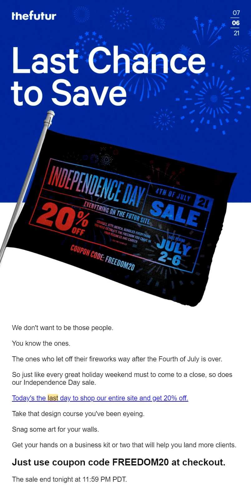 Don’t forget to make your promo code impossible to miss
The language of this email isn’t in-your-face or pushy. They describe a relatable situation and use a friendly tone to invite their subscribers to shop their entire website while the big sale is still on. The promo code is also unique and memorable enough to not even bother copying it.
ProWritingAid
This award-winning writing platform helps commercial and fiction writers strengthen their skills through online benchmarks and all kinds of workshops and virtual classes. Many accomplished authors share their knowledge and expertise through this platform, and, of course, their lessons have to be promoted.
The promotion process includes detailed last chance emails.
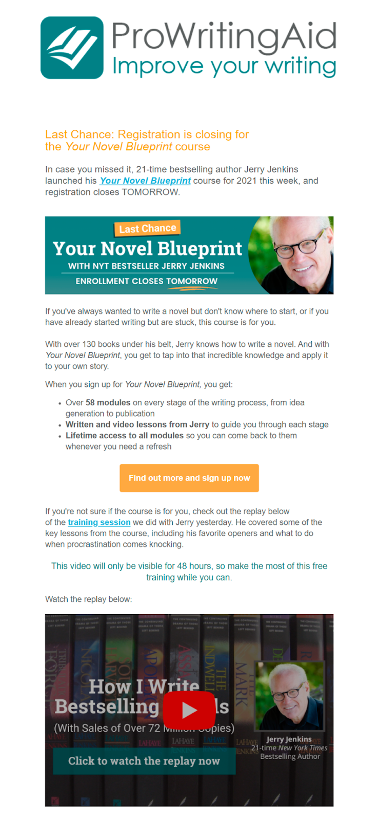 Extra-long last chance emails are great for explaining the benefits of an expensive offer
As you’ve probably noticed, this last chance email is unusually long. However, it was made this way on purpose. The platform sells high-value lessons that need to be described and explained properly. It’s not an easy task to choose a writing course and be sure it’s worth the money. The team at ProWritingAid understands that and provides their subscribers with all the necessary details to help them sign up for the course with confidence.
Arturia
Here’s another example of how to craft a convincing last call email for a high-ticket product without coming across as manipulative. Arturia elegantly highlights the benefits of the offer as well as the potential savings, adding the irresistible option to pay in four installments on top of that.
This template boasts a trendy dark theme design, excellent visual hierarchy, and stylized typography. The CTA buttons resemble load progression bars, and the headlines are formatted to mimic code lines. These are excellent and subtle touches that make the layout more unique and on-brand. Finally, the endorsements from popular artists reinforce the last day promotion, highlighting the offer’s true value for music makers.
Skillshare
Saying less to say more is definitely a thing when it comes to last day sale emails. This minimalistic sale extended email from Skillshare hits the spot even though it doesn’t have any verbose descriptions or intricate illustrations. Sometimes, the captivating CTA is all it takes.
If you promise a generous discount, like this one, let it speak for itself. Don’t oversaturate your last chance email — without distractions, it’ll be easier for your recipients to grasp the significance of your exclusive offer.
Copper Cow Coffee
Speaking of catchy email design, this example proves that it’s possible to grab and direct the user’s attention without making the message clickbaity or tacky. Copper Cow Coffee doesn’t beat around the bush — the bold text sums up the offer quite well, allowing impatient readers to skim through the email without missing any important details.
The supporting copy describes the advantages of the service quite well, pointing out the unbeatable convenience of a subscription-based coffee delivery. There are also useful links to guides for those who just take their first steps in the world of home coffee brewing.
How to create a last chance email template with SendPulse
Discover the simplicity of crafting compelling last call emails with the right tools. With SendPulse, you can assemble powerful and urgency-inducing campaigns in minutes. Our platform offers an intuitive visual editor and other user-friendly tools, enabling you to design impactful emails tailored to your goals and representing your brand.
To get started, log in to your SendPulse account or sign up for a free one. Go to the “Email” tab and click on “Mailing lists” to import contacts in bulk or add them one by one. Then, proceed to “My campaigns,” click “New campaign,” and select your target audience or segment.
SendPulse has a variety of visually striking customizable templates for all purposes. You can convert any one of them into a last chance email template using our drag-and-drop editor.
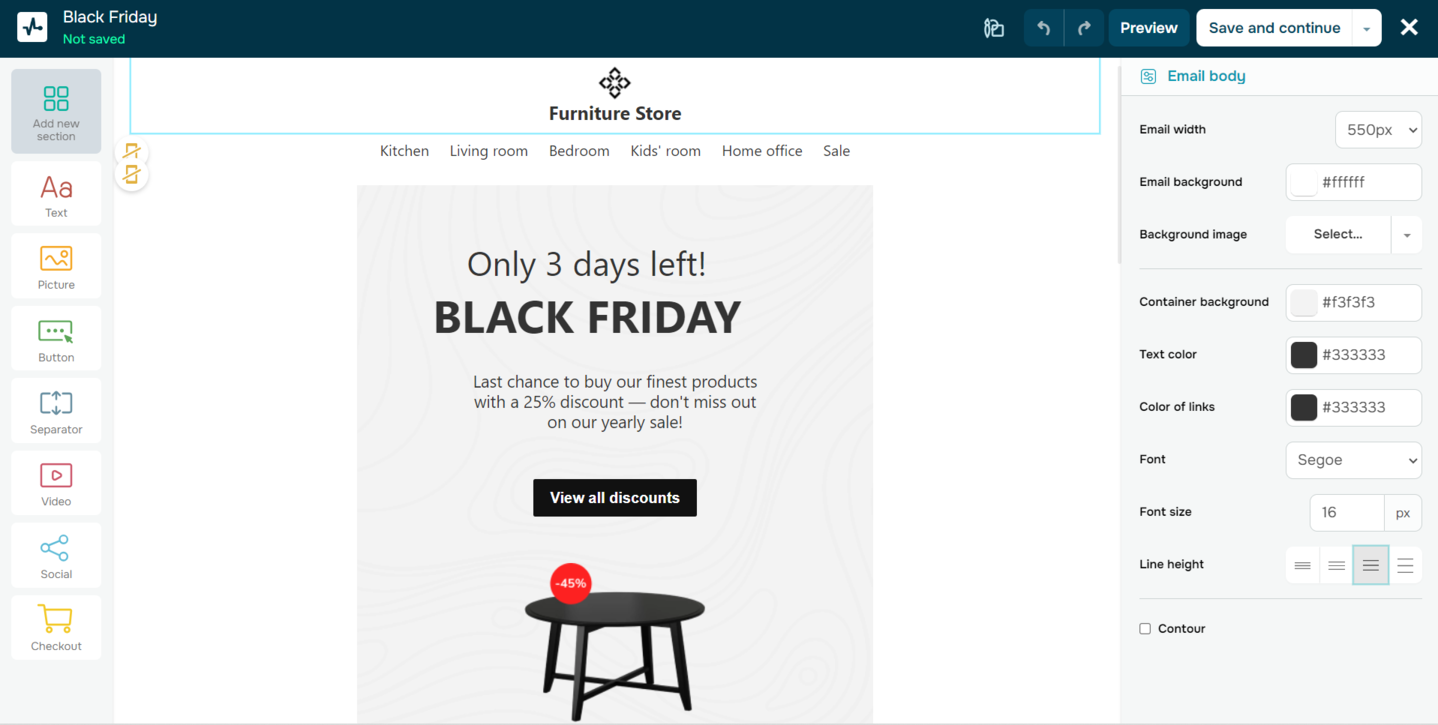 Creating a last call email in SendPulse
Add or remove some structural elements if needed and make the email stand out by adding images, text, CTAs, and other content. Ensure brand recognition by incorporating your company’s colors and logo. Don’t forget to preview your campaign before launching it.
In the campaign parameters, specify the sender name, subject line, and preheader text. Set the desired sending schedule and delivery time to engage your audience when they’re most active online. When satisfied, click “Send” to set your campaign in motion.
If you have especially ambitious email marketing goals, our
partner directory will help you find the right expert to achieve them.
It’s easier than you think
You can supercharge your email marketing strategy by including last chance emails and making them bold and eye-grabbing. This type of email can spark the interest even of the most passive subscribers because no one likes to miss out on great purchasing opportunities.
Managing your own campaigns shouldn’t be difficult. Try using SendPulse to build and automate your emails without writing a single line of code — you can start for free and learn as you go — without spending days adapting to it. Our platform empowers you to send up to 15,000 emails per month to 500 subscribers free of charge. Pricing plans start at $8 a month. You can save 20% by paying annually.