Designing pop-ups is like skating on thin ice. If you make them too intrusive, Google might penalize your website. Also, users are fed up with aggressive, spammy pop-ups — they don’t like to be manipulated into a purchase. On the other hand, if you decide to be overly cautious and formal, your new visitors might get bored and leave without properly familiarizing themselves with your offer.
Let’s talk about pop-up best practices and the art of being persuasive without being pushy. We’ll show you some eye-grabbing pop-up design examples and discuss what makes them stand out. We’ll also go through several common pop-up-design mistakes and find out how to avoid or fix them.
The dos of website pop-up design
Let’s start with the pop-up best practices. Typical pop-ups are relatively small, so you have to use your screen real estate wisely — and pay extra attention to your visuals and copy.
Keep it consistent
Just because your pop-up is a stand-alone message, it doesn’t have to be an eyesore. You can make it part of your design and help your visitors instantly recognize it as another offer from your brand addressed directly to them.
Here’s how Cetaphil, a skincare brand, makes sure its pop-ups won’t be mistaken for random third-party notifications and ignored or glossed over. The company uses the same color palette for its pop-ups and website pages, ensuring their graphic integrity.
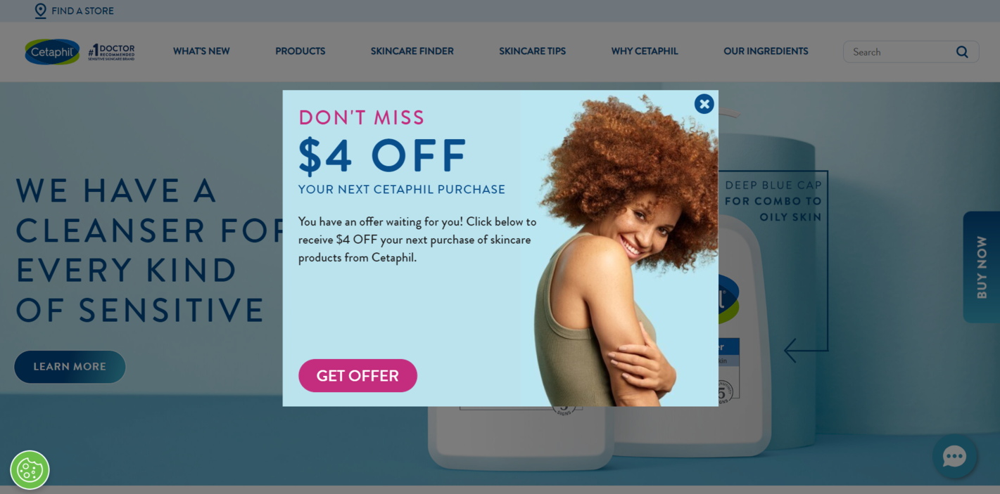 A harmonious pop-up design example
Nevertheless, this pop-up doesn’t blend into the background, thanks to its clever color accents, typography, and image. It’s inviting but not pushy, and it conveys just enough information to get the user into a buying mood without overwhelming them.
Make your headline the star of the show
Your headline should be the first element to grab the user’s attention and make them listen to you. You can make it cheeky, provocative, conversational, or humorous — just make sure to not slide into clickbait.
To maintain your brand consistency, make sure to use more or less the same tone of voice for your messages, be they social media posts, blog articles, or, as in our case, pop-ups.
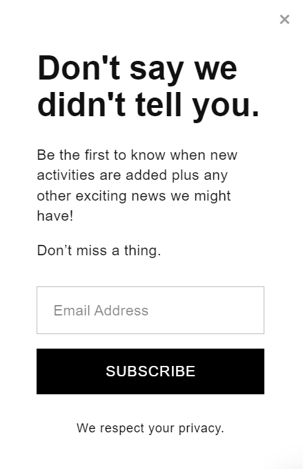 Pop-up headline example
This example features an extremely clean yet effective pop-up that has a character of its own. The catchy headline doesn’t reveal much — it teases the user and makes them read further, and the pop-up copy explains the rest, all written in a nice, friendly tone. It’s a great approach to adopt if you want to build long-lasting customer relationships and show the human side of your brand.
Add some time sensitivity or scarcity into the mix
Make your pop-ups unskippable by using them to promote a seasonal offer, a limited-edition item, or a short-lived discount. Once your website visitors learn that they only have so much time to explore your goodies before they’re gone, they’ll act quickly. That being said, you shouldn’t lie about your time constraints — it’ll undermine your target audience’s trust. Make sure to come up with an appealing and realistic limited-time offer.
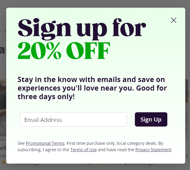 Time-sensitive pop-up example
This pop-up does a great job of grabbing the reader’s eye and conveying the essence of the offer. However, it could be further improved by making a stronger visual emphasis on the time limit. You can achieve that by using a contrasting color or a more prominent typeface to make sure your potential customers don’t wait till your offer expires.
Use custom illustrations instead of stock images
No matter how long you’ve been working on your pop-up copy — if you’re pairing it with a generic, clichéd image from a free photo library, you lower your chances of winning your users’ attention or interest. The same royalty-free stock images are being used by hundreds of thousands of businesses around the world, so you should avoid them if possible. Instead, look for unique images that correspond with your brand and its aesthetic.
Instead of staged unnatural photos of smiling people, try using hand-drawn or stylized images to make your pop-up one-of-a-kind.
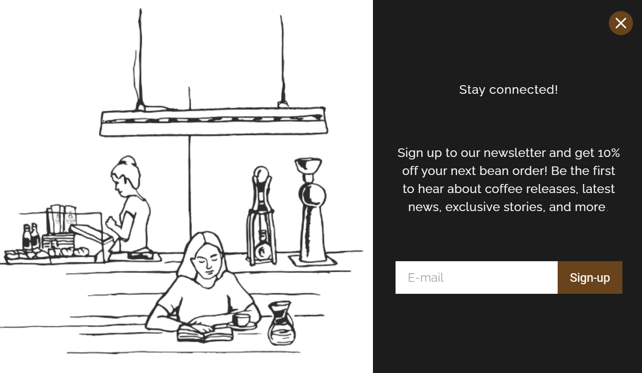 Unique illustrations for pop-ups
This pop-up is rather unusual because it includes a cozy illustration instead of a typical in-your-face stock photo. The company itself is selling coffee, and this pop-up design reflects that. This message feels more like a friendly recommendation than a commercial offer. There are a few things that could make this pop-up even better, namely, a bolder headline and a more powerful call to action.
Give your users a choice
Avoid rage clicks and make sure your first-time visitors can instantly close your pop-up and jump to your main page because that’s what they originally came for. It’s not always possible for them to visually locate your close button, so you may want to give them an alternative, such as a “No, thanks” or “Maybe later” button.
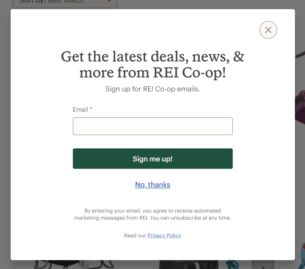 A pop-up with two options
By helping your users skip the content they find irrelevant, you show them that you care about them and that you want them to have a smooth, positive shopping experience. Just like in this example, you can also include a link to your privacy policy in your pop-up subscription form to stay transparent and honest with your audience.
Make it more personal and emotive
You can choose another way and use real photos instead of custom illustrations — just make sure to pick the most natural-looking shots where your audience can see your or your team’s personality. It’ll help your pop-up messages stand out from the crowd and trigger an emotional response in your target audience.
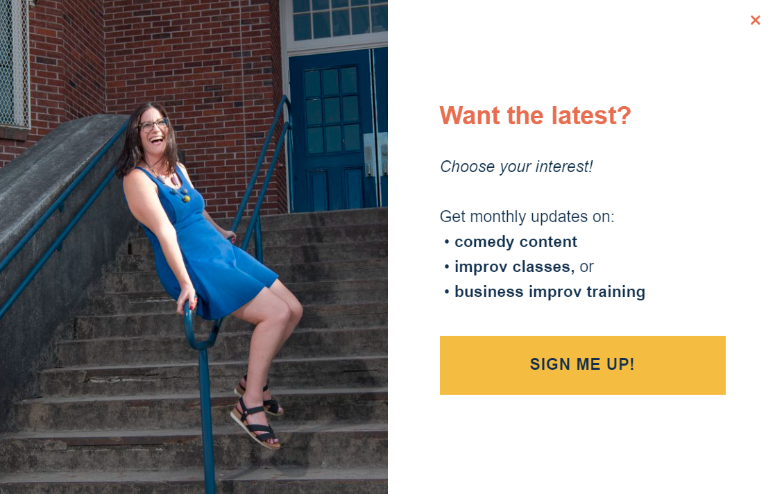 A pop-up with a real photo instead of a stock image
You won’t even need to work on your copy for too long once you get your hands on a good image. An attractive, authentic photo will do half of the work for you by non-verbally telling your visitors what your brand is about and who’s staying behind it.
Don’t take it too seriously
A pop-up can be a boring, formal, text-heavy message. Or, it can be a small delight, an Easter egg for your users — it’s up to you. You can use puns, memes, GIFs, or emoji to spice up your subscription forms and make your visitors smile. Take a look at this example to see how it’s done.
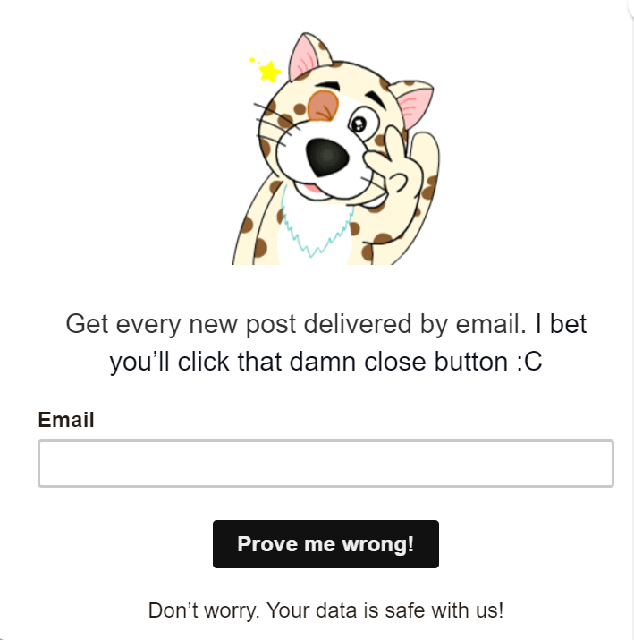 An informal, cheeky subscription form
Even if your main tone of voice is relatively formal, you can use smaller formats such as pop-ups to experiment and see how your customers react to a more relaxed version of your brand persona. Also, it might encourage them to perform an otherwise boring task such as filling out a form.
Deliver value
Before asking your website visitors to share their personal information with you, give them a solid reason why they should do that. The only way to prevent your pop-up from being perceived as spammy is to make sure that it promises real value. How will your customers benefit from filling out your form? What can they expect after handing their email address or phone number to you? Why should they check out your special offer?
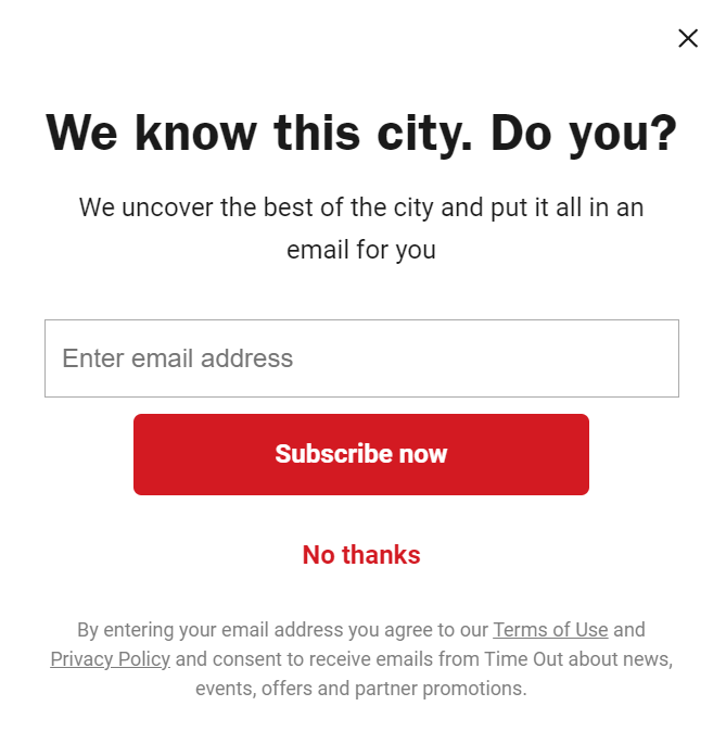 Pop-ups offering real value to users
Make a strong emphasis on your expertise and let your first-time visitors know that they’re in good hands. Design your pop-ups in a way that would highlight your unique selling proposition. This example demonstrates how to do that using clever, sharp headlines and impossible-to-miss CTA buttons.
Using footer links is one of the pop-up design best practices for a reason. Disclosing your privacy policy can help you improve your conversion rate because your visitors will keep their peace of mind knowing that you won’t sell or abuse their data.
Respect the user’s screen space
Let your creativity run wild when designing pop-ups, but don’t forget about the user experience. Justify your use of space and don’t allow your messages to hijack the whole screen if all you’re offering is a modest discount. If you want your message to be an absolute eye-catcher, try using bright colors or unusual forms.
Look at this pop-up design example from BarkBox. The message is tiny but hard to miss because of its cheerful yellow background, which doesn’t conflict with the website’s color scheme at all. We can see the same shade of yellow being used to highlight text throughout the page.
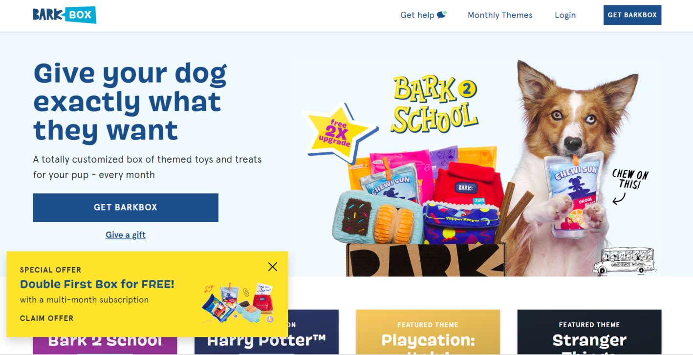 A small-sized pop-up example
The CTA button leads to an elegant step-by-step form where users are asked to describe their pet in order to get a customized box with toys and treats. An attempt to squeeze such a big questionnaire into a pop-up would have turned into a UX disaster — a small-sized message was a better option.
Keep even “boring” pop-ups friendly and conversational
Legal pop-ups have the right to take over the whole screen because they contain important disclaimers and protect the contents of the website. In fact, they should be full-screen to get the user’s undivided attention.
At the same time, they’re often unnecessarily formal, if not intimidating. You can follow Sakari brewery’s example and inject a bit of personality into your website pop-up design and copy.
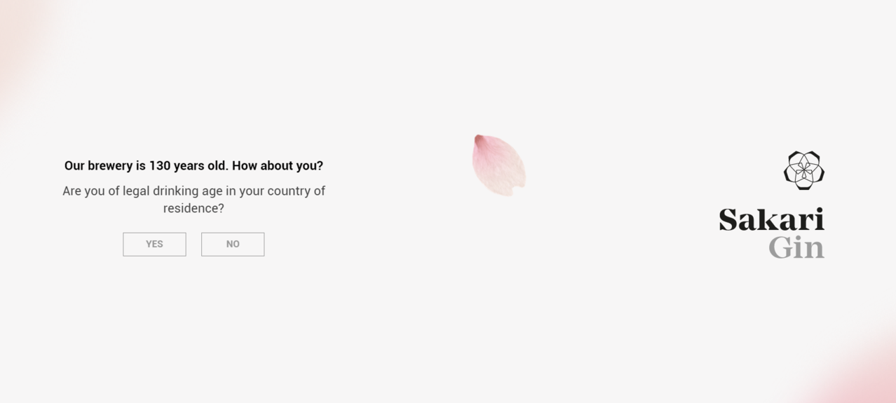 A pop-up with a legal disclaimer
This lightweight pop-up overlay leaves a positive impression and serves as an elegant introduction to the website itself. Instead of making the user type in their exact age, the pop-up is simply asking them whether their age allows them to consume alcohol in their country legally. Since there’s no way for the company to prove if the submitted information is true, they prefer to not bore their users with meaningless forms and fields.
The don’ts of website pop-up design
Let’s move on to the pop-up design examples that teach us what can be avoided or designed differently. It’s important to not overstuff pop-up messages, but it’s also crucial to keep them meaningful and informative.
Don’t make pointless pop-ups
It might be tempting to create a pop-up just to make your homepage more lively and interactive, but you should always keep the end user in mind. Will your pop-up serve a specific purpose and enhance the buying experience for your visitors? Or will it just annoy or confuse them? Make sure every little distraction you create is justified.
Pointless pop-ups aren’t actionable. They’re either too abstract or too obvious — sometimes, they don’t even have a CTA button, like in this example.
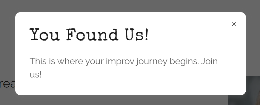 A pop-up message without a call to action
When faced with actionless pop-ups, users don’t usually know what to make of them. They don’t want to miss out on good deals, but they also aren’t ready to spend time deciphering every little notification. It makes sense to avoid uninformative pop-ups at all costs if you want to create a frictionless customer journey.
Don’t oversimplify your pop-up
Overloaded, busy pop-up design can be harmful, but it doesn’t mean that you have to strip everything down to the bare bones. If you go too far, you might end up with something like this — a pop-up that looks unfinished, even unprofessional.
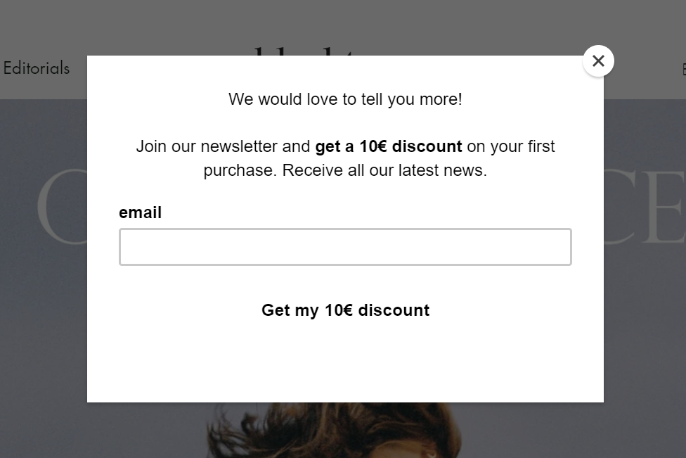 An oversimplified pop-up example
Keep the essentials of your pop-up design where they belong. A CTA button, a headline, and a supporting text play a big role in creating a compelling message.
Don’t force your visitors to give you their data
The pop-up forms on your website shouldn’t be intrusive or mandatory — if they are, neither your customers nor Google will like it. If you aggressively offer your new visitors to register without explaining why, chances are, they’ll just leave.
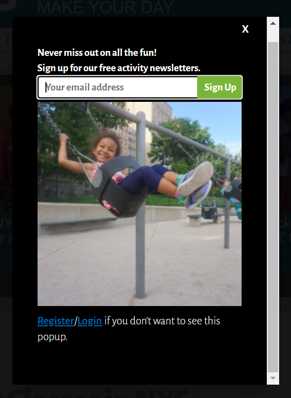 An intrusive pop-up example
Instead of manipulating your users into a purchase or a subscription, offer them valuable content or fantastic deals they won’t find elsewhere. In short, make sure your website pop-up is a lead magnet, not a scarecrow.
Don’t sacrifice legibility and accessibility
We’ve mentioned why it’s important to stay consistent and design pop-ups in alignment with your general brand guidelines. However, there’s no need to go overboard with it and prioritize aesthetics over functionality — your pop-up design can be both pretty and accessible.
Here’s a pop-up design example that is visually pleasing but not very legible.
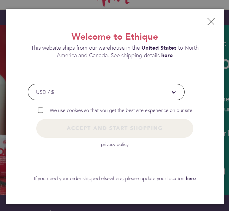 A low-contrast pop-up text example
The text is too small and not contrasting enough — it does look stylish, but it’s hard to read. The link to the privacy policy is barely visible, and the CTA button is “locked” until the user accepts cookies. With pop-ups, you need to be a bit more obvious and straightforward. Your visitors are just getting acquainted with your website, and it’s unfair to make them spend time and energy reading the fine print.
Don’t go full page unless you have a good reason to do so
Full-screen pop-ups can confuse your website visitors and make them think they landed on the wrong page. Because of the format, the “Close” button usually ends up being further away and harder to locate, which can throw off some users. You can almost always trim the fat off and avoid taking over the whole screen.
However, it makes sense to choose the page overlay format if you have something important to demonstrate, such as, say, your value-packed newsletter.
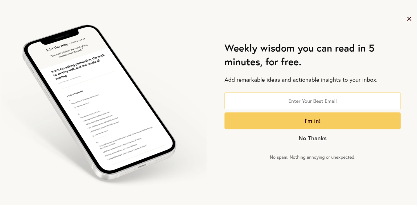 A full-screen pop-up example
In this example, the page overlay format allows the user to have a glimpse of what they’re being offered. They can actually see that the newsletter is worth subscribing to, so they won’t be worried about sharing their email address. Alternatively, you can use a video pop-up, but creating a high-quality video requires much more effort.
Design exquisite pop-ups for your website in minutes
With SendPulse, you can create and set up personalized pop-ups in less than 10 minutes. Choose one of the predesigned templates and customize it to your liking using our easy drag-and-drop builder. Then, define display conditions to guarantee that your message appears at the right time.
Our platform allows you to create responsive, GDPR-compliant pop-up forms to boost your conversion rate and turn passive visitors into loyal customers. Forget about rigid, out-of-place pop-ups — you can run different scenarios and CTAs based on the purpose of your page to make sure your users see the most relevant messages.
SendPulse gives you a complete toolkit for marketing and sales automation. Generate leads using pop-ups and chatbots, nurture them through email campaigns, and keep track of them in our CRM. Give it a try!