The thing about webinars is that people tend to procrastinate and don’t register right away because they think, “It’ll be recorded anyways. I’ll watch it later.” Needless to say, that day may never come. That’s why we’ve decided to look closer at what makes webinar landing pages work. Stick with us, and you’ll learn how to attract more attendees with one simple page.
What is a webinar landing page?
A webinar landing page is a stand-alone page where you describe your online event and encourage visitors to participate in it by registering in advance. Usually, a webinar landing page includes an event schedule, a list of speakers, and an overview of the topics for discussions that will take place.
There are so many weak webinar landing pages out there, and that’s why it’s important to learn from the best. Here is an example of a killer webinar landing page you don’t see every day:
 A compelling webinar landing page example; source: Impact
Webinars can be an essential part of the lead-nurturing process — they help you collect email addresses, establish personal contact, demonstrate your expertise, immerse your prospects into your product, and answer their questions. Webinars are equally effective for conversing with existing clients and attracting new ones, so you can’t afford to make a mistake.
There are quite a few details that turn a boring event description into an attractive invitation:
- converting, strong headlines;
- key event details;
- a sense of urgency;
- positive feedback from previous attendees;
- a description of the benefits viewers will gain;
- high-quality headshots of the hosts and speakers;
- a contrasting CTA button.
You’ll see all of these elements at work in our webinar landing page examples.
Why do you need to create a webinar landing page at all?
As with any other event, you need to put some effort in to earn your audience’s time and attention. A landing page is the best way to do that: you get enough virtual space and creative freedom to present your webinar in the best light. Webinar emails, effective as they are, won’t do the trick alone. But, combine them with tailored landing pages, and you’ll see registrations coming.
Find out plenty of tips on making
webinar emails an effective part of your lead nurturing strategy.
Here is just a brief overview of what you can do when you have a dedicated webinar landing page with a registration form:
- grow your mailing list;
- gently but repeatedly remind users about the upcoming event;
- share additional materials with newcomers;
- grab your visitors’ attention by showing an event teaser;
- create urgency by displaying a countdown timer;
- send your audience recordings and highlights after the event and stay connected with them.
Best practices and webinar landing page examples
Here, we’ll go through some important elements to include and best practices to follow. They will help you make your webinar landing page more converting without making it less unique.
Write a stunning headline
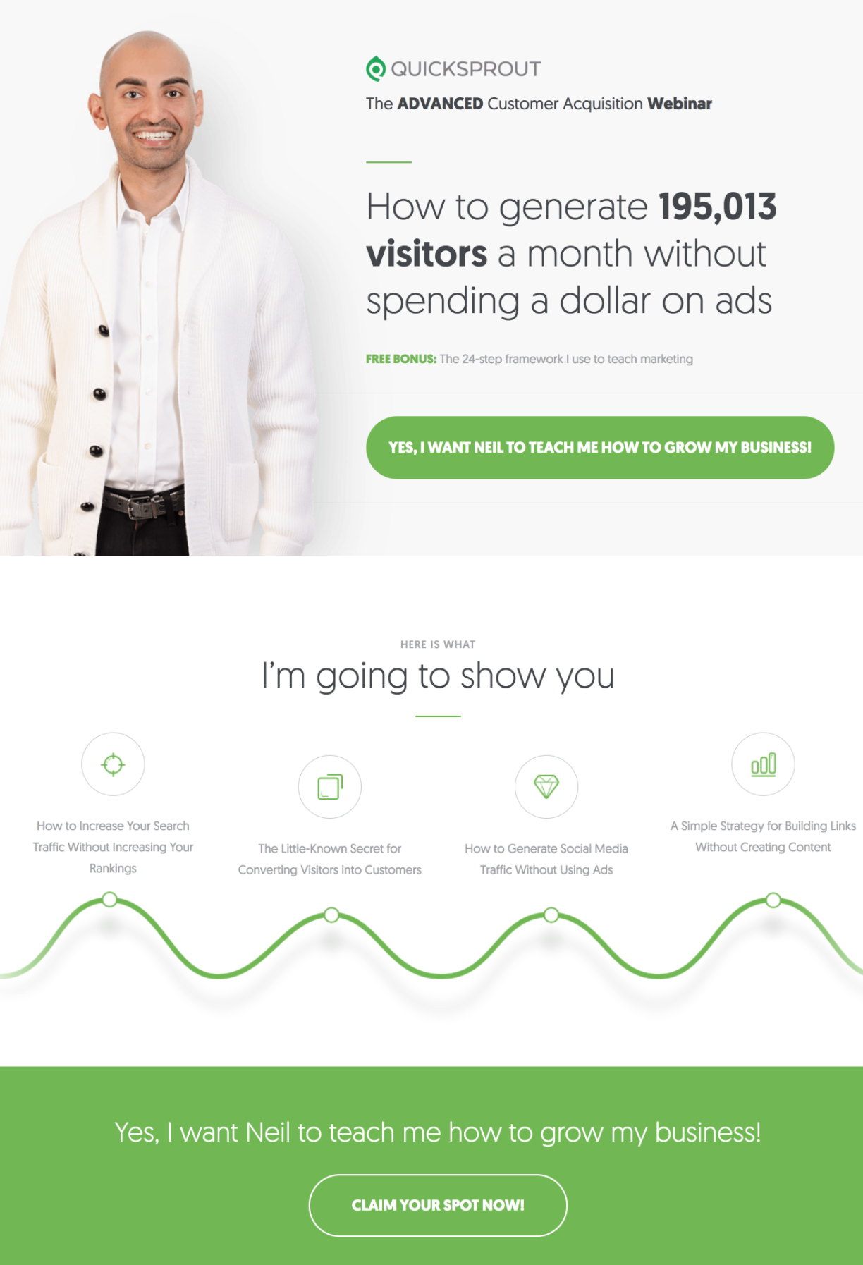
By stunning, we mean a punchy and clear sentence that describes the very essence of your online event. It should be both attractive and actionable. To make it even more effective, add a short description and a CTA button to it so that your visitors will be able to click and save their seats right away. These are the main components that you need to place above the fold. Last but not least, you can add logos of your partners or sponsors if you have any.
Here’s a webinar landing page example that effectively combines it all:
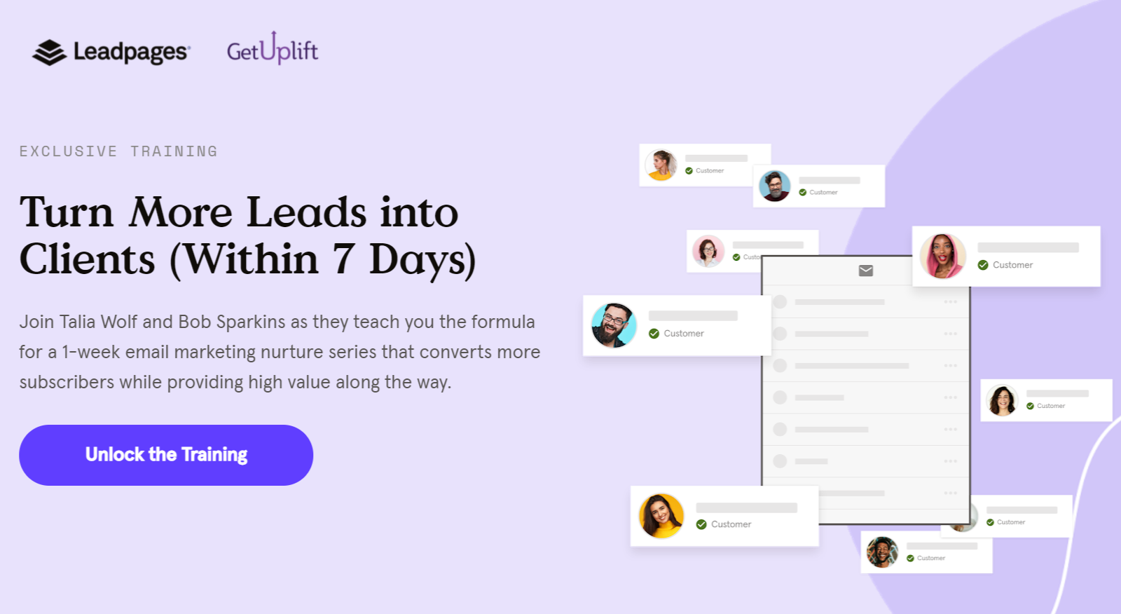 Make your headline the main focal point of your webinar landing page
Show your speakers
Include your presenters’ photos to create an emotional hook that will keep your users engaged. It’s important because it makes the whole event less abstract. But pay attention to the quality and style of the photos you choose — to maintain visual consistency, use pictures where the lighting, facial expressions, and postures of the speakers and hosts are similar.
Below is a webinar landing page example with professional headshots of the speakers:
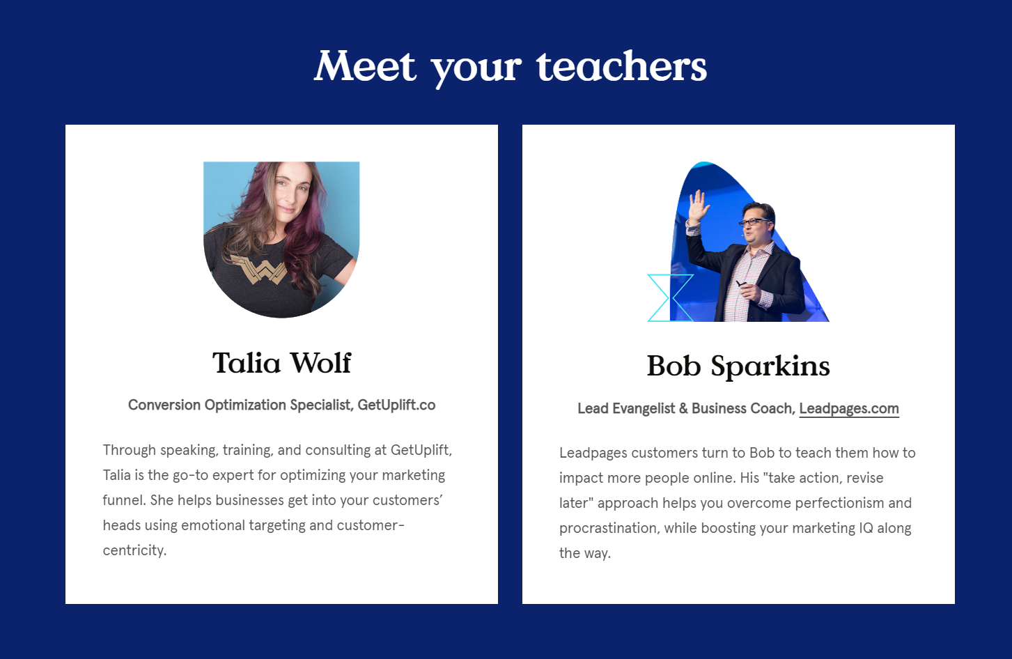 Present your speakers by using high-quality photos of them
Encourage your visitors to register
You need to explain that you limit the number of participants because you want to make it more personal. Also, you want to be able to answer everyone’s questions at the end and send them the recordings after. Therefore, it’s in your users’ interest to register upfront and claim their spot before someone else does. You can mention that you keep seating limited because you’re focusing on quality, not quantity.
Back it up with a call to action:
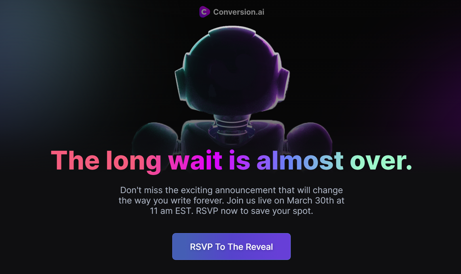 Give your users a solid reason to hurry up and save their spot
Reveal your webinar schedule
If you host or promote a series of webinars, you want your attendees to have a clear understanding of when each speaker will be up. The best way to do that is to add a schedule to your webinar landing page and make sure no one is going to miss a thing. Also, don’t forget to specify the time zone if you deal with a multinational audience.
Here’s a webinar landing page example with the schedule broken down into days:
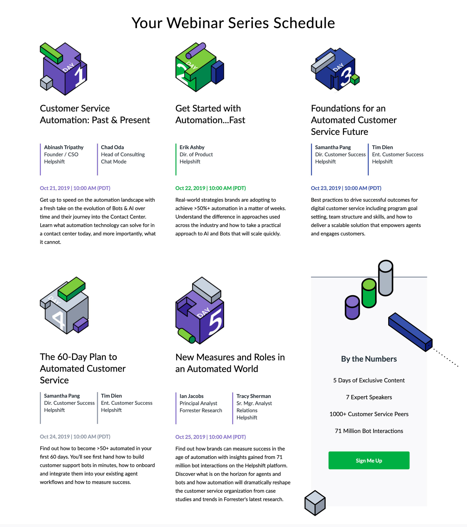 Your webinar schedule will help users attend the most interesting sessions or workshops
Drive urgency
For webinars with limited seating, it’s important to encourage users to save their seats before they’re gone. But the truth is, many users still wait until the last minute. You can prevent this by adding urgency with a countdown timer showing how much time is left before registration closes. This trick works best when paired with short, simple forms placed above the fold.
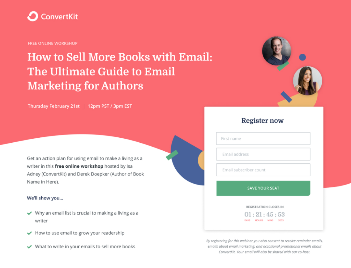 When time is limited, users are more likely to register
Keep it simple
Don’t overwhelm your users with information — only put essential details above the fold and explain the rest below. All you need to have on the first screen of your webinar page is a headline, a short description, and a CTA button.
This webinar landing page example proves that a minimalist approach makes pages look cleaner. It also demonstrates the importance of using professional and positive photos:
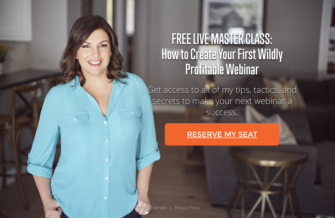 Remove any distracting elements from your webinar landing page; source: Learn Landing Pages
Include a short video
Not everyone is a big fan of reading. Sometimes, videos work much better when you need to convey the idea behind your event and engage viewers from the start. Letting your users know who they’re going to be listening and talking to is beneficial for you — you’ll warm up your audience and awaken their interest. It also makes the whole event more real and tangible.
Make a short overview or a teaser specifically for your webinar landing page, and you’ll see your conversion rates going up.
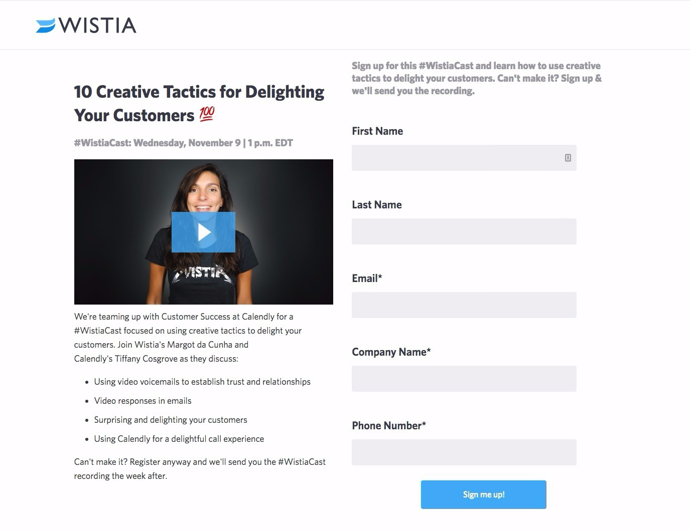 Videos are great for promoting webinars
Make a summary of what your users will learn from your event
Here, you might want to avoid going into detail and writing wordy paragraphs — just fuel your visitors’ interest by highlighting the main problems and questions you’re going to be discussing. Your task is to convince them your event is worth their time. Emphasize the benefits they will receive by participating in your webinar:
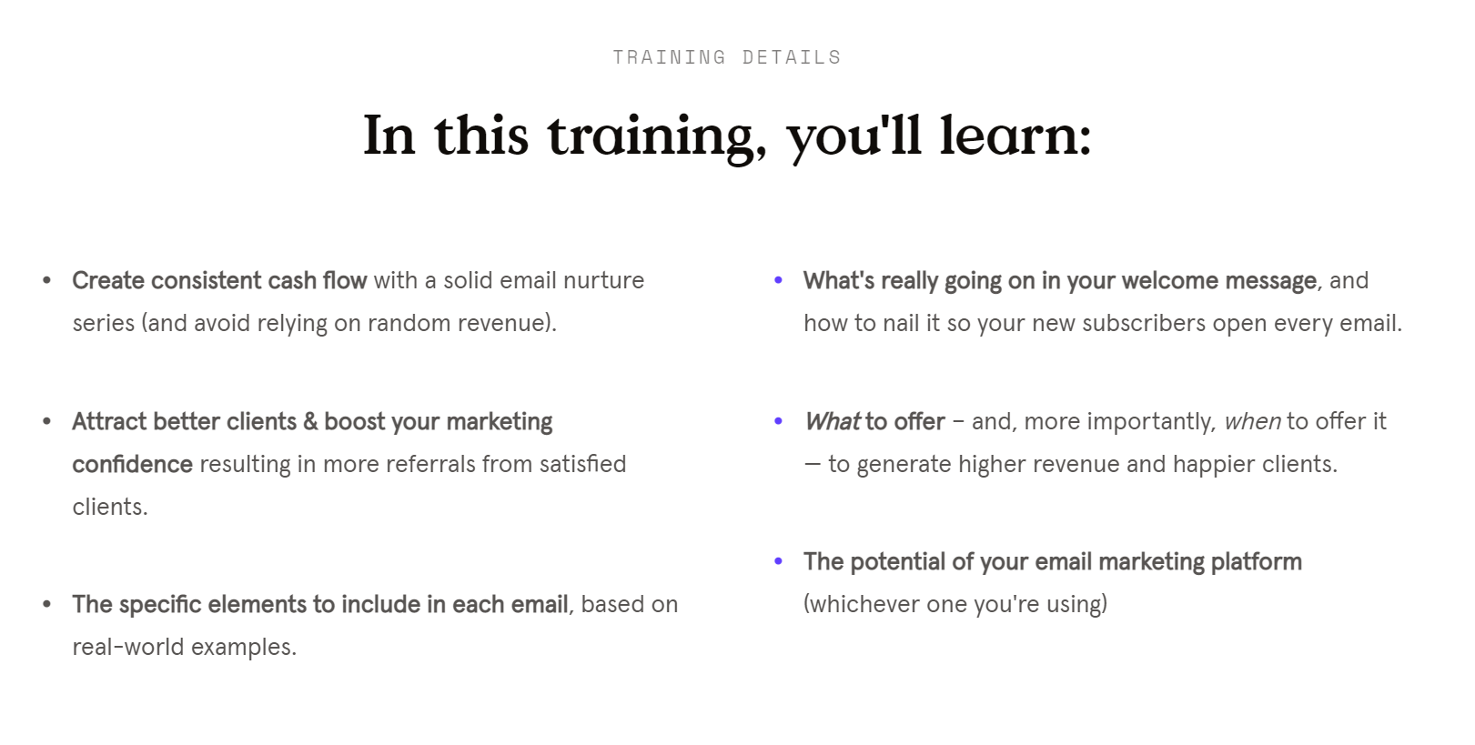 Explain what your participants will learn from your event
Give a hint on how long your webinar will be
You will help your users squeeze your event into their tightly packed schedules if you tell them how long it will take. Also, they will respect your honesty. It’s not a very common practice but it’s certainly worth considering — people are usually scared of four-hour-long conferences, so they’ll be happy to learn that you offer a brief but useful workshop.
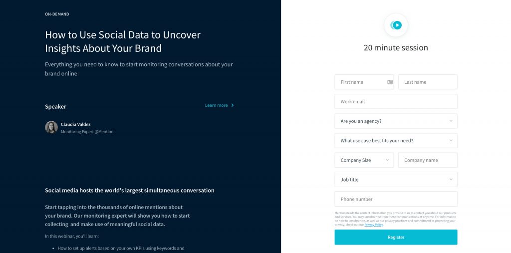 Mention the planned length of your webinar
Explain where to get your webinar recording
Of course, you can play on your users’ FOMO and not record your event at all, but it’s the common courtesy to share the recordings after — even with those who’ve registered but couldn’t make it. So, your goal is to motivate your target audience to register by saying that this is the only way to get your webinar recordings and watch them whenever they want.
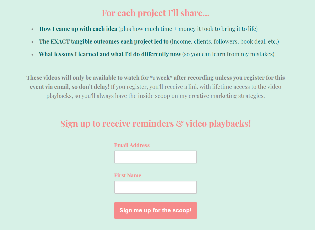 Explain how your visitors can watch your webinar after it’s over
Add social proof
People trust people. Use this to your advantage and show all of the nice things your previous attendees have to say about your events. Choose the most honest, genuine, and emotional testimonials to prove that your webinar is not to be missed. Also, try to make them more trustworthy by adding real names, photos, and job titles when possible.
 Strengthen your webinar description with relevant social proof
Add FAQ on your webinar landing page
Instead of writing lengthy copy, precisely target potential concerns and questions your users might have. In your FAQ, explain who your webinar is for and how to get access to the materials you’ll show during the event.
Of course, your existing clients already know that, but your new audience may not be familiar with the way you organize and run your webinars. It’s always better to make sure everyone is on the same page.
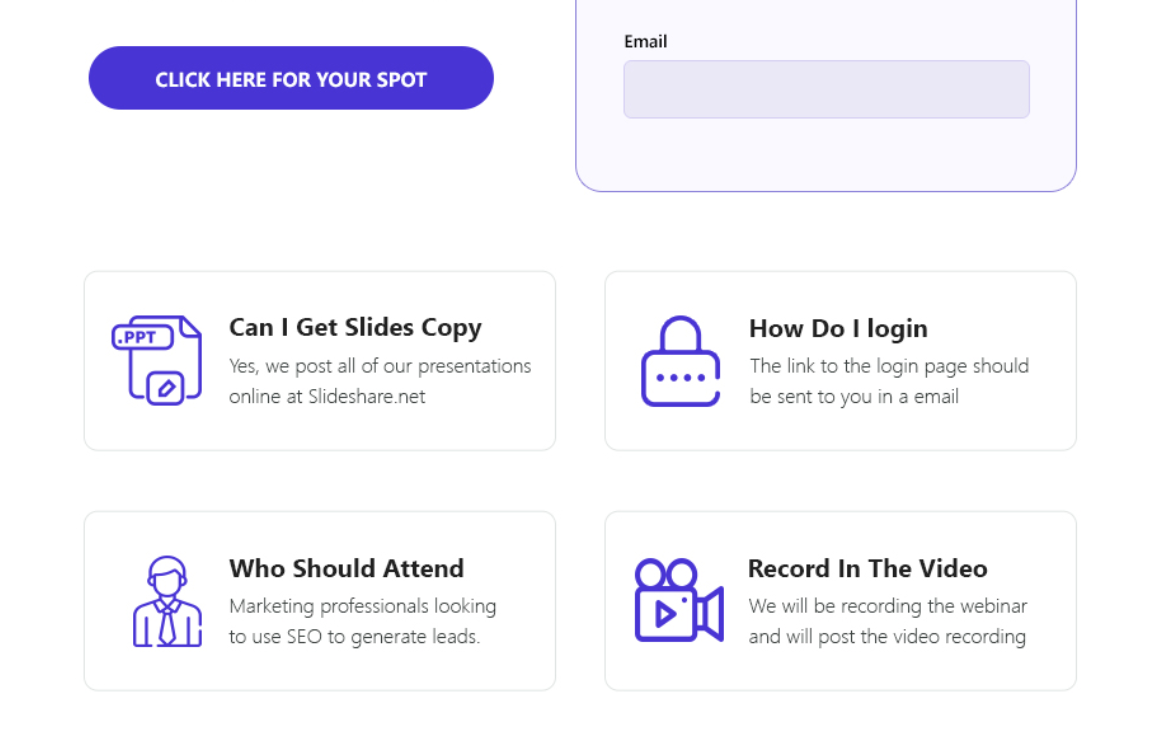 A FAQ section will help your users get acquainted with the way your online events work
Don’t abandon your page after the event
Chances are you’d like to make webinars a part of your content marketing strategy. If that’s the case, you may want to be more consistent, perhaps, by making a series of them. So, instead of disappearing without a trace, let your visitors know when you’ll be back with new webinars. You can do that right on the same landing page.
Users may stumble across your webinar landing page later, and they’ll be pleasantly surprised to see some updates and an opportunity to subscribe to your news. And, of course, it’s a subtle way to collect more email addresses without pushing.
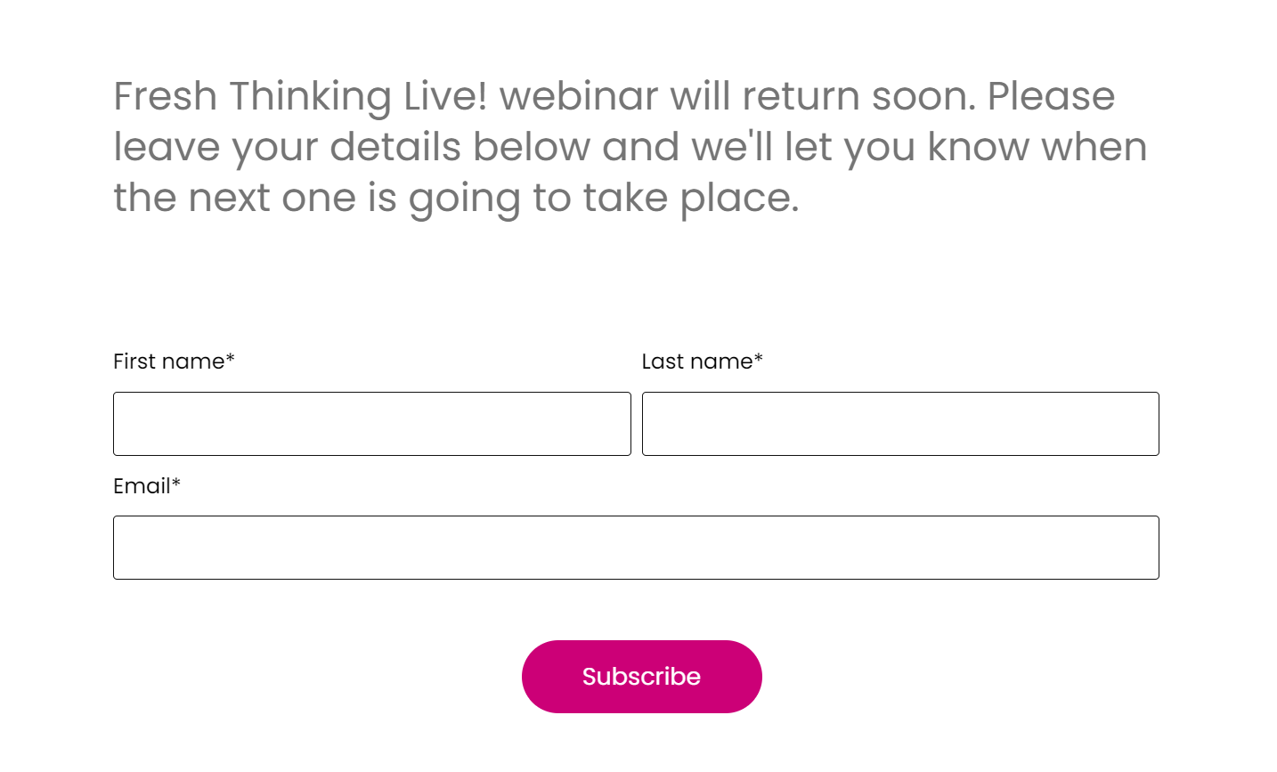 Let your visitors know when the next webinar will take place
Bring your landing pages to the next level
Congrats, you’ve made it to the end. Now, it’s time to re-examine your approach to other types of landing pages by turning them into conversion machines. Go through the previous articles in our blog and learn more about landing page design and the best practices. There is more content to come — subscribe to our news and receive our new posts right in your inbox.
If you already have itchy fingers, you can create your landing page in just 15 minutes with our simple landing page builder. Try it for free to get a taste of it!