Website layout is an arrangement of page elements aimed to provide the best user experience. It determines the sequence in which visitors notice visual components and the objects they pay the most attention to.
In the article, we define website layout elements and types. We explain how to design an effective layout and provide examples of websites that convert.
Website Layout Elements
According to CLIQUE, 94% of the first website impressions are design-related. Your layout should be well-defined and attractive to motivate visitors to stay on it for a long time. Study the main elements of the website and how they influence user experience below.
- Visual appearance. It takes about 50 milliseconds for users to form an opinion about your website. Your layout should be intuitive, simple, and good-looking to attract their attention. People need to understand what you sell at once. Make every page easy to scan and place elements according to a visual hierarchy.
- Navigation. 38% of consumers look at navigational links for the first time visiting a website. People can navigate the website using a heading menu, a footer, or call-to-actions. It is a good idea to add a “Back to Top” button and, in such a way, make searching more convenient. You can create a website map to organize all the content logically.
- Branding. A notable logo and your company’s name are required in a well-defined layout. Your website should raise visitors’ brand awareness and let them easily distinguish your business from others. You can do it by implementing the same design in your packaging, social media, site, offline location, and even the products. Also, choose a definite color palette, as 39% of respondents say color is one of the most crucial elements on websites.
- Images and videos. They can transmit your values, show products you sell, or provide helpful information about your brand. Be extremely attentive to the quality of the content, as 40% of consumers appreciate photos and images, and 21% believe that videos are the top visual elements in web design.
- Content. Organize data using a title, headings, and lists. It is critical to stick to the one tone of voice, so before you write content for your website, develop a style that will align with all your branding. Provide only useful data in an easy-to-understand form.
- Typography. What you write in your texts is vital, but how you write them is crucial too. Choose one or two readable fonts and use them in all your media accounts. It will let you increase brand awareness and recognition of your business.
- Web and mobile-friendly layout. According to Statista, mobile phones generate 54.4% of worldwide traffic, so optimizing your site for users of different devices is critical. We recommend designing your website according to UX principles to provide exceptionally positive user experiences. Also, it is essential to develop it according to SEO requirements, to reach the top places in search results.
- Speed optimization. The chance of a bounce increases when a page load time is up to 5 seconds. So, speed optimization is critical. To make your website load faster, you should compress images, videos, and gifs. Also, you can move it to a better host, reduce the number of plugins, and use caching.
- White space. It helps focus viewers’ attention on the most important elements. White space is necessary to create more readable texts, connect different components of a website, develop a visual hierarchy and make the design more attractive. We recommend leaving some white space between every content element to make it easier to perceive.
Now you understand the main website elements and how to apply them correctly. Let’s further discover the types of layouts you can use in your design.
Types of Website Layout
- Single column layout
- Fullscreen image layout
- Horizontal stripe layout
- Z-pattern layout
- F-pattern layout
- Split screen layout
- Asymmetrical layout
- Card layout
- Magazine layout
The choice of the most appealing layout is critical. It lets you make your website easy to use, focus visitors’ attention on the most important elements and convey your marketing message. Below we provide the top 10 popular layout types and some insights on how to use them effectively.
Single column layout
Single column layout is extremely widespread. It includes the content in one vertical column so viewers can scroll to discover more data. This layout looks well on both mobile and web screens. Designers often use it to place long-read blog posts. In such a case, divide the text into parts and add images, videos and gifs to make content easier to perceive.
Fullscreen image layout
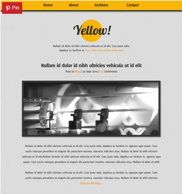
Fullscreen image layout includes only one image and, sometimes, a slogan. Viewers can’t scroll it to find more information, as his type is supposed to depict the products instead of describing them. Fullscreen image layout lets you provide an amazing first impression, as most of the data our brain processes is visual. However, it isn’t suitable for some websites, such as blogs, online magazines, stores and others where you need to place lots of content on.
Horizontal stripe layout
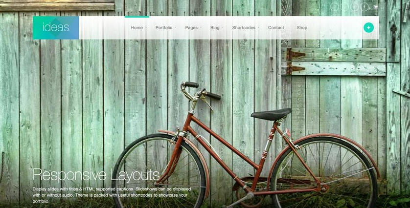
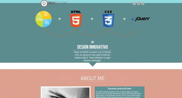
Horizontal stripe layout includes photos, videos, and illustrations that take up the whole screen. When users scroll through such websites, they see new full-screen images. You can add catchy slogans or short descriptions to provide more details. This layout lets you engage consumers and organize information into sections by creating pictures with various background colors.
Z-pattern layout
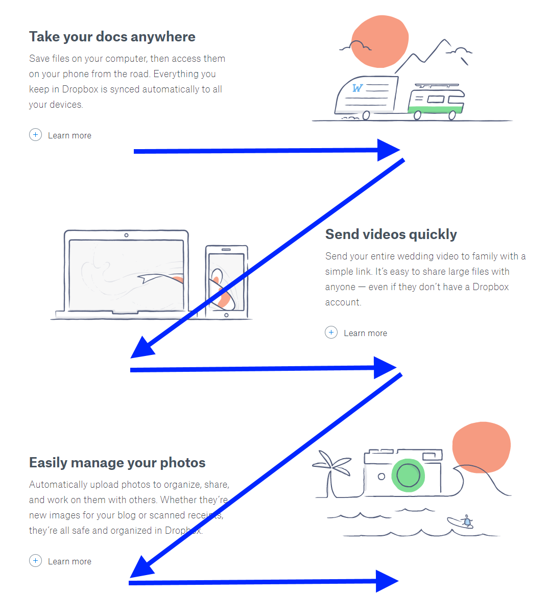
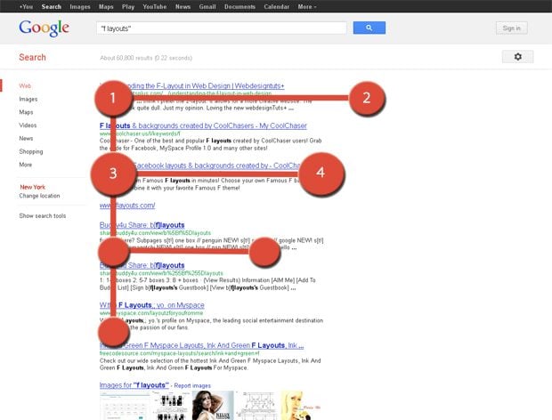
Z-pattern layout is based on people’s scanning behavior. Studies say that consumers perceive small pieces of information in a zigzag form. You should point out the most important data where viewers stop their focus. For instance, designers often place logos in the upper left corner, navigation menus on the top, and calls to action on the bottom of the page. You can mix text and images to engage consumers and make scanning easier.
F-pattern layout
F-pattern layout is also developed according to the viewers’ scanning behavior. People read huge pieces of data in an ‘F’ form. We recommend using this layout for long-read posts. Remember that consumers pay more attention to the text on the left side, so it is better to organize it using lists. Also, you can place a navigation menu, banners, or special offers above as consumers always notice elements on the top of the page.
Split screen layout
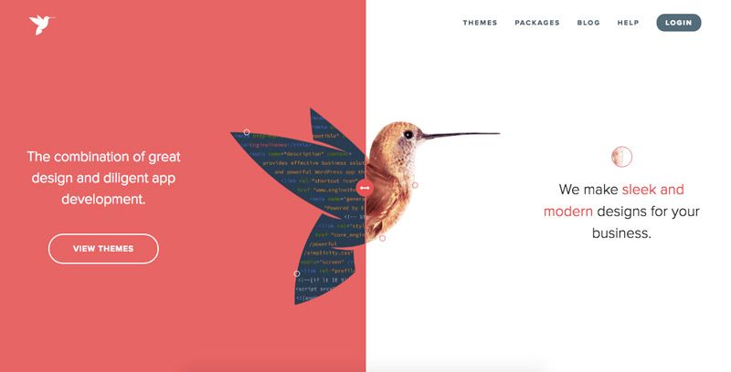
Split screen layout consists of two columns divided vertically in the center. It suits companies that sell two different products or offer two various types of content. Also, you can use it if you target two segments of the audience, e.g., men and women, teens and adults, etc. Split screen layout lets you find a balance but may seem boring. Avoid placing too much text, add images and animated details to make your website look more dynamic.
Asymmetrical layout
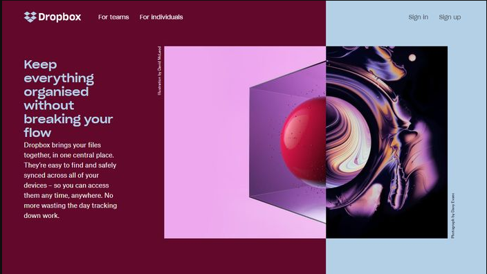
Asymmetrical layout is based on the split screen, but the parts are not equal. It lets you focus viewers’ attention on the most important pieces of content by adding them visual weight. To do so, use bright colors and make certain elements bigger than others. An asymmetrical layout helps make your web design more dynamic and engaging and allows people to scan pages faster.
Card layout
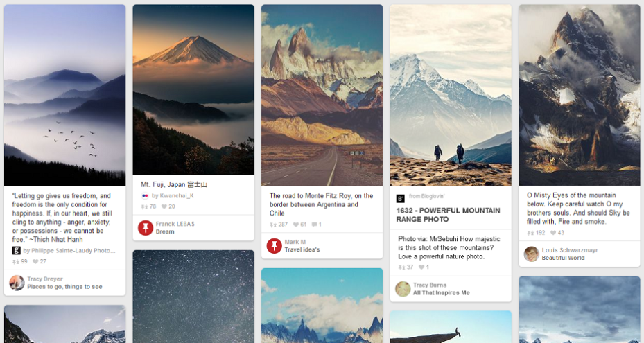
Card layout consists of several pieces of content organized in similar boxes. Each card usually includes a title, an image, and a few sentences of text. If viewers click on it, the browser leads them to a separate page describing this product. This layout suits content-heavy websites. To make it more interactive, you can add bite-sized previews. Pay attention to the white space between the cards, as the lack of it can negatively influence your site's readability.
Magazine layout
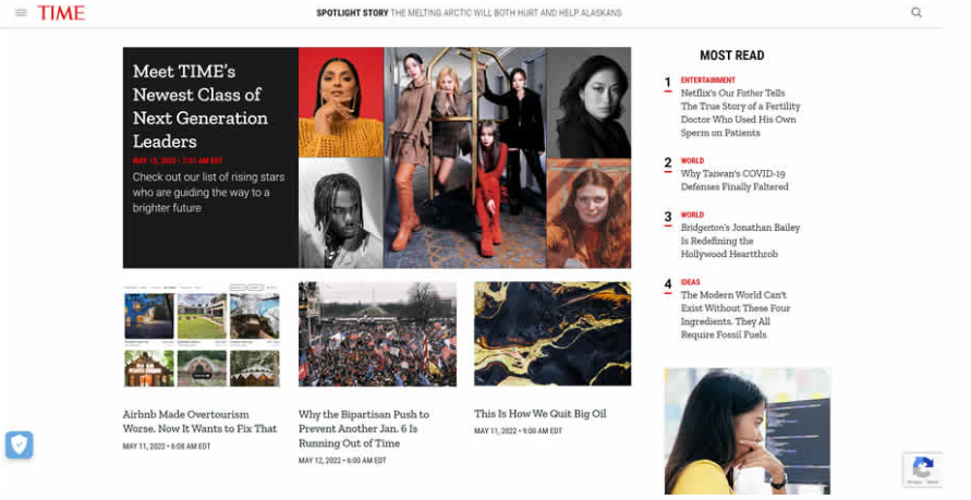
Magazine layout is necessary when you need to place lots of content on one page. It is based on a modular grid. You can place content in the columns and highlight vital information by adding visual weight. Prioritize data using titles and bright colors, make the most prominent pieces of content bigger and place them in the center of the page. Your layout should remain readable and add white space between elements to make it easier to scan.
Once you choose the type of layout that suits your website the most, it is time to design it according to your needs. Discover how to do so in the next section.
How to design an effective website layout?
According to Review 42, 75% of people judge a company’s credibility based on its website. The choice and development of a user-friendly layout directly influence the number of conversions. Study how to design an effective website below.
- Set up your goals. The website layout triggers viewers to do certain actions, so you should create it according to your company’s aims. You may want to raise consumers’ brand awareness, inform them about something or sell your products. Note that layouts may vary from page to page based on your goals.
- Estimate the amount and the importance of the content you will place. The size of text, images, and videos determines the choice of a layout. You need to understand what content you need to focus users’ attention on to create a visual hierarchy and, at the same time, make all the elements look holistically together.
- Create wireframes. It will let you allocate space and prioritize the essential elements. Pay special attention to the white space and its distribution. 79% of consumers only scan pages, so you should make it easier to perceive the data. Note that your wireframe should fit all screen sizes, so it is critical to start from the smallest one, usually for mobile phones, and gradually enlarge it.
- Identify stylistics and create content. Then you should choose the color palette and determine the visual appearance of your website. The style should remain the same in all your media accounts and align with your branding.
- Use cutting-edge services for development. It may seem difficult to craft a website, but now there are plenty of services that can help you. Use SendPulse drag and drop builder to create a landing page or an online store without writing a line of code. You can insert multi-channel subscription widgets and add buttons and multiple links to social media accounts to optimize your website.
- Test the performance and optimize. A user-friendly design needs constant improvement to stay up to date. You can ask a few people to try your website and provide feedback. It is better to screen-record their actions to find and fix the problems immediately.
Now you are almost ready to create the functional and aesthetic layout that converts. Continue reading to discover examples of effective websites and gain some ideas for future development.
Examples of Website Layouts that Convert
HubSpot states that 50% of users are sure that website design influences the overall brand. Tendencies are changing, but the basics of a converting layout remain the same. Study some examples to gain ideas for your web design.
Shopify
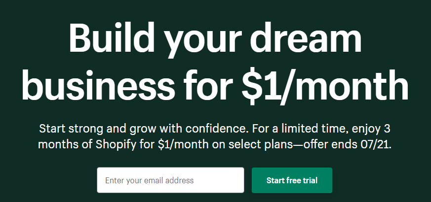
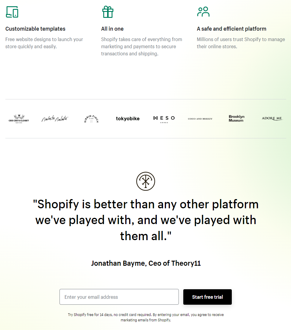
This ecommerce platform lets people launch brands and sell through their website. Designers created the free trial page based on a single-column layout. A few blocks include all the elements consumers consider before making a decision. Such a decision lets viewers study all the benefits and subscribe at once.
RealSpace
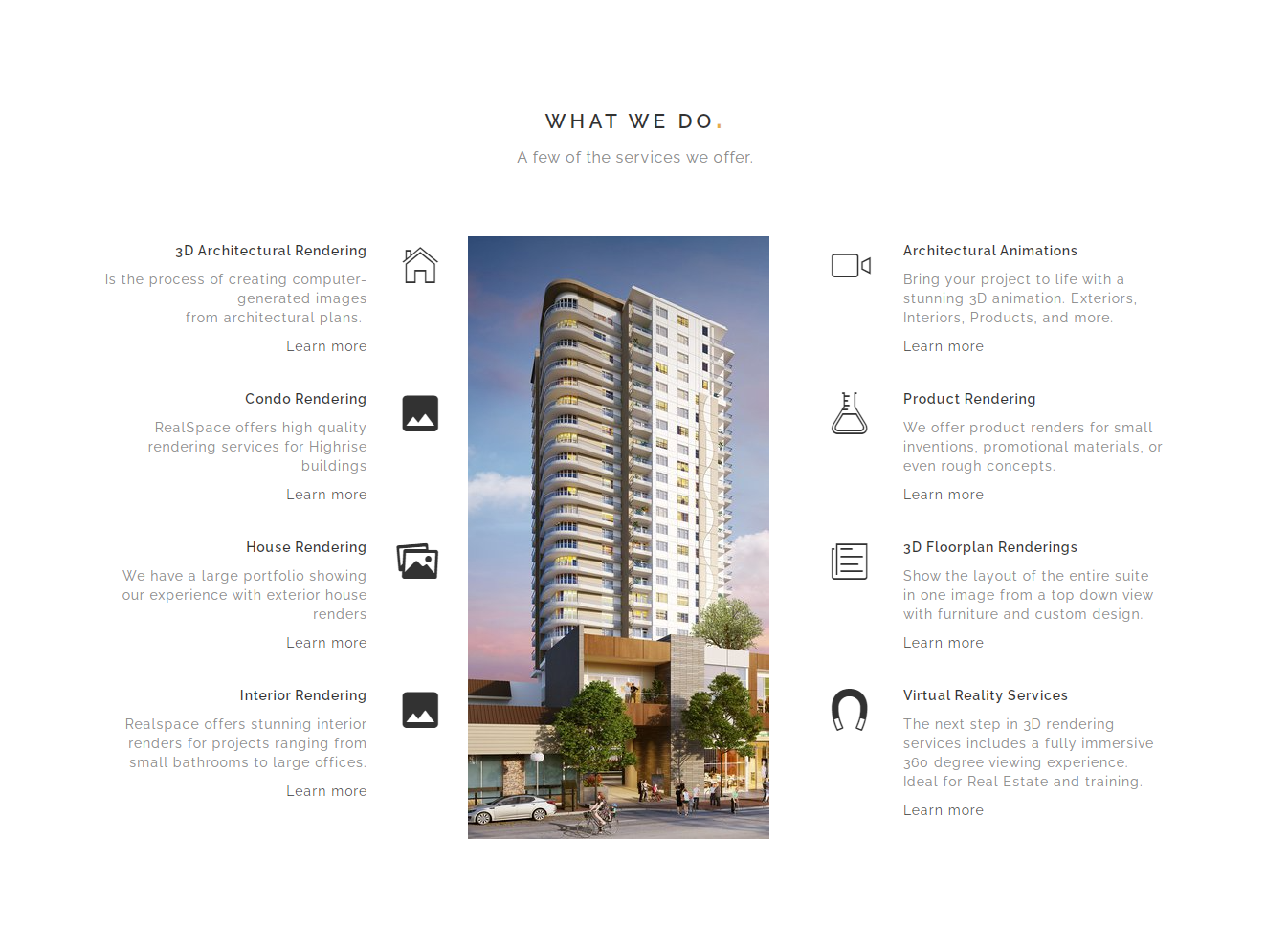
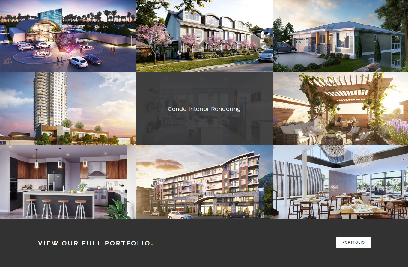
It is an architectural rendering and 3D animation service. Its design looks stylish and attractive and ideally fits the progressive and technologically-educated specialists they target. In the first screenshot, the design is based on a split-screen layout but is modified by placing the image in the center. The second screen is a grid of cards that lets you study more about solutions the company offers. This website has plenty of white space and amazing images which motivate viewers to continue searching and, perhaps, start using the service.
Wise
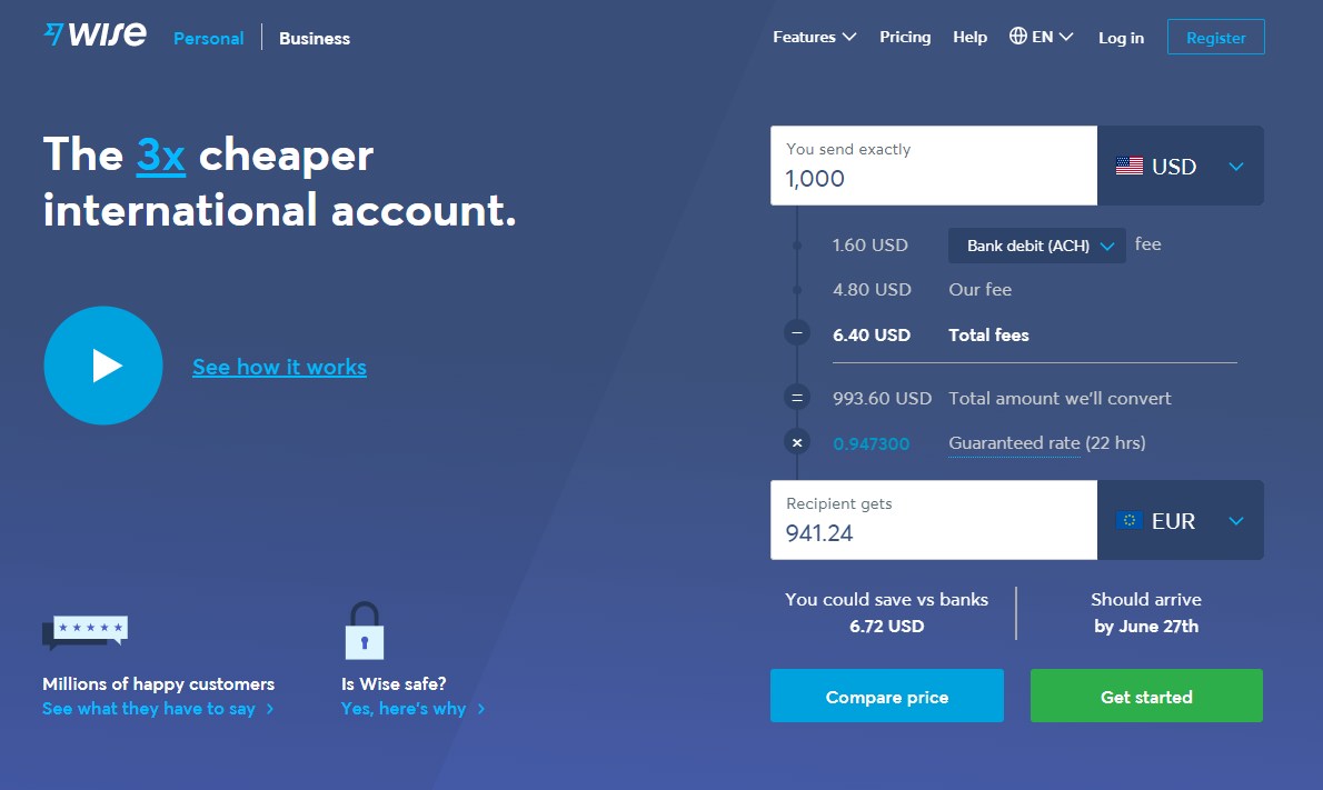
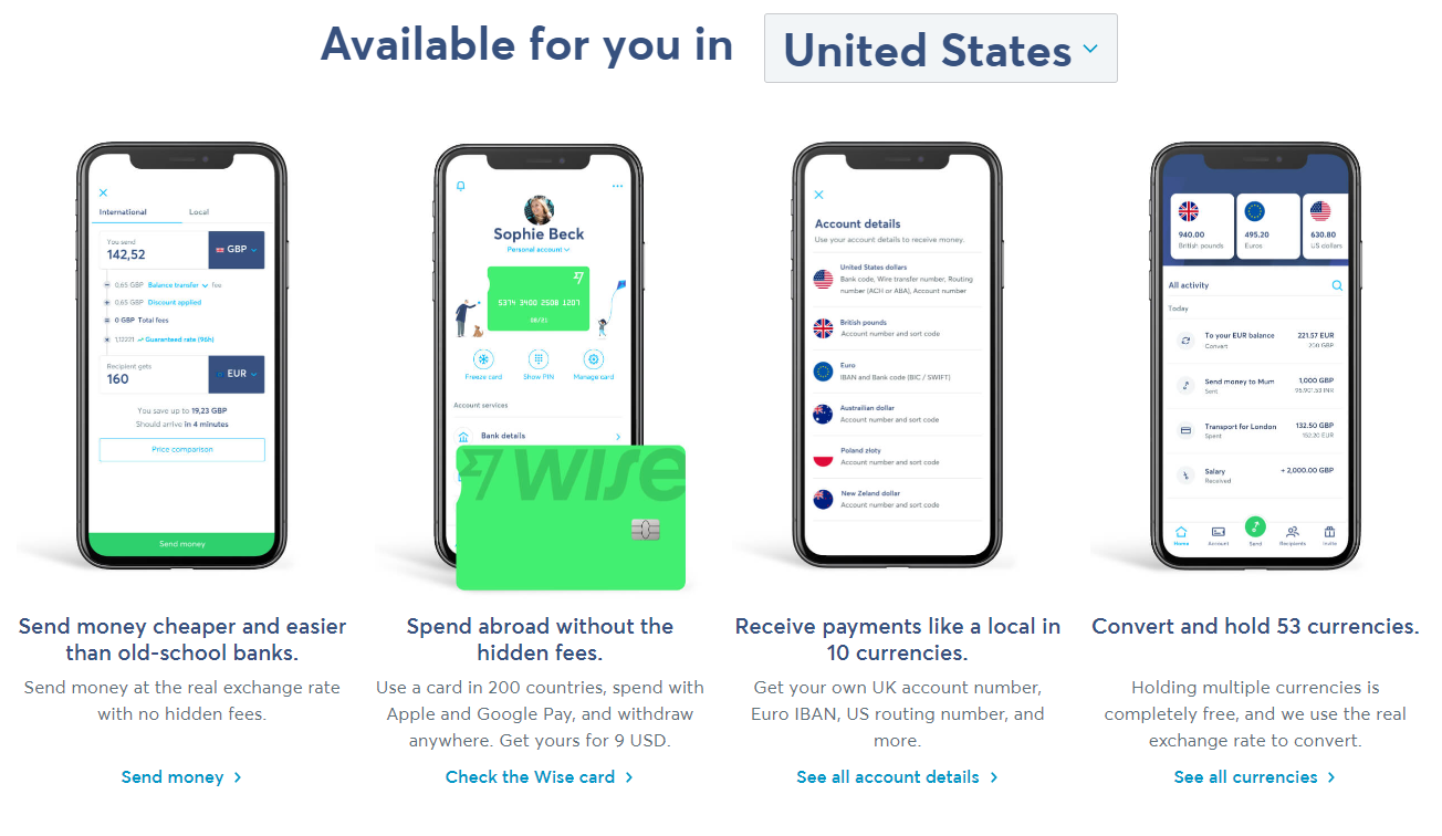
It is a service for transferring money. Designers took a Z-pattern layout as the basis for the website development. An ultimate advantage of its main page is that it includes a fees calculator and tips on platform usage. You can click on the CTAs to open the pages that describe the benefits in detail. Generally, the layout is easy to understand and very engaging.
Congrats, now you know what the website layout is, its elements, and types. Use SendPulse builder to create an effective landing without hiring a designer. Promote it with our email, SMS and web push campaigns to attract and convert lots of clients.

or