It’s overwhelming to think about the level of competition brands face these days, especially online. All possible digital surfaces and platforms are being monetized, and the quality of ads is constantly improving. About eight out of ten dollars invested in ads in the US are devoted to digital advertising. How do you stand out in such an overcrowded and noisy environment?
One way to do that is by producing high-quality niche content, e.g. newsletters, blog posts, or video tutorials. The thing is, top-tier content also needs promotion, and that’s where email pop-ups step in. They’re also irreplaceable for organic and ethical mailing list building and lead generation.
This post will help you discover or rediscover email pop-ups and learn how to make them highly converting while staying true to your brand voice. There’ll be no sleazy sales tricks — just hands-on tips and proven best practices to help you build an engaged mailing list.
What are email pop-ups?
Email pop-ups, also known as subscription forms, are those little messages that appear out of nowhere and ask you for your email address when you visit a new website. Typically, they contain up to three fields and a sign-up button. Email pop-ups are also called lead capture forms because they help you connect with potential customers and start nurturing them.
Some pop-ups take over the whole screen while others are modestly displayed somewhere in the corner of the page. Here’s what a regular email pop-up looks like.
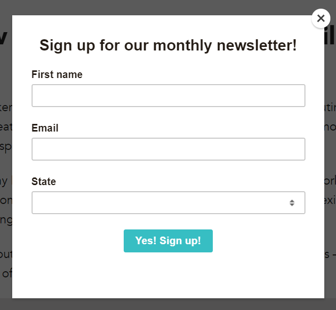 An email pop-up example
A good email pop-up doesn’t manipulate the user — it just invites them to access valuable and relevant information and gives them solid reasons why they should do so. When done right, pop-ups shouldn’t feel intrusive. You can make them informative, educational, or entertaining, depending on your website’s purpose.
Email sign-up pop-ups are vital for building a loyal, organic audience. By filling out your form, the user grants you verifiable permission to send them emails. As a result, you get higher-quality leads and better email deliverability, especially if you choose double opt-in.
There’s quite a variety when it comes to email capture pop-ups, and you can choose the right format based on your specific goals. You can also try out different types and scenarios to establish what works best for your target audience.
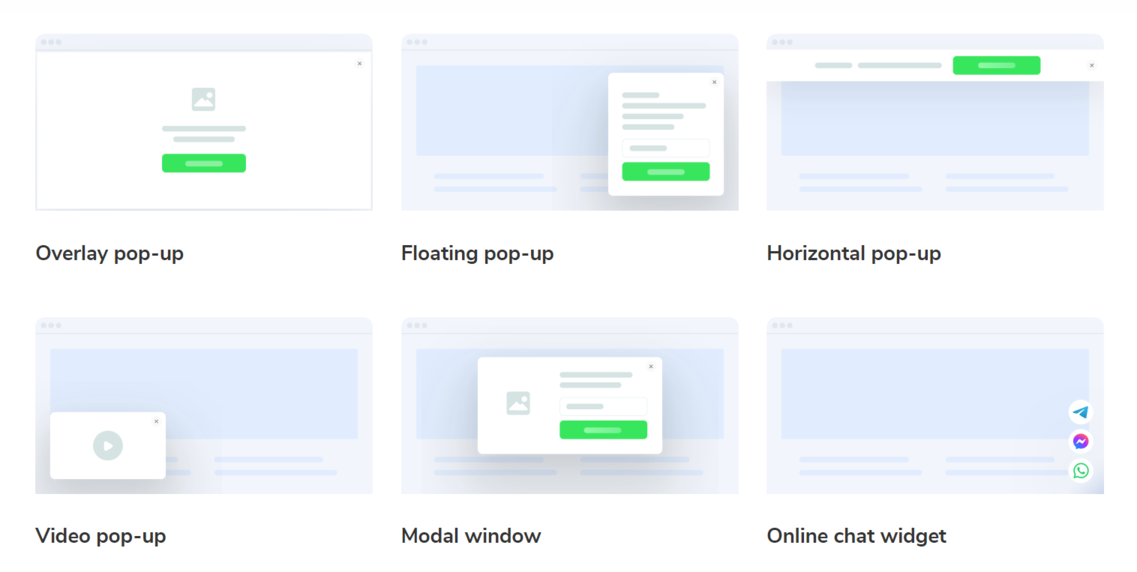 Pop-up types you can create with SendPulse
Let’s discuss the six most popular pop-up formats and their pros and cons.
- Overlay pop-up. This format appears on top of the main content on the page and covers the whole screen. Powerful as it is, this pop-up format should be used with caution — reserve it for highly important announcements or limited-time offers. Otherwise, you may inadvertently annoy your website visitors.
- Floating pop-up. This is the most common and versatile pop-up type. A floating window grabs attention but doesn’t interrupt the overall viewing experience — the page content remains visible because the pop-up itself is displayed in the corner of the page. A floating pop-up allows you to make your messages compact yet noticeable.
- Horizontal pop-up. This pop-up is displayed in the form of a horizontal bar at the top or the bottom of the page. This format is more gentle — it doesn’t interfere with the reading experience, and the user can interact with the pop-up whenever they’re ready.
- Video pop-up. This is, probably, the most engaging and prominent pop-up format. It usually features a short video clip along with a CTA button. This format is perfectly suited for promoting highly visual products.
- Modal window. A modal pop-up appears in front of and darkens all other page content. It is harder to miss, compared to a floating pop-up. Modal windows enable you to quickly bring attention to something essential, like your curated newsletter.
- Online chat widget. This pop-up type opens a chat window where your user can communicate with your chatbot or real agent. Online chat widgets can also be used for collecting email addresses. In case your support team is offline, your chatbot can ask the user to leave their contact data so that your agent can promptly call them back.
All six pop-up formats are great for collecting subscriptions. It all boils down to what kind of angle you want to take when inviting your visitor to leave their email address. Do you want to impress them with your expertise while avoiding distractions? Use clean text-based pop-ups and focus on your credentials. Do you want to present your personality and establish an emotional connection early on? Try vibrant video pop-ups.
With SendPulse, you can create all six types of email pop-ups — more on that in the following sections.
How should you structure your email subscription pop-up?
Now, to the pop-up anatomy. This seemingly small message often contains over five elements, and each of them serves an important purpose. Here’s what they are and how they work.
Headline
Think of this as a hook used to grab the user’s attention. If you prefer minimalism, turn your headline into an extended CTA where you explain what kinds of emails you’ll be sending and how often. For instance, “Subscribe to our biweekly newsletter to receive failproof gardening tips!”
Or, you can take a different route and grab your visitors’ attention by making a bold statement they’re likely to agree with. For example, if you’re a tour guide running an informational website about your city, your email pop-up headline could be “Bored of going to the same places every weekend?”
Value proposition
Once you’ve stated your offer, it’s time to explain why you think the reader should share their email address with you. How will your content help them work, shop, create, exercise, or run a household more efficiently? What can you offer that they can’t google themselves? Try to wrap up that in one concise sentence.
Trust signals
What makes you an expert? Why should they trust your brand in the first place? If you’re developing your personal brand, address these questions by mentioning your titles and credentials. For a business, it makes sense to feature your Trustpilot rating or specify how many repeat buyers you have.
Here’s how HubSpot proves that its newsletter is authoritative and in high demand.
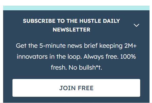 An email pop-up copy example
This, right here, is a perfect email pop-up copy example — it’s value-driven, yet the whole text occupies less than three lines.
Image
Most email subscription pop-ups do just fine without any visuals. However, in some cases, you may want to include an image to make your pop-up stand out, especially if the page is text-heavy and you need something bright to cut through that.
A rule of thumb is to avoid using generic images or stock photos. If you’re promoting your services, include your own photo to show your new visitors that you’re a real person. If you’re making a bold claim in your headline, use custom illustrations to support it and drive your message home.
Contact data field
Try to keep the number of fields in your subscription form to a minimum. If your pop-up feels like an interrogation or an IRS form, it’ll only scare your website visitors away, which defeats the whole purpose of lead generation.
If you do need more information from them to customize your messaging, you can use conditional or multi-step forms. They feel more natural and conversational and look less intimidating.
CTA button
This last element can make or break your marketing efforts. When designing your pop-up, make sure your call to action button looks clickable and inviting. Don’t overstuff it with lengthy phrases and avoid capitalizing every word — sensationalism might put savvy consumers off. Instead, opt for active verbs and snappy phrases that clearly state the action you want your users to take.
What’s the best timing for email pop-ups?
When it comes to email capture pop-ups, we recommend forgetting about the one-size-fits-all approach. Instead, try to narrow down your focus and combine different scenarios to target various user needs. For instance, in SendPulse, you can set conditions to personalize your messages based on user behavior.
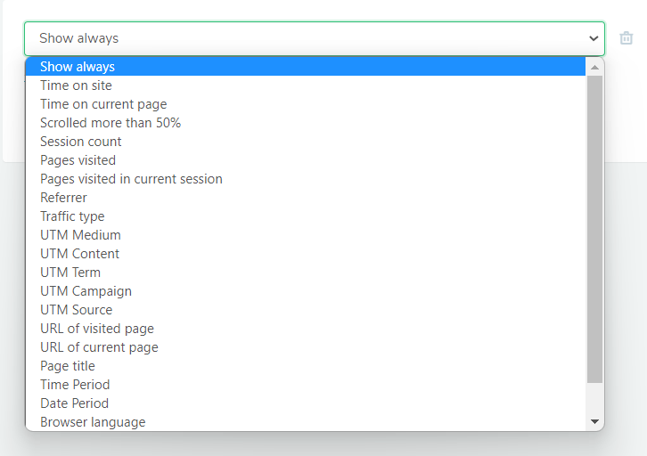 Pop-up display conditions
These are the pop-up display conditions you’re likely to use the most:
- Time on site/page. Target users who’re visibly interested in your offer and spent a certain amount of time reading up on it.
- UTM/Traffic source. Display tailored, highly relevant messages based on where the user came from.
- Session count. Target repeat visitors with a special offer to help them overcome doubt.
- Browser. Show personalized pop-ups to mobile users.
- Date period. Select the time interval when the message will be displayed on your website.
- Cursor off screen. Hit them with a discount pop-up to stop them from leaving your website.
As you can see, figuring out the best timing for email pop-ups involves some experimentation. Your visitors won’t always act the same — that’s why it’s important to add multiple conditions for more complex scenarios.
Five powerful email pop-up examples
There’s a lot to be learned from pop-ups other brands use, especially if they’re your competitors. Check out the following email pop-up examples to discover what your forms might be missing.
Email pop-up example #1 Offering a freebie
The HubSpot team surely knows a thing or two about lead generation, and their pop-ups are another proof of that. They use slick collapsible multistep forms and incentive users to leave their contacts by offering them a free guide packed with knowledge on leadership.
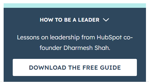 An email pop-up example from HubSpot
This is another email pop-up best practice you should be following. Invest some time into creating a unique eBook, guide, tutorial, or blueprint to use as a lead magnet and enjoy an influx of genuinely interested subscribers.
Email pop-up example #2 Using visuals to show your expertise
Remember how we talked about using real photos to strengthen your expert positioning? Here’s a convincing example of how one high-quality photo can take a basic pop-up to a whole new level.
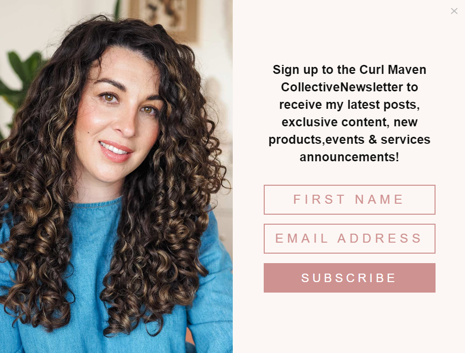 An email pop-up from Curl Maven
This simple headshot plays an important role. Not only does it make the message more relatable, but also it proves that the blogger, in fact, is a legit hair care expert. Looking at her shiny hair, the reader can safely assume that her beauty advice actually works.
Email pop-up example #3 Enticing users with a discount
Planning a little price drop? Why not combine it with your lead generation campaign? A nice discount can persuade even the most cautious users to share their email address with you.
This witty example from a supplement brand demonstrates how much of a difference a simple promo code can make.
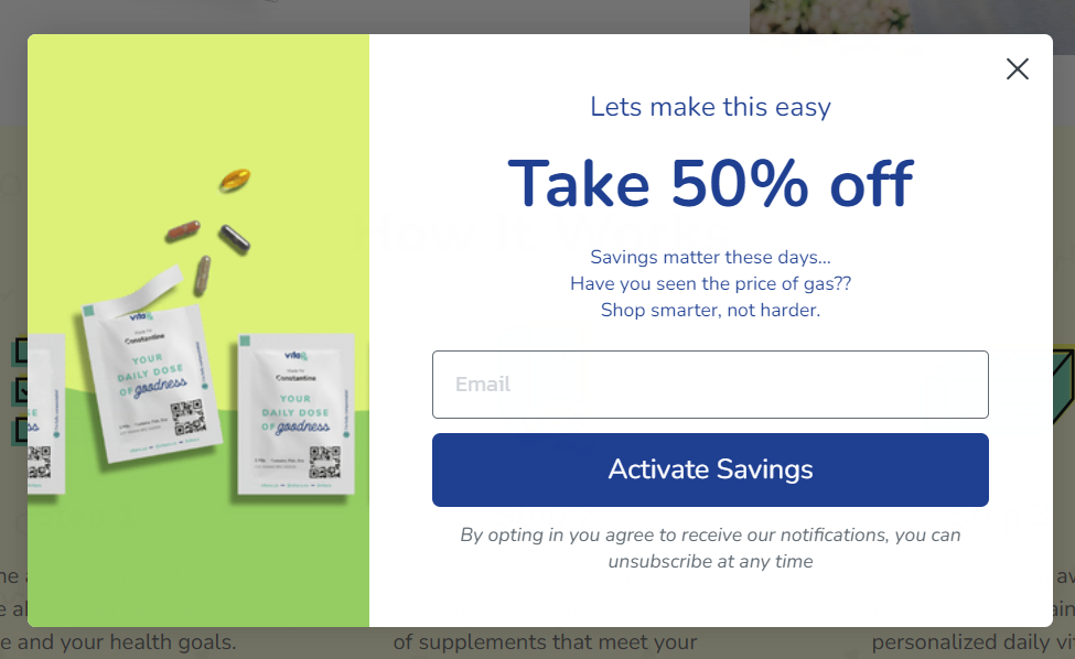 An email pop-up example from VitaRx
The heading instantly hijacks the reader’s attention and makes them think about how much they’ll be able to save. The call to action, too, works excellently in this context — it helps users focus on the value they’re about to receive by sharing their contact data.
Email pop-up example #4 Providing helpful information
Another great way to start a conversation with your website visitors is by giving them access to expert content they won’t find elsewhere. If you promote an educational newsletter, emphasize how much effort and research goes into it. This way, your users are less likely to disregard your subscription form.
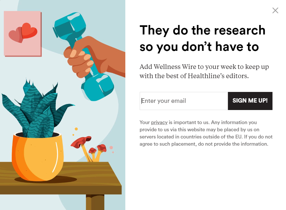 An email pop-up example from Wellness Wire
This is a beautiful example showing how a science-backed newsletter can be promoted in a friendly, unimposing way. The illustration makes the message feel rather playful than salesy, and so does the headline.
Email pop-up example #5 Not going overboard with visuals
If your page is too busy on its own, your pop-up can be easy to miss. In that case, go with the bare essentials and keep your form as tidy as possible.
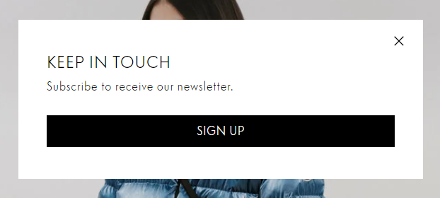 An email pop-up example from Moncler
Minimalistic pop-ups always look elegant and don’t cause too much distraction. If you follow this practice, make sure to keep your CTA button big and contrasting because it’ll be the main focal point.
How to create an email pop-up from scratch with SendPulse
We’ve just launched our intuitive pop-up builder — check it out if you want to learn to create attractive pop-ups in minutes. Spoiler alert, you can create up to 30 pop-ups for free with our Basic plan! Let us show you how to use it, step by step.
Step 1. Create your project
Log in to your SendPulse account and open the Pop-ups tab. Then, click “Create project” to create your workspace. You can tie multiple sites to one project or create a separate project for each of them.
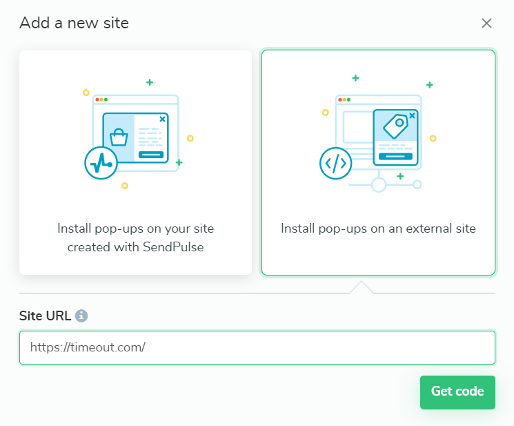 Adding a new website in SendPulse
You’ll be asked to connect your website to SendPulse and will be given an installation code. If you want to add a SendPulse-based site, you can just type in the URL, and it’ll be connected automatically.
For an external website, copy your code and add it to your site before the closing /head tag. Then, check the installation. You can also skip the verification process and return to it later.
Step 2. Pick a template and customize it
Open your project and click “Create pop-up.” You’ll see a variety of pop-up templates, blank as well as themed.
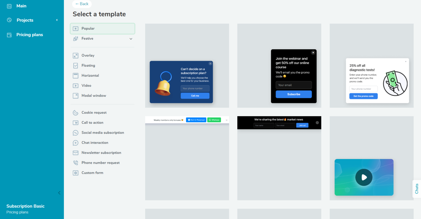 SendPulse’s pop-up template collection
In our case, we need one of the email subscription pop-up templates. Simply click on the template you like to jump to editing mode.
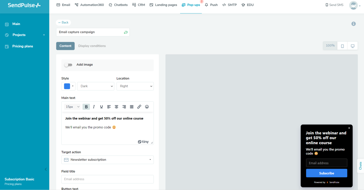 Editing a pop-up template in SendPulse
Change the template’s appearance, placement, and copy however you like and add an image if needed.
Step 3. Set conditions
Once you’re done editing your pop-up, click “Next” and move on to the display conditions to define when your form should be displayed. You can combine different conditions and choose to display your pop-up when at least one or all of them are met.
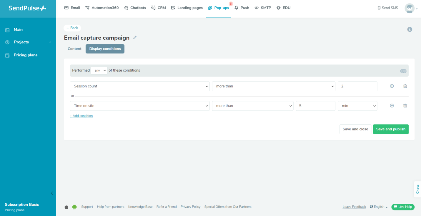 Setting pop-up display conditions in SendPulse
All set? Go ahead and publish your pop-up or save it for later. To see how your subscription form is performing, open the Statistics tab. There, you’ll see how many views, clicks, and leads it’s collected. You can also check how your pop-up is displayed on your site — you’ll find the necessary URL at the bottom of the project page.
Level up your email pop-up game
As you see, creating a pixel-perfect email pop-up takes less than 10 minutes if you’re using the right tools. With SendPulse, you can create versatile messages for different purposes and keep your website visitors active and curious about your brand.
Moreover, you can utilize our whole marketing automation toolkit to communicate with your audience and promote your products more efficiently. Create your SendPulse account now and give it a try!