Acquiring new customers is crucial for business growth and directly affects revenue. One of the most effective ways to gather customer information is through an email subscription form. The success of this strategy often hinges on how well you design and present your form. In this guide, we’ll cover best practices and share compelling newsletter signup form examples to inspire your own designs.
A newsletter signup form is an essential tool for businesses to connect with their audience. It allows website visitors to subscribe to your email updates and stay informed about your latest content, promotions, and news. By filling out your form, users give consent to receive regular emails directly in their inbox, making it a key element of effective email marketing strategies for building and maintaining a strong mailing list.
Every successful email subscription form includes a few key elements to ensure effectiveness and user-friendliness:
- Input fields. The core of any newsletter subscription form is a field for the user’s email address. Depending on your needs, you can also include optional fields for details like their name, phone number, or preferences.
- A call-to-action button. CTA buttons motivate users to complete their signup. Labels like “Subscribe,” “Sign Up,” or “Join Us” can clearly convey the next step and make your form more action-oriented.
- Privacy assurance. Users value transparency, so it’s essential to include a brief note or link to your privacy policy. Let subscribers know how their data will be used and ensure then that their information is secure.
- Incentives. Some newsletter signup forms offer benefits like discounts, free resources, or exclusive content to encourage registration.
Each of these elements plays a crucial role in attracting subscribers and building trust and engagement.
Newsletter subscription forms come in various types, each designed to support different user engagement strategies. These forms can generally be categorized based on their placement, display style, and the number of fields they include. Let’s explore each type in more detail.
Placement-based forms
Email subscription forms can be categorized by their placement into four main types: inline forms, pop-ups, slide-in forms, and dedicated landing page forms. Each type comes with its own set of advantages and disadvantages.
Inline forms
Inline forms are a type of newsletter subscription form embedded directly within website content. They are commonly placed in sidebars, headers, footers, or between content sections.
| Pros |
Cons |
| Seamless integration into the user’s browsing flow |
Can be easily overlooked by users |
| Less intrusive compared to other form types |
Offer limited space for compelling copy or visuals |
To overcome these challenges, it’s best to place inline forms near engaging content or in high-visibility areas, such as blog posts, product pages, or other sections where users are already actively interacting.
Below is a newsletter signup example from The New York Times. This form doubles as a barrier, preventing users from scrolling further unless they sign up.
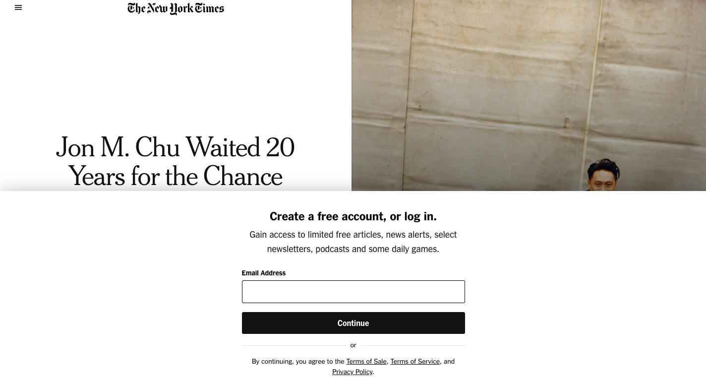 An example of an inline form on the website
Pop-up forms
Pop-up forms are a type of newsletter signup form that appear as overlay windows triggered by user actions. They come in various subtypes, including timed pop-ups, exit-intent pop-ups, scroll-based pop-ups, and more.
| Pros |
Cons |
| High visibility and strong conversion rates |
Can be easily intrusive to users and cause high bounce rates |
| Can feature attention-grabbing CTAs and copy |
Sometimes blocked by pop-up blockers |
To overcome these challenges, it’s best to limit frequency to avoid overwhelming users, and present a clear value proposition. Offering something in return, such as a discount or free resource, can significantly improve pop-up engagement rates.
Here you can see a subscription form example from Nüma. Upon signing up, users will receive a $5 off a snack pack that can motivate more website visitors to complete their registration.
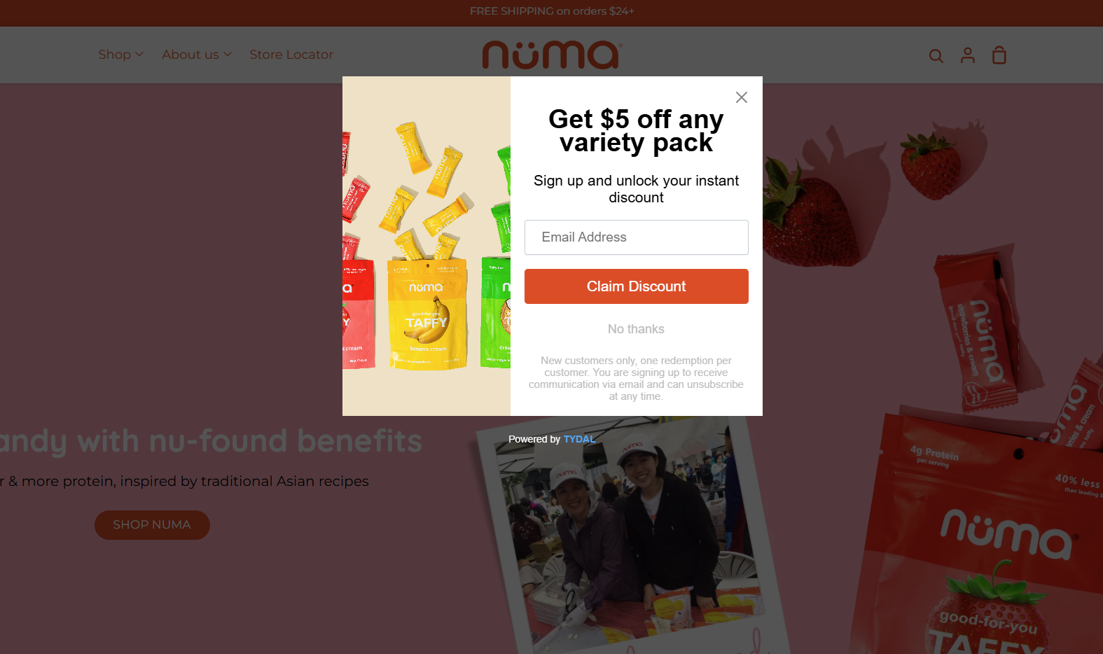 A pop-up example on the website
Slide-in forms
Slide-in forms are a type of newsletter signup form that smoothly slide into view from the side or bottom as users interact with a web page.
| Pros |
Cons |
| Less intrusive than pop-ups |
Can still be distracting or annoying if overused |
| Eye-catching while still allowing users to maintain their focus |
May be ignored if triggered at the wrong time |
To overcome these challenges, it’s best to use subtle animations to draw attention without being disruptive. Also, it’s essential to trigger the form based on user behavior, such as time spent on the page or scrolling activity. This will ensure relevance and minimize interruptions.
Happy Socks uses a slide-in email subscription form that appears shortly after a user opens the website. Its bright, eye-catching colors make it stand out against the website’s background.
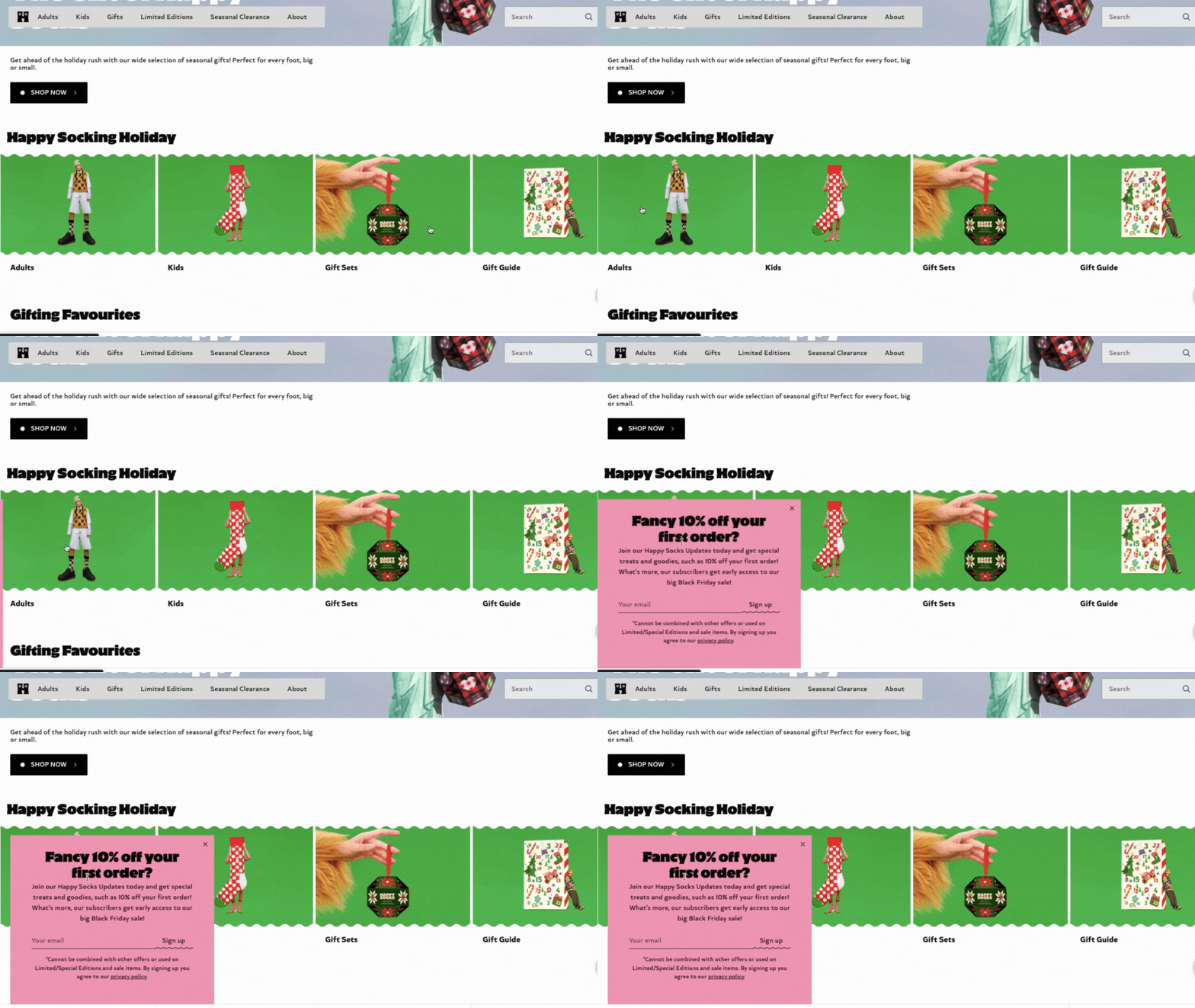 An example of a slide-in form on the website
Dedicated landing page forms
A dedicated landing page form is a standalone page designed specifically for subscription purposes.
| Pros |
Cons |
| Focused attention with no distractions from other content or vice versa |
Requires additional effort to drive traffic to the page |
| Detailed information about the benefits of subscribing |
Conversion success depends on landing page optimization |
To overcome these challenges, it’s best to promote this type of subscription form through ads, social media, or email campaigns to attract traffic and maximize sign-ups.
Here is an example of a dedicated landing page subscription form from Sephora. With more space available, the brand can collect additional information from users in a single step.
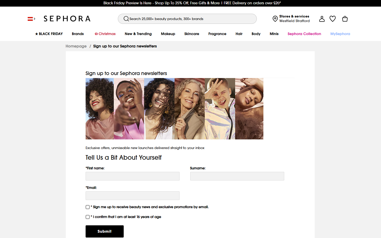 An example of a dedicated landing page form
Display-based forms
Newsletter signup forms can be categorized based on their display settings. Let’s explore each type in more detail.
Static forms
Static forms, as the name implies, remain fixed in a specific position on the page, such as the header or footer.
| Pros |
Cons |
| Non-intrusive and consistently visible |
Can easily blend into the page and be overlooked |
| Optimal for long-term engagement |
Lack dynamic triggers to actively capture attention |
To overcome these challenges, it’s best to incorporate bold designs or subtle animations within the email subscription form to make it stand out.
In the example below, Mixsoon has positioned its newsletter signup form in the website footer. This ensures it does not disrupt the user experience.
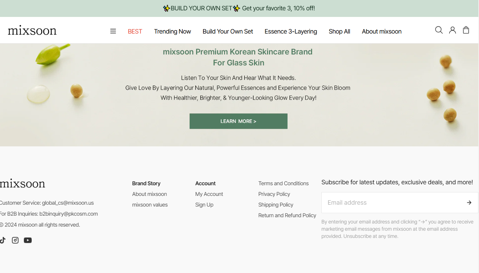 Static newsletter signup example
Dynamic forms
Dynamic forms adapt and appear based on user behavior, such as hovering over an element or interacting with the page.
| Pros |
Cons |
| Can be engaging and contextually relevant |
May confuse users if the trigger isn’t intuitive |
| Personalized to align with user interactions |
May disrupt user experience |
To overcome these challenges, it’s best to clearly indicate the trigger action to ensure a smooth user experience. It’s also a good idea to A/B test different scenarios to determine what works best.
Wild Souls features a dynamic subscription form that appears in the corner of the website as users scroll. Its bold colors, combined with subtle animation, help draw additional attention.
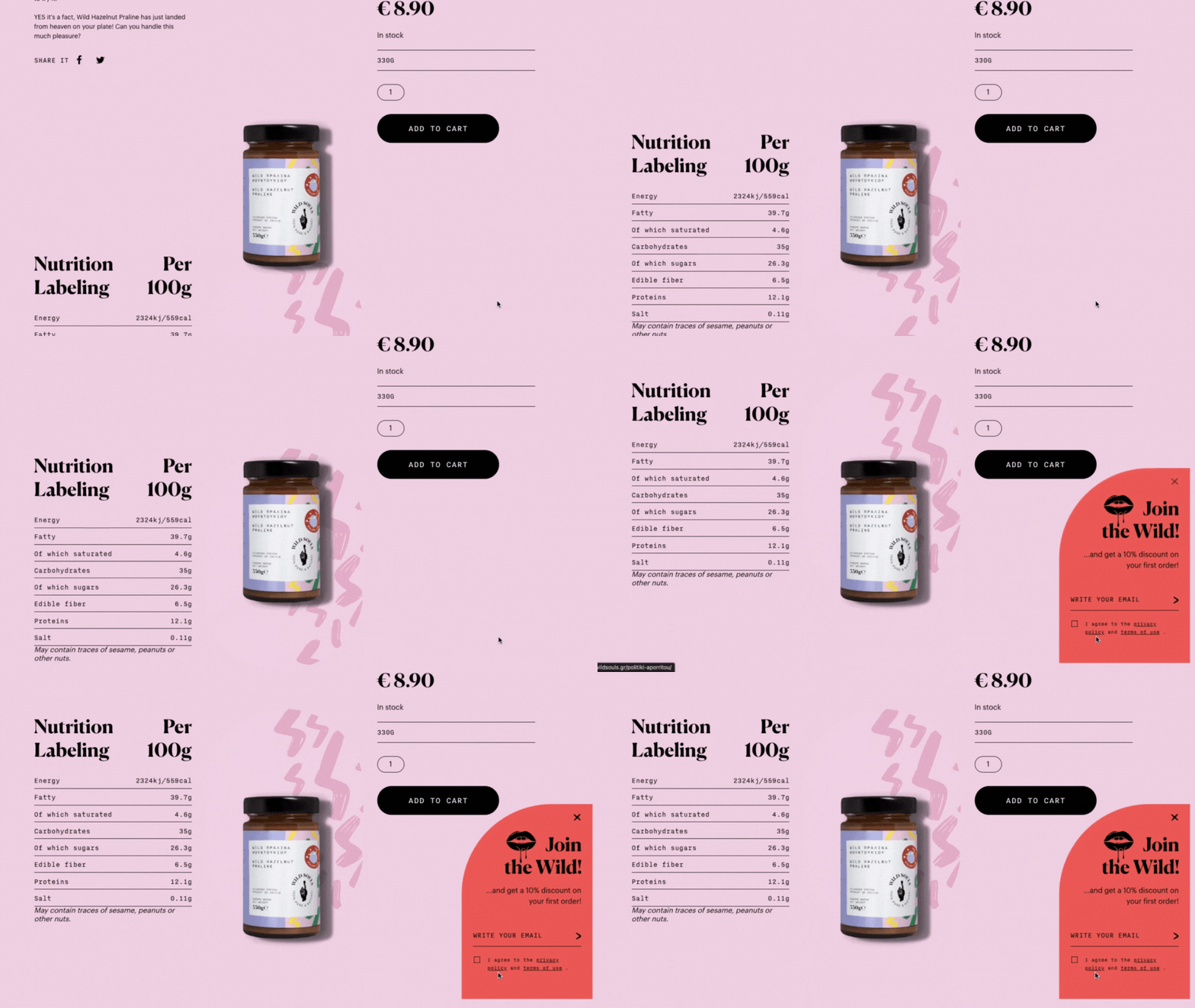 An example of a dynamic newsletter signup form
Field-based forms
Newsletter signup forms can also be categorized based on the number of fields. They include one-field forms, multiple-field forms, and interactive forms.
One-field forms
One-field forms focus on a single essential input, typically the email address.
| Pros |
Cons |
| Quick and easy to complete, boosting sign-up rates |
Limited data collection, which can restrict personalization opportunities |
| Clean and minimalist design |
|
To overcome this challenge, it’s best to use them for broad, top-of-funnel audiences.
Here is a typical example of a one-field newsletter signup form. While it includes some additional context, it requires users to fill out only a single field.
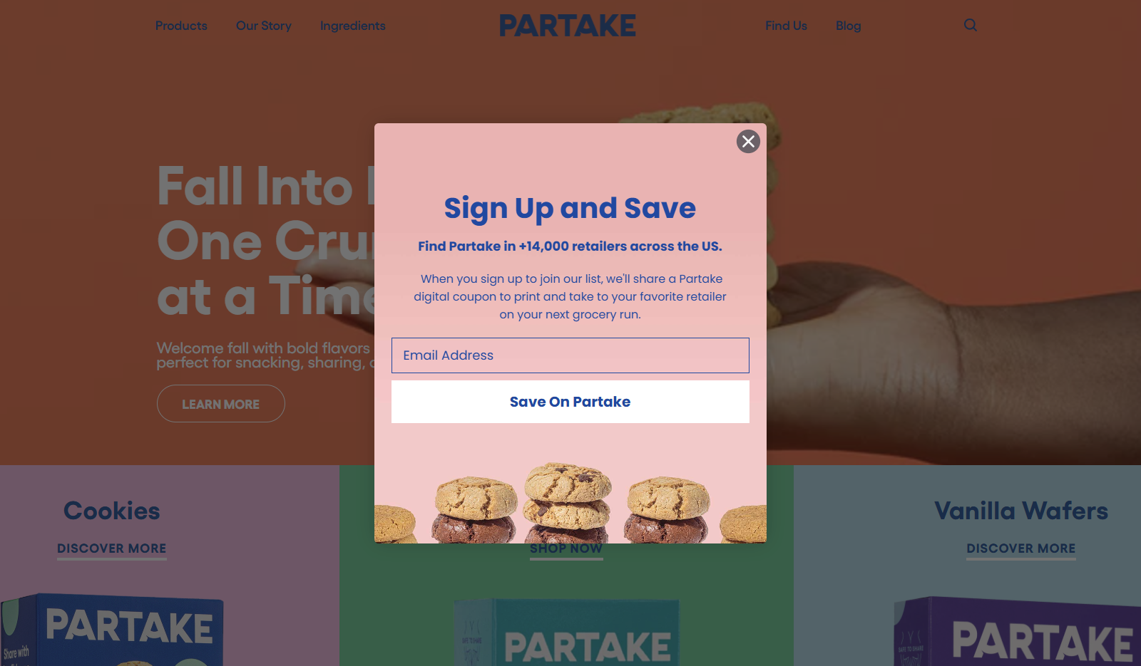 An example of a one-field form
Multiple-field forms
Multiple-field forms collect a range of information. They can require such data as email address, name, preferences, location, and more.
| Pros |
Cons |
| Enable more precise audience segmentation and targeting |
May discourage sign-ups due to increased effort |
| Build trust by demonstrating a commitment to understanding user preferences |
|
To overcome these challenges, it’s best to implement progressive profiling or optional fields to minimize friction and improve user experience.
Earth Harbor offers an email subscription form that includes additional fields for first and last names. This enables a more personalized approach in their email communications later on.
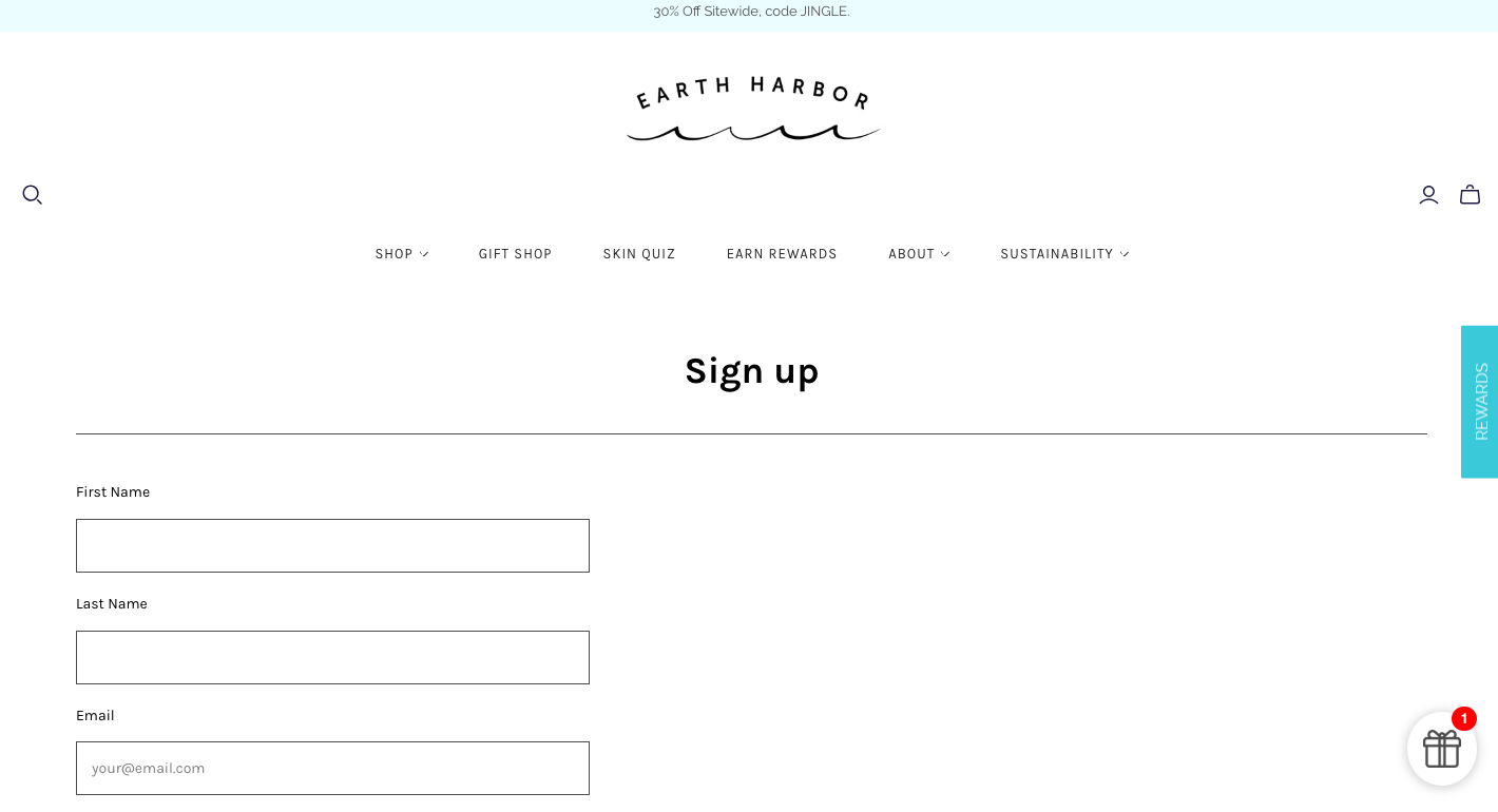 An example of a multiple-field subscription form
Interactive forms
Interactive subscription forms incorporate elements like drop-downs, sliders, or quizzes to enhance user engagement.
| Pros |
Cons |
| Captivating and enjoyable for users |
Demands more development effort |
| Collects detailed, actionable data |
May slow down the sign-up process |
To overcome these challenges, it’s best to provide immediate value, such as personalized recommendations or discounts. This will help to keep users engaged.
Briogeo features a hair quiz on their website to engage users, encouraging them to stay longer and learn more about their hair type and recommended care.
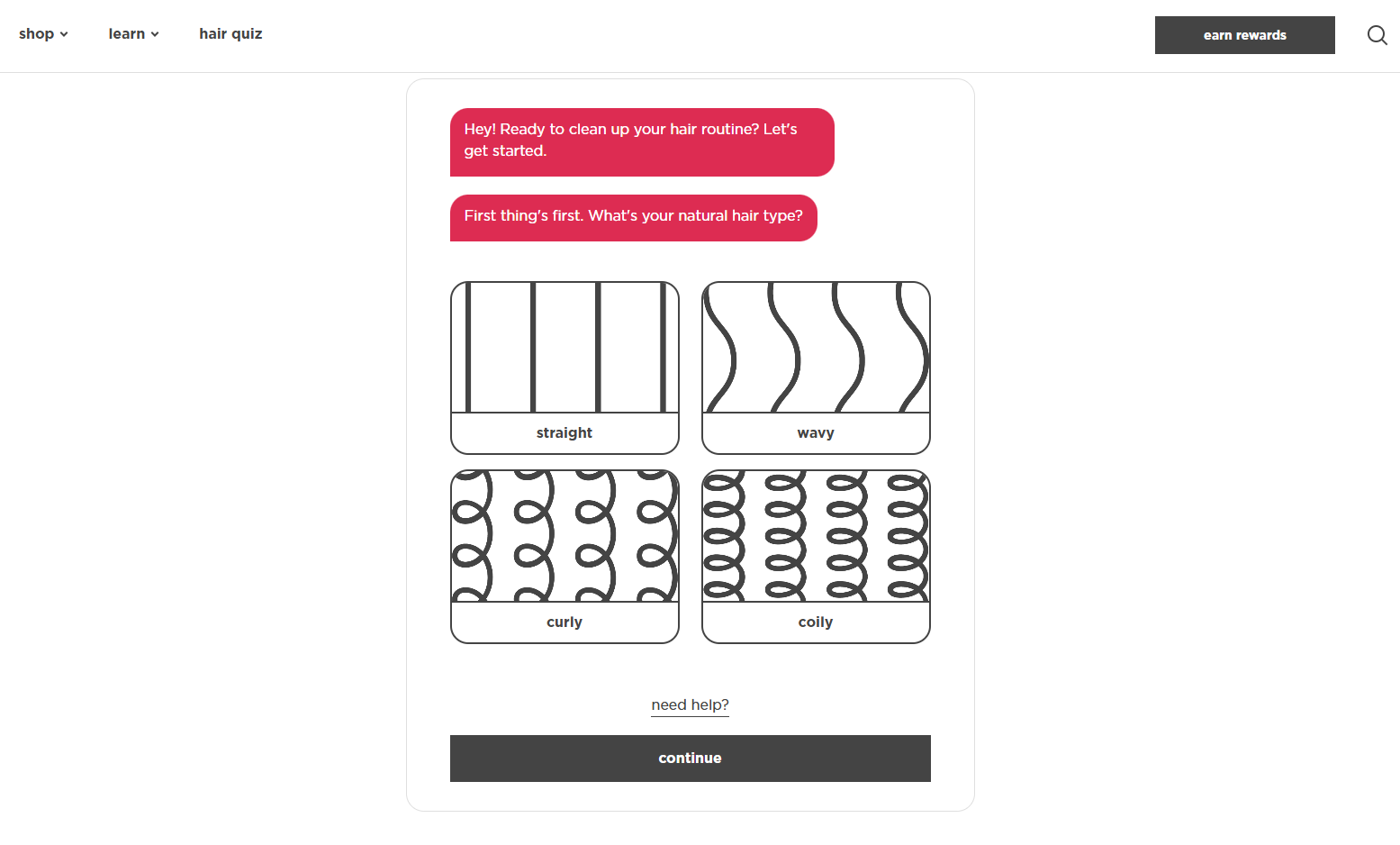 An example of an interactive subscription form on the website
After completing the quiz, users are prompted to provide their email address to receive a special offer, redeemable when purchasing suitable products.
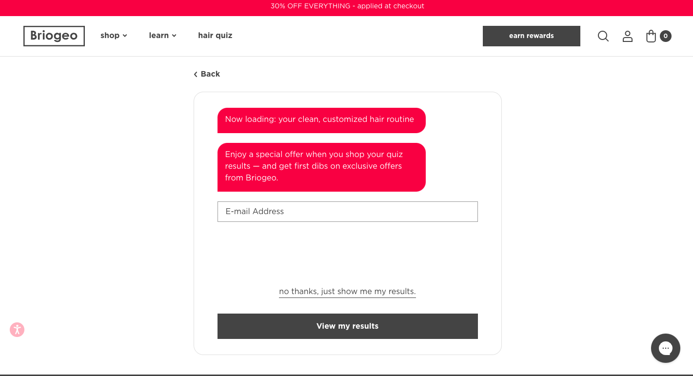 An example of an interactive subscription form on the website
By choosing the right type and subtype, you can optimize newsletter subscription forms for your audience and goals. Balancing visibility, engagement, and user experience is key to maximizing conversions.
Once you’ve identified the type of subscription form that suits your needs, it’s essential to follow a few simple pop-up design guidelines when creating it. Here are some best practices to help you create an effective and visually appealing form.
Stick to simple design
When creating a new email subscription form, simplicity is key. Try to limit the form to essential fields, typically just the email address. Extra fields like name or phone number can be optional.
Little Sky Stone opted for a sleek pop-up design that includes only essential information. It asks only for an email address, indicating all the perks, such as a gift packaging, and a 30% off the next order.
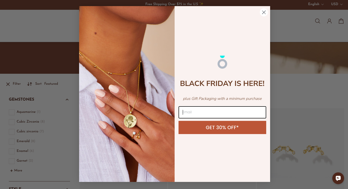 A minimalist subscription form example from Little Sky Stone
Avoid clutter
Keep your form clean and free of unnecessary elements or excessive text. A minimalist, well-organized design is more appealing and easier to interact with. Also, proper alignment, such as centering or left-aligning the form, enhances its overall appearance and ensures the form looks neat.
Take a look at the newsletter signup example below. The form is positioned below the main offerings, following the website’s two-column layout. Its placement feels natural and prevents unnecessary clutter.
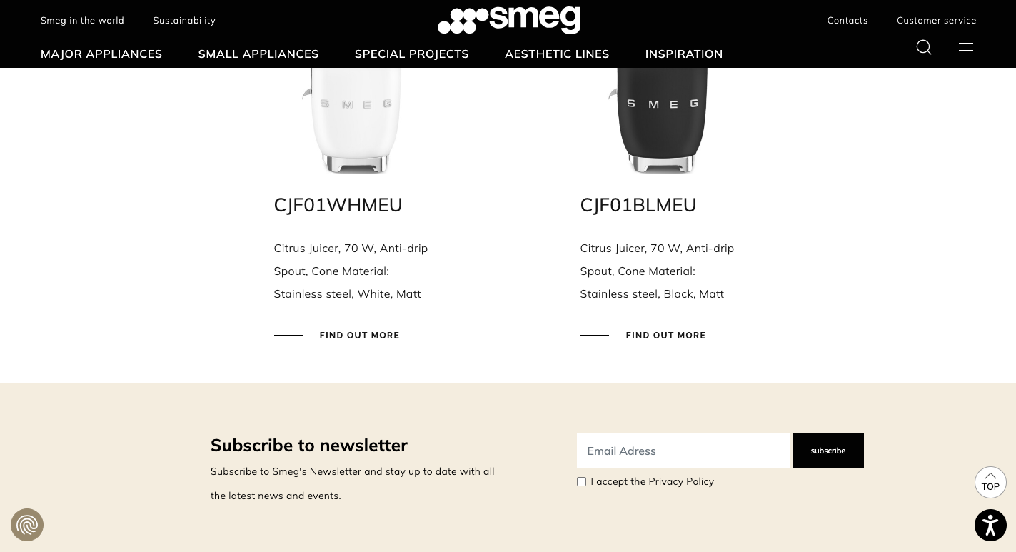 A subscription form example from Smeg
Add prominent CTAs
To motivate users to take action, make your CTA button large and visually distinct, and use a color that contrasts with the background to draw attention.
Got Bag uses a standard pop-up to collect email addresses. Its CTA button stands out clearly against the white background.
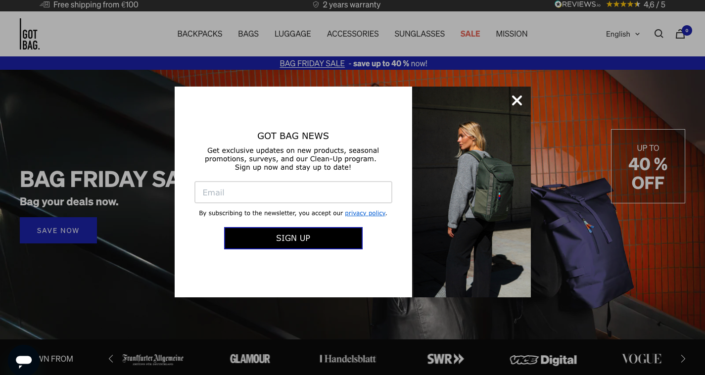 An example of an email subscription form from Got Bag
Ensure enough whitespace
It’s advisable to use whitespace around form fields and the CTA button to ensure the form looks clean and is easy to navigate.
Take a look at the example below. Nomad uses enough white space on the website, making other website elements pop. Also, a subscription form is embedded as a standout element that immediately draws attention.
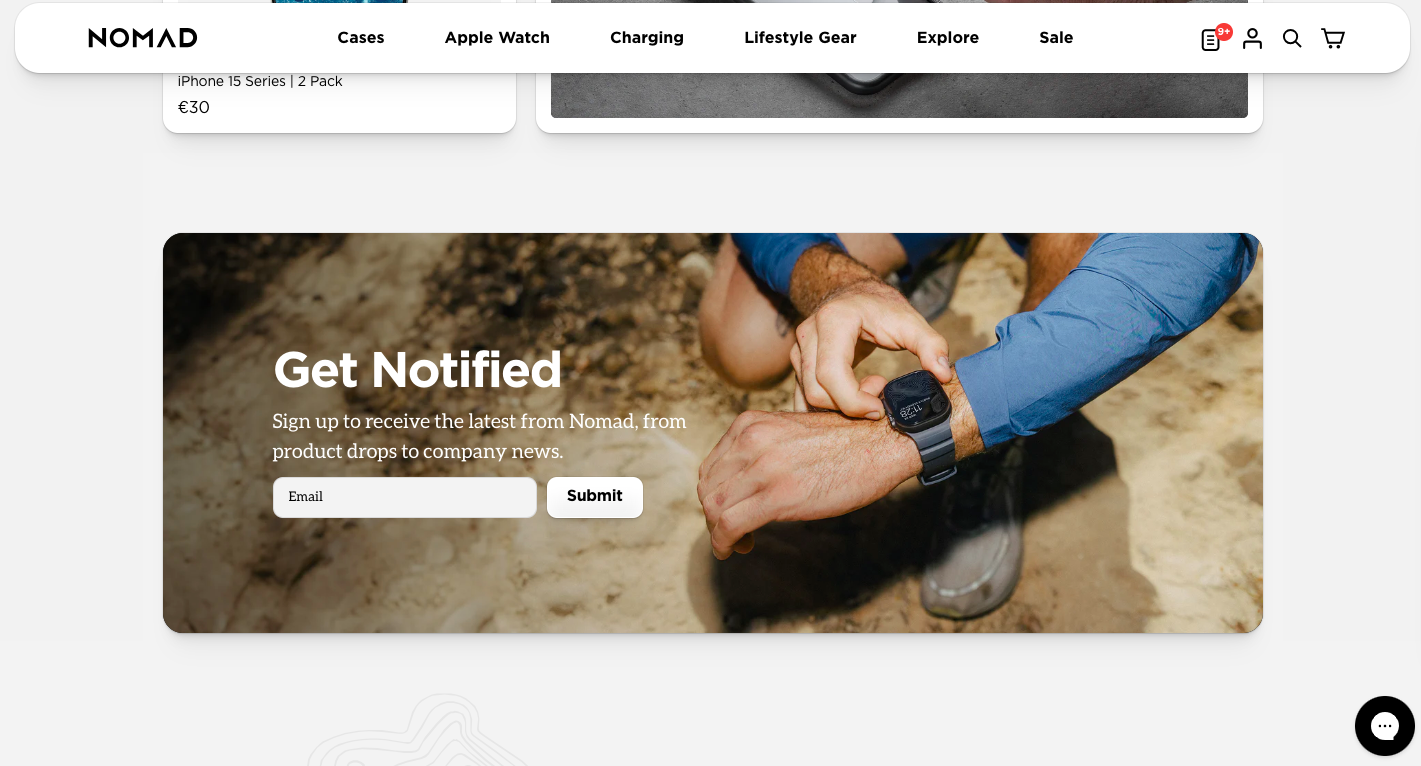 A newsletter signup example from Nomad
Responsive and mobile-friendly design
It’s important that your newsletter signup form adjusts to various screen sizes, particularly on mobile devices. Mobile users should be able to easily read and fill out the form. Additionally, make buttons large enough for mobile users to tap easily and ensure that form fields are appropriately sized for smaller screens.
Helmut Lang utilizes a pop-up to collect customer data and offer them a 15% off the next purchase. The subscription form features a field for an email as well as two buttons to complete or close the form.
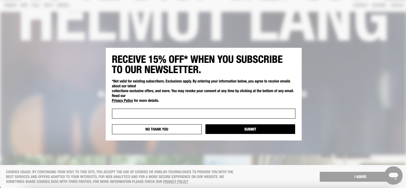 A subscription form example from Helmut Lang
Here is the same form but displayed on a mobile device. The design remains unchanged, but instead of a horizontal layout, the form is now arranged vertically. This adjustment ensures all buttons are visible without the need to swipe sideways.
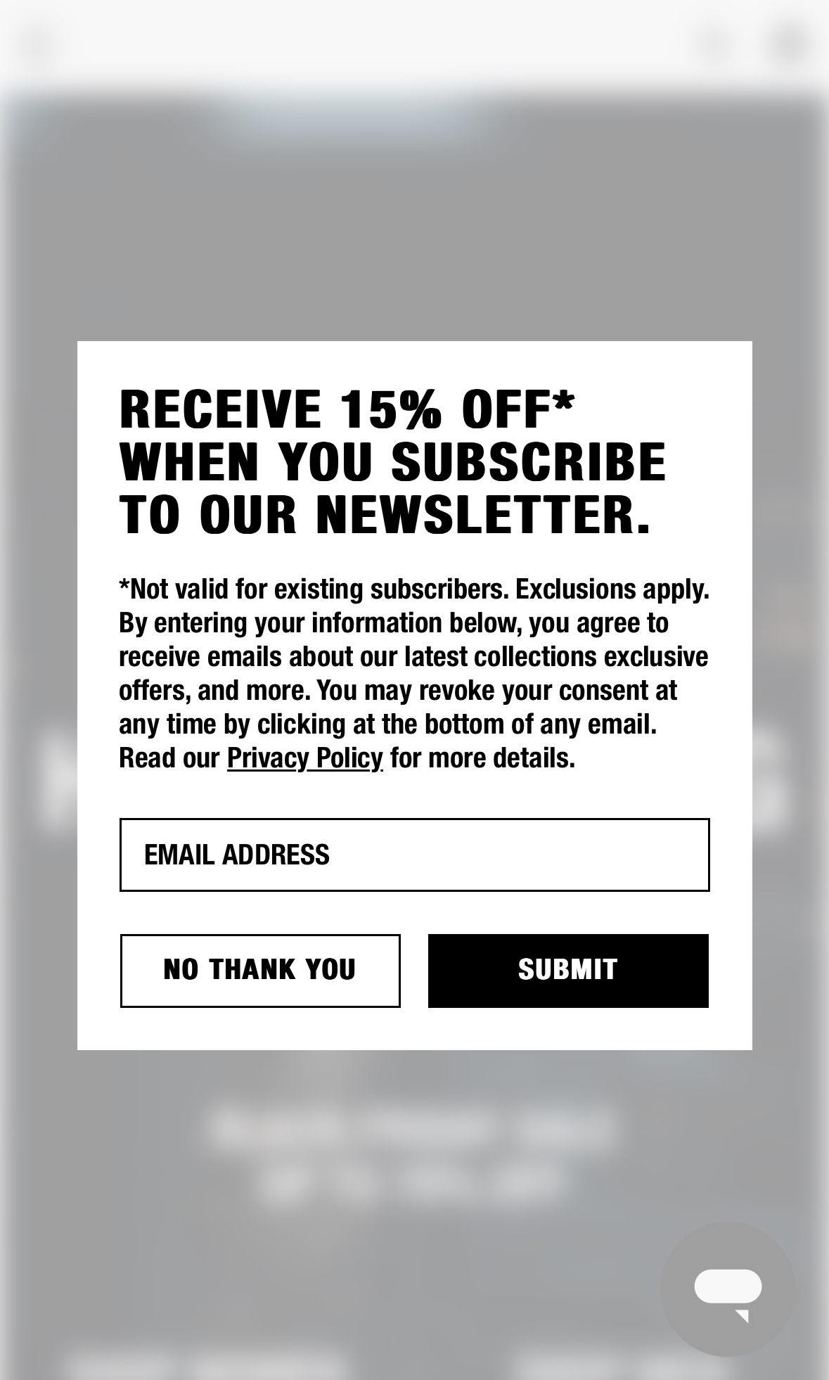 A mobile subscription form example from Helmut Lang
Ensure readability
The text on the form should contrast well with the background for readability. Avoid using low-contrast color combinations that could make text hard to read. Instead, choose simple, legible fonts that are easy to read, even on small screens. Stick to web-safe fonts and avoid overly stylized typefaces.
Here is a newsletter signup example from Avocado. The text is dark enough to be easily readable on a white background. And vice versa, the text on the CTA button is white, making it stand out against the dark green background.
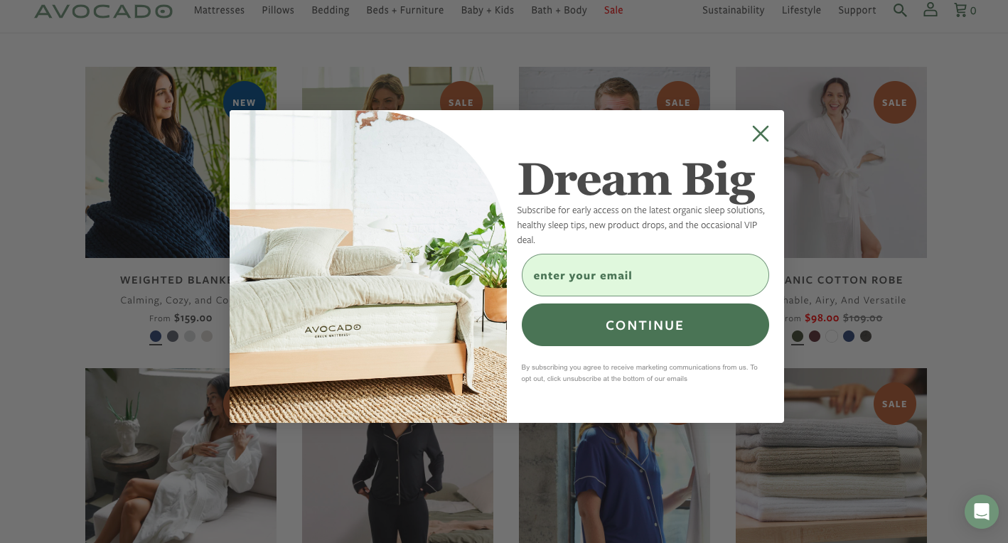 A subscription form example from Avocado
Now that we have outlined the key design elements of a newsletter subscription form, it’s time to focus on creating an effective copy. Here are some best practices to help you get started.
Highlight the value
To encourage users to fill out your form, you should clearly communicate the benefits they will receive by signing up. This could include exclusive content, discounts, helpful tips, or updates.
For example, Tommy Hilfiger uses a pop-up to inform website visitors about the benefits of subscribing. These perks are presented as concise checkpoints, avoiding the need for lengthy descriptions.
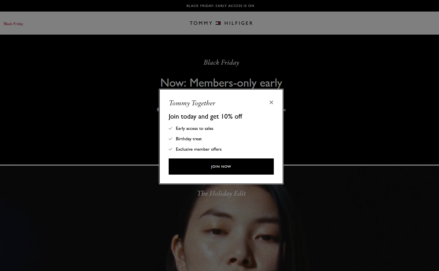 A subscription form example from Tommy Hilfiger
Use actionable language
The wording of your subscription form is crucial. Avoid vague phrases and use clear, action-oriented language instead. Phrases like “Sign Up Now” or “Join Today” will likely result in more subscriptions.
Cushion Lab also opts for action-oriented language to boost subscription rates. The phrase “Claim it before it’s gone” emphasizes the urgency of a limited-time offer.
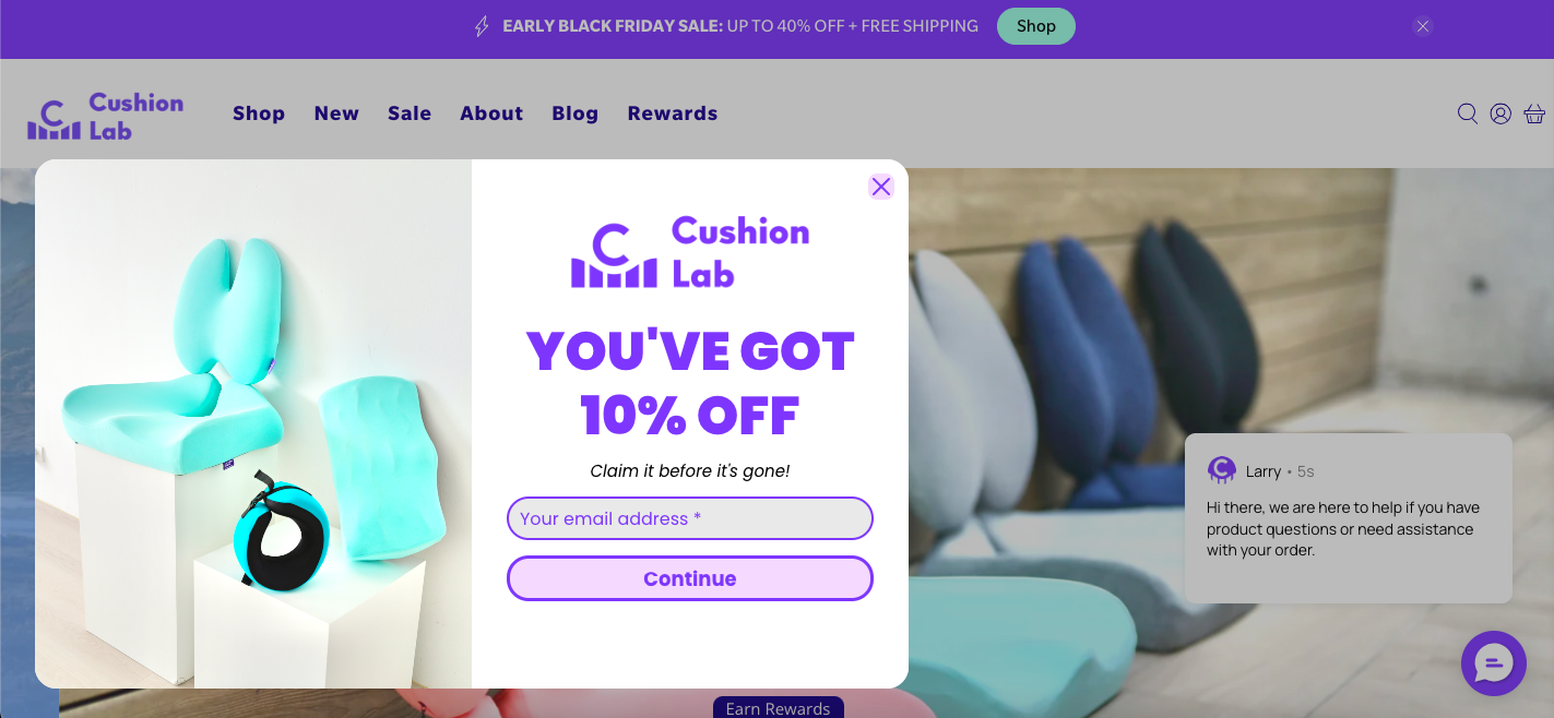 A newsletter subscription form example from Cushion Lab
Be concise
Since the space is usually limited, try to keep the text brief and to the point. Users should immediately understand the benefit without reading lengthy descriptions.
In the example below, Passenger includes a subscription form on their website, clearly highlighting the value of subscribing in a single sentence. Visitors immediately learn about a 10% discount on their first order and the opportunity to win a monthly voucher. The form maintains a minimalist design, ensuring the background image stays fully visible.
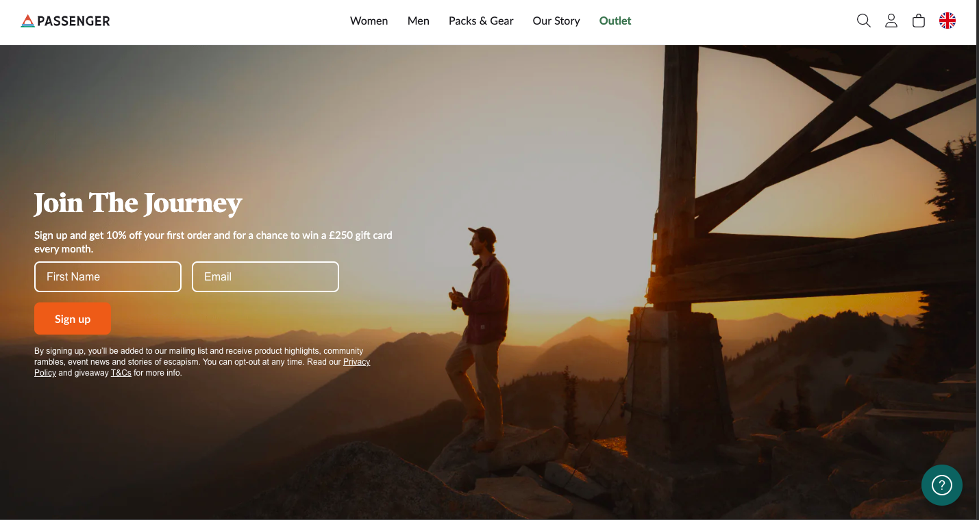 An email subscription form from Passenger
Include social proof
Another method to boost subscription rates is to mention the number of subscribers, customer testimonials, or positive feedback to build trust. For example: “Join thousands of happy readers who receive our weekly updates!”
Take a look at the example below. Oakcha features an email subscription form that highlights the number of existing subscribers. This serves as social proof, suggesting that if so many people have subscribed, it must be worthwhile.
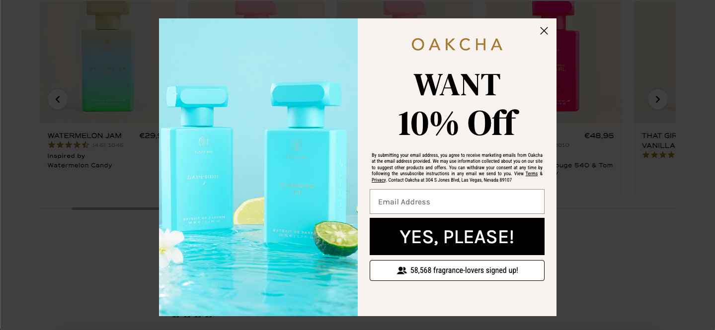 A subscription form example from Oakcha
Personalize the message
When writing a copy for newsletter signup forms, aim to speak directly to your audience by addressing their needs or pain points. For example: “Struggling to stay organized? Get our weekly productivity tips.”
In the example below, Round Lab asks for the customer’s skin type directly in their subscription form. This creates a touch of personalization and encourages users to subscribe to get tips that can directly help them address their concerns.
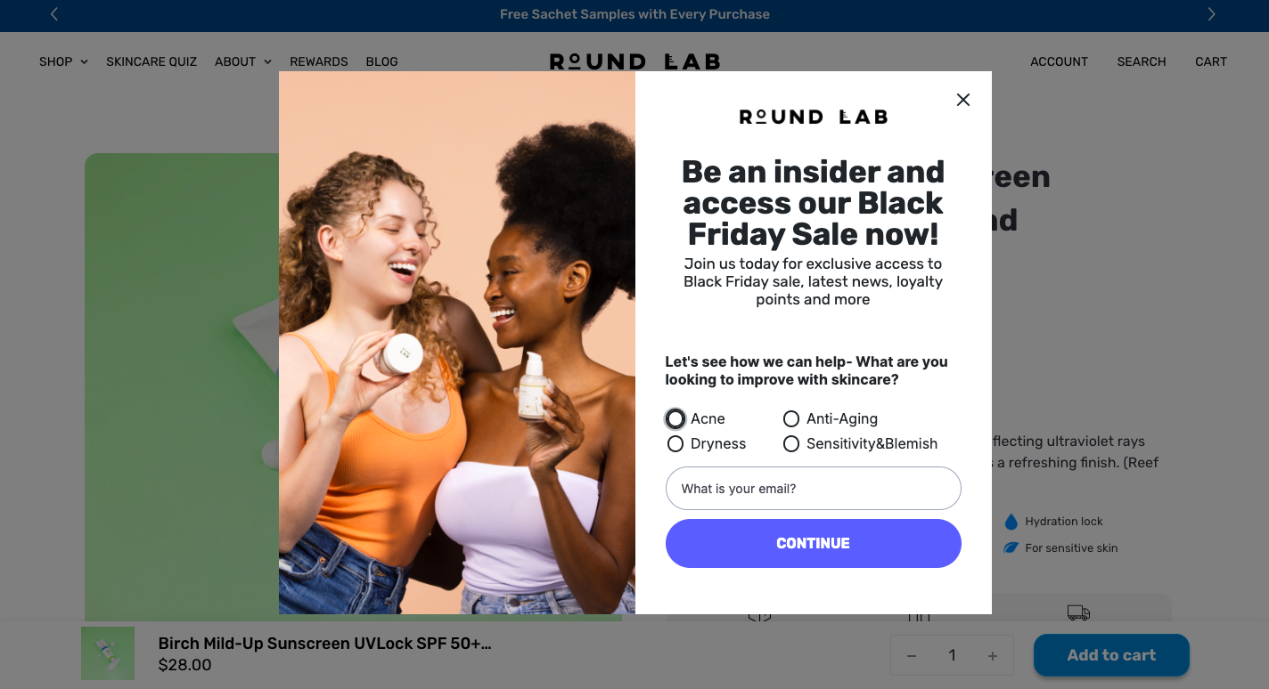 A newsletter signup form from Round Lab
Top newsletter signup examples
In this section, we’ll explore several subscription form examples that stand out with their eye-catching design and functionality. After each example, you’ll also find a brief guide on how to create similar forms using the SendPulse pop-up builder.
AquaFunded
AquaFunded effectively uses an overlay pop-up to collect customer information. The transparent background helps users stay focused, leading to higher engagement with the form.
 An overlay example from AquaFunded
Using SendPulse, you can choose between a number of subscription form types, which include page overlays, floating pop-ups, horizontal pop-ups, modal windows, or video pop-ups. You can customize the background by choosing a solid color, an image from the library, or uploading your own visuals.
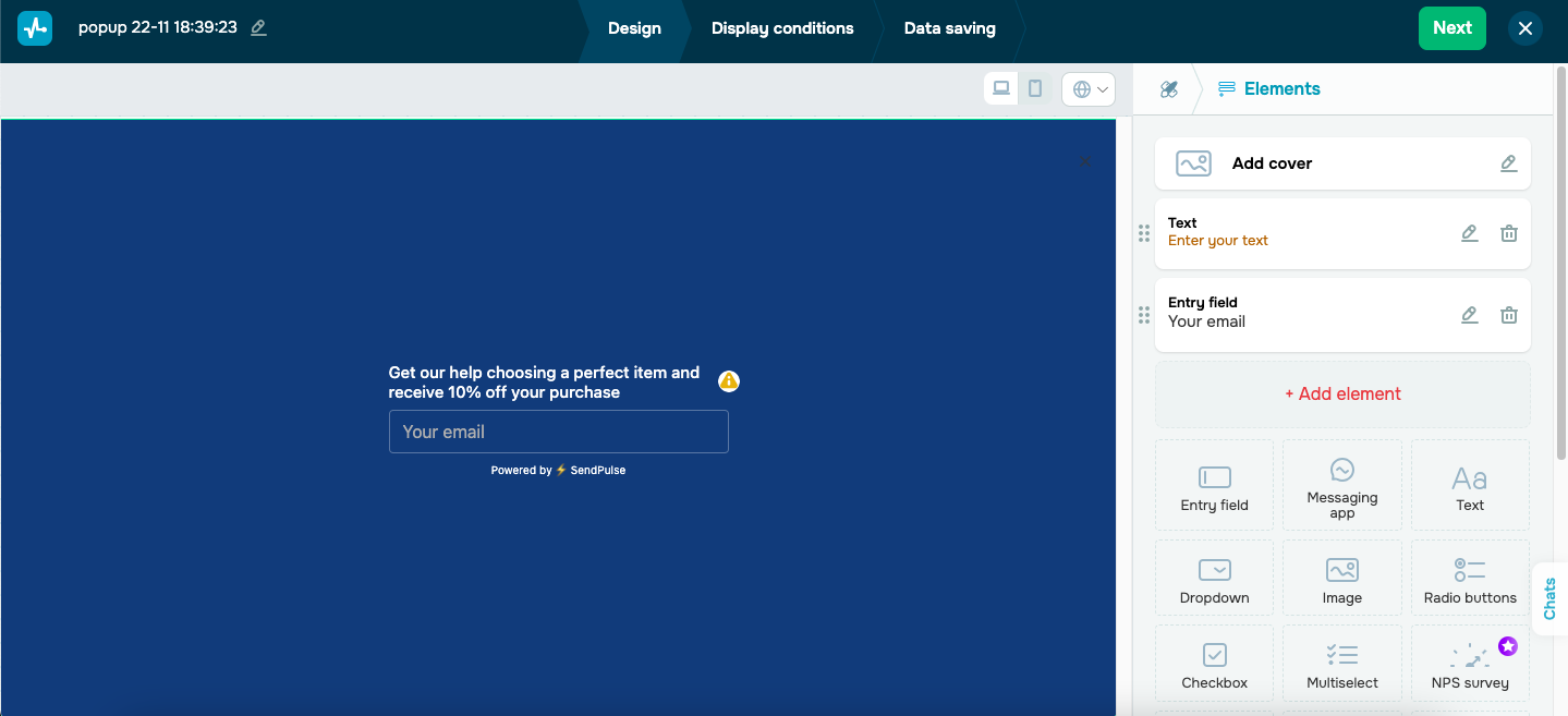 Creating an overlay pop-up
Backbone
Backbone displays a pop-up offering a 30% discount on their products. It also asks whether the customer is shopping for themselves or someone else, encouraging interaction with the widget.
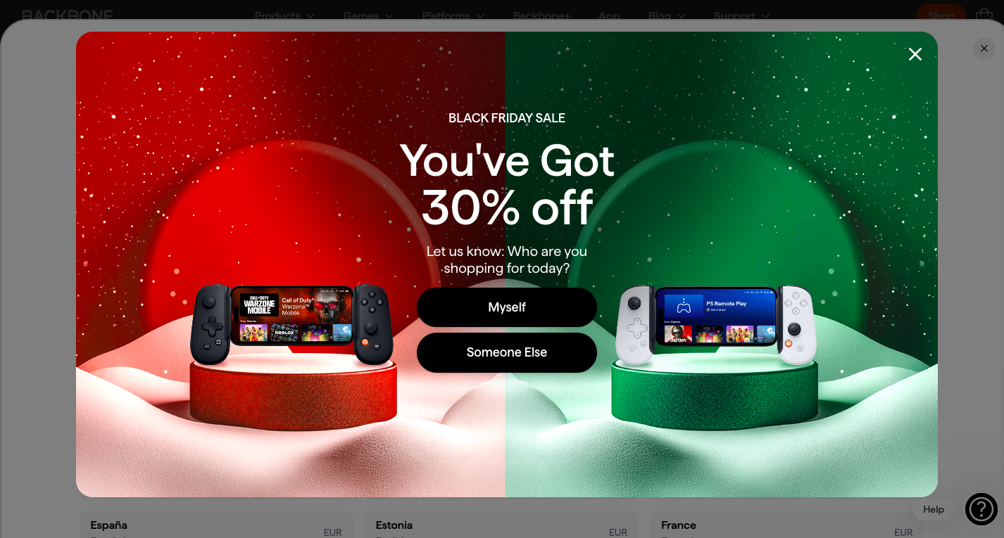 An example of a pop-up from Backbone
After the first interaction, a second pop-up appears offering the prospect to submit their email address to secure the discount.
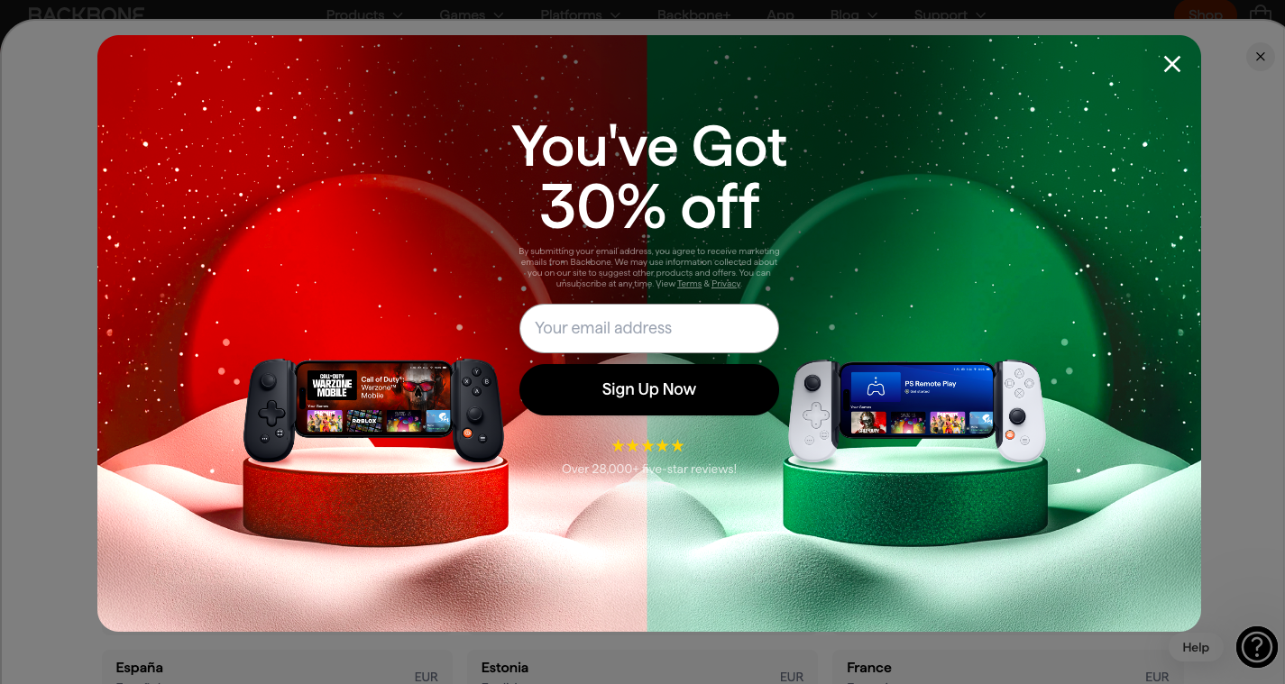 The second pop-up from Backbone
SendPulse allows you to create various pop-up flow scenarios. You can link different pop-ups and display conditions to different users. These can include subscription forms, pop-ups with promo codes, or promotional pop-ups.
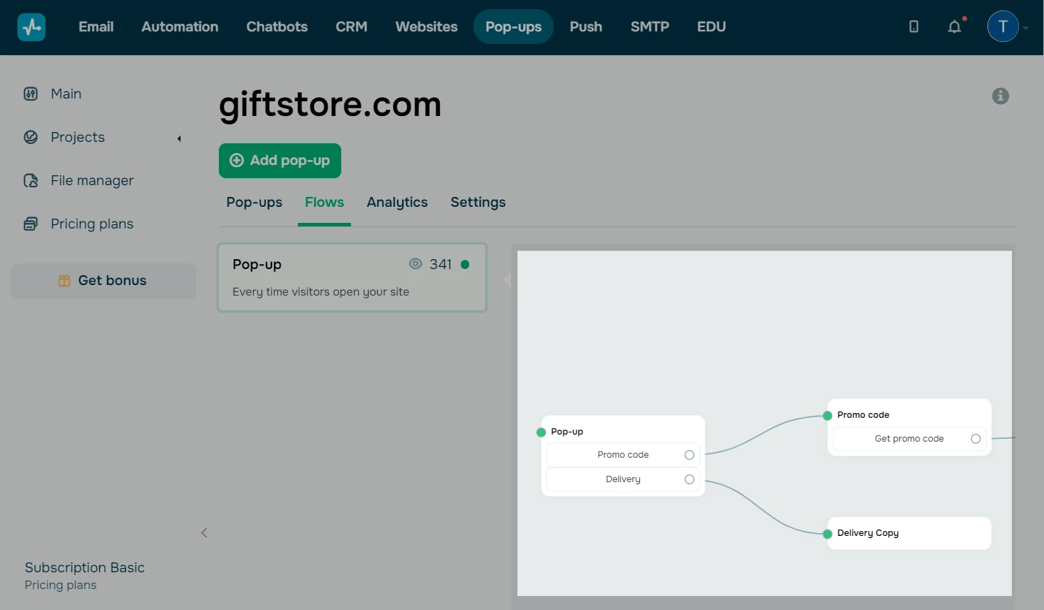 Arranging multiple pop-ups in a flow
City Bonfires
City Bonfires features a newsletter signup form that grabs attention with its customized text and clever use of emojis. The fire emoji, in particular, emphasizes the bonfire theme and helps draw focus to the form.
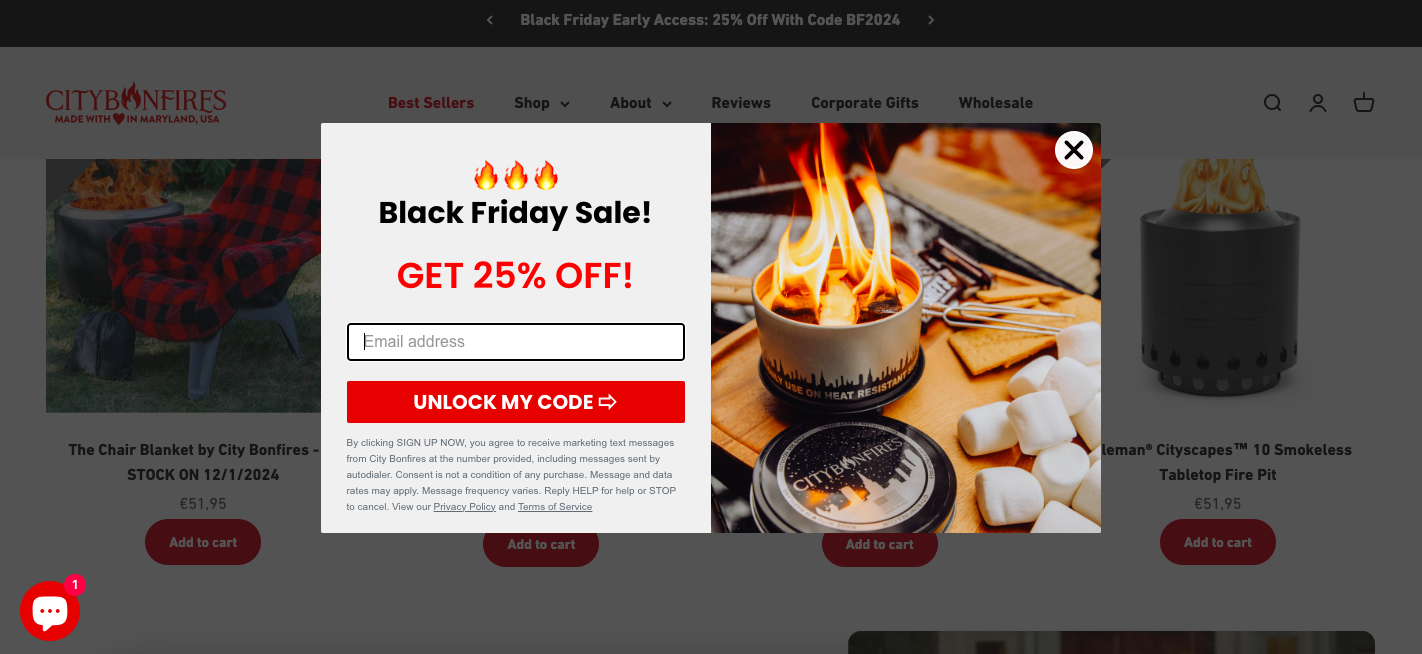 Use of emojis in an email subscription form
SendPulse offers great flexibility in its text editor. You can customize the text of your subscription form template and add hyperlinks and emojis if necessary.
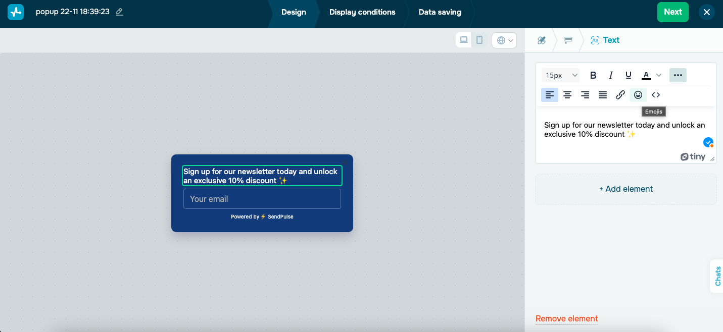 Customizing text in the pop-up editor
Rockport
Rockport created a subscription form for its customers with an option to specify their gender. This way, customers receive relevant emails with products they are interested in.
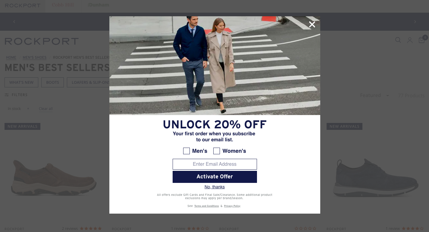 A newsletter signup example from Rockport
Similarly, in SendPulse you can fully customize your pop-up. The software allows you to add additional fields to fill out, drop-down menus, checkboxes, and also radio buttons to ensure more precise segmentation.
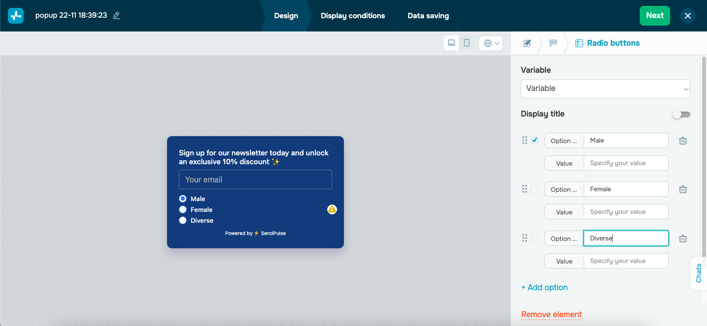 Adding additional elements to a subscription form template
Sunflower Motherhood
On the Sunflower Motherhood website, you’ll find a pop-up launcher in the bottom left corner. Launchers trigger the appearance of a pop-up window or form when specific conditions are met. They also allow users to close the subscription form and reopen it later if needed.
A launcher on the website
With SendPulse, you can create and customize a launcher to suit your needs. You can choose an action to trigger when users click on the icon, such as opening a new pop-up or redirecting to another page.
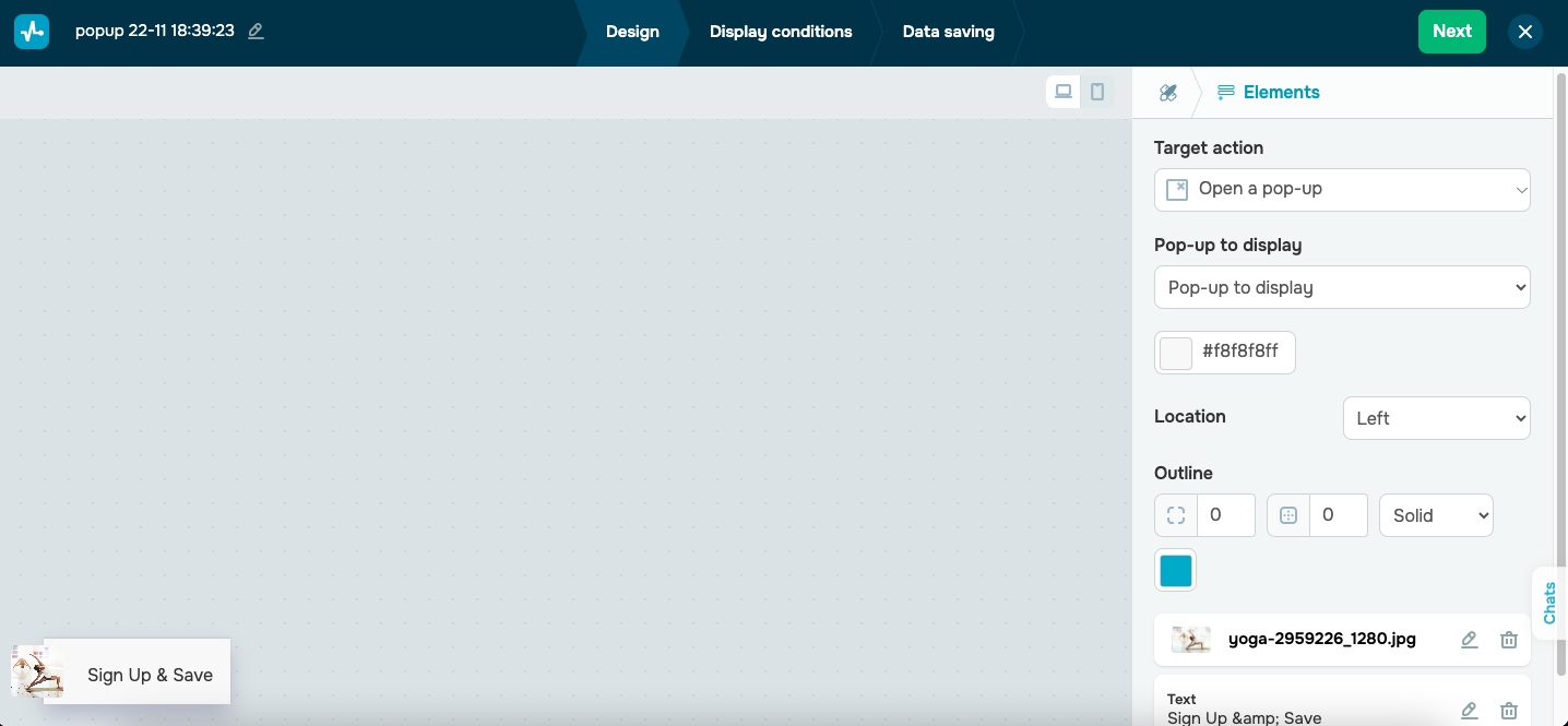 Creating a pop-up launcher in SendPulse
Funded Next
Funded Next implements a countdown timer on a pop-up. This gives an exact idea of when an offer is due, but also motives website visitors to act fast.
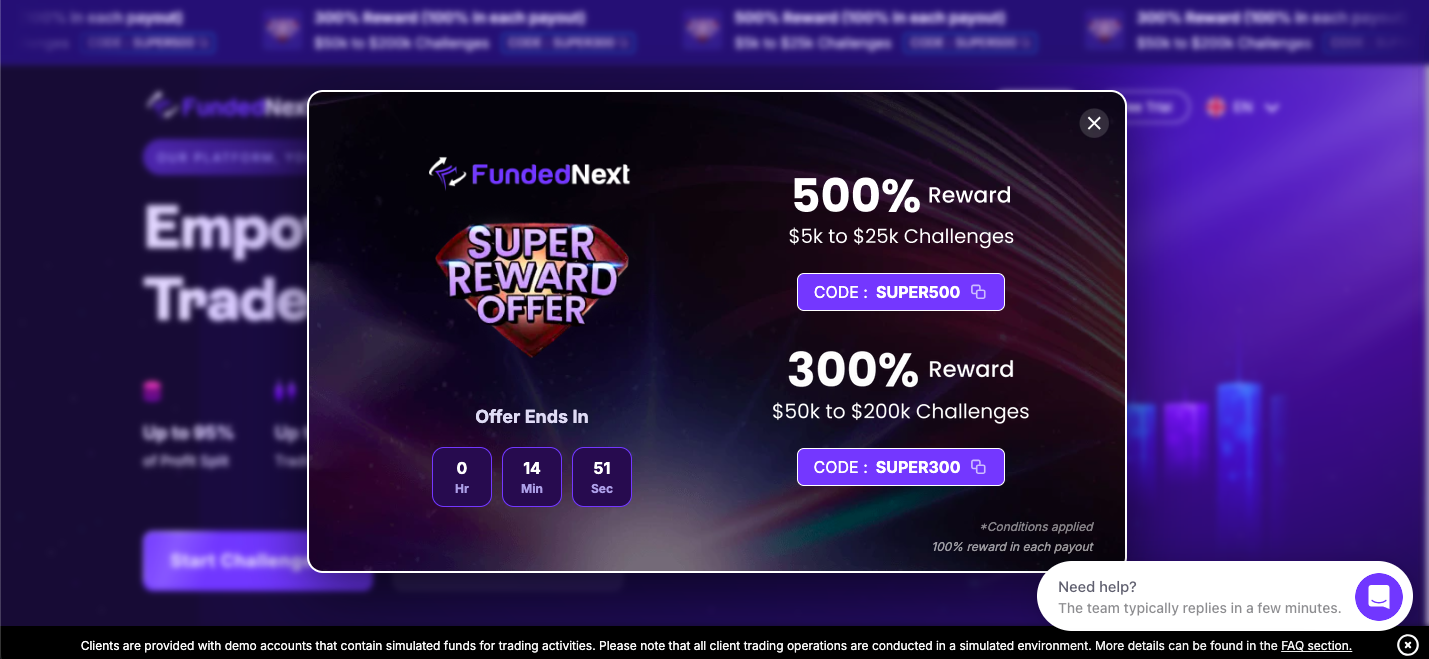 A pop-up with a countdown timer from Funded Next
Using SendPulse’s pop-up builder, you can also incorporate FOMO elements into your newsletter signup forms, especially if you’re offering a larger discount for a limited time. Simply add a countdown timer to the form as an additional element to create urgency.
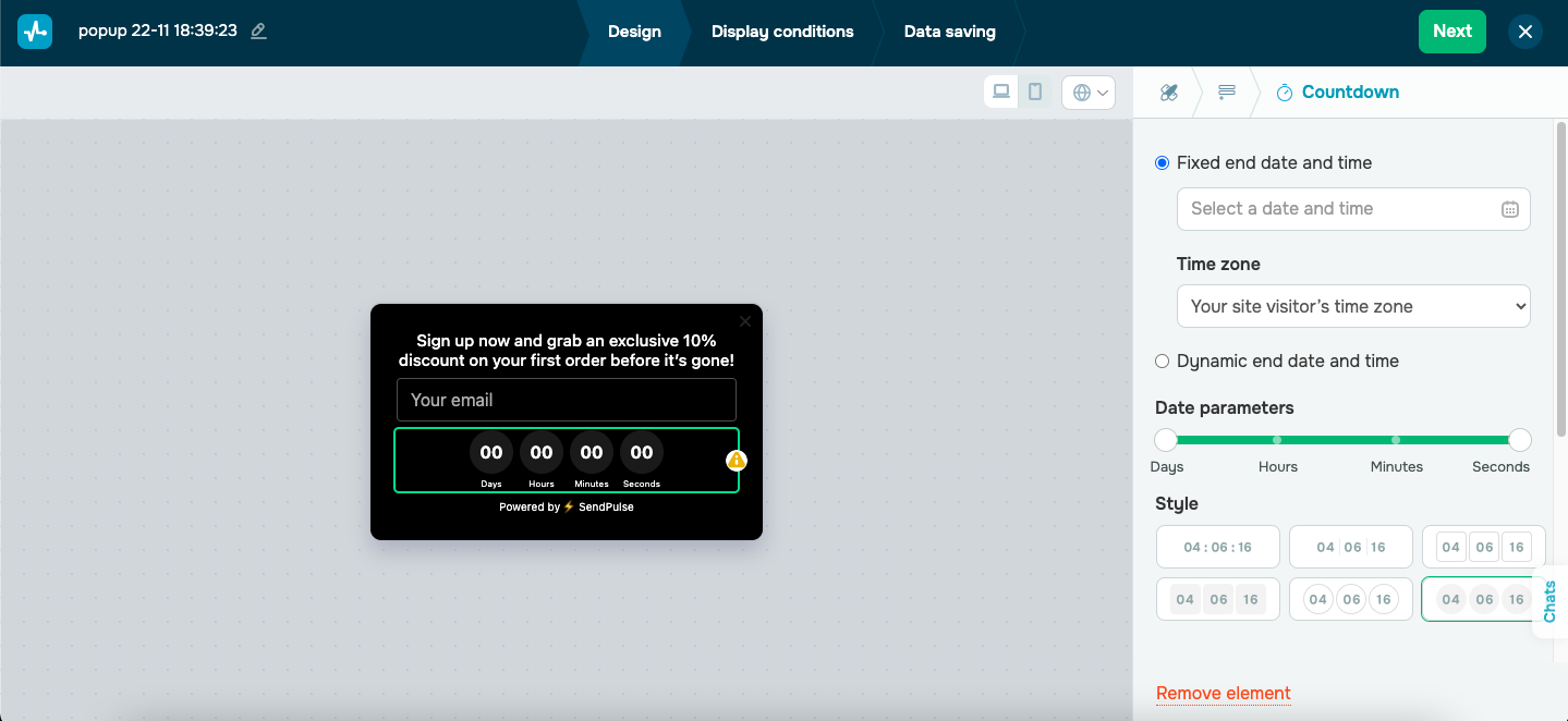 Adding a countdown timer to a subscription form template in SendPulse
It’s also worth noting that you can add gamification elements to your signup forms. SendPulse currently offers a spin-to-win feature, scratch cards, dice, and pick a gift elements that can be customized to your needs.
CreativeBloq
CreativeBloq uses inline forms in the blog articles, offering visitors to sign up for new offers and recommendations. In the example below, an inline form is embedded in the main body of the blog and is a part of a regular content flow.
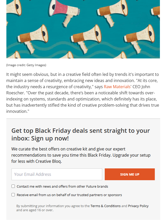 An example of an inline subscription form from CreativeBloq
Using SendPulse, you can create similar inline forms and embed them on your website. You can select your pop-up position, and customize its appearance so that it looks natural on your page.
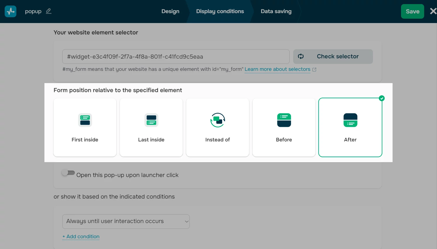 Creating an inline pop-up in SendPulse
Wrapping up
Newsletter signup forms are essential for any online business looking to grow its mailing list and engage with customers regularly. To create effective and visually appealing forms, a reliable solution like SendPulse is key. It offers complete flexibility in designing and customizing various signup forms while also allowing you to manage your email newsletters in one place. Plus, you can get started for free!