When people land on a website for the first time, they typically spend around 52 seconds viewing a page and don’t explore every detail on it; instead, they scan the page to find a hook that grabs their attention and convinces them to stay longer. Being one of the first things visitors see on a website, your header could be the very hook.
In addition to catching the eye, the header helps users navigate the website. If it’s user-friendly, visitors are more likely to keep browsing, which increases your chances of getting conversions. Therefore, it’s crucial to pay attention to both how your header looks and how it works.
In this post, we’ll discuss what a website header can include and how to create an effective one. We’ll also share a bunch of actual website header examples from various businesses, giving you unique, fresh, and creative ideas to inspire your design.
What is a website header, and why does it matter?
A header is a horizontal bar typically located at the top of a website and appearing on most pages. Usually, it contains key navigation elements and components that establish the brand identity, like a company logo, name, or statement. Additionally, it may include extra components: a search bar, social media icons, contact information, and CTA buttons.
For instance, here’s what the SendPulse website header looks like:
 The SendPulse website header includes the logo and key navigation elements
Here are several reasons why a well-designed and functional header is vital to many websites:
- It creates a first impression. The header is one of the first elements visitors notice on your website, and you might not get a second chance to make it better.
- It sets the tone for your website. The header gives visitors a clear idea of what your site is about and encourages them to explore further. From branding elements to key navigation links, it guides them deeper into your content.
- It helps users navigate your website. A header acts as a table of contents for the most critical sections of your site. By carefully organizing its elements, you make it easy for visitors to find what they’re looking for.
- It drives people to action. Call-to-action elements, like sign-up buttons, shopping carts, or demo requests, are often placed in the header, and users naturally expect to find them there.
In summary, a website header serves two primary purposes: navigation and marketing. It helps users quickly access key pages while fostering engagement and guiding visitors to the next step in your sales funnel.
Since every website has its own structure, target audience, brand style, and specific goals, there are various approaches to website header design. Some headers consist of a bare minimum to ensure easy navigation, while others prioritize aesthetics.
Let’s explore the most common types of website header designs used by different online businesses.
Fixed header
A fixed (sticky) header remains visible at the top of a page as users scroll down. Unlike regular website headers that disappear when scrolling, a sticky header stays in place, ensuring that key navigation elements, such as the menu, logo, and call-to-action buttons, are always within reach.
A fixed header on the Zapier website stays visible while scrolling
This type of header is particularly effective for content-heavy or long-scrolling websites that need to simplify the process of moving between sections, for instance:
- on eCommerce sites, it helps users quickly get to the shopping cart and check out product categories;
- on blogs and news websites, it keeps categories and search options easily accessible;
- on SaaS and business websites, it highlights essential CTAs, such as sign-up or demo buttons.
However, be careful: a sticky header may not be the best idea for the mobile version of your site, as it can take up valuable screen space and disrupt user interactions.
Transparent header
A transparent header has a see-through background that blends with the first section of the website. This approach allows the content behind the website header, such as a hero image or video, to remain visible.
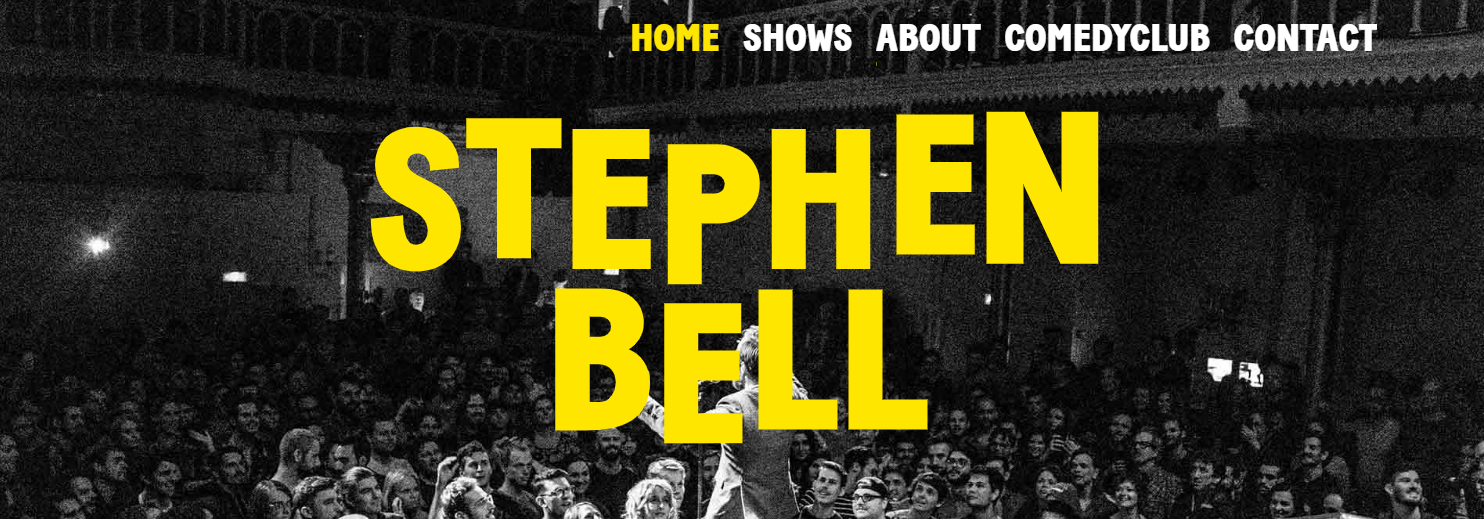 The website of Bell’s Comedy Club features a transparent header
A transparent header is great for visually immersive websites that rely on strong images. It works particularly well in these cases:
- for websites with full-width hero images or videos, it creates a seamless and modern look;
- on creative portfolios and agency sites, it elevates the overall aesthetics, giving a high-end, professional feel;
- on landing pages, it helps keep the focus on visuals while allowing easy navigation.
To ensure good readability, use contrasting text and buttons or apply a subtle gradient or blur effect to your header background.
Minimalist header
A minimalist website header is designed with simplicity in mind, featuring only the most essential elements. Typically, it includes a logo, a streamlined navigation menu, and a call to action while stripping away any distractions like excessive links or graphics.
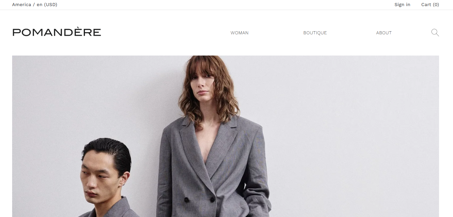 Pomandère’s online store website has a minimalist header
A minimalist header is perfect for websites that prioritize clarity and a clean aesthetic, for example:
- on portfolio websites, it keeps the focus on visuals without unnecessary distractions, ideal for photographers and videographers;
- on business and SaaS websites, it creates a sleek, professional look that enhances credibility;
- on personal blogs and content-driven sites, it improves readability by eliminating clutter.
However, minimalism doesn’t have to mean boring. Using a striking color scheme or adding a subtle hover or scroll effect, like a gentle color shift or animation, can make your header feel more dynamic and visually engaging. AI animation generators can make it easier to create interactive effects of this kind, even if you are a designer with little coding experience.
Mega menu header
A mega menu header features an expansive dropdown menu that displays multiple categories, subcategories, and links at once. Unlike traditional dropdown menus, a mega menu can accommodate images, icons, descriptions, and even interactive elements to improve usability and aesthetics.
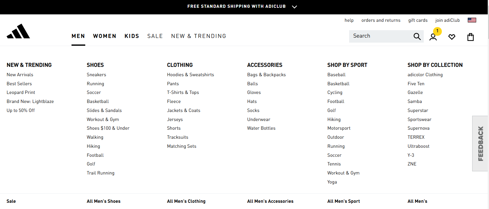 Adidas online store has a mega menu header
A mega menu header is ideal for websites with a large amount of content or complex structures:
- on large eCommerce stores, it displays product categories for easy browsing and better discoverability;
- on news and magazine sites, it helps structure different sections and improve navigation;
- on SaaS and corporate websites, it showcases multiple services, resources, or features in an intuitive layout.
However, keeping your mega menu structured and user-friendly is crucial, so group related content logically to avoid overwhelming visitors.
Full-screen header
A full-screen header is a type of header that expands to cover the entire screen and is often used as a bold visual introduction to a website. It typically includes a hero image or video, a strong call to action, and minimal navigation elements to keep users engaged and focused.
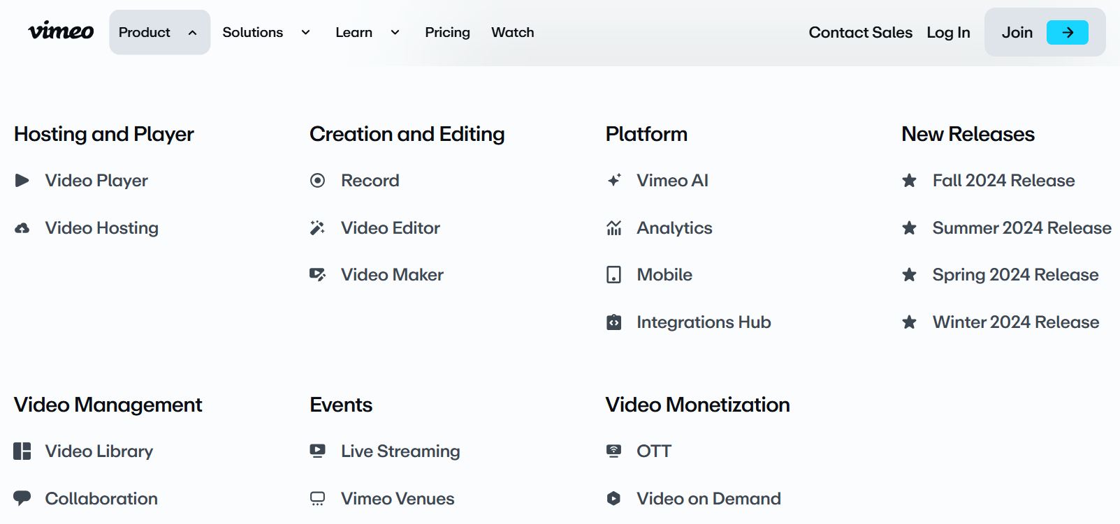 The Vimeo website contains a full-screen header
A full-screen header works best for websites that aim to make a bold first impression:
- on product landing pages, it helps you draw attention to a single offer or specific service;
- on creative agency sites and portfolios, it showcases stunning visuals in an immersive way;
- on event pages, it builds excitement for an upcoming launch or experience.
When designing a full-screen website header, you should focus on optimizing its performance and responsiveness. Make sure it adapts to different devices and screen sizes so that visitors get a consistent, user-friendly experience.
Hidden header
The defining feature of this type of header is clear from its name — it remains hidden on the website until the visitor takes action, such as clicking a button to expand it. Using a hidden header helps save space, which can be especially useful when designing a website for mobile devices.
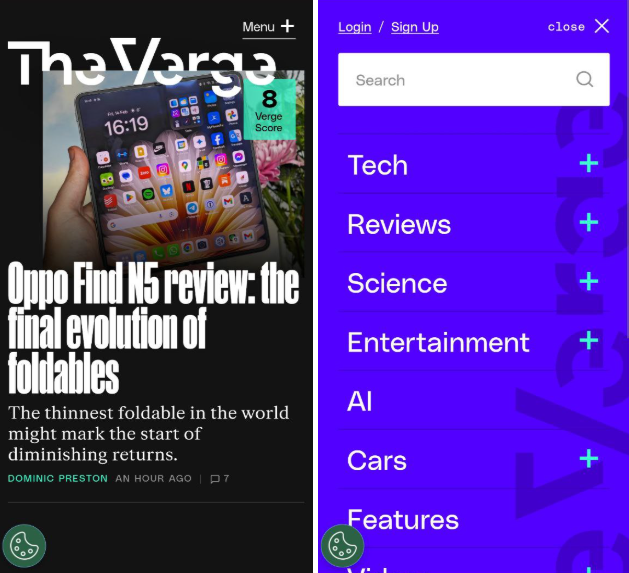 The mobile version of Vimeo’s website features a hidden header
A hidden header is particularly useful for:
- mobile-first websites to save screen space and improve the browsing experience on smaller screens;
- minimalist and creative websites to keep the design sleek and distraction-free while ensuring accessibility.
When implementing a hidden header, make sure it is easily discoverable and intuitive to access. Opt for recognizable icons and consider incorporating smooth animations to improve user experience.
Vertical header
A vertical header, often designed as a one-sided navigation drawer, offers a flexible and space-efficient website layout. Unlike standard horizontal headers, it allows for a more structured menu arrangement and maintains the natural scroll-down flow.
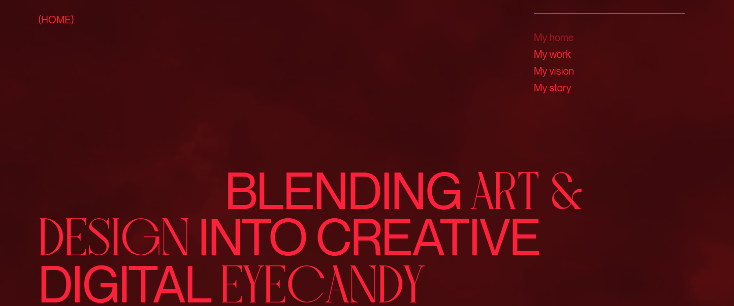 Mark Vogelaar’s website has a vertical header
This type of header is beneficial for:
- knowledge bases or forums to organize large amounts of information into categories and subcategories, making it easier for users to find relevant content;
- blogs and news portals with extensive categories to provide clear, organized access to various topics;
- freelancer, agency, or portfolio websites to provide a dedicated space for projects while still offering intuitive access to different sections.
If your vertical header houses numerous links, consider allowing visitors to expand or collapse it when needed. Also, place your logo or brand mark at the top of the header and make sure it scales appropriately.
Two-tier header
A two-tier or multi-level header features two distinct levels of navigation, typically displaying both primary and secondary options simultaneously. This layout lets users easily access a wide range of sections right from the header.
 Trustwave has a two-tier website header design
This type of header works well for:
- large eCommerce sites to make it easy for users to browse through multiple categories and subcategories or access the cart, supporting a rich, layered shopping experience;
- content-rich sites to help visitors quickly locate different sections like articles, topics, and archives.
Differentiate the tiers visually by applying contrasting background colors, subtle textures, or thin lines. Also, consider making the tire with core elements, such as primary navigation and CTA buttons, sticky to maintain usability.
Website headers of businesses of the same type often share a similar set of components, yet they can vary across different industries. In this section, we’ll explore the core components most website headers contain.
Brand logo and tagline
This element is a primary visual identifier of a business, and a header is a perfect place for it, as visitors will see it once they land on your website. The logo and tagline represent the brand’s identity and serve as a clickable element that usually returns users to the homepage.
 TED placed its logo and tagline in the website header
Navigation menu
The navigation menu provides structured links to the key pages of your website, such as Home, About, Products, and Blog, acting as the roadmap for users to explore your content. Depending on the website type, the menu can range from simple and minimalistic to more complex layouts that include dropdowns and mega menus.
 Serpstat included only the main elements in the navigation menu
A well-designed navigation menu improves usability thanks to making your website intuitive and easy to browse. Placing it in the header ensures that visitors always have quick access to the most important pages, no matter where they are on the site.
CTA buttons
CTA buttons guide visitors toward key actions, encouraging them to sign up, book a demo, shop now, or get started. A CTA placed in prominent locations, like the header’s bottom right or center, ensures it is immediately visible. Whether it’s a contrasting color, bold text, or an eye-catching design, an effective CTA button stands out and motivates users to take the next step.
 LOT used a noticeable color to emphasize the CTA in the website header
Search bar
A search bar helps visitors find specific content quickly without browsing multiple pages. It’s essential for eCommerce stores, blogs, and large websites with lots of content.
 Target placed a clear search bar in the website header with a speech-to-text option
The search bar improves navigation by allowing users to enter keywords for instant results. Many websites also incorporate features like autocomplete suggestions or filters to deliver a better user experience.
Contact info and social links
Contact info and social links are all about making it easy for visitors to get in touch and connect with you. This section of a website header typically includes your phone number, email address, and a “Contact us” link, along with social media icons so visitors can easily follow your brand on platforms like Facebook, Instagram, X, and LinkedIn.
 Tea Associates added the “Contact” section to its transparent header
Languages
A language selector in the header allows users to switch between different languages, making the website accessible to a global audience. This feature is crucial for eCommerce stores, SaaS platforms, news sites, educational platforms, etc., where it is often located in the top-right corner.
Digidop’s website header with the language selection icon
If a website supports two languages, you’ll often see flags or language codes side by side. However, a dropdown menu is a more user-friendly solution when multiple languages are available.
We’ve covered the key elements most commonly added to a website header, but to make it truly compelling and engaging, you should strike a balance between including essential components and avoiding clutter. Following these tips can help you make the most of the limited space available.
Keep it clean and user-friendly
A well-structured website header reduces distractions and makes navigation convenient. Visitors should be able to locate key components like the navigation menu, CTA buttons, and logo without effort. In this context, “clean” means keeping the design minimal: limit your menu items to the most essential pages, maintain a consistent color palette, and use ample whitespace to prevent overcrowding.
Sometimes, contrasting font sizes and colors can help focus user attention on what matters most. The key is to keep the layout visually digestible.
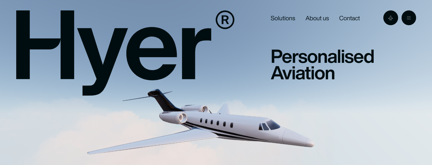 Hyer highlighted its logo using a larger font size
Remember that your website header should guide users rather than confuse them. When navigation is simple and straightforward, visitors can easily find what they need. This clarity also helps reduce bounce rates. A well-balanced design makes the header both functional and appealing, encouraging visitors to stay and explore further.
Cramming too much into the header is one of the worst website header ideas, as it only creates a cluttered look.
 The company’s header is overloaded with menu elements
It’s convenient when you can fine-tune every website detail, including its header. For example, SendPulse offers an intuitive website builder that allows you to customize different sections of your site, ensuring your header aligns perfectly with your overall design. You can add essential navigation elements, structure them effectively, and adjust the spacing, fonts, sizes, and more.
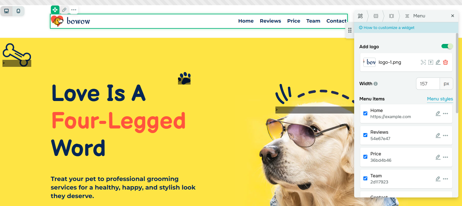 Customizing a website header design in the SendPulse builder
Ensure mobile responsiveness
Mobile users make up a significant portion of web traffic. By the end of 2024, smartphones accounted for 62.54% of global website visits. Therefore, your website should be easy to navigate for smartphone visitors, and the header plays a key role in creating a smooth experience for them.
Since the header is the first thing users notice, it’s important to optimize it for smaller screens. On mobile, using a simplified navigation menu — perhaps transformed into a collapsible hamburger menu — or a resized logo can help maintain usability without compromising functionality.
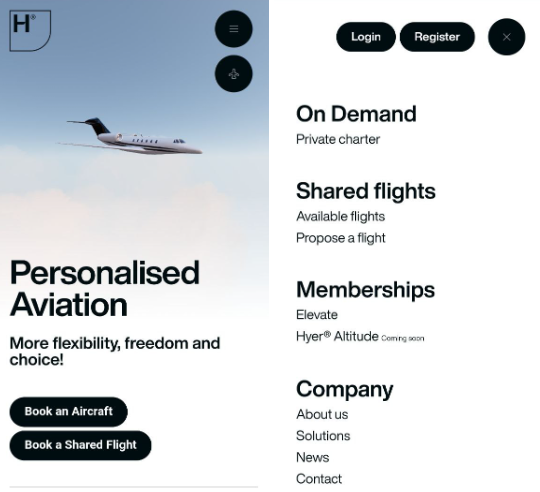 Hyer’s mobile website features a collapsible hamburger menu
With platforms like SendPulse, your website and its elements will automatically adapt to mobile devices. However, if needed, you can customize the mobile version yourself by adding or removing blocks and adjusting their settings.
The preview feature allows you to see how your website will look on different devices
You might also need to adjust the spacing, increase button sizes for easier tapping, or remove unnecessary text to keep your header design clean and readable.
Use eye-catching CTAs
If there’s a particular action you want users to take, make sure to emphasize it in your website header. For your CTA button to be compelling, it should immediately pop in your header or have sufficient contrast to the rest of the page. For example, using a bright, contrasting color like orange or green against a neutral background will make the CTA more noticeable.
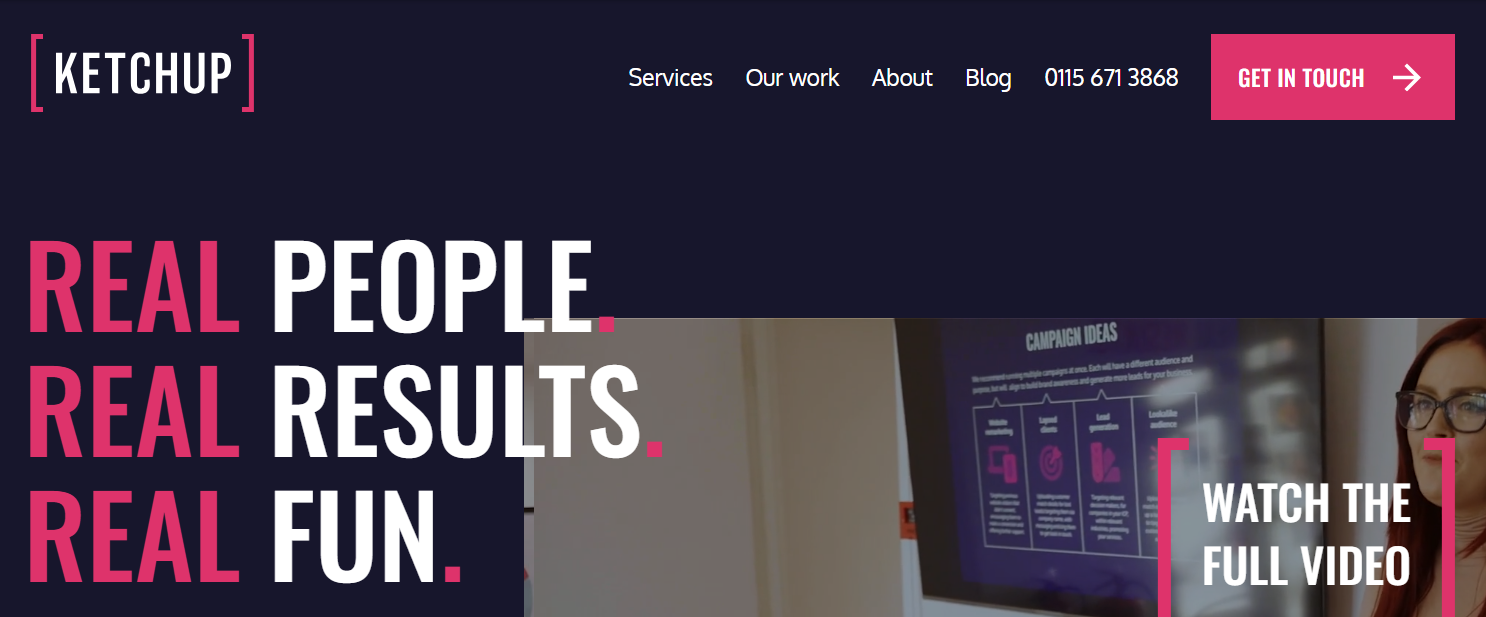 Ketchup highlighted the CTA in the header with a bright color
Use precise, task-related, and action-oriented text — think “Get Started” or “Sign Up.” Position your CTA where users naturally look, for example, at the top-right or center of the header, depending on your layout.
Add visual elements
Many companies include a logo in the header, as it’s a standard element. However, there is often room for additional graphic elements, such as navigation menu items.
 Mini used photos of car models in the navigation menu
The usage of visual elements should remain clean and balanced — consider incorporating subtle icons or other types of visuals that complement the overall design aesthetic without stealing attention from the key items like your logo or CTA buttons. For example, if your site is simple and minimalist, avoid overly detailed or complex graphics; stick to plain icons that match your brand’s style instead.
 Kelvin Zero’s website header features minimalist icons
If your navigation menu has different sections, you can place small icons next to each menu item to help users quickly identify what they’re looking for, like a shopping cart or contact page.
 The MakeMyTrip header contains menu icons
Optimize for SEO and accessibility
When designing your website header, it’s vital to consider its impact on SEO and accessibility. A fast-loading header helps improve your site’s search engine rankings. Heavy elements, such as large images or videos, can slow down page load times and increase bounce rates. To prevent this, compress necessary images using modern formats like WebP and employ asynchronous loading for non-essential elements. Additionally, use semantic HTML tags and provide alt text for images to make your site more user-friendly for all visitors.
Let’s look at website header examples from real companies and businesses across different industries to uncover how they apply best practices to their designs.
SEM restaurant
SEM is a Portuguese food company with a thoughtful mission and concept — to craft micro-seasonal menus that minimize food waste. On the company website, users can find information about their culinary philosophy, menu offerings, reservation details, and founder backgrounds.
This restaurant website has a transparent header that seamlessly blends with its atmospheric visuals. The design leverages ample white space between menu items to create a calm feel and a subtle animation effect to smooth the navigation experience.
SEM’s website header features a hover effect animations
Velvet global packaging distributor
Velvet is a global distributor that specializes in flexible packaging solutions and machinery. Their website features a bold design and stands out from conventional layouts.
Velvet’s header adopts a minimalist approach that aligns with the industry’s focus on functionality and innovation. It includes only essential menu items — Packaging and Equipment — while additional navigation options are hidden in a collapsible hamburger menu. Additionally, the company incorporated a tasteful hover effect that highlights elements within the transparent header, ensuring better visibility for key information.
Core header sections on the Velvet website stand out despite the minimalistic approach
BuckitUp platform
BuckitUp is a platform that provides a secure, offline-first crypto ecosystem designed to safeguard valuable files and communications without relying on the internet connection. The website offers information about their technology and features and guides users on setting up their own data storage solutions.
The header blends seamlessly into the main content, with no distinct background color or borders separating them. Its minimalist design, which features only the logo, a prominent call to action, and social media icons, relies on bright color highlights to immediately capture user attention.
 BuckitUp draws attention to its website header with the contrasting font color
EntreAutre design studio
EntreAutre is a design studio specializing in product design, 3D rendering, and innovation. The website showcases its expertise and invites potential clients to discuss their design challenges and collaboration opportunities. The site serves as both a contact point and a portfolio for the studio’s design services.
EntreAutre’s header demonstrates a minimalist yet dynamic design that mirrors its creativity. The layout features generous white space to make the logo and navigation elements breathe and subtle animations for social media and language selection buttons. These buttons light up on hover and expand into a dropdown menu.
EntreAutre’s header combines simplicity and gentle animations
Bits Kingdom software development company
Bits Kingdom is a software development company that creates custom mobile, web, and app solutions. Its website serves to introduce the company’s services and approach to potential clients, present its portfolio, and facilitate communication and project initiation.
The Bits Kingdom website employs a vibrant and bright first screen, which is quite unexpected for companies in this industry. With just a few key elements — the logo, a blog link, contact information, and a price dropdown menu — this header prioritizes clarity. What’s interesting about this website header design is the bold tagline placement in the center to draw the visitor’s attention to the company’s unique value proposition.
 Strategic tagline placement in the Bits Kingdom website header
Lucky Done Gone music artist
Lucky Done Gone is an electronic music artist. On the website, the artist showcases music, announces upcoming events, and provides details about tours and releases. It also offers a platform for fans to stay connected with the latest music and performance schedule.
At first glance, it may seem like there’s nothing special about this website header, except for the unusual placement of the social media icons — on the left side instead of the right. However, when users scroll, the header turns sticky, and the menu elements are compacted into a hamburger menu. It gives this website header design a unique twist and keeps the menu always at hand without overwhelming the visual space.
Lucky Done Gone features a transparent header that becomes sticky on scroll
RTRFM radio station
RTRFM is an Australian community radio station that presents a diverse range of local music, podcasts, and programs, offering a platform for emerging artists and voices. On its website, listeners can access live streaming, program guides, and information about events, sponsorships, and ways to support the station.
RTRFM’s website header is a prime example of how its content and structure can reflect the company’s unique features. It integrates a live on/off button for streaming the radio broadcast and a scrolling ticker that displays the currently playing song.
RTRFM’s header contains a play button and a scrolling ticker
DUNA agency
DUNA is a full-service digital marketing agency specializing in brand growth strategies. This website is kind of a portfolio that proves the agency’s expertise in web design, SEO, paid ads, and social media marketing.
The company uses the header not only as a place for the menu but also as a space for announcements displayed in a scrolling ticker. Additionally, the CTA button is stressed with animation and a gradient, making it both eye-catching and interactive.
DUNA agency uses a website header to convey announcements
Builder Renderings visualization company
Builder Renderings is a company that specializes in creating high-quality architectural visualizations, including 3D renderings, animations, and virtual reality presentations for construction and real estate industries.
The Builder Renderings website header takes a creative approach. It is a full-screen header with many elements, such as images in the navigation menu and a brief description of what the company does. Here, header elements that are usually placed at the top are positioned at the bottom of the screen. As users scroll, the header transforms into a regular sticky header that displays the main menu options.
The full-screen header on the Builder Renderings website
Hello Period health company
Hello Period is a sustainable period care brand offering a range of eco-friendly products. The website serves as a platform to educate users about these products, share usage guides, and facilitate online purchases.
The website header is designed in a bold, vibrant orange color that complements the first screen. A significant portion of the header is dedicated to the logo, making it a prominent focal point that immediately catches the visitor’s eye. Key menu items are neatly organized in a separate panel, with some options expanding into dropdown menus. The header remains visible as users scroll, but the large logo shrinks and compacts so it doesn’t dominate the screen.
A bright header on the Hello Period website
Conclusion
Coming in various types, shapes, and layouts, website headers are critical to grab attention, promote your brand, and increase engagement. In this post, we’ve explored the key components that typically make up a good website header and the best practices you can follow to optimize this element for your site’s success. We’ve also looked into inspiring website header designs to learn from.
To design a unique header for your website, look no further than SendPulse. With ready-to-use templates, reusable blocks, and advanced design options, you can create a website header that best represents your business and makes a strong first impression.
Besides a website builder, our platform includes marketing and sales automation features, an integrated CRM system, tailored pop-ups, AI-powered chatbots, email marketing tools, and more. Sign up for a free account and try it yourself!