Online users today have endless options for shopping, learning, and entertainment. If your website isn’t easy to navigate, the chance they’ll stick around is slim to none. In fact, research shows that 34% of visitors leave a website without looking back due to a poorly organized website structure or usability. Add slow-loading pages into the mix, and you’ll quickly find potential customers heading straight to your competitors.
In this post, we’ll explore the essentials of website structure, showing you how to create a clean, user-friendly design that keeps visitors engaged and coming back.
What is a website structure?
Website structure refers to how the pages on your website are organized, connected, and arranged to create a seamless user experience. Think of it as the blueprint of your website, mapping out the hierarchy of pages and guiding users through clear navigation paths. This structure ties all your web pages together using menus, internal links, and categorized content.
Why is website structure important?
A well-organized website structure is key to helping your visitors achieve their goals, whether they’re shopping, exploring your content, or getting in touch. Their browsing experience should feel seamless and intuitive from start to finish. Notably, 31% of consumers consider an engaging user experience a top priority.
At its core, website structure isn’t just about user experience; it also directly affects your business’s success. A clear and logical structure makes it easier for visitors to take target actions, like completing purchases or submitting inquiries. When users can find what they need effortlessly, they’re more likely to trust your brand and return as loyal customers.
Beyond helping users, your website structure is critical in search engine optimization. A clear, logical layout helps search engines crawl and index your pages efficiently, which can, in turn, boost your chances of ranking higher in search results.
A well-planned structure guides visitors through their journey and ensures your website is easy to manage and scale over time. Planning this organization from the start minimizes surprises and helps you deliver both a user-friendly experience and strong SEO performance.
The good news is that investing in your website structure doesn’t have to be complicated or expensive. Tools like SendPulse’s website builder offer ready-made solutions to create a professional, user-friendly website without the need for extensive resources or technical expertise.
Best way to stucture a website
A strong website structure is built on three essential elements: categories and subcategories, navigation, and a linking system. Together, these components keep your website organized, guide visitors to the right information, and encourage them to explore further.
Categories and subcategories
Categories are the foundation of your website’s structure, which group related content into clear, logical sections. For larger websites, breaking these into subcategories makes navigation even easier.
For example, if you run an online clothing store, the best way to structure your website’s categories might be including “Shoes,” “Outerwear,” or “Accessories.” Each can be further divided — for instance, “Sandals” under “Shoes” or “Jackets” under “Outerwear.”
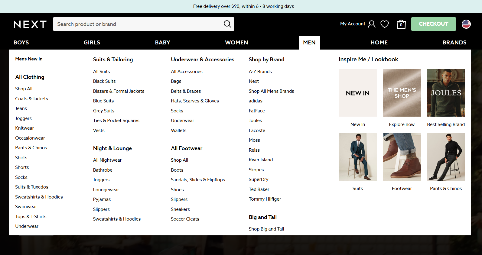 Categories and subcategories in the Next store
Navigation
Your website’s navigation is like a map, helping visitors move effortlessly between pages. It often begins with a menu. For example, it can be a traditional menu in your website header.
 Menu on the ASOS website
It can also be a compact hamburger menu, like in the example below.
Hamburger menu on the H&M website
A well-planned navigation system ensures all key pages are accessible right from the homepage. This includes dropdown menus for subcategories and links to other important pages like “Contact Us” or “About Us.”
For example, on The North Face website, in addition to the main categories in the site’s menu, a visitor also has access to an “About Us” section.
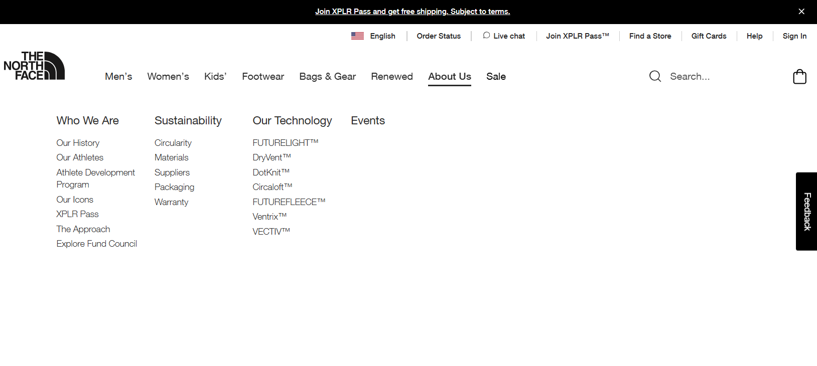 “About Us” section on the North Face website
Linking system
An effective linking system connects your pages and ensures users can explore your website with ease. This system includes:
- Calls to action. Bold, clickable links like “Sign Up” or “Shop Now” that drive visitors toward specific actions.
- Internal links. Links that connect pages within your website, helping users and search engines understand the relationships between your content.
- Contextual links. Links that point to external resources, such as blog posts, partner pages, or news articles, to provide additional value.
For example, here is what an internal link on the edX website looks like. When clicked, this link takes the visitor to another page on the same website where they can view the full list.
 Internal link on the edX website
Website structure types
Let’s explore the top website structure types you can choose from, depending on your business’ needs and goals.
Linear structure
 Linear website structure type
The linear website structure, also called the sequential model, guides users through a simple, step-by-step journey. Each page flows logically into the next, making it a great choice for websites with minimal content or a focused purpose.
This model is especially useful for businesses or creators showcasing a product, service, or process. For example, a fitness trainer might design their website to take users from the homepage, where they select a training package, through to additional pages with detailed information, and finally to a sign-up form. Each step ensures visitors get the information they need before moving forward.
It is one of the website structure types that keeps navigation straightforward and users focused, reducing the risk of confusion.
Hierarchical structure
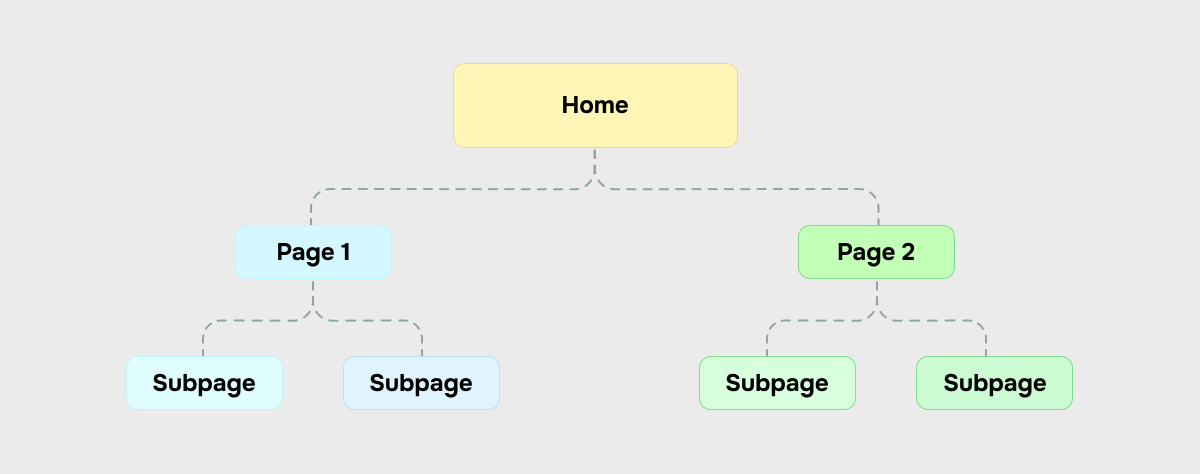 Hierarchical website structure type
The hierarchical structure, also called the tree model, is one of the most popular ways to organize a website. It begins with a homepage (the parent page) that branches into categories and subcategories (subpages). It creates a clear path for users to navigate from general to specific content.
This structure works well for content-rich websites like online stores or portfolio websites. To set up a hierarchical structure, start by organizing your content based on its importance. General information should appear on top-level pages, with more detailed or niche content on subpages. This structure simplifies navigation and helps visitors quickly and effortlessly find what they need.
Matrix structure
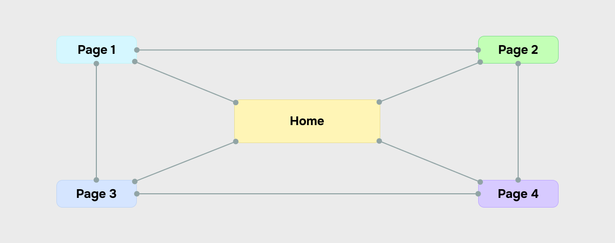 Matrix website structure type
The matrix website structure prioritizes user exploration, offering a flexible, non-linear journey through your content. Unlike hierarchical or linear models, the matrix structure allows visitors to jump between categories, pages, and topics without following a predetermined path. This is ideal for websites with a variety of interconnected content, such as online newspapers, resource libraries, or large eCommerce platforms.
While categories and subcategories still exist in the matrix model, their arrangement is less restrictive. Instead, navigation tools like a search bar, drop-down menus, and breadcrumb navigation play a central role in guiding users. These elements allow visitors to explore freely, offering multiple points of entry to your website’s content.
For instance, an online newspaper might feature a homepage showcasing trending stories, editorials, and multimedia from various categories like politics, business, or sports. A visitor can dive into a specific topic through search results, cross-links within articles, or recommended reads. Similarly, an eCommerce website using this model might guide users from a product page to related items or trending collections.
Best practices for creating a website structure
No matter what way to structure your website you choose, follow these tips to ensure your website is user-friendly and attracts visitors rather than driving them to your competitors.
Ensure logical navigation
Website navigation helps visitors understand the structure of a website and quickly find what they’re looking for. To make navigation intuitive, ensure all main categories are represented in your menu. Follow these best practices:
- Keep it concise. Use short phrases or even single words for menu elements.
- Use simple, clear language. Make sure visitors immediately understand what each section offers.
- Avoid clutter. Stick to essential links in the main navigation to prevent overwhelming users.
From the homepage, guide users to essential categories and subcategories. Drop-down menus or other methods for accessing subcategories can help maintain a clean, organized structure.
If your website is complex, create a visual sitemap using tools like MindMeister, Lucidchart, or XMind to ensure your structure is logical and user-friendly. This can help you identify overly broad sections that may need to be split into smaller, more manageable subcategories.
Eliminate orphaned pages and fix broken links
Orphaned pages, which have no internal links, are difficult to find, while broken links can frustrate users and hurt your SEO efforts.
To ensure your website is easy to navigate and optimized for search engines, follow these steps:
- Run a website crawl. Use tools like Screaming Frog or Ahrefs to identify orphaned pages and broken links.
- Check internal linking. Ensure every page has at least one link pointing to it, ideally from a high-traffic or relevant page.
- Fix broken links immediately and add internal links to orphaned pages. Regularly update your internal linking as new content is added.
Address keyword cannibalization
When multiple pages target the same keyword, they compete with each other, creating confusion for both users and search engines. To address this issue, start by conducting a content audit to group related pages by topic and identify instances of overlap. Use analytics to evaluate which pages perform best for their targeted keywords and pinpoint weaker ones.
Next, merge similar pages into a single, comprehensive resource that provides greater value to users. Finally, implement redirects from the old pages to the optimized version to maintain traffic flow and preserve SEO value.
Ensure your website is fully responsive
As the world has become increasingly mobile-first, making your website design responsive is no longer optional — it’s essential. In fact, 70% of US consumers shop on their smartphones, particularly for entertainment and food. If you have an unresponsive website, you risk losing both engagement and conversions. Pages that don’t adapt to different screen sizes lead to frustrating navigation and poor readability, driving potential customers away.
To avoid this, start by testing your website across various devices using tools like Chrome DevTools or BrowserStack. These tools help pinpoint design issues and ensure your website looks great on any device. Also, double-check that interactive elements, such as buttons, menus, and forms, are user-friendly on mobile. A responsive design doesn’t just improve usability; it creates a seamless experience that keeps users engaged.
If you use the SendPulse website builder, you won’t have this issue, as websites created with the drag-and-drop editor display perfectly on different screens. During the website creation process, you can easily preview how it will look on both desktop and mobile.
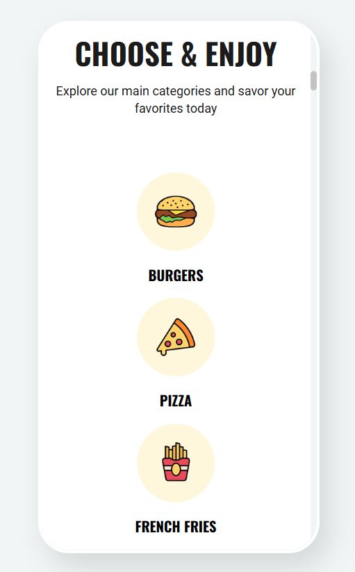 Mobile website preview in the SendPulse builder
Analyze your website
Once your website is live, it’s crucial to regularly monitor user behavior to understand how visitors interact with your content. Using analytics tools like Google Analytics can help you track key performance metrics and spot areas for improvement. Key metrics to focus on include:
- Entrance and exit pages. Which pages are getting the most visits, and where are users leaving the website?
- Time spent on your website. How much time do users spend on various pages? This can give you insights into content engagement.
- User journey. How are visitors navigating through your website? Identifying common paths can help you improve the user flow.
Analyzing these metrics helps you identify weak points in your website’s structure. For example, if a specific page has high exit rates, it may indicate issues with content or navigation. Addressing these areas can optimize the user experience and reduce bounce rates.
Using SendPulse, you can easily monitor your website’s performance with detailed statistics. View overall data, including sessions, subscriptions, and payments. You can track these metrics over different time periods.
- Sessions. Monitor the total visits, visitor-to-session ratio, and device usage (desktop vs mobile). You can also see detailed data on page visits.
- Subscriptions. Track sign-ups via the Form widget, conversion rates, and device breakdown (desktop vs mobile).
- Payments. See successful transactions, payment-to-session ratios, and detailed payment statistics, including device usage.
- Visitor country. View data on where your visitors are from, showing the countries and percentage of sessions from each.
Implement a live chat
You might wonder: what do live chats have to do with website structure? There are two key benefits: one for you and one for your visitors.
Implementing a live chat on your website can guide visitors to the right sections, improving navigation. Unlike a traditional search bar, which may not always help users find the correct page, a chatbot offers direct assistance. If a visitor lands on your site and struggles to find what they need, they’re likely to leave. Don’t let them go without offering help.
Here is an example of a chatbot on a shoe retailer website that offers visitors assistance, helping them with popular queries they might not be able to find by themselves.
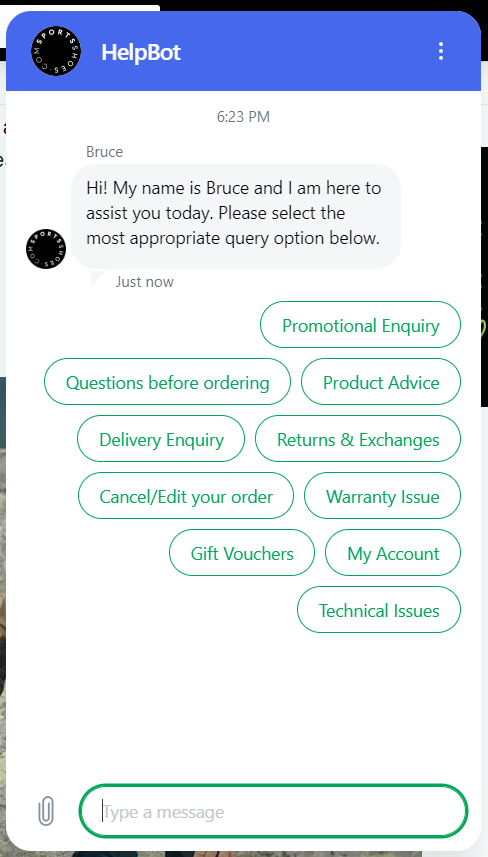 A website chatbot that helps visitors
The second benefit is that chatbots can provide valuable insights into how user-friendly your website structure is. They can help you identify where visitors encounter difficulties and which categories, sections, or elements may be confusing or inconvenient.
Website structure examples
Let’s look at some website structure examples.
Target
Target’s website is among excellent hierarchical website structure examples. It features a well-organized structure with clear categories like “Clothing, Shoes & Accessories” and subcategories for easy navigation. The navigation menu offers dropdowns for subcategories and links to key pages.
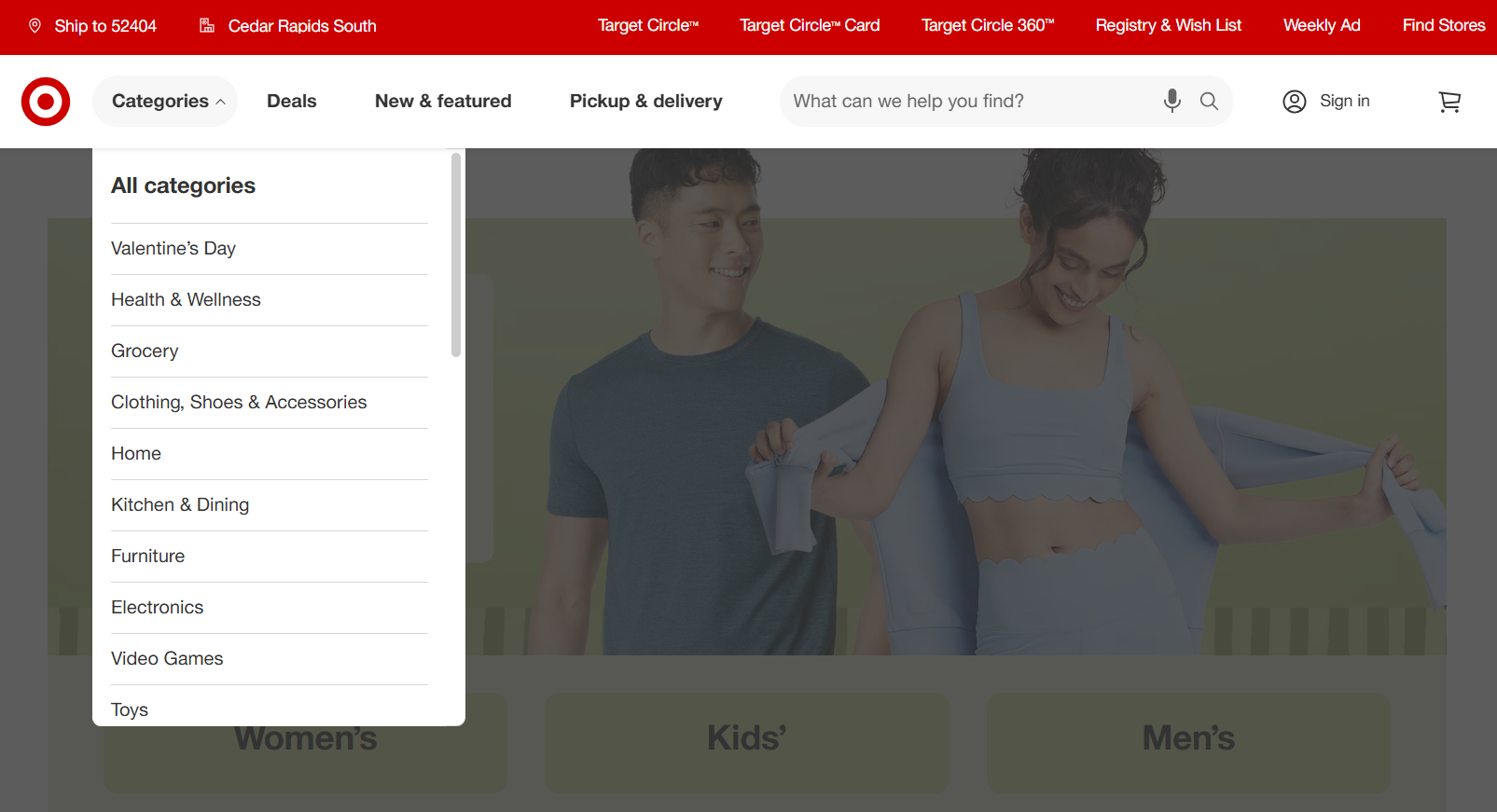 Target is a great hierarchical website structure example
The retailer’s website also uses a strong linking system, with internal links and CTAs that seamlessly guide users through their shopping journey. It’s mobile-responsive, ensuring smooth browsing on all devices.
 Target’s website is also mobile-friendly
Coursera
Coursera’s website has a matrix structure rather than a strictly hierarchical one. In a matrix model, users are encouraged to explore the website through multiple pathways, which is exactly how Coursera is designed.
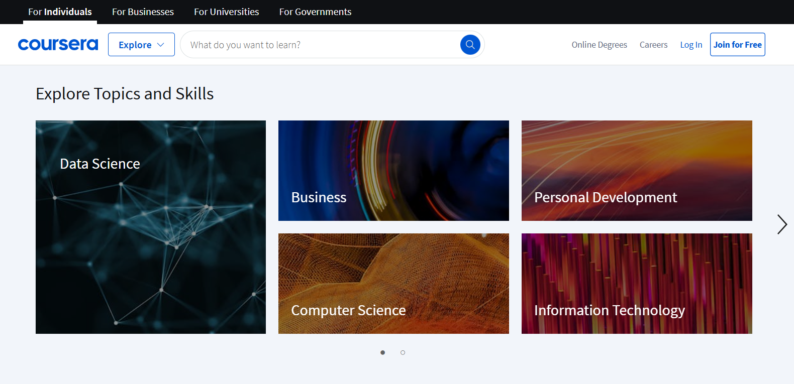 Coursera’s website structure can be considered as a matrix one
Coursera provides flexibility in how users navigate its website. Visitors can explore courses, programs, and degrees from various angles, whether by subject, skill level, or career goals, without following a set linear path. For example, you can find courses based on your career interests (like “data science” or “business”) or choose from categories like “Free Courses” or “Top Rated” offerings.
There’s also a search bar, personalized recommendations, and links to related content, all contributing to an interconnected experience.
Xmind
Xmind’s website follows a clear hierarchical structure with easy-to-navigate categories and subcategories.
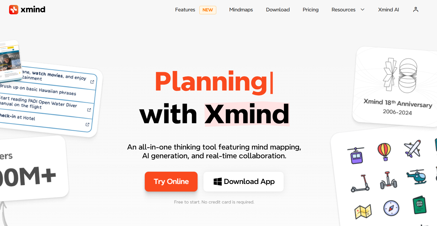 Hierarchical website structure example with categories and subcategories
Xmind’s homepage features a prominent menu that offers access to key pages like features, pricing, and download options.
The website offers intuitive links to tutorials, resources, and customer support that contribute to a seamless user experience. This structure helps users quickly access information, download the tool, and explore its full potential, providing a user-friendly journey.
Conclusion
The structure of a website directly impacts its conversions. If visitors can’t find what they’re looking for, they’re unlikely to keep searching — they’ll simply leave and look for alternatives with your competitors.
The best way to structure a website is to ensure a simple, straightforward, and intuitive design that allows users to navigate through key sections easily. It’s essential to keep your website responsive, as many users will access it from mobile devices.
Avoid complicated navigation and menus, and ensure proper internal linking to guide visitors seamlessly through your content. If you want to create a high-quality website without hiring a developer while having access to valuable marketing tools and analytics, give SendPulse a try!