Just as people are judged from head to toe, a website isn’t complete without a well-designed footer. While the header makes the first impression, the footer leaves a lasting one. It provides key information, builds trust, and ensures visitors can easily navigate. A strong website footer doesn’t just enhance visual appeal, it adds structure and functionality from top to bottom.
In this post, we’ll explore the website footer, its purpose, and its essential components. You’ll also find expert tips on creating one, along with real-world website footer examples for inspiration.
A footer is the bottom horizontal section of a website that typically contains contact information, legal details, and a sitemap. It can also include other elements, vary in size, and either remain consistent across all pages or differ from one page to another.
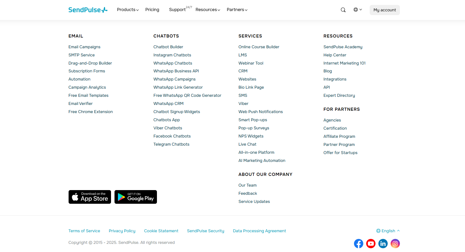 SendPulse website footer
A website footer is like the foundation of a building — often overlooked but crucial for stability and support. While it may not be the main attraction, it holds everything together, providing users with important information and seamless navigation. A well-crafted footer ensures your website remains functional, trustworthy, and easy to explore.
A website footer shouldn’t be just an afterthought, as it is crucial in user experience, engagement, and even SEO metrics. Let’s now explore in more detail why investing in a well-designed footer is a smart move.
Improving navigation and user experience
When visitors reach the bottom of a webpage, they often seek additional information or the next step in their journey. A well-designed footer acts as a mini-navigation hub. It offers quick access to essential pages such as contact details, FAQ section, and service information. By structuring links logically, footers prevent users from feeling lost and keep them engaged with your website.
Website footer examples from brands like Similarweb showcase how a well-planned footer can keep visitors engaged.
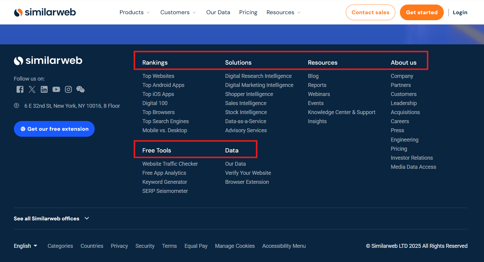 Well-structured footer from Similarweb
Encouraging engagement and conversions
A website footer is an extremely valuable touchpoint for driving engagement. It’s the perfect place for newsletter signup forms, social media links, or a final call to action. For businesses, this could mean generating leads, promoting special offers, or directing users to key resources, all of which can boost conversion rates.
For instance, Similarweb enhances its website footer design with social media links and a compelling CTA, making it easy for users to stay connected.
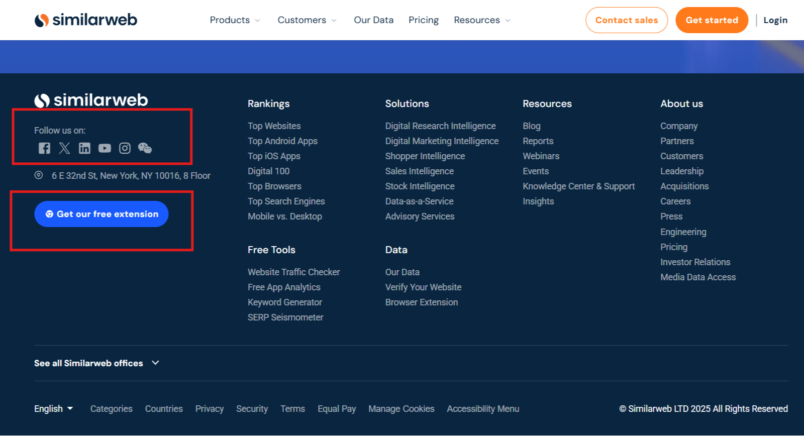 Website footer design by Similarweb
Boosting SEO with structured links
Search engines favor well-organized websites, and a strategically designed website footer helps reinforce website structure. Internal links in the footer help search engine crawlers understand your website’s hierarchy, and in turn, improve its discoverability in search results.
Including essential details like business location, contact information, and a copyright notice also strengthens local SEO and establishes credibility. Search engines recognize these elements as trust signals, which can enhance your website’s optimization, authority and improve rankings.
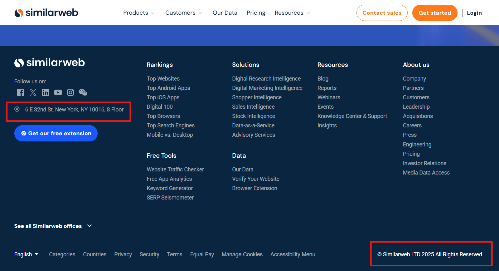 Similarweb placed contact information and a copyright notice in the footer
Establishing trust and transparency
A footer also serves as a space to communicate credibility. Including legal disclaimers, privacy policies, and copyright information is a great way to reassure visitors that your site is secure and compliant.
Additionally, showcasing certifications, awards, or customer testimonials in your footer can further enhance trust and brand authority. In the following example, DSMN8 highlights reviews and certifications in its website footer design to give users extra confidence in its services.
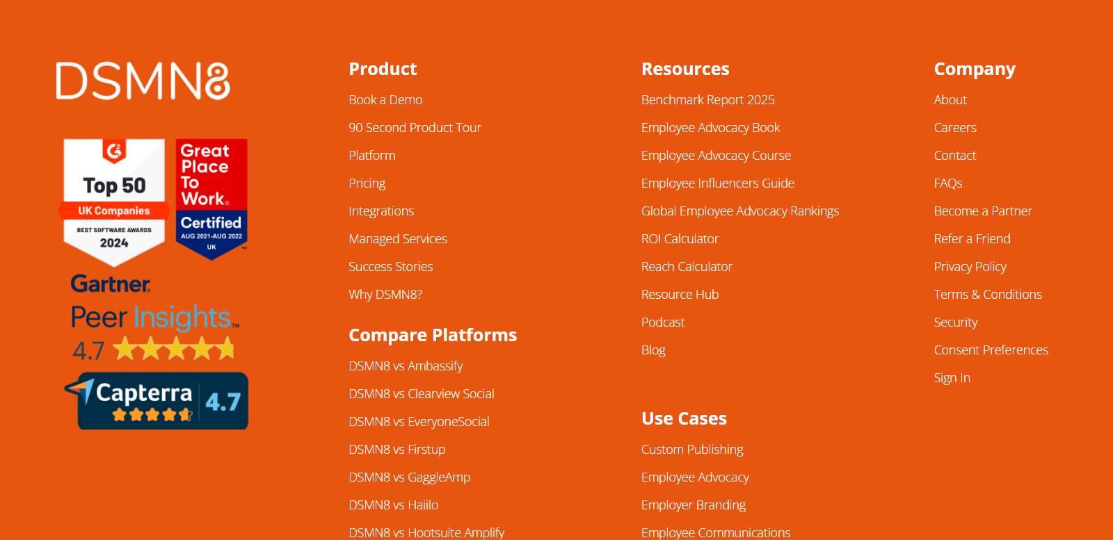 Website footer design by DSMN8
Customization for a more personalized experience
Not all footers need to be identical across a website. Businesses can tailor footer content to different pages to ensure users see the most relevant information at each stage of their journey. For instance, a checkout page might prioritize customer support links, while a blog page could include recommended articles or social sharing options.
Some website footer elements, like contact details and navigation links, are quite self-explanatory and non-negotiable. Others, like social media icons, testimonials, or a bold call to action, can take your website footer design to the next level. The key is knowing what to include and how to structure it. Let’s break down both essential and optional elements to help you build a footer that works.
Essential elements every footer should have
Contact information ensures that visitors can reach out without hassle. This may include an email address, phone number, or a direct link to a lead capture form. Making contact details easily accessible improves customer support and removes friction for potential clients, business partners, or jobseekers trying to connect with your company.
Navigation links act as a secondary roadmap, guiding users to important sections like the About page, FAQs, or customer support. When visitors reach the bottom of a page and still have questions, the footer provides them with a logical next step.
For instance, Vimeo’s website footer includes both contact details and navigation links for a seamless user experience.
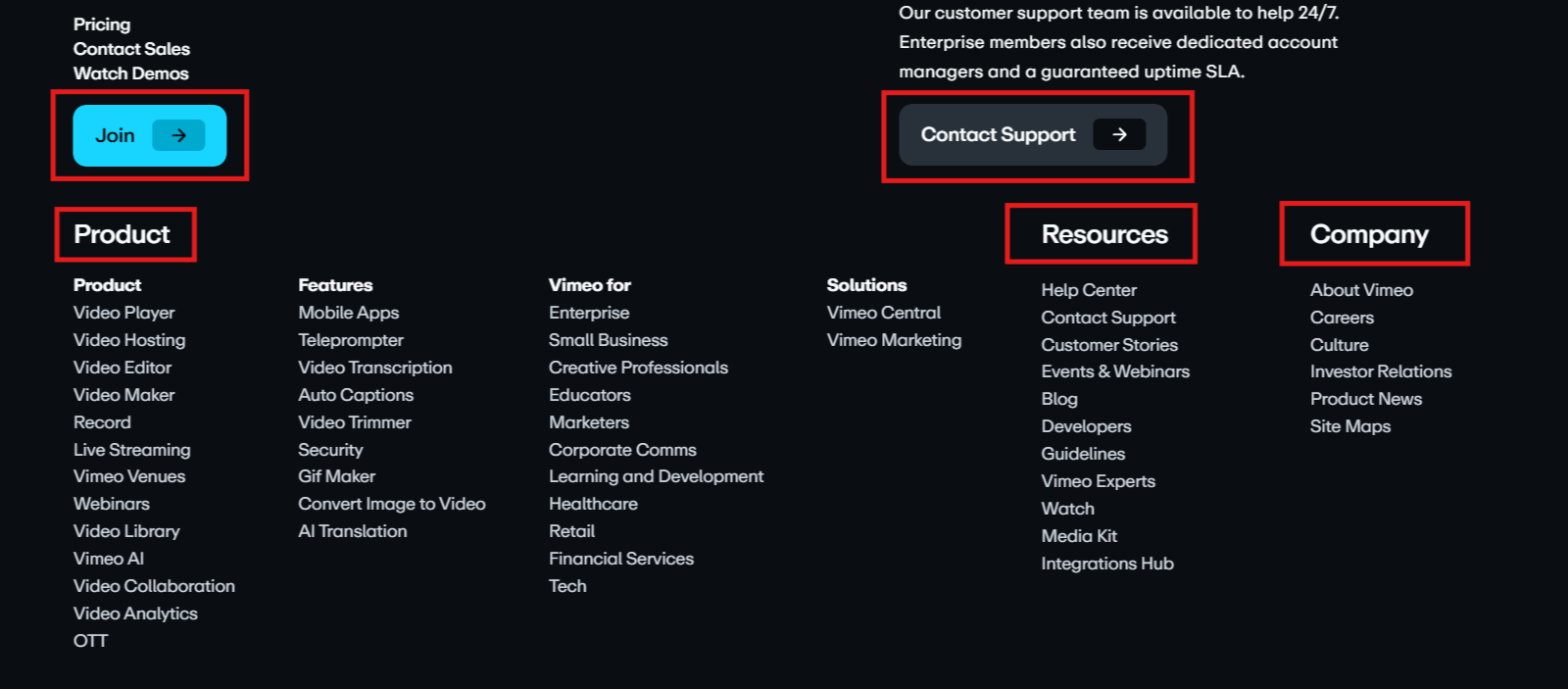 Footer example from Vimeo
Social media icons extend your brand’s reach beyond your website. If you place links to your social profiles in your website footer, visitors can continue interacting with your business on different platforms. This strengthens brand presence across multiple marketing channels.
A copyright notice is as a subtle but necessary legal safeguard. It signals ownership of your content, discourages unauthorized use, and reinforces professionalism. While a small element, it contributes to the overall credibility of your website.
Zapier’s footer integrates social media links alongside its copyright notice for a well-balanced website footer design.
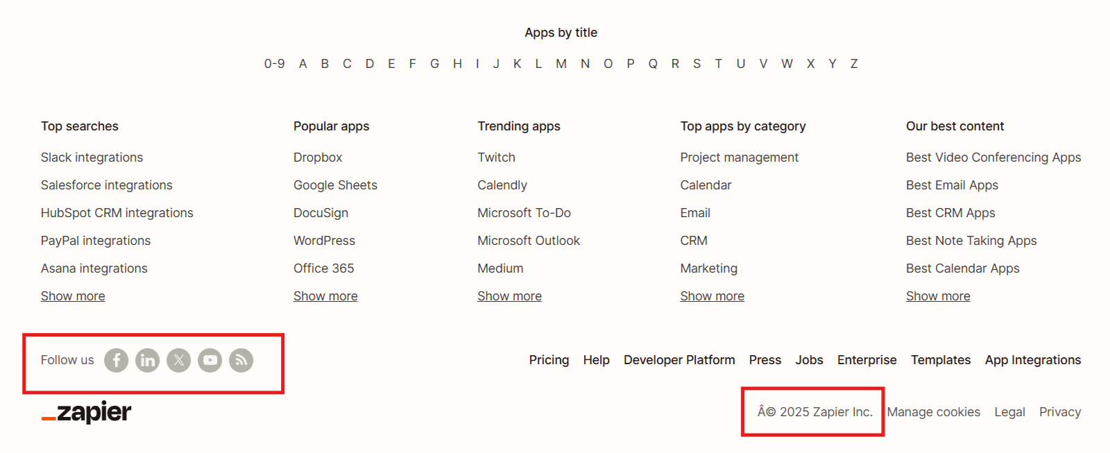 Website footer example from Zapier
Privacy policies and terms of service are not just legal necessities. They build trust. If your website collects user data, such as email addresses or payment details, these documents clarify how information is handled and ensure compliance with data protection laws. Visitors expect to find these links in the footer, making it the ideal location to meet both legal and user expectations.
A well-placed call to action in the footer can turn passive visitors into engaged users. Whether it’s a free trial button, or a demo request, including a compelling CTA encourages ongoing interaction and lead generation. By the time visitors reach the bottom of your page, they may be ready to take action, so make that step seamless.
Trustwave’s website footer combines a subscription CTA with a privacy policy, ensuring transparency while encouraging engagement.
 Footer example from Trustwave
The online travel brand eDreams has a fairly large footer that includes all the essential elements we’ve discussed: contact information, navigation links, social media icons, copyright notice, privacy policies and terms of service, and even a CTA — “Fly cheaper with eDreams!”
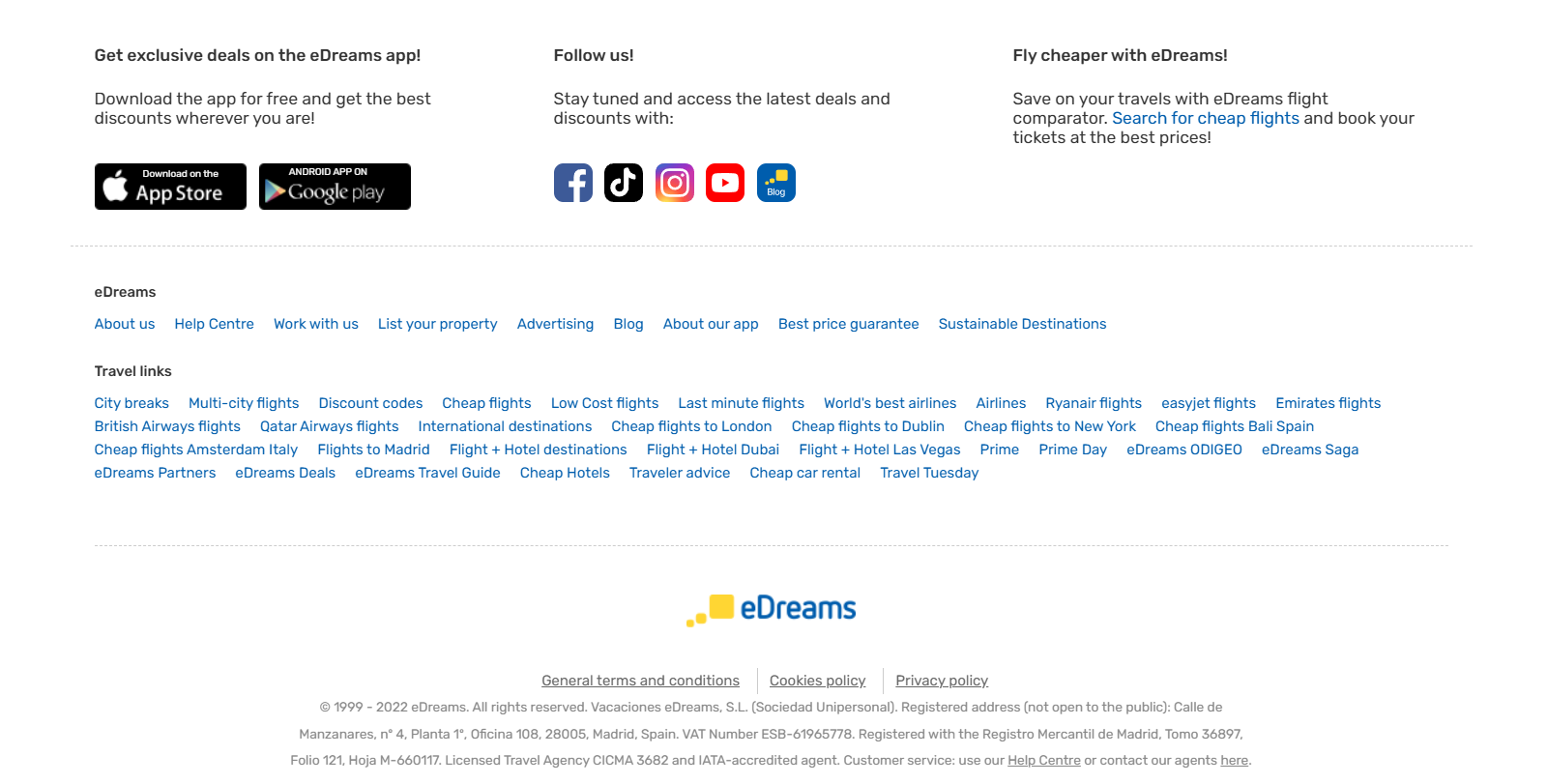 eDreams website footer
The footer is divided into sections, with information highlighted using different colors and fonts. This creates a sense of order and structure, making it easier for users to find the necessary footer elements.
Optional but useful elements
If you’re wondering what to put in a website footer beyond the essentials, here are a few more ideas to consider.
If you are looking to strengthen your company’s credibility, display awards and certifications in your footer. This simple addition reassures visitors that they are dealing with a trusted and recognized brand.
In the following example, Mangools’ website footer includes awards to reinforce its authority.
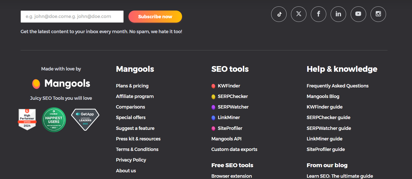 Website footer example from Mangools
A company mission statement or tagline in the footer serves as a final brand reinforcement. It reminds visitors what your business stands for and helps create an emotional connection before they leave your website.
New Balance, for example, features its tagline “Fearlessly Independent” in its website footer to strengthen brand identity.
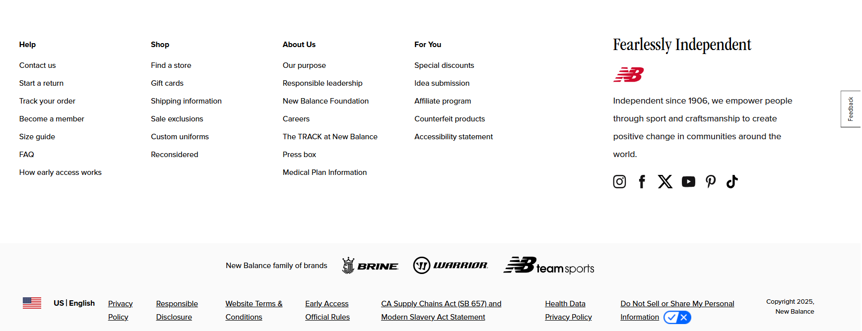 Footer example from New Balance
Lastly, a subscription form in the footer is an effective lead-generation tool. Since visitors who scroll to the bottom of a page are often more engaged, offering them an easy way to subscribe to updates, promotions, or exclusive content can help build long-term customer relationships.
KIA’s website footer below includes a newsletter subscription form to capture leads and encourage ongoing engagement.
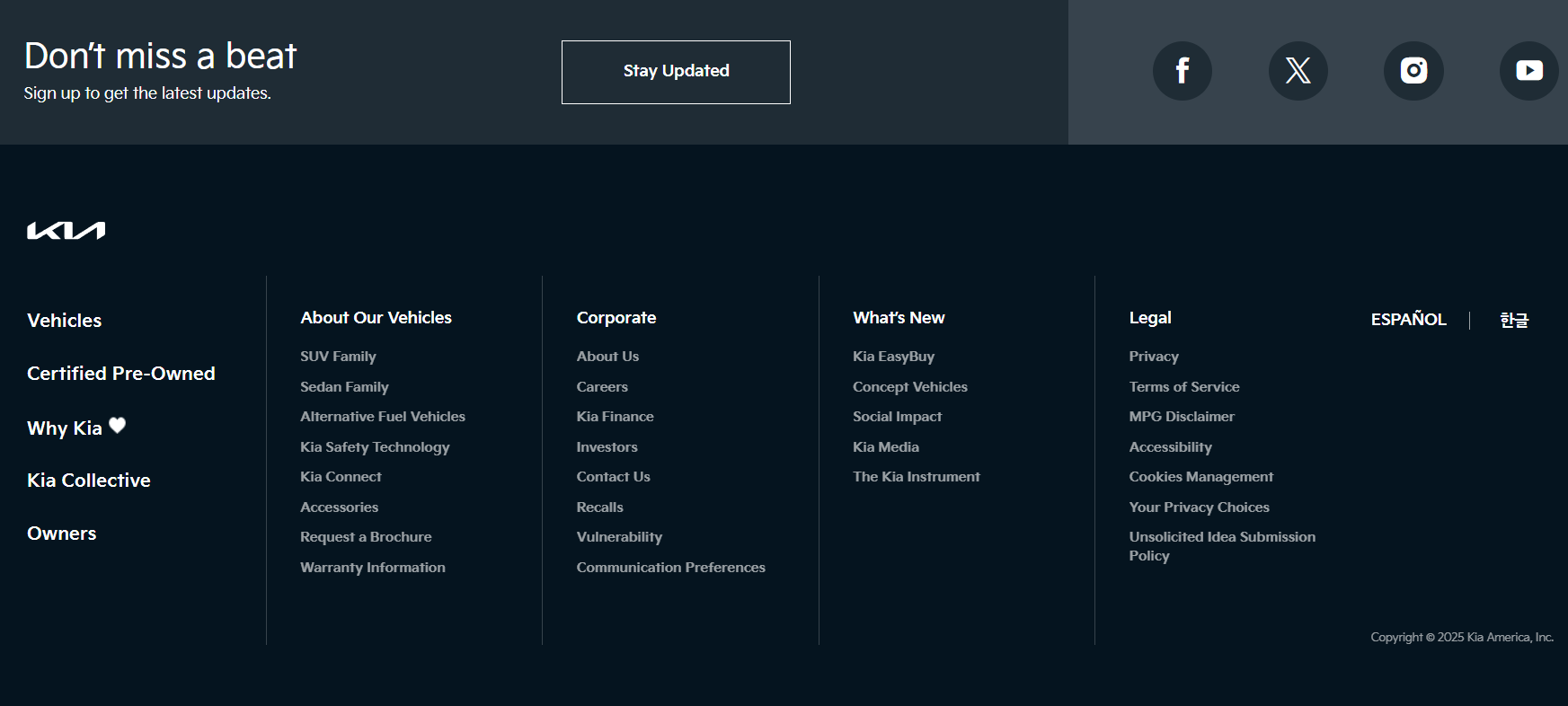 Website footer example from KIA
A well-crafted website footer should be both visually appealing and user-friendly. To achieve this, choose a website builder with an intuitive editor and a variety of customization tools. With SendPulse, you can easily design and adjust your footer to fit your needs.
You can choose from a library of pre-made customizable templates to get a head start. Alternatively, you can build a website from scratch by dragging and dropping ready-made blocks.
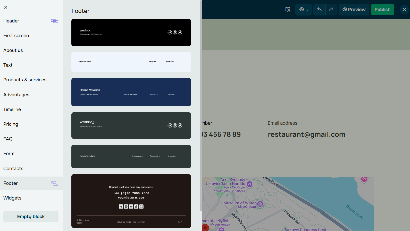 Footer block library for your website
Now, let’s explore key tips to ensure your website footer design is both functional and aesthetically pleasing.
Keep it clean and organized
To decide how to design and what information to add to your footer, take a moment to analyze competitors’ websites from a user’s perspective. Ask yourself, does this footer contain useful information? Are there any unnecessary elements cluttering up the space? This also depends on the industry you’re in and how complex the structure of your website is.
For example, sitemaps are great to add to the footer if you have a lot of pages and a complex structure. Apple’s website footer below includes a sitemap to help users quickly find what they need.
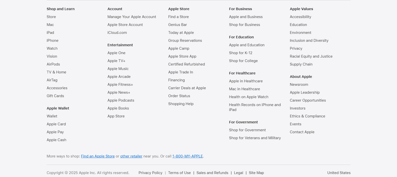 Apple’s footer contains a sitemap
For businesses that operate both online and offline, listing physical addresses and business hours would make it much easier for customers to visit. If your goal is to grow your mailing list, placing a newsletter subscription form in the footer is a great way to capture leads.
For instance, Gucci’s website footer includes a store locator and newsletter sign-up to enhance customer engagement.
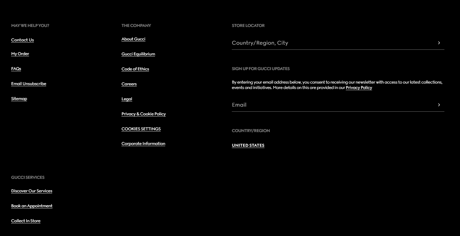 Website footer example from Gucci
To sum up, before creating your footer, analyze your users’ needs and the specifics of your business. To avoid clutter, group related elements into sections and use adequate spacing for readability.
A well-structured website footer design makes it easier for users to find important details at a glance. The SendPulse website builder allows you to organize information into blocks, adjust margins, and fine-tune alignment for a clean, professional-looking layout.
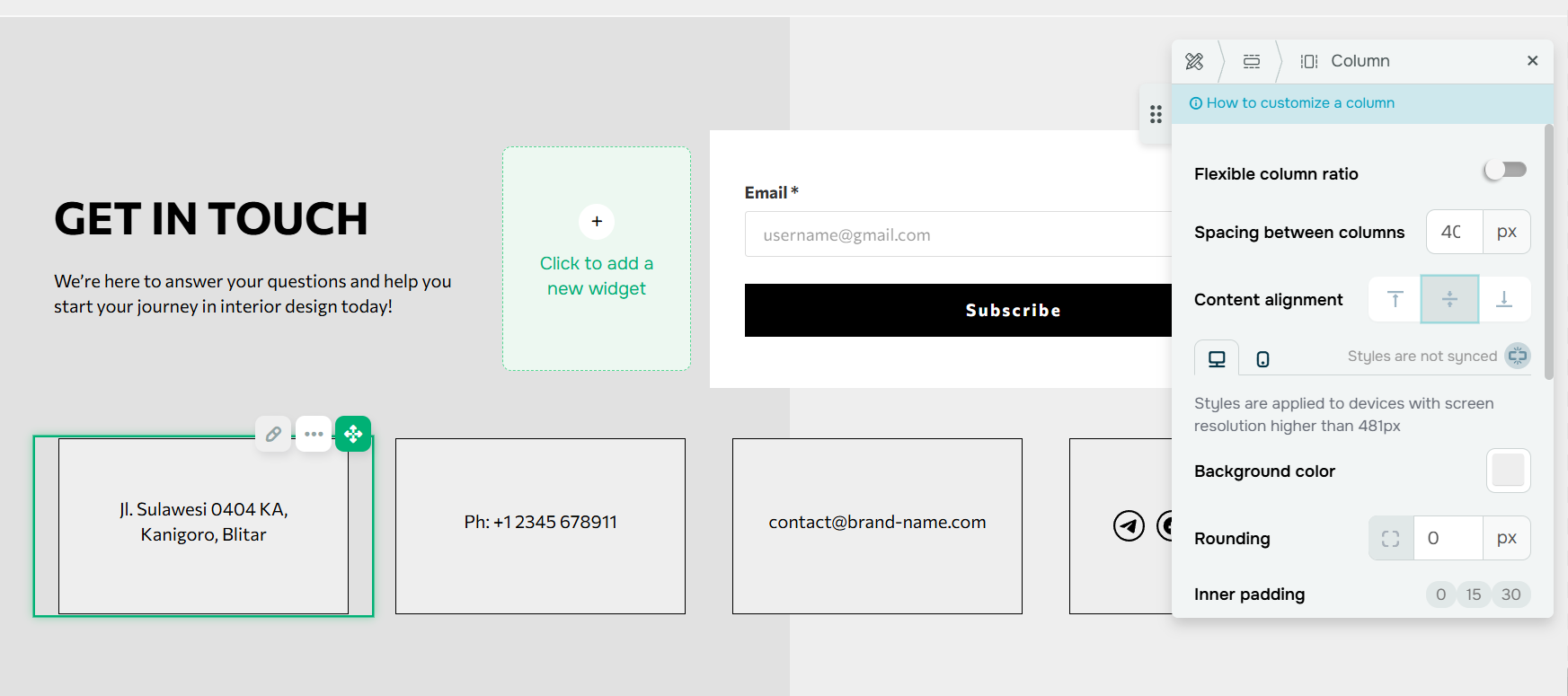 Element placement settings in the SendPulse builder
Use contrasting colors for visibility
Using contrasting colors in your website footer is essential for both aesthetics and usability. When your footer contains multiple elements, color can help organize information, making it easier for users to navigate.
To improve link visibility, choose a color that contrasts with both the background and surrounding text. A bold or bright hue can make important links stand out, drawing attention to them.
A great example is the Velvet website footer, which is clearly structured with information blocks separated by lines. While the main content of the page features a light, monochromatic background, the footer stands out with a space-themed backdrop. This cohesive website footer design mirrors its header, creating a visually balanced and well-structured page.
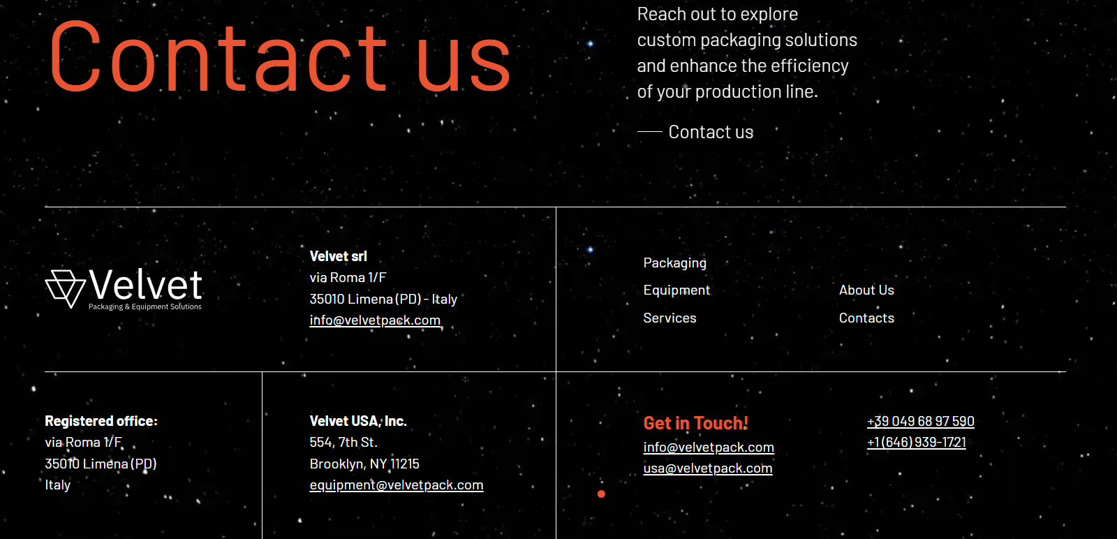 Velvet uses a space-themed backdrop for its website footer
Beyond color contrast, adding hover effects or underlining links can provide clear visual cues for identifying clickable elements. Besides, it’s crucial to consider accessibility when selecting colors. Ensure that the contrast ratio between text and background meets the Web Content Accessibility Guidelines. That way, users with visual impairments can easily read the content in your footer, creating a more inclusive web experience for everyone.
For instance, Nominal’s footer below includes an Accessibility feature, allowing users to adjust content display settings.
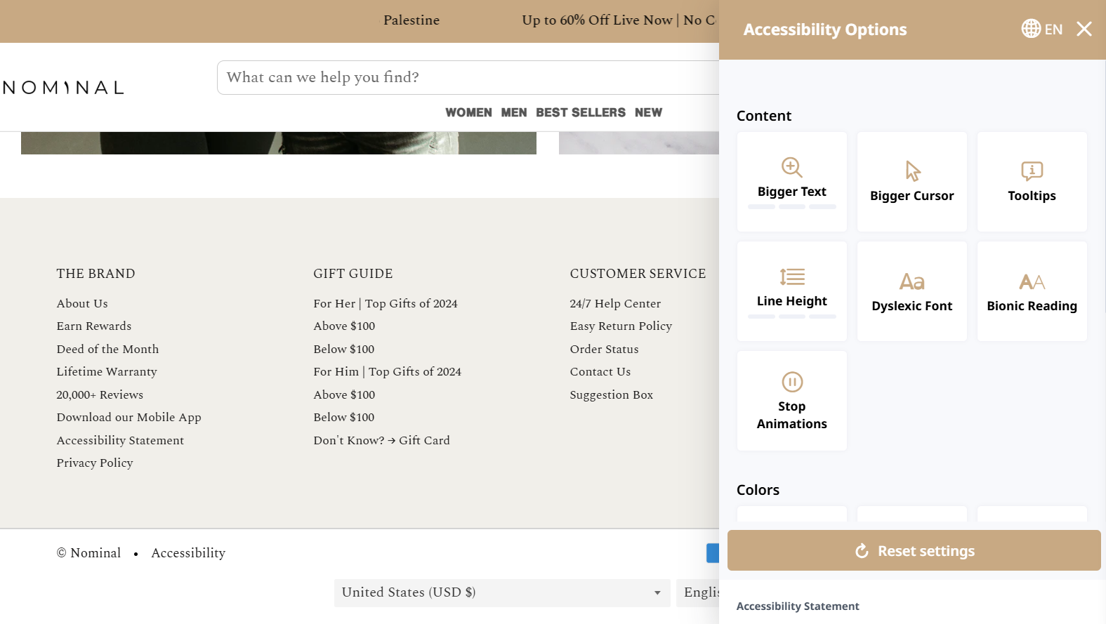 Nominal includes accessibility settings in the website footer
Make it mobile-friendly
Since a large portion of visitors browse on mobile devices, optimizing your website footer design for smaller screens is crucial. You may need to remove some non-essential elements, increase font sizes or buttons dimensions, or rearrange the structure.
If you’re creating your website and footer using the SendPulse website builder, it will automatically be responsive across different devices. Additionally, you can preview how each element will appear on the site.
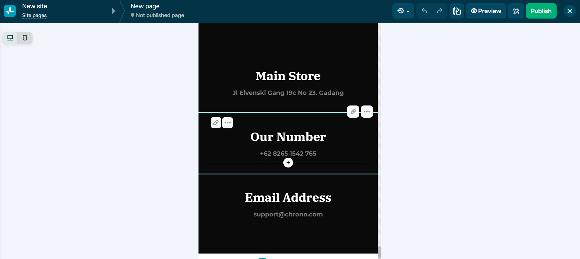 Check how the footer looks on a smartphone by clicking the corresponding icon
Let’s take a look at several best website footers with different content and designs.
Minimalistic footer by Colorlib
Colorlib is a website that provides both free and premium website templates and themes. The Colorlib website is dominated by white and purple colors, and the footer is created in the same palette. It’s quite minimalist, with the main focus on the subscription form. In addition, only the most essential information, like copyright, Privacy Policy, and similar details, has been included.
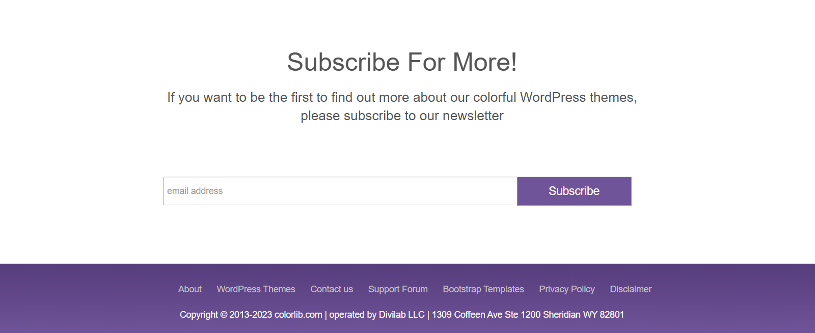 Colorlib website footer
Informational footer with detailed navigation menu by Statista
Since Statista is an informational service with a complex website structure, they included a lot of information in their footer, such as navigation links and a sitemap. The footer doesn’t stand out with background or font color, but the information is divided into blocks to make it easier for users to find what they need. Additionally, the footer contains links to social media.
 Statista website footer
Creative footer with dynamic elements by Yellowbird
The online store Yellowbird has a very vibrant design, which they also used for the footer. It is in the same bright yellow color as the website pages. The footer contains quite a few navigation links, as well as social media links. When hovering over the text in the footer, a highlight appears. But the most interesting and attention-grabbing feature is the animation next to the subscription form, which will definitely capture visitors’ attention.
Yellowbird website footer
Extensive navigation footer by The New York Times
The New York Times website is the digital platform for one of America’s most renowned newspapers. They offer comprehensive news coverage, in-depth analysis, and a variety of multimedia content.
The footer of their website is well-structured. It contains a lot of information, primarily serving as a navigation tool for users. In addition, it includes all the necessary legal information and an account management section.
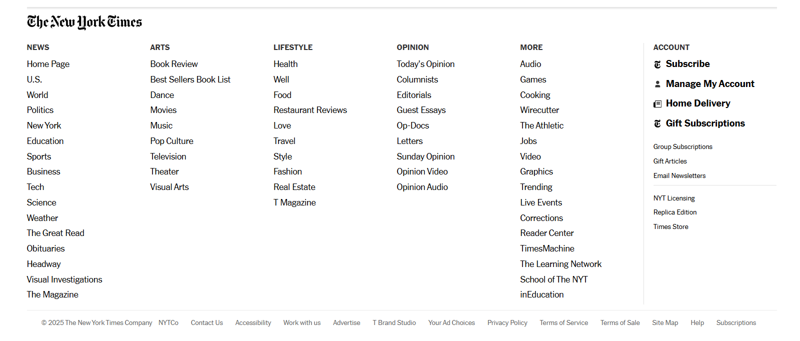 The New York Times website footer
Location-focused footer by Envoy
Envoy is a full-service digital experience consultancy that leverages design, technology, and data to create impactful business solutions.
They designed their website footer to be quite large, yet it doesn’t contain much information. The focus is on font size. There are no typical legal details or navigation links in the footer. Instead, it provides contact information for different inquiries and links to social media.
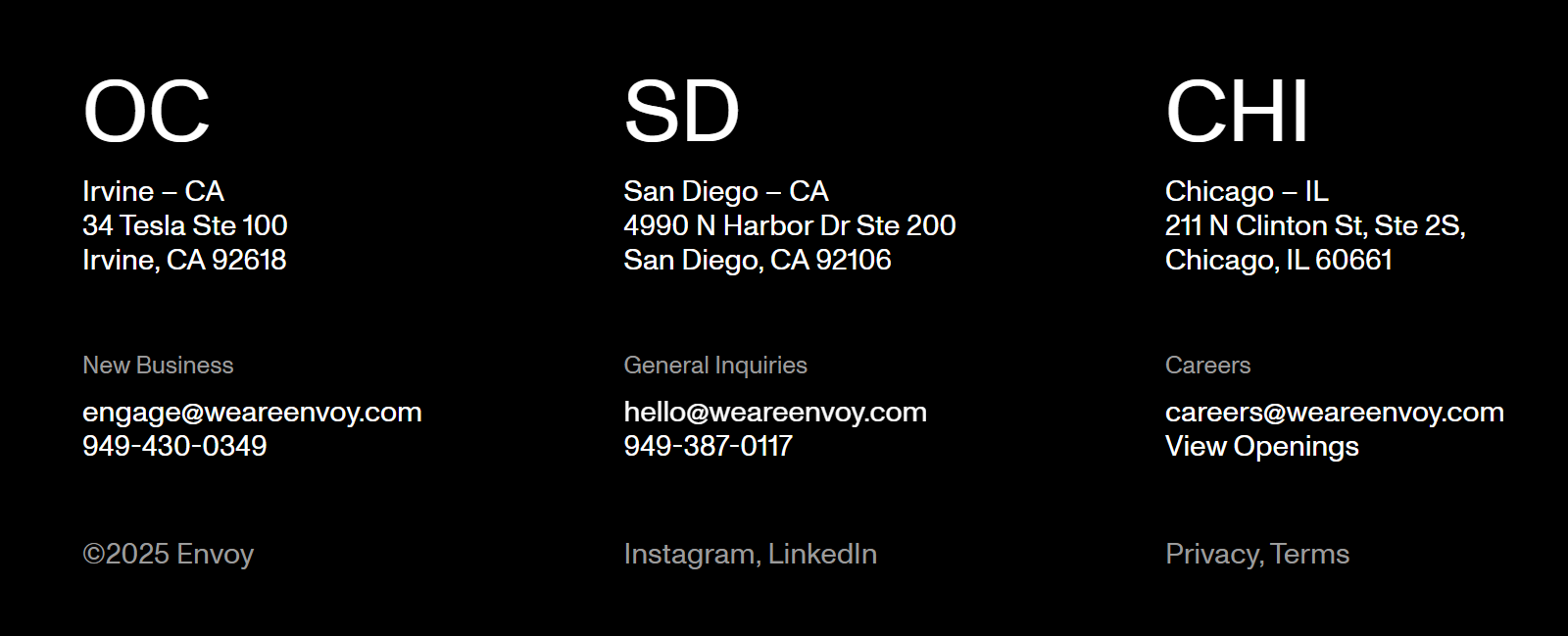 Envoy website footer
Footer with a featured image and logo by Little Beast
Little Beast is a lifestyle brand specializing in high-quality dog apparel, including onesies, hoodies, sweaters, and more, designed for dogs of all shapes and sizes.
Although their website footer is quite small, it grabs attention with a themed image that, along with the logo, takes up most of the space. Additionally, it includes key navigation links, as well as the Privacy Policy and Terms of Service. Everything in this example looks cohesive and visually appealing.
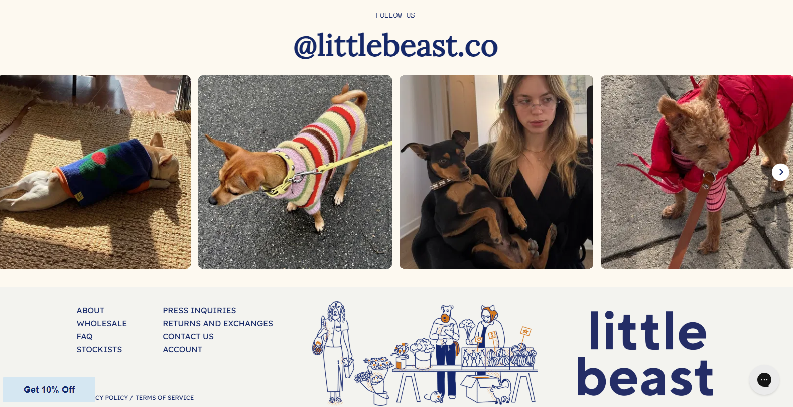 Little Beast website footer
However, there is a small nuance worth considering when designing a footer and a website in general. When visitors browse the site, they are shown a pop-up offering a discount.
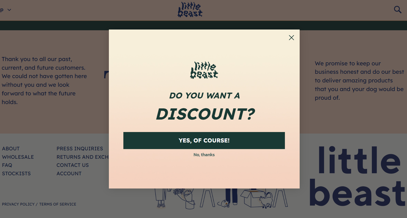 Little Beast website pop-up
Even if they close it, a launcher remains at the bottom of the page, allowing them to reopen the pop-up at any time.
 Little Beast website launcher
This is a great practice for website pop-ups, as it ensures users can access the offer when needed. However, when scrolling to the very bottom of the page, the launcher overlaps the Privacy Policy link, making it inaccessible. This could frustrate visitors and negatively impact their overall experience on the website.
Eye-catching footer by Viator
Viator is an online travel booking platform that specializes in tours, activities, and experiences around the world. The website serves as a marketplace connecting travelers with tour operators, ensuring a booking process and verified reviews.
The website footer stands out from the rest of the content thanks to its black background. Social media links and a customer review-based rating are placed prominently in the center.
 Viator footer design
In addition to navigation links and standard legal information, the footer includes two more elements — links to Google Play and the App Store. The company has its own app, which can be downloaded via these links. Why include them in the desktop version? Perhaps a user will notice them and want to learn more about the app before downloading it later. Meanwhile, for mobile users, these footer links provide an easy way to convert them into new app users.
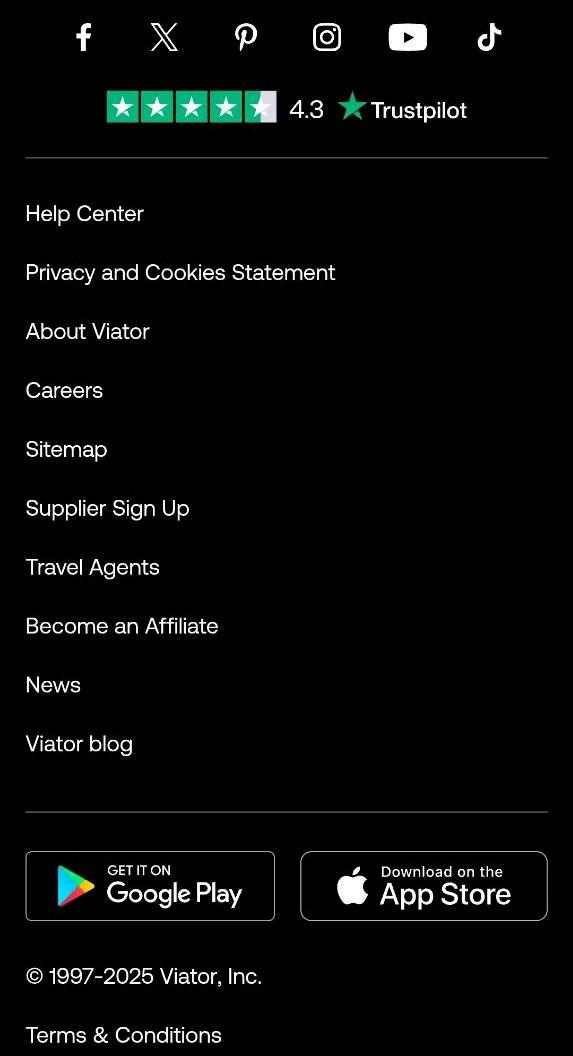 The mobile version of the Viator website footer
Conclusion
In this post, we explored the website footer, its purpose, and the elements most commonly included in this section. While the footer may seem like an insignificant part of a website at first glance, its design and usability are just as important as any other content.
A footer can include sitemaps and navigation menus to help visitors find the pages they need, subscription forms to grow your contact base, social media links to enhance brand recognition and strengthen cross-platform connections, and much more. Pay close attention to the creation, structuring, and visual design of your footer to turn it into a conversion-driving element.
With SendPulse’s website builder, you can easily bring all your website footer ideas to life. Make sure to give it a try!