Customize your page style
You can customize your website design to fit your brand style. Build a visual identity by choosing a primary color scheme and fonts for your site elements. The settings you choose in the Page Style section will be applied to all of your elements.
We recommend copying elements to maintain a consistent page design style without additional customization.
Read more: Customizing the element appearance.
Click the pencil icon in the upper left corner to access the style settings of your page.
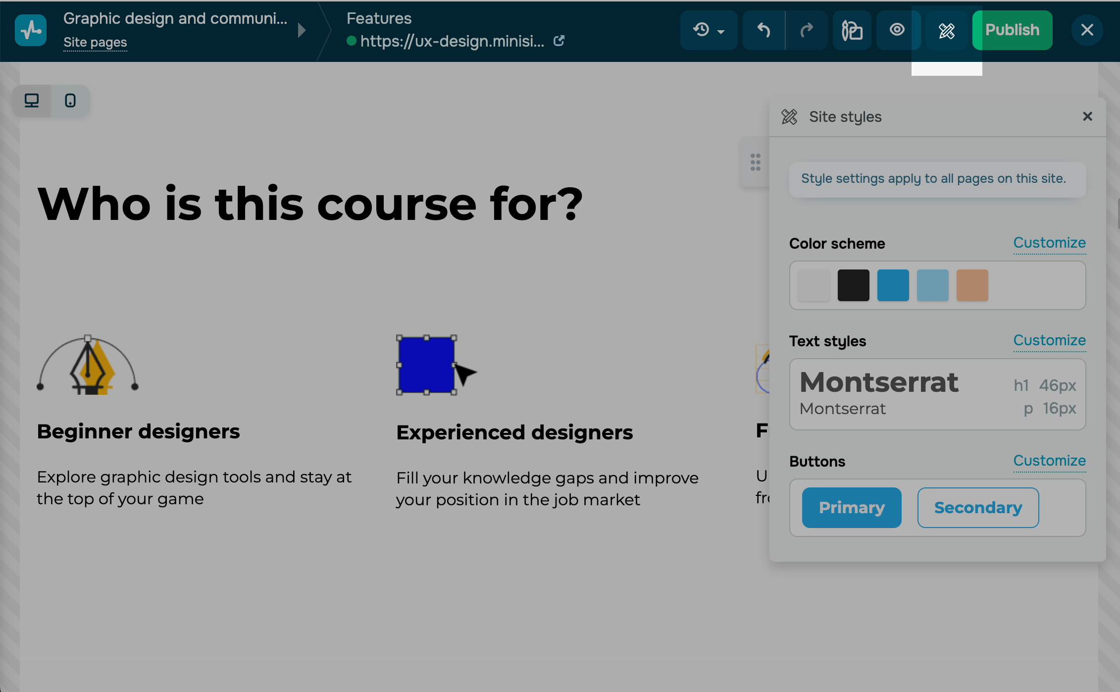
Select Customize next to the desired element.
Color scheme
In the Color scheme section, you can select dominant element colors.
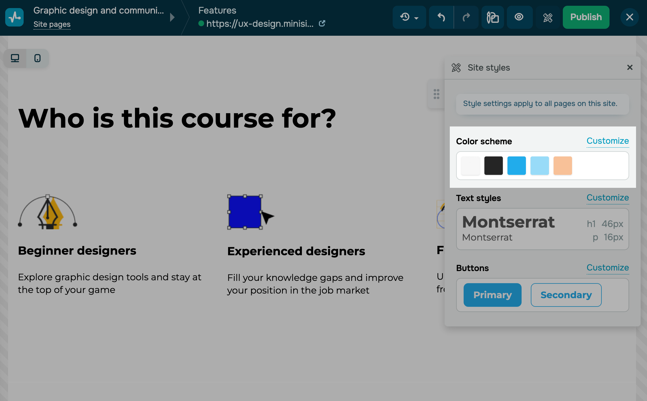
To set the color scheme for every element individually, click Customize and select a color:
| Light | Used as a background for dark site elements. |
| Dark | Used as a background for light site elements. |
| Primary | Used to attract attention to your brand and represent your brand identity. |
| Secondary | Used to attract attention and complement your primary color. |
| Accent | Used to highlight unique site elements. |
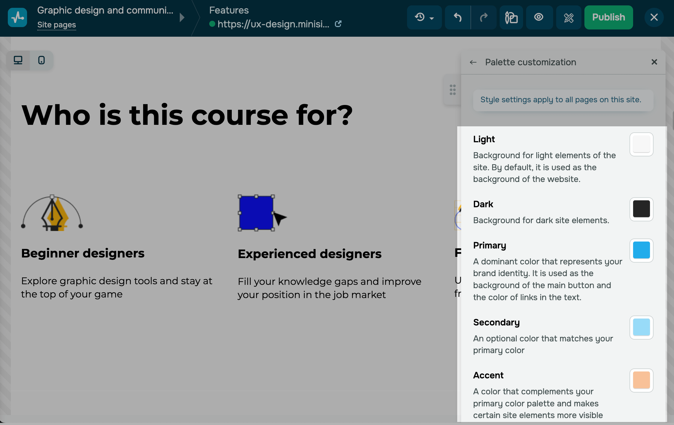
Text styles
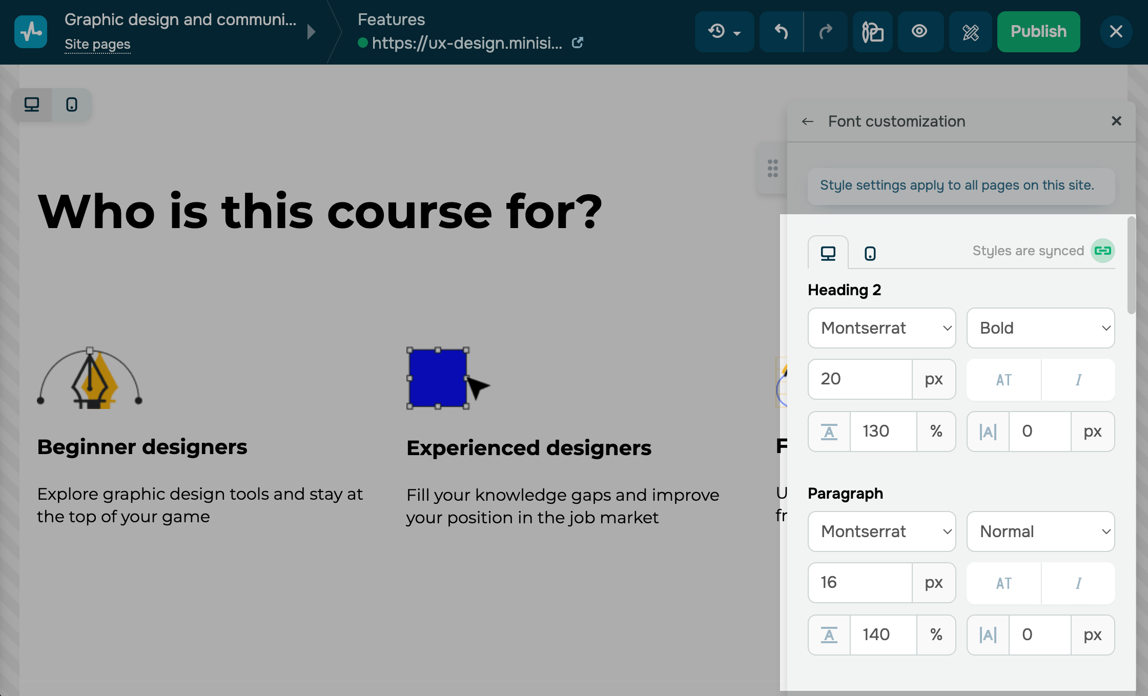
In the Text styles section, you can select from our predefined font combinations or customize your paragraph and heading fonts to match your website's style and maintain design integrity.
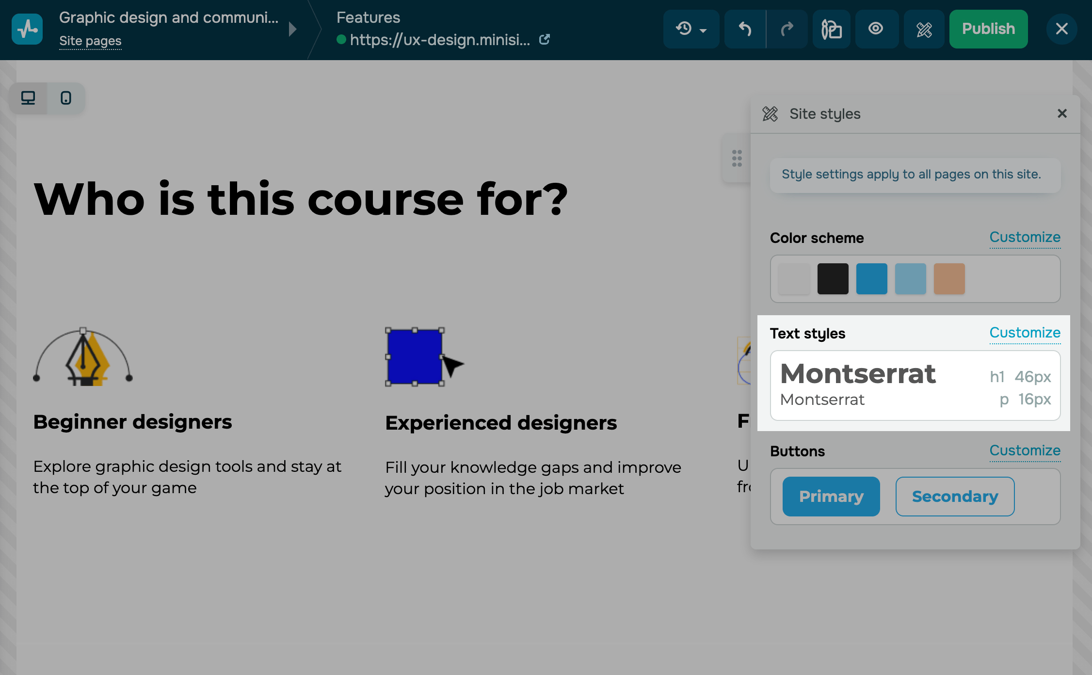
To set paragraph and heading text styles individually, click Customize and adjust the settings.
| Font | Select an overall text appearance. |
| Font weight | Set a font weight: bold, thin, or regular. |
| Font size | Set a font size in pixels (px). |
| Format | Select text properties (capitalize, italicize). |
| Line height | Set a vertical distance between text lines, which can be less or more than 100%. |
| Letter spacing | Set a spacing between characters in pixels (px), which cannot be less than zero. |
Button settings will match your selected sizes and fonts.
The font size of your Form widget buttons depends on your selected button size (S is 0.8 of the specified size, M matches the selected font, and L is 1.2 of the specified font).
You can also add your own fonts to the website builder, based on your brand style.
Read also: How to add a custom font to a website.
Button styles
In the Buttons section, you can select the styles for all website buttons, including those in the Button, Form, Payments, Registration widgets, etc.
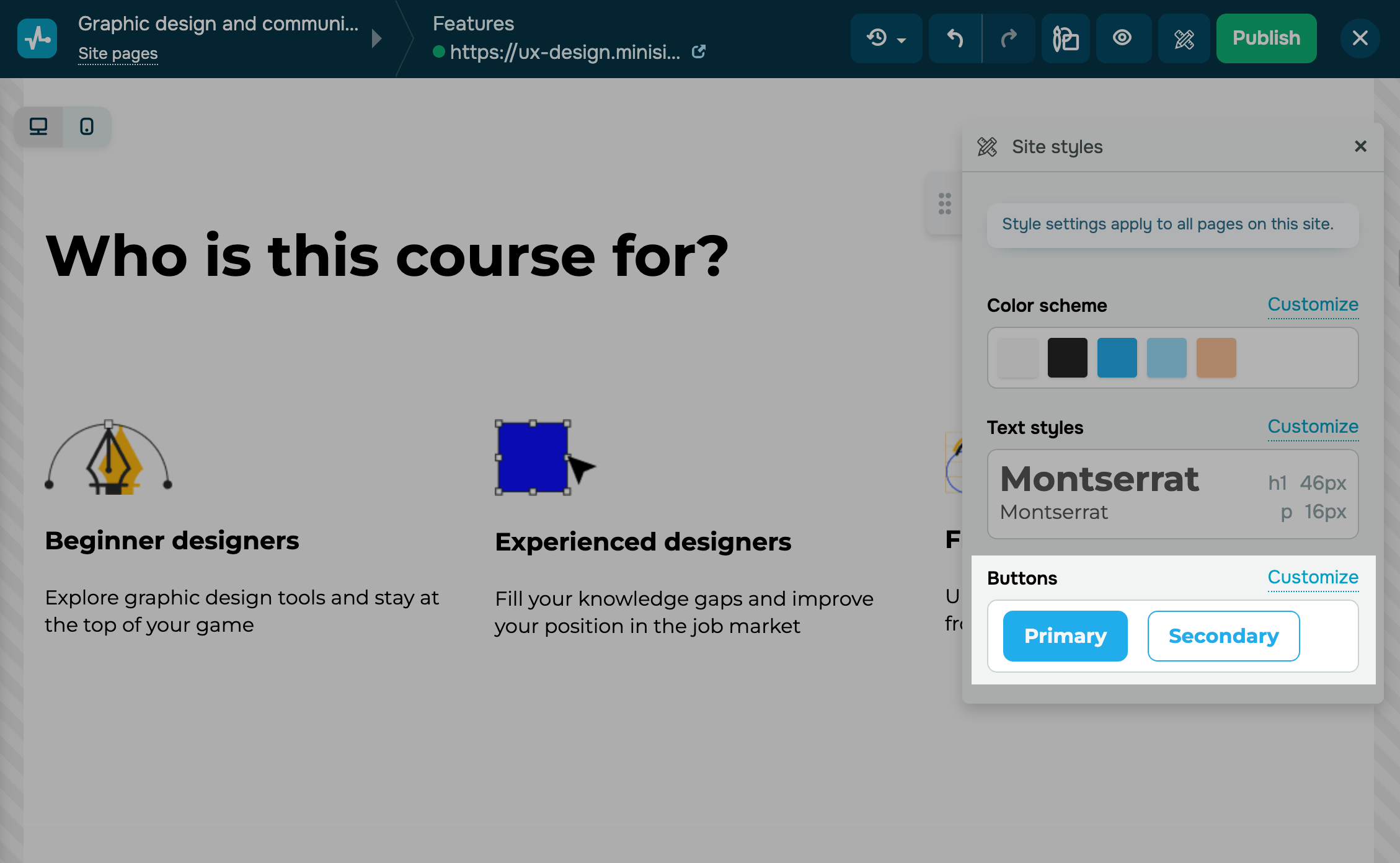
To customize your style, click Customize and go to a tab:
| Primary | Used for high-priority call-to-action buttons that need to get more attention. |
| Secondary | Used for less important buttons — their color is paler by default. |
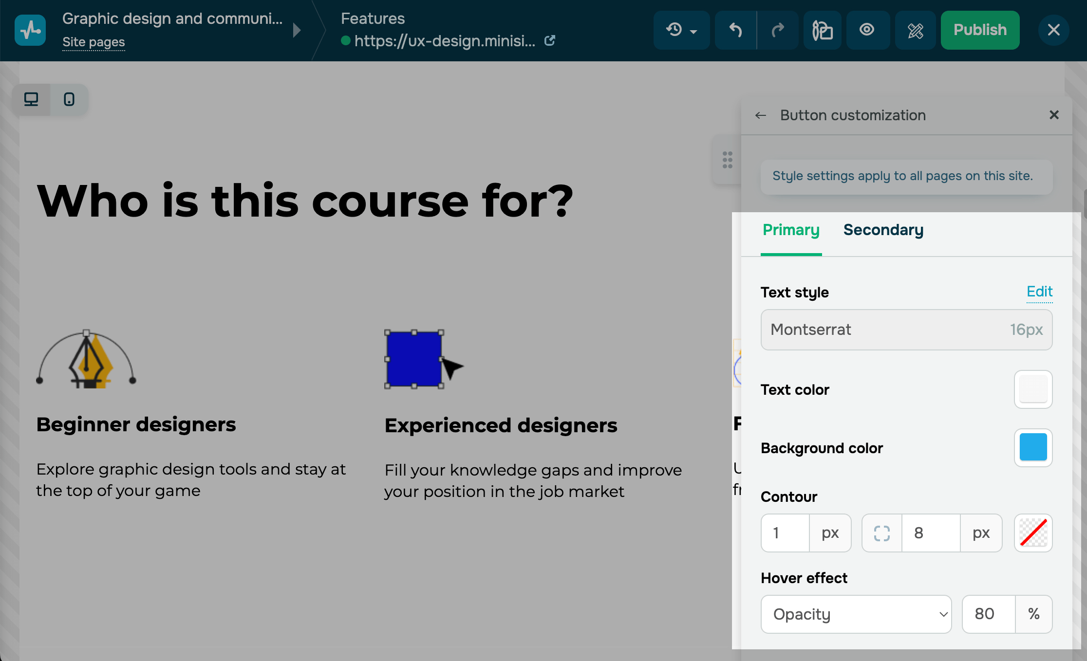
You can use the following options to customize your buttons:
| Text style | Shows the text style selected in font settings. To change it, click Edit. Then, in the Button section, select a font and its size, and adjust your line height and width. | |
| Text color | Defines the button text color. Click the icon and select a color. | |
| Background color | Defines the button background color. Click the icon and select a color. | |
| Contour | Adds a line around the button's border. Turn on the toggle, enter a value in pixels to set the line thickness, and select a line type and its color. | |
| Hover effect | Adds hover effects to increase conversions and encourage visitors to perform an action on the page. | |
| Opacity | Your button opacity will change from 100% to the specified percentage. | |
| Shadow | A shadow will appear around your button. | |
| Alternative color | Your button color scheme will change.
Select an on-hover text, background, and contour color. |
|

Last Updated: 10.01.2025
or