HTML email best practices
An HTML email is the use of a type of HTML to provide an email with semantic markup and formatting abilities that is not possible with plain text email. It helps marketers to create stunning emails that drive more sales and increase customer engagement.
Texts are fitted into the width of the viewing surface instead of breaking each line at every 78 characters. HTML email allows the provision of tables, colors, mathematical formulae as images, charts, and diagrams. They assist companies in building brand recognition.
Why is HTML email important? 64% of people say that they prefer HTML emails over plain text emails. This high approval rating is due to the following benefits of HTML emails:
- Better design: HTML email allows marketers to customize email templates with their brands’ colors and logos. Also, they can provide clickable CTAs and images in their emails. All these capabilities serve to improve the design of marketing emails.
- Higher conversions: HTML emails enable marketing departments to tweak their messages to make CTAs stand out, provide relevant links, to make it easier for subscribers to engage with emails.
- Tracking: Using an email service such as SendPulse to manage HTML emails provides marketers with email campaign analytics that helps in the evaluation of subscriber engagement and identification of messages that work well enough.
- Higher engagement: Given that visuals get processed faster than words, HTML emails enable marketers to convey their messages more effectively. In particular, brands can demonstrate their products from the most appealing angles.
That said, here are the HTML best practices to help businesses achieve those benefits.
Create a single column layout
Although brands use both single and multiple-column layouts, the second one often appears to be squashed on screens of mobile devices. So, if you have doubts, stick to single column one to be on the safe side. It makes emails compatible with all devices, and thus, more readable even when viewed on various email clients. Apart from that, a single column simplifies the design and emphasizes the essential parts of a marketing message. When designing for mobile, 320px (640px for retina) is the optimal width.
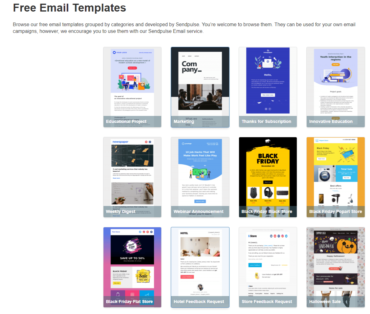
In SendPulse, you can choose any email template structure you wish and it will look perfect across all devices. Select a pre-designed template or create your own one from scratch and drag the necessary layout to your email. Look below.
Look at the email with a single column layout. It’s easy to scan, the CTAs are logically placed and are quite visible.

Craft responsive emails templates
That will ensure your emails look well even on the smallest screen resolutions. There’s no need to know HTML and do some old school by coding emails on your own. With SendPulse email service, marketers have a big choice of pre-designed email templates that look stunning on any device and screen. Apart from that, one can use flexible and free drag and drop editor and customize templates to fit their company colors and logos. They will be responsive as well.

Be sure to utilize email safe fonts
Arial, Arial Black, Comic Sans MS, Courier New, Georgia, Impact, Times New Roman, Trebuchet MS, Verdana, and Webdings are some of the universally supported fonts marketers can use for HTML emails. Regarding the size, be sure to use 13px-14px for texts and 20px-22px for titles.
Notice how this email uses different fonts and font sizes for texts and headings.

Customize a preheader
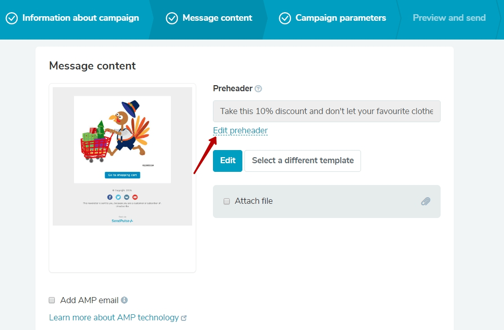
Very often, email marketers underestimate the power of a preheader and just stay away from using its benefits. It significantly influences email open rates by providing valuable information on the message inside. Besides, it may develop your subject line for better performance. SendPulse users don’t need any technical skills to create a preheader. After designing an email template, you can customize the preheader and preview it by clicking on the loop or sending a test email to make sure everything’s fine.

Make it highly informative to provide subscribers with a better idea of your email content. Follow this guide to customize an email preheader in SendPulse.
Look at how Dermstore take an email preheader to their advantage. They use it to motivate users to buy by offering a freebie.

Be careful with tables, background color, and white space
Even though many email clients support padding and margins, the results are always inconsistent. If the spacing is essential, then the developer can nest tables inside their main tables instead.
Regarding background color, it is essential to have a wrapping table all around the content. Setting the background color attribute on the content will ensure that email clients do not do away with the background on the <body> tag or whatever is set on the developer’s style sheet.
Away from that, in theory, all whitespace in HTML files ought to be ignored. However, in practice, it can cause various issues, especially if there is whitespace in between the table cells. As such, it is essential to eliminate any spaces in between the closing tag of one cell and the opening tag of the next to remove layout problem and unpleasant gaps.
Check out the way National Geographic makes use of black background color. It elaborates the space topic making an email a mysterious piece of art. In addition, the brand has taken special care of the text color for the sake of contrast.

Use images properly
Given that images are the heaviest objects in HTML emails, using them a lot can lead to slow loading time that causes a business to lose readers. So, instead, it is imperative to use smaller and more responsive images. This way, marketers save their audience some bandwidth also. That said, be sure to use twice as large images to ensure that you provide users with high-resolution displays (e.g., Super AMOLED or Retina) with pictures of excellent quality.
It is also essential for marketers not to assume that all images will be displayed. Some email clients show images, while others do not. Get prepared for such situations by including Alt Tags. This way, in case an image fails to display, the alternative text will describe it. Last but not least, never send images only.
Below is a great example of how MAC Cosmetics utilizes images. They use small GIFs to demonstrate their new lipsticks.
Include noticeable buttons
Emails marketers should provide large buttons in their HTML emails to make it easy for readers to tap them. A CTA of at least 40px by 40px will make it easier for the reader to interact with the email. It is also important to avoid cluttering hyperlinks as this might cause some trouble when tapping them. Preferably, put buttons in place of hyperlinks. Marketers can provide a “tap to call” button if they want subscribers to dial a phone number.
Although red color is considered to be the best choice for a CTA, it’s not a must. What really matters is the overall email design. Make sure there’s enough white space around your call to action and the email colors are compatible. Let your buttons contrast with the whole email to be really eye-grabbing.
Although MAC Cosmetics are true minimalists, their email CTAs are eye-catchy due to classic black and white combination.

Avoid Flash, JavaScript, and Complex CSS/HTML
Flash and JavaScript are totally unsupported across different email clients. So, it makes sense not to use them. Make sure that you use CSS2 instead of CSS3, HTML4 instead of HTML5, inline CSS instead of style sets or <style> blocks. To get more insights into the art of coding emails, follow the tips on SendPulse blog.
Last Updated: 25.09.2024
or