Design an email template
There is a great variety of full-fledged guides on email template design on the internet. They contain both general information and useful tips, hints, and advice.
In this article, we'll discuss the most important and useful issues from users.
Creating an email template usually takes a lot of time, effort, and imagination. That's why you'd better create your brand template with special design and follow it while creating further email campaigns. This way, you will not only automate your work but promote brand awareness.
An email template is a place where you should be creative and original. This medium has its structure. We will take into consideration structural and non-structural email elements and formatting.
Let's start!
Email includes both structural and non-structural elements.
Non-structural elements
Non-structural elements include email sender, subject line, and preheader. These elements are vital to you. Why? They are the first to be seen by the subscribers when checking their inbox. Have you ever been about to give a chance to an email the sender of which was unknown, the subject line — boring and the preheader — non-informative? Highly unlikely!
Use Your Company Name as an Email Sender
You’ve undoubtedly received an email from an unknown person and asked yourself a question “Who on earth are you?” and this is great if you just asked but not marked as spam. So, for your clients not to be confused, use your company name with the department you are sending from in the “From” field.
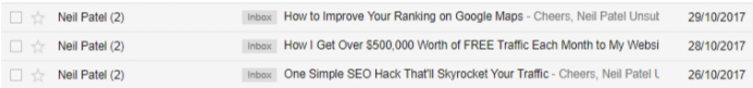
Draw Attention with the Subject Line
If you want a subscriber to open your email, your subject line must stand out from the rest. Make it short but informative, personalize it, use rhetorical questions to intrigue, include emoji, and test your email!
Inform Subscribers with a Preheader
The preheader is the text to the right to your subject line. Use it effectively to convey the primary goal of your email. Use a compelling call to action. But remember the size of the preheader. Try to use no more than 35 characters — the number available on iPhone.
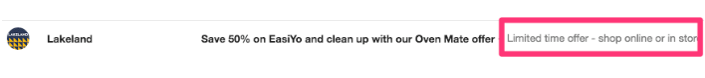
An informative preheader allows marketers to increase email open rates. Services like SendPulse provide this functionality as a built-in feature.
Blow up your email open rate!
With SendPulse, you can customize an email preheader while creating a campaign. It may support a subject line to provide subscribers with more information.
To create a custom email preheader, follow this step-by-step guide.
Structural elements
Before considering the structural elements of an email in details, several important issues should be concerned:
- email template width
- email template height
- image size and format
- mobile-friendly email
- responsive email
We have already talked about structural elements, discover the answers to them in the article “Email template size.”
Make Your Email Easy to Read
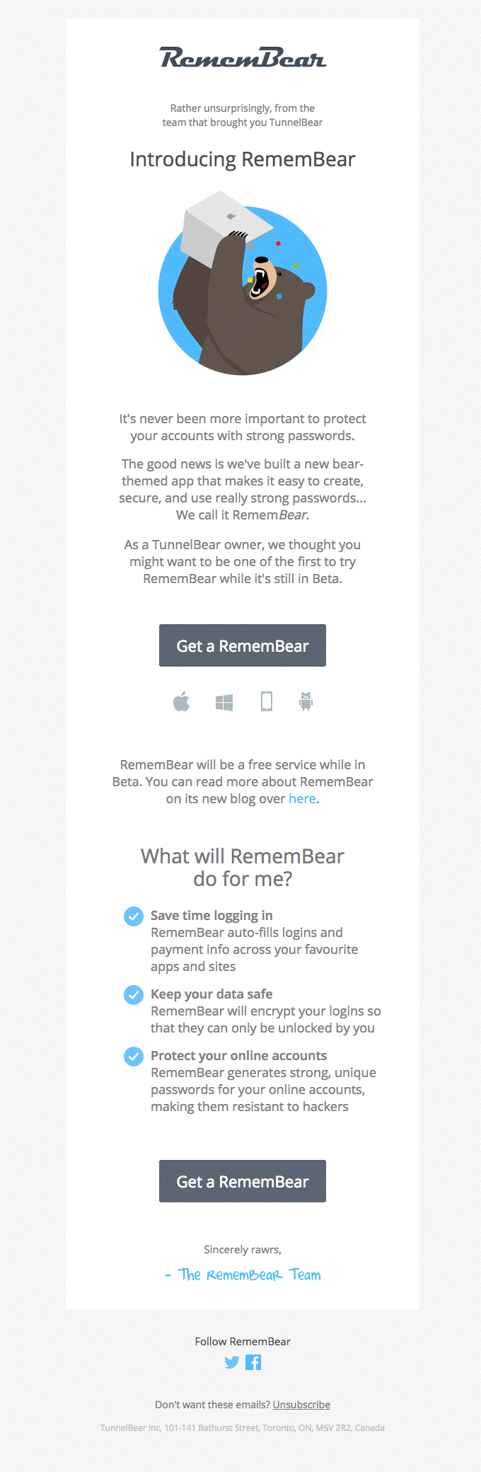
Why is this email easy to read?
There are several possible answers:
-
Inverted pyramid design. You have probably heard of an inverted pyramid design. The average time people pay attention to email is 8 seconds. The pyramid model allows you to make the most important elements like the header, image, paragraph, and call to action button prominent. It perfectly fits the email with a single call to action.
The email from Remembear has the structure of an inverted pyramid model: the header grabs our attention, the email body builds anticipation — we learn more about Remembear, and a button encourages the reader to try their services. Despite the fact that a call to action button is commonly at the bottom of an email, while in this one, there are buttons in the middle and at the bottom — it does not prevent us from easy reading. Visually, the email consists of 2 parts: introducing the service and specifying its benefits. Each part ends with a call to action button. That's why it looks quite logical.
-
White space. White space around your call to action button makes it more visible and eye-grabbing. Use it not only to drive attention to the CTA but also place white space between the paragraphs and round the header. This way, your email will look minimalistic, and the message will be highlighted without exaggeration.
-
Contrast. Black text on a white background is the best choice. An abundance of colors makes the eyes tire quickly, while black and white do not. If you choose bright colors, stick to no more than 3 of them because this may be distracting.
Let’s take a closer look at each of the structural elements of an email.
Do Not Use Background Images
The trouble with the background images is the fact that most email clients do not support them, and block background pictures. This is a default setting of most email clients. If you still want to use them, you should know all the ESPs and make sure they support background images.
Host Images on Your Web Server
You have a choice: attach images to an email or host them on your web server. If you host an image on your web server, the size of your email won’t be l, and all the email clients “understand” this method of loading the pictures. If you attach images to an email, your email size will be larger. Thus it will take a long time to load the picture.
Make Images Clickable
This is important because recipients tend to click on images. They click small images to examine them better and big ones, especially logos, to be redirected to your homepage. Pay attention to your images to avoid creating a poor user experience.
Use Alt Text with Your Images
Alt text stands for alternative text. If your image does not load or breaks, the alt text will be displayed. It explains what is in the picture. Using an Alt text, make sure that you specified the width and the height of your image, this is the area for the alt text to be displayed.
Create a Tempting Call to Action Button
A call to action button is the last appeal that you make to a recipient explaining why they should take action. Keep away from designing the button as a simple text link.
A call to action button should:
- Be large. The larger your call to action button is — the more chances there are for it to be clicked. The size should be convenient for the recipient to tap on a button, reading an email on the phone.
- Match your brand color. It’s a bit of advice rather than a must. Make the contrast between the button color and the background. Red is considered to be the most actionable.
- Be the only one. Surely, if you are in eCommerce and you send TOP-rated goods, you will have several call to action buttons. Still, it’s better to have one button not to distract the reader’s attention. Create an A/B test to find out the most profitable variant for your business.
Include a Link to a Web-Version
A web version is necessary in case your email is displayed incorrectly. It is essential because the recipients can block graphics, or an email provider may block them. A Web-version allows recipients to see the HTML email as a web page. The users will see images, links, unsubscribe links, etc.
Check The Links
Make sure that every link in your email works on every kind of device, that it has UTM tracking, and is appropriately colored. Apple and Gmail tend to make the links blue, and you can use CSS to avoid this.
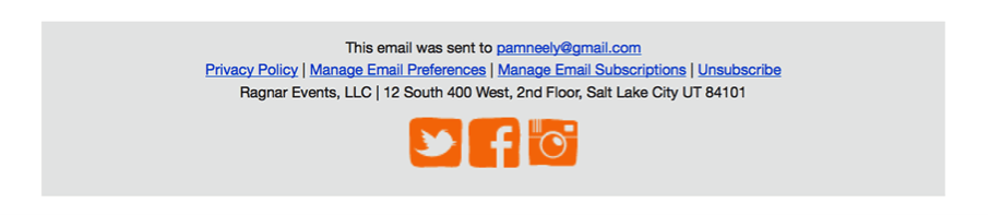
Make Use of an Email Footer
Do not neglect the email footer. Footers are necessary users because it provides a great user experience. Email footer should contain contact information, company address, link to your website, links to social networks, unsubscribe link, copyright.
How to create a helpful footer
- Place a visible unsubscribe link. We won’t be too wordy regarding this issue. If you are interested in mailing list quality and having a good sender reputation — visible unsubscribe links are to your advantage. In case it is hidden somewhere in the text, and the font size is small, it will be harder for the unengaged users to unsubscribe. So, they will mark your email as spam. Besides, it should be easy for a user to unsubscribe — in one click.
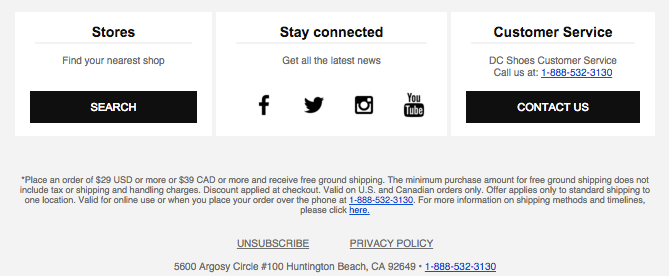
- Give a chance to manage email preferences. Users may unsubscribe for different reasons: they receive emails from you too often, they don’t want to get a specific type of newsletters, their interests have changed since the last time they set them. Give them a link to the preference center where they can update them.
Formatting
1. Design your emails so that their style corresponds to your brand — colors, fonts, buttons should always be the same to create brand awareness.
2. Use readable fonts.
Choose the font size 12-14, for headers — bigger. Some fonts render properly anywhere, and they are Times New Roman, Verdana, Courier, Arial, Georgia, Helvetica.
3. Use full justification or left-margin justification for the paragraphs.
4. Use center justifications for headers.
5. Use left-margin justification and semi-bold for subheaders.
6. Place an empty string between the paragraphs.
This is not the full guide on how to design an email template, but the most critical issues to be considered. If you put them into practice, you will be able to create a great user experience.
The last advice — always test!
Last Updated: 29.09.2024
or