Button pop-up element
With the SendPulse pop-up builder, you can add the Button element to include links to other pages and elements, phone numbers, or email addresses.
In the pop-up builder, select the Button element and go to its settings.
Customize your button
In the element editing panel, you can customize your button parameters. Select a button type (text or image).
Text
Enter your button text.
Keep your pop-up size in mind, and make your call to action short and clear.
Select your style settings:
| Size | Select a button size: small (S), medium (M), or large (L). |
| Text color | Select a text color from the palette. |
| Button color | Click the icon, select a color using the sliders, and click Save.
To revert to the original color matching your pop-up style, go to the Style section, and select the pop-up color. |
Select an on-click button action:
| Next step | Go to the next pop-up window. |
| Close modal window | Close the pop-up window. |
| Open URL | Open another page or website in a new window. |
| Download file | Download a file. Select a file from your account file storage or device. |
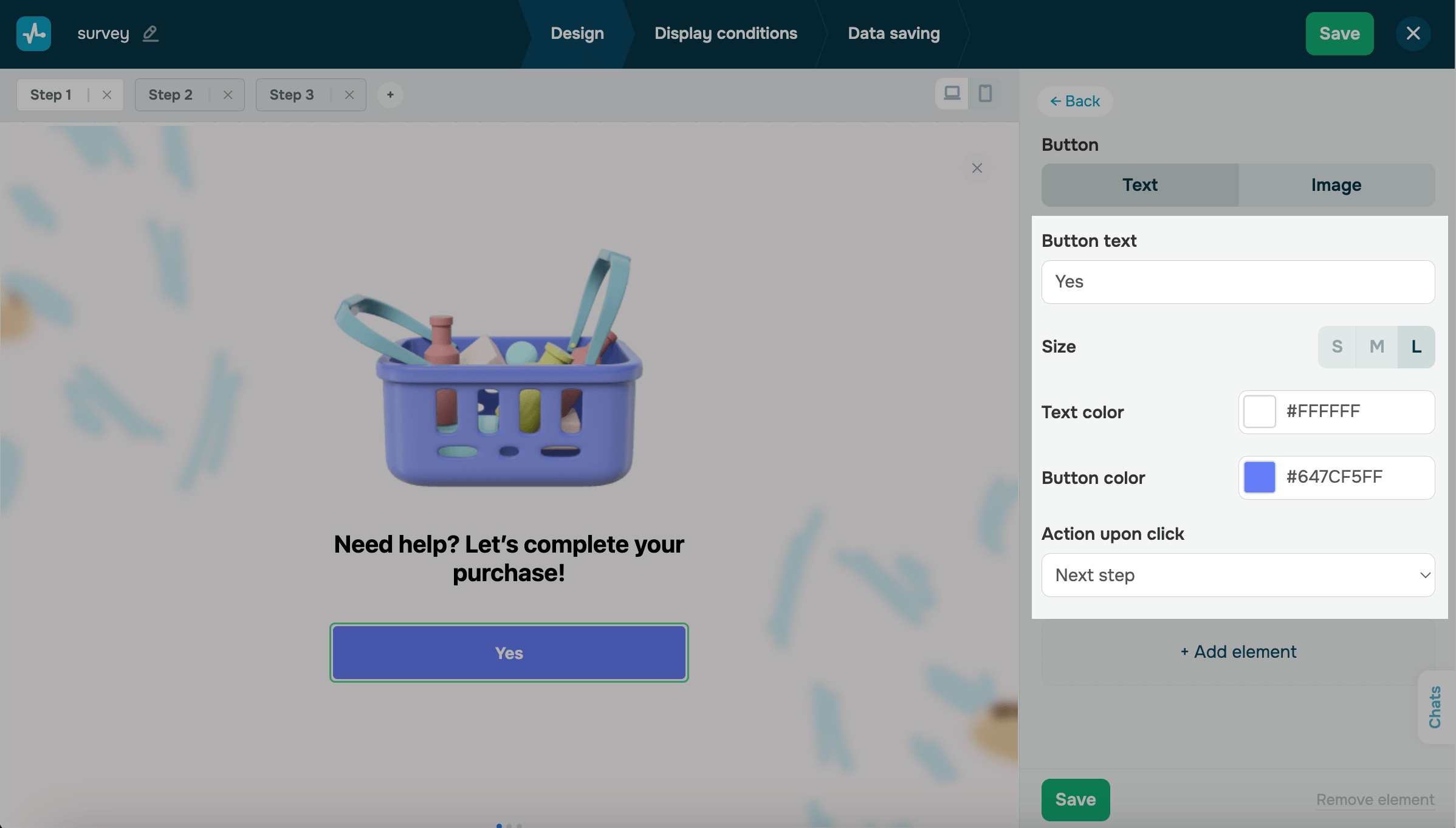
Click Save.
Image
Upload an image, and select a button size: small (S), medium (M), or large (L).
Select an on-click button action: Next step, Close modal window, or Open URL.
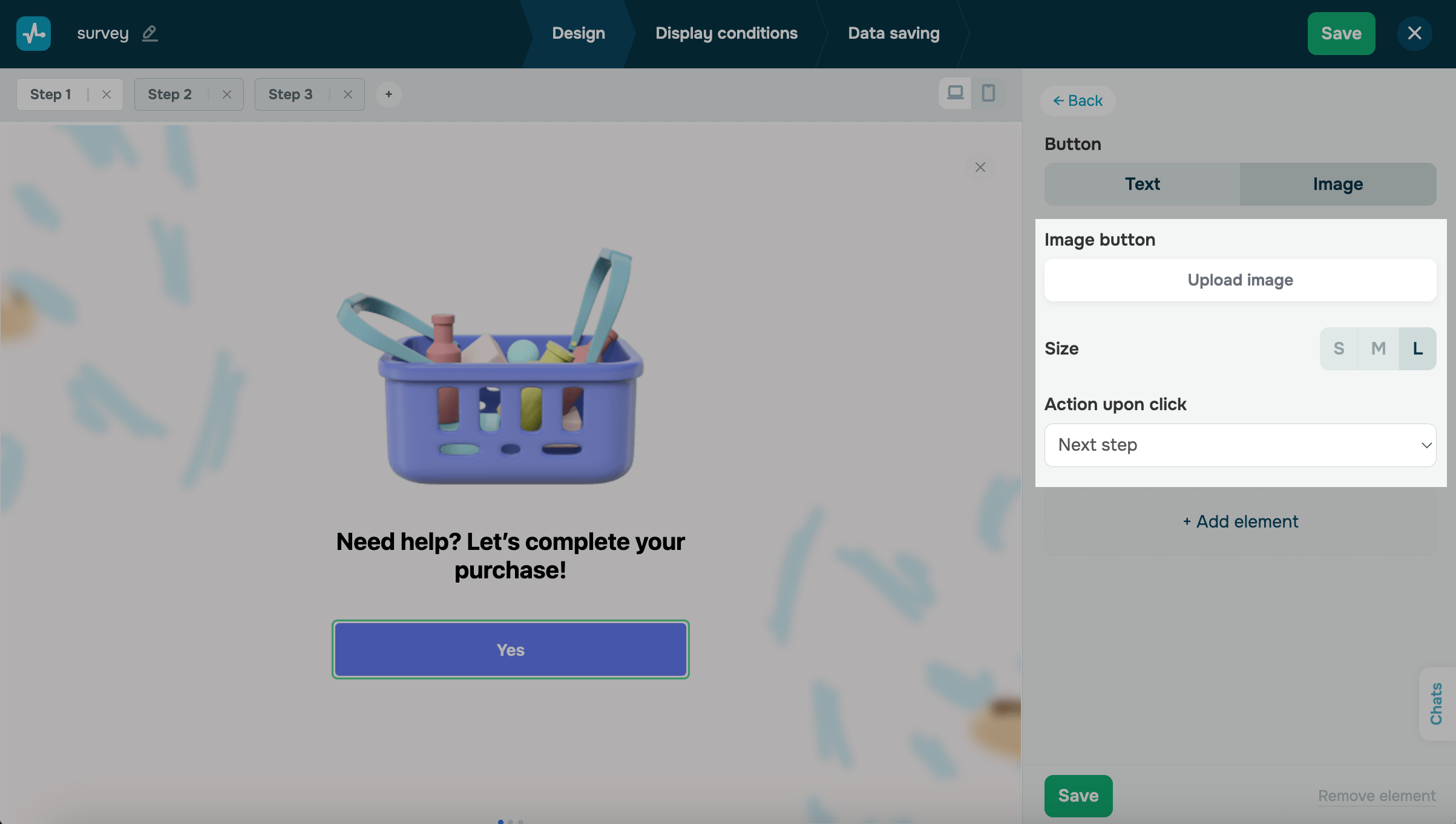
Click Save.
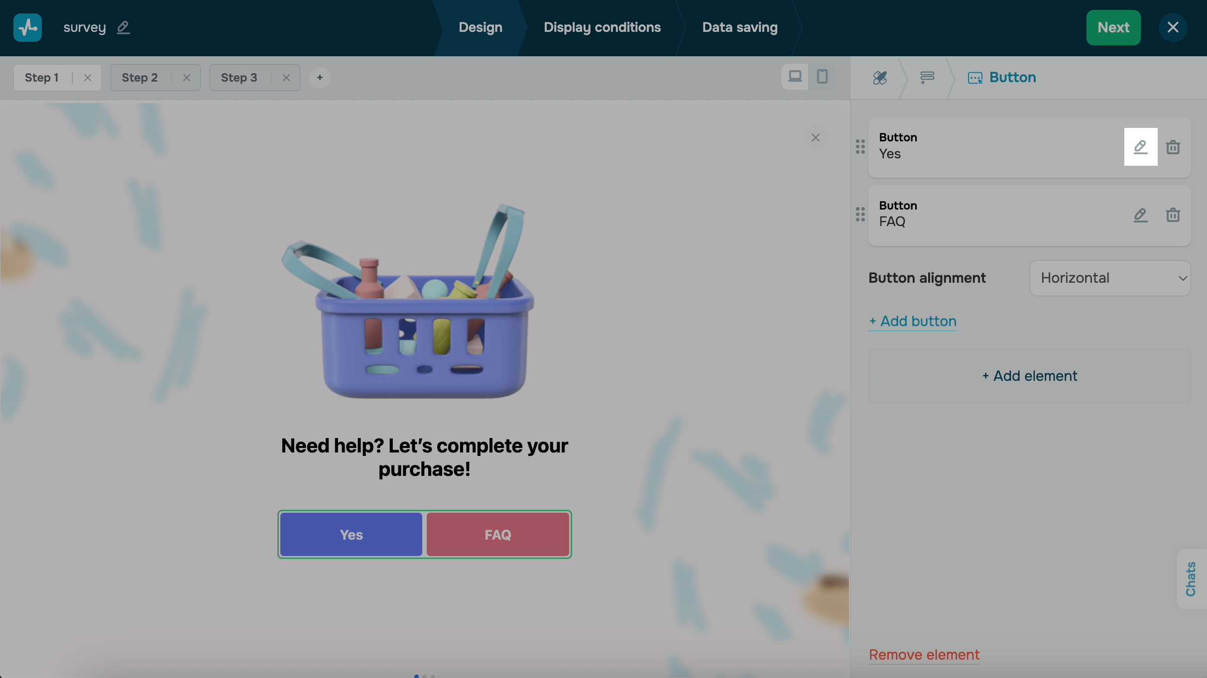
Button groups
You can create a group of up to 6 buttons and customize their alignment. Go to the Button element settings, and in the Button alignment section, select an alignment (horizontal or vertical).
To add a button within the Button element, click + Add button.
To customize every button in the element individually, click the pencil icon next to it.
Last Updated: 13.09.2024
or